Pet Insurance & Finance Reviews Website Template
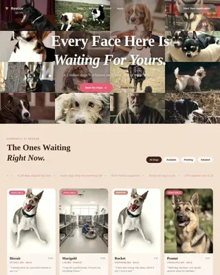
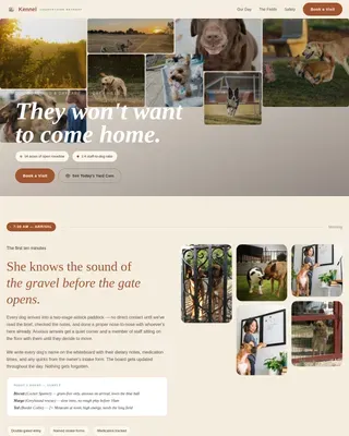
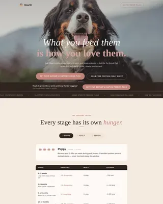
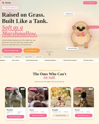
Pawprint is a pet insurance comparison landing page built on a Masonry/Pinterest layout. It pairs emotional testimonial tiles with interactive plan-comparison widgets, guiding pet owners from heartfelt stories to confident coverage decisions. A three-step progressive lead form captures pet type, age, and contact details, turning warm visitors into qualified leads without friction.
by Rocket studio
Quick summary
Pawprint is a single-page pet insurance comparison template designed to convert anxious pet owners into confident insurance shoppers. The Masonry layout alternates emotional proof tiles with live toggle comparison widgets. A progressive three-step form captures leads gently. The Organic Flow design and Dopamine Pop color palette make the experience feel warm, trustworthy, and impossible to scroll past.
Who this template is for
This template is built for pet insurance comparison sites that need to turn visitor anxiety into action. It works equally well for direct carriers, affiliate review publishers, and independent brokers who want a polished lead-generation page.
- First-time puppy or kitten owners who are still processing their first unexpected vet bill
- Senior pet owners managing ongoing conditions such as hip dysplasia who need clear, side-by-side plan comparisons
- Pet insurance publishers and comparison platforms that rely on lead capture volume and want high emotional engagement
What problem this template solves
Most pet owners arrive on a comparison page overwhelmed and skeptical. They have already seen a frightening bill, or they are dreading one. Generic plan tables feel cold and confusing. This template fixes that by pairing real owner stories with rational comparison tools, so visitors feel understood before they are ever asked to commit.
- Visitors leave comparison pages before converting because the content feels clinical and impersonal
- Pet owners struggle to evaluate accident-only versus comprehensive versus wellness add-on plans without a visual, interactive tool
- Mobile users abandon long-form pages before reaching the lead form because the scroll depth is too deep
What you get with this template
You get a fully designed, single-page layout built for pet insurance lead generation. Every section has a defined role: the header hooks emotionally, the mosaic builds trust, the comparison widgets handle objections, and the form closes the loop.
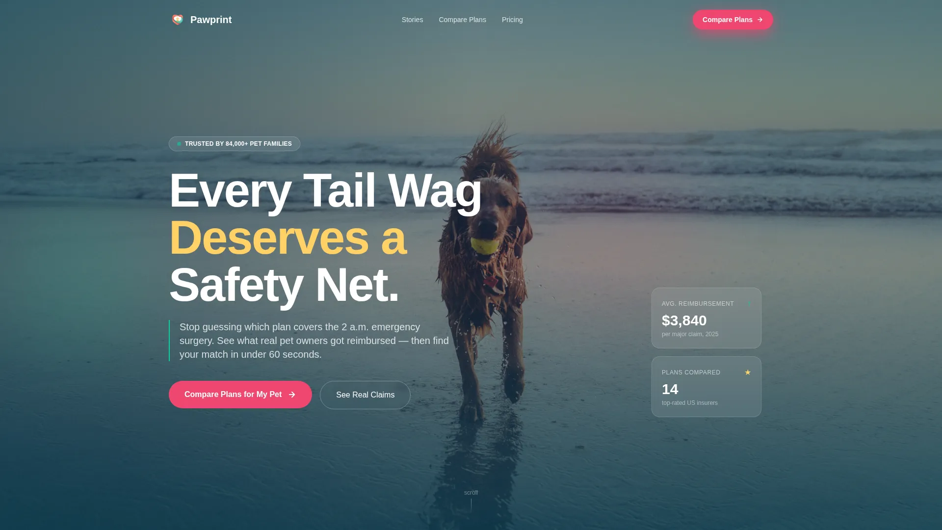
- A full-bleed photo header with headline overlay, a translucent coral call-to-action button, and a Dutch-angle hero image composition
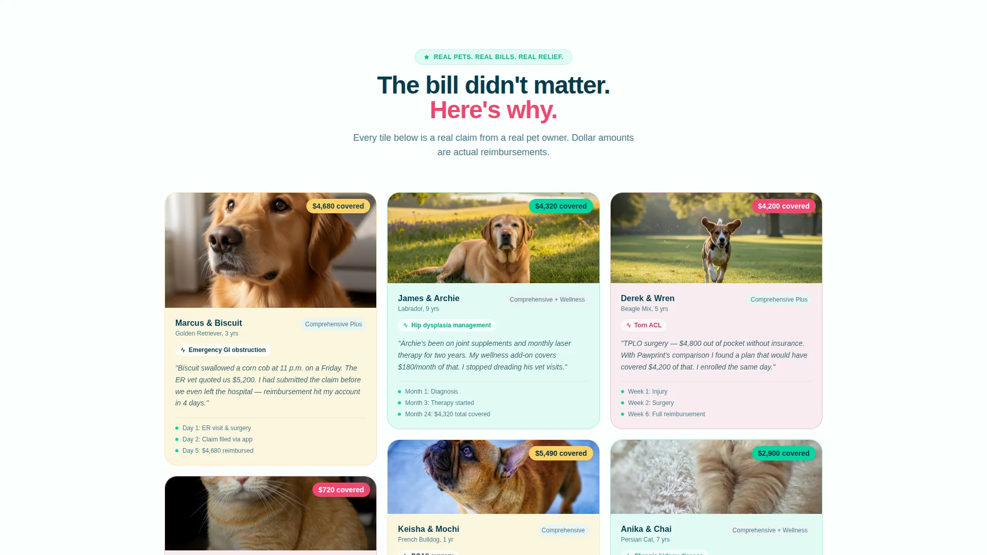
- A Testimonial Mosaic section with small, medium, and large tiles showing real-format pet owner stories, breed details, condition notes, and policy payout amounts
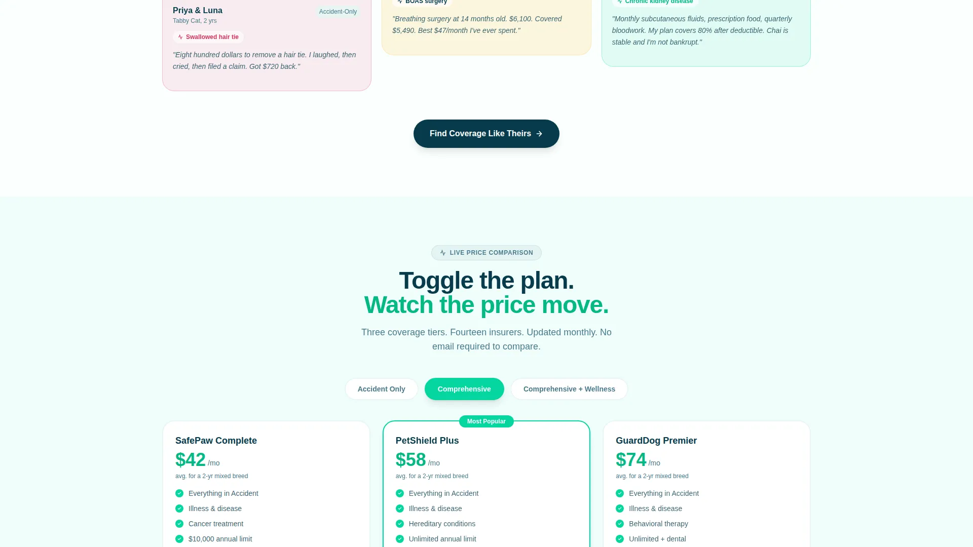
- Interactive plan comparison cards with toggle switches for coverage types and a three-step progressive lead capture form with illustrated pet-type selectors
Feature list
This template delivers six focused components that work together to move a visitor from emotional connection to qualified lead.
Full-Bleed Hero Header
The header uses a high-energy beach photo composition shot from a low Dutch angle. A clean white headline sits over the image. A translucent coral button pulses gently beneath it, drawing the first click without visual noise.
Testimonial Mosaic Layout
Masonry tiles vary across three sizes. Small tiles show a quote and a covered dollar amount. Medium tiles add a vet-visit timeline. Large tiles expand into mini case studies with full claim breakdowns, breed details, and pet photos.
Interactive Plan Comparison Widget
Embedded between testimonial clusters, each comparison card lets visitors toggle between accident-only, comprehensive, and wellness add-on coverage. Three plan prices update as visitors interact, so rational evaluation happens inside the emotional scroll.
Three-Step Progressive Lead Form
The lead form breaks the ask into three gentle steps. Step one uses illustrated selector buttons for pet type and breed. Step two uses a friendly slider and checkboxes for age and pre-existing conditions. Step three collects zip code and email.
Sticky Mobile Quote Bar
On mobile, a fixed bottom bar reads "Get Your Free Quote in 60 Seconds." It persists through the entire scroll, giving users a single-tap conversion path without requiring them to reach the main form.
Dopamine Pop Color System
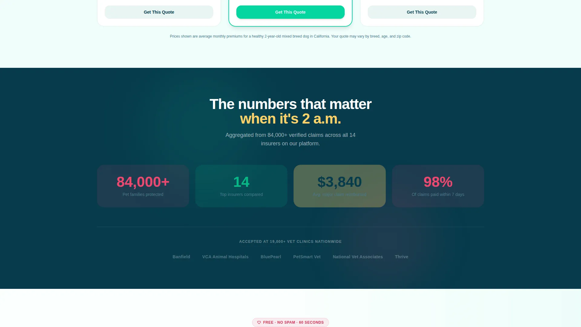
Sunshine yellow washes testimonial cards and trust badges. Veterinary teal highlights interactive comparison elements and toggle switches. Serotonin coral fires on primary calls to action and urgent stat callouts. Deep trust navy anchors all headlines and body text.
Page sections overview
| Section | Purpose |
|---|---|
| Full-Bleed Header | Hook visitors emotionally with a hero image and headline |
| Hero call to action Button | Drive the first click with a pulsing coral action button |
| Testimonial Mosaic | Build trust through real owner stories and payout amounts |
| Comparison Widget Cards | Let visitors toggle coverage types and see live plan prices |
| Progressive Lead Form | Capture pet type, age, conditions, zip code, and email |
| Sticky Mobile Bar | Provide a persistent one-tap quote path on mobile devices |
Design & branding system
The visual identity follows an Organic Flow theme with a Dopamine Pop color palette. The combination feels energetic and warm without tipping into chaos. White space between every masonry tile keeps the layout breathable and the colors from overwhelming the eye.
- Five-color palette: sunshine yellow (#FFD166), serotonin coral (#EF476F), veterinary teal (#06D6A0), deep trust navy (#073B4C), and clean-sheet white (#FAFFFE), each assigned a specific functional role across the layout
- Navy anchors all headlines and body text for readability; teal marks interactive elements; coral fires on primary calls to action; yellow washes trust-signal areas
- The Masonry/Pinterest grid creates visual rhythm by varying tile sizes and breaking predictable row patterns, keeping the eye moving naturally down the page
Mobile & speed optimization
The layout is built with mobile-first behavior in mind. The sticky bottom bar is a mobile-specific feature that removes the need to scroll to the lead form. Masonry tile sizing adapts to narrower screens without losing the testimonial detail that drives trust.
- The sticky "Get Your Free Quote in 60 Seconds" bar floats persistently at the bottom of the screen on mobile, giving users an always-visible conversion option
- Illustrated selector buttons in step one of the lead form replace typed input with taps, reducing friction on touchscreen devices
- Masonry tile stacking reflows for single-column mobile views so quote amounts, breed details, and story snippets remain fully readable
How this template helps you convert
The conversion strategy is layered deliberately. Visitors see proof before they see a form. The mosaic builds emotional confidence, the widgets satisfy rational doubt, and the form captures the lead only after both hurdles are cleared.
- The Testimonial Mosaic shows real covered dollar amounts tied to real conditions before any form appears, so trust is earned before data is requested.
- The interactive comparison widget answers the plan-selection question inside the page itself, removing the need to open a second tab or call an agent.
- The three-step progressive form reduces perceived commitment by breaking the ask into small, friendly micro-steps, each designed to feel like a conversation rather than an application.
Other information about this template
This template is designed specifically for the pet insurance comparison niche, where purchase decisions are emotionally charged and comparison fatigue is common. The layout philosophy treats emotional resonance and rational clarity as equal conversion drivers.
- The template style is Masonry/Pinterest, which suits high-volume social proof content and works well for niches where personal stories carry more weight than feature tables
- The creative direction is Testimonial Mosaic, meaning the primary trust architecture relies on varied-size story tiles rather than static review grids
- The header concept is Full-Bleed Photo, designed to establish an immediate emotional connection before any product information appears
- The landing page direction is Lead Generation, with every section ordered to reduce friction and move visitors toward the three-step form or the mobile sticky bar
Theme
Organic Flow
Creative direction
Testimonial Mosaic
Color system
Dopamine Pop
Style
Masonry/Pinterest
Direction
Lead Generation
Page Sections
Full-bleed Hero Header
Testimonial Mosaic Layout
Interactive Plan Comparison Widget
Three-step Progressive Lead Form
Sticky Mobile Quote Bar
Dopamine Pop Color System
Related questions
Can I customize the pet types shown in the lead form selector?
Does the comparison widget require a live data connection to update plan prices?
Is this template suitable for a single insurance brand or only for comparison platforms?
How does the sticky mobile bar work alongside the main lead form?
Can I update the testimonial tiles with my own customer stories?