Dog Daycare Referral Program Landing Page Template
Pawreferrals is a split-screen landing page template built for dog daycare businesses running a referral program. It combines an editorial magazine aesthetic with a warm, persuasive layout that walks pet parents through how the program works, reveals the reward math upfront, and guides them toward sharing their referral link with minimal friction.
by Rocket studio
Quick summary
Pawreferrals is a single-page referral program template designed for dog daycare businesses. It uses a 50/50 split-screen layout, an Editorial Magazine visual style, and a Plum Executive color system to feel warm, refined, and trustworthy. The page reveals reward tiers before asking for anything, then collects just three form fields to get the referral moving.
Who this template is for
This template is built for dog daycare owners and operators who want to grow through word-of-mouth rather than paid advertising. It speaks directly to the dual-income pet parent who researches daycare the way they would a preschool.
- Dog daycare businesses launching or refreshing a referral program
- Pet care operators who want a polished, magazine-quality page without a design team
- Marketing staff who need a lead-generation landing page that converts existing clients into active referrers
What problem this template solves
Most referral program pages feel like an afterthought. They either bury the reward details or overwhelm visitors with lengthy forms. Pawreferrals fixes that by front-loading the value and keeping the ask small.
- Pet parents leave the page without understanding what they actually earn
- Long or confusing forms reduce referral submissions before they begin
- Generic design fails to match the premium tone that today's pet parents expect
What you get with this template
You get a fully structured, single-page referral landing page with every section pre-built and ready to customize. The layout is opinionated but flexible, so you can swap in your own photography and copy without rebuilding the structure.
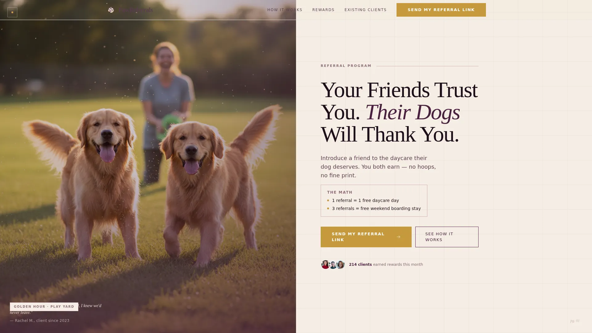
- A half-page photo-and-text hero header with a serifed headline, deck copy, and a primary call-to-action button
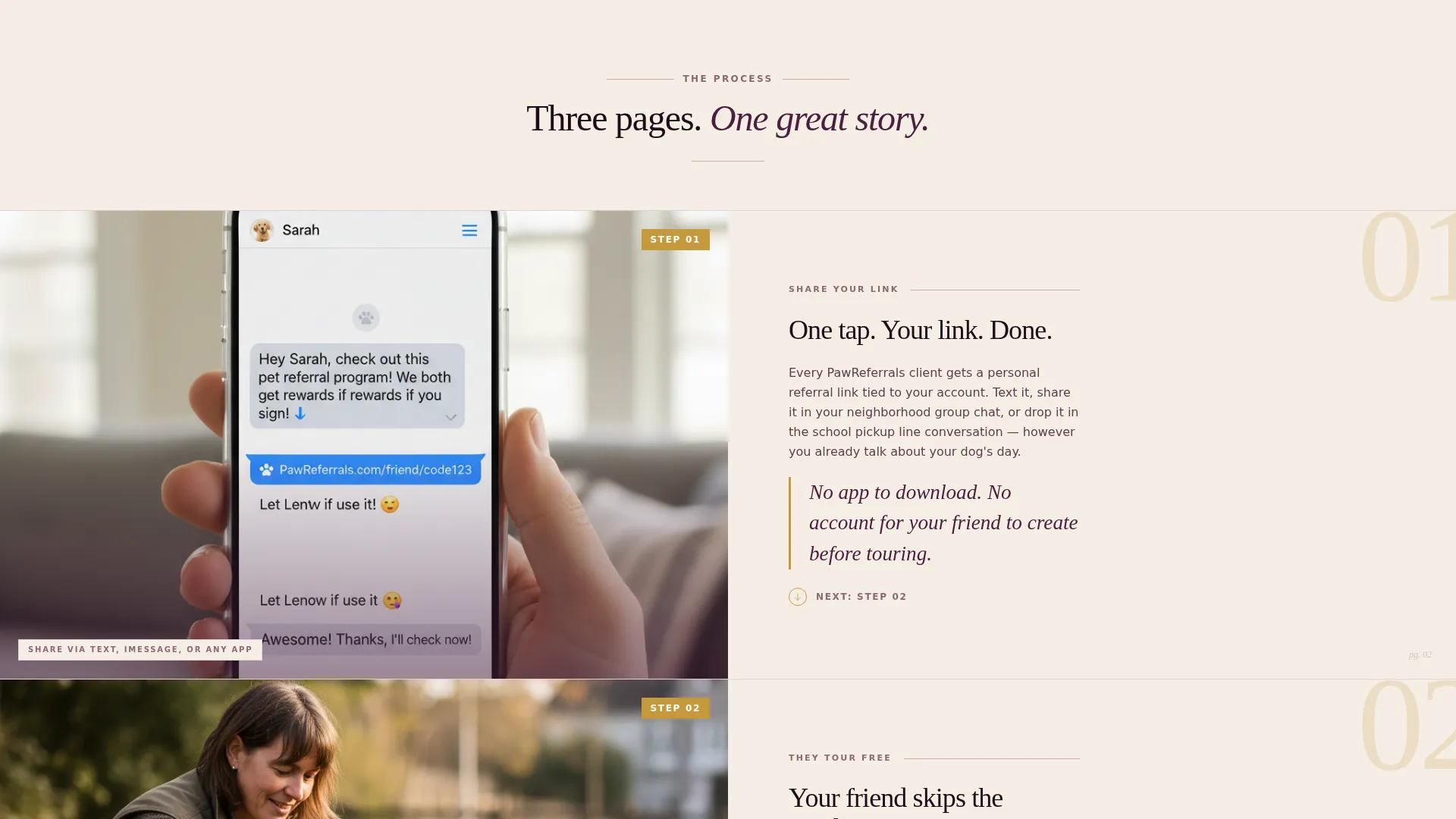
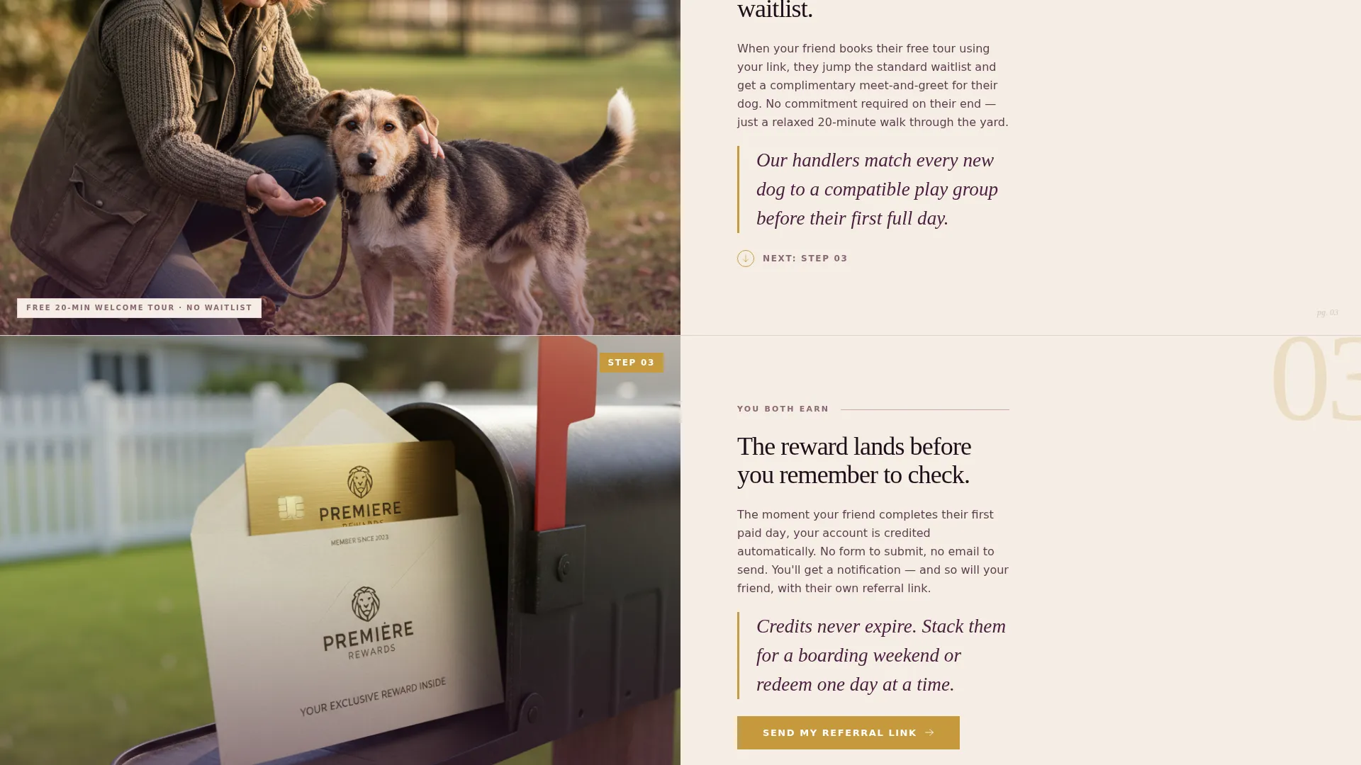
- A three-step transparent process section revealing how the referral program works, with space for real photographs and oversized step numbers in gilded mustard
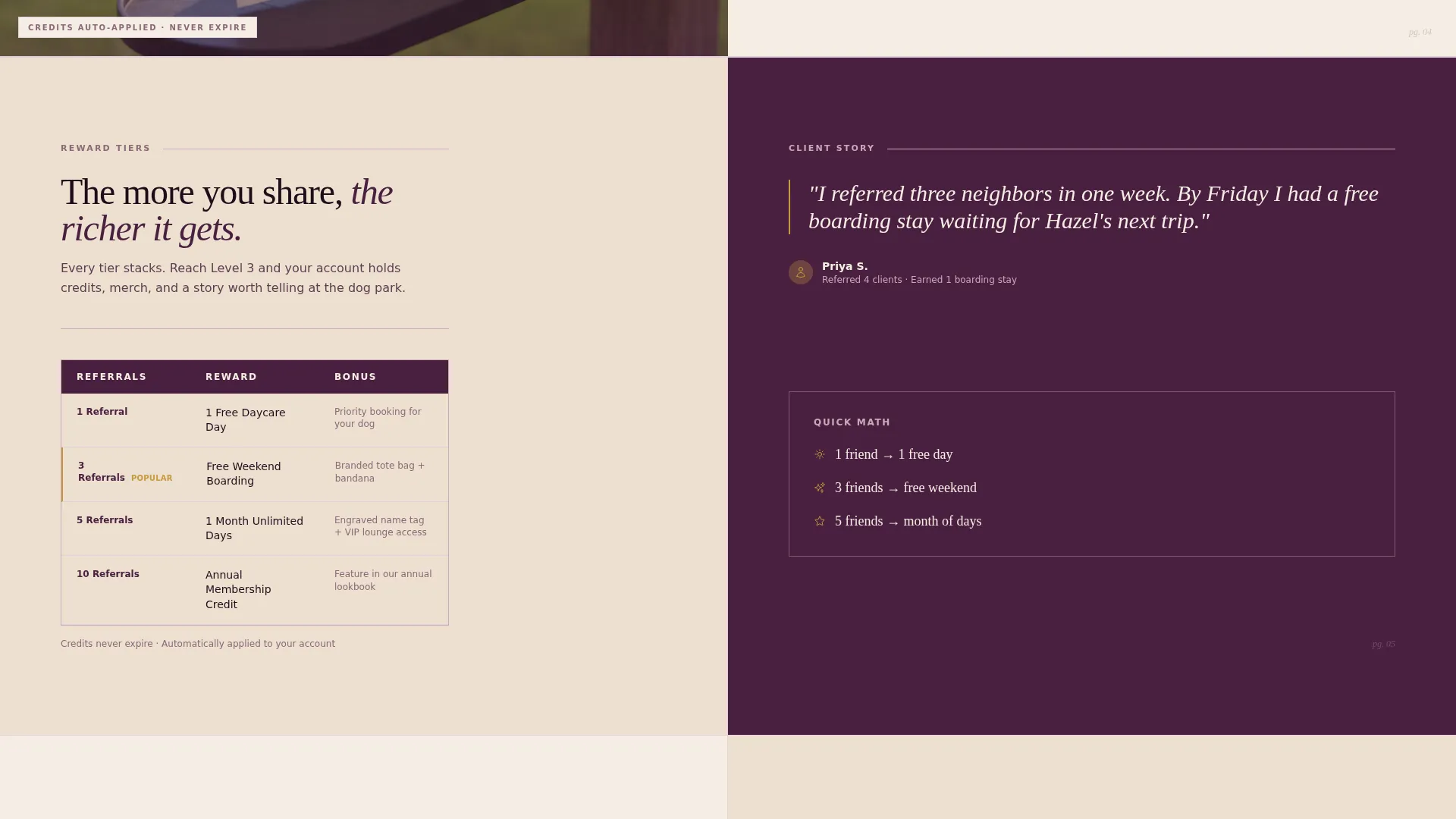
- A reward tiers table, a three-field referral form, a secondary client login path, and a sticky mobile bottom bar with a repeat call-to-action
Feature list
This section walks through the core built-in components that make Pawreferrals work as a referral lead-generation landing page.
Split-Screen Hero Header
The header divides the viewport evenly. The left panel holds an editorially lit golden-hour photograph. The right panel sits on warm parchment and carries a large serifed headline, a single line of deck copy, and the first "Send My Referral Link" call-to-action button.
Transparent Three-Step Process Layout
Each referral step gets its own full-width split section. The left column holds a real contextual photograph. The right column presents the step in editorial typographic hierarchy with an oversized gilded mustard step number. The three steps are Share Your Link, They Tour Free, and You Both Earn.
Reward Tiers Comparison Table
A magazine-style table lays out the reward structure side by side. It compares daycare day credits, free weekend boarding nights, and branded merchandise so the visitor understands exactly what each referral is worth before they fill in the form.
Minimal Three-Field Referral Form
The form asks only for the referrer's name, email address, and their friend's first name. Keeping the form to three fields reduces drop-off and removes any reason to hesitate before submitting.
Sticky Mobile Call-to-Action Bar
On smaller screens, a fixed bottom bar keeps the primary "Send My Referral Link" button visible at all times. The call-to-action appears three times in total across the page: in the header, after the process reveal, and in this sticky bar.
Secondary Client Login Path
Existing clients can follow a secondary link to log in and track the status of their referrals. This keeps the page useful beyond the first visit and gives returning clients a reason to come back.
Page sections overview
| Section | Purpose |
|---|---|
| Hero Header Split | Introduces the program with an editorial photo and confident headline |
| Share Your Link | Step one of the process with a contextual photo and copy |
| They Tour Free | Step two showing the friend's free tour moment |
| You Both Earn | Step three revealing the mutual reward structure |
| Reward Tiers Table | Compares credits, boarding nights, and branded merch side by side |
| Referral Form | Collects name, email, and friend's first name in three fields |
| Client Login Path | Secondary route for existing clients to track referral status |
| Sticky Mobile Bar | Keeps the primary call-to-action accessible on mobile screens |
Design & branding system
The Plum Executive color system gives this template a rich, editorial feeling without leaning into the typical pastel pet-business palette. The result is a page that a professional pet parent feels comfortable sharing.
- Deep plum (#4A2040) and muted mauve linen (#C9A9B8) form the primary palette, evoking a velvet jewelry box lined with cream tissue paper
- Warm parchment (#F5EDE3) provides breathing room and legibility across the right-side copy panels
- Gilded mustard (#C6993E) is reserved for buttons, pull-quotes, oversized step numbers, and reward tier highlights to draw the eye to moments of action and value
Mobile & speed optimization
The template is structured with mobile visitors in mind from the start. The sticky bottom bar and simplified form mean that a pet parent browsing on their phone after school pickup encounters zero friction.
- The sticky call-to-action bar pins the "Send My Referral Link" button to the bottom of the screen on mobile so it is always one tap away
- The three-field form is thumb-friendly and quick to complete on any device
- The split-screen layout adapts cleanly to narrower viewports without losing the editorial hierarchy
How this template helps you convert
The page is engineered around one core insight: show the value before you ask for anything. Every structural decision flows from that principle.
- The reward math appears early and explicitly. "One referral equals one free daycare day. Three referrals equal a free weekend boarding stay." The visitor knows what they stand to gain before they ever see the form.
- The three-step process section removes uncertainty by walking through exactly what happens after a link is shared, making the program feel transparent and trustworthy rather than vague.
- Three placements of the primary call-to-action across the page mean a visitor is never more than a scroll away from acting, while the secondary login path keeps existing clients engaged on return visits.
Other information about this template
This template sits at the intersection of professional services design and dog daycare marketing. It is purpose-built for the referral program niche within pet care, where trust and social proof drive growth more than any ad campaign.
- The Editorial Magazine theme and Transparent Process creative direction work together to create a scroll experience that feels like turning magazine pages rather than grinding through a funnel
- The Half-Page Photo+Text header concept is designed for real photography, not stock imagery, which reinforces authentic trust signals for discerning pet parents
- The template style is Split Screen (50/50) throughout, keeping visual and editorial weight balanced at every scroll position
- The Lead Generation landing page direction is expressed through the three-field form, the three-point call-to-action placement, and the reward-first information architecture
- The Plum Executive color system was chosen specifically so the page looks polished enough for a pet parent to share on professional social networks without feeling out of place
Theme
Editorial Magazine
Creative direction
Transparent Process
Color system
Plum Executive
Style
Split Screen (50/50)
Direction
Lead Generation
Page Sections
Split-screen Hero with Editorial Photo
Three-step Transparent Process Sections
Reward Tiers Comparison Table
Minimal Three-field Referral Form
Sticky Mobile Call-to-action Bar
Secondary Client Login Path
Related questions
How many form fields does the referral form include?
Can existing clients use this page to track their referrals?
Where does the primary call-to-action appear on the page?
Does this template work if I do not have an in-house designer?
What reward information does the template show before asking for a sign-up?



