Pet Camera Monitor Landing Page Template
Pawwatch is a hero-dominant landing page template built for pet camera and monitor brands. It pairs a full-bleed ceiling-perspective hero photo with a community gallery grid, an embedded demo booking calendar, and a calm Japanese Zen color palette. The result is a page that feels warm, personal, and quietly persuasive for anxious pet owners ready to try remote monitoring.
by Rocket studio
Quick summary
Pawwatch is a single-page landing page template designed for pet camera and monitor products. It opens with a ninety-percent-viewport hero image and flows into a real-user gallery, then closes with an embedded booking form. The tone is serene and the visual language is grounded in Japanese Zen design principles, making every scroll feel intentional and calm.
Who this template is for
This template is built for brands and solo founders selling home pet cameras or remote pet monitoring products. It speaks directly to buyers who need to earn trust quickly, because their audience is emotionally invested in their animals.
- Pet tech brands launching a home camera or monitor product
- Hybrid-schedule and remote-working pet owners who want to self-identify as the target customer
- Small pet care businesses offering camera-based check-in services or demo-driven sales flows
What problem this template solves
Pet camera products face a specific sales challenge. Potential buyers are not just evaluating specs; they are picturing their own dog asleep on the couch and wondering whether they can really see that from their phone. Generic product pages fail to create that emotional connection. Pawwatch solves this by letting real footage and real community moments do the selling.
- Buyers leave pages that feel cold or corporate before they ever reach the call to action
- First-time puppy parents and frequent travelers need reassurance, not just feature lists
- Demo-averse visitors drop off when the only path forward is a long sign-up form
What you get with this template
You get a complete, ready-to-customize single landing page built around three clear sections. Each section has a distinct job, and together they move a visitor from emotional recognition to confident action without friction.
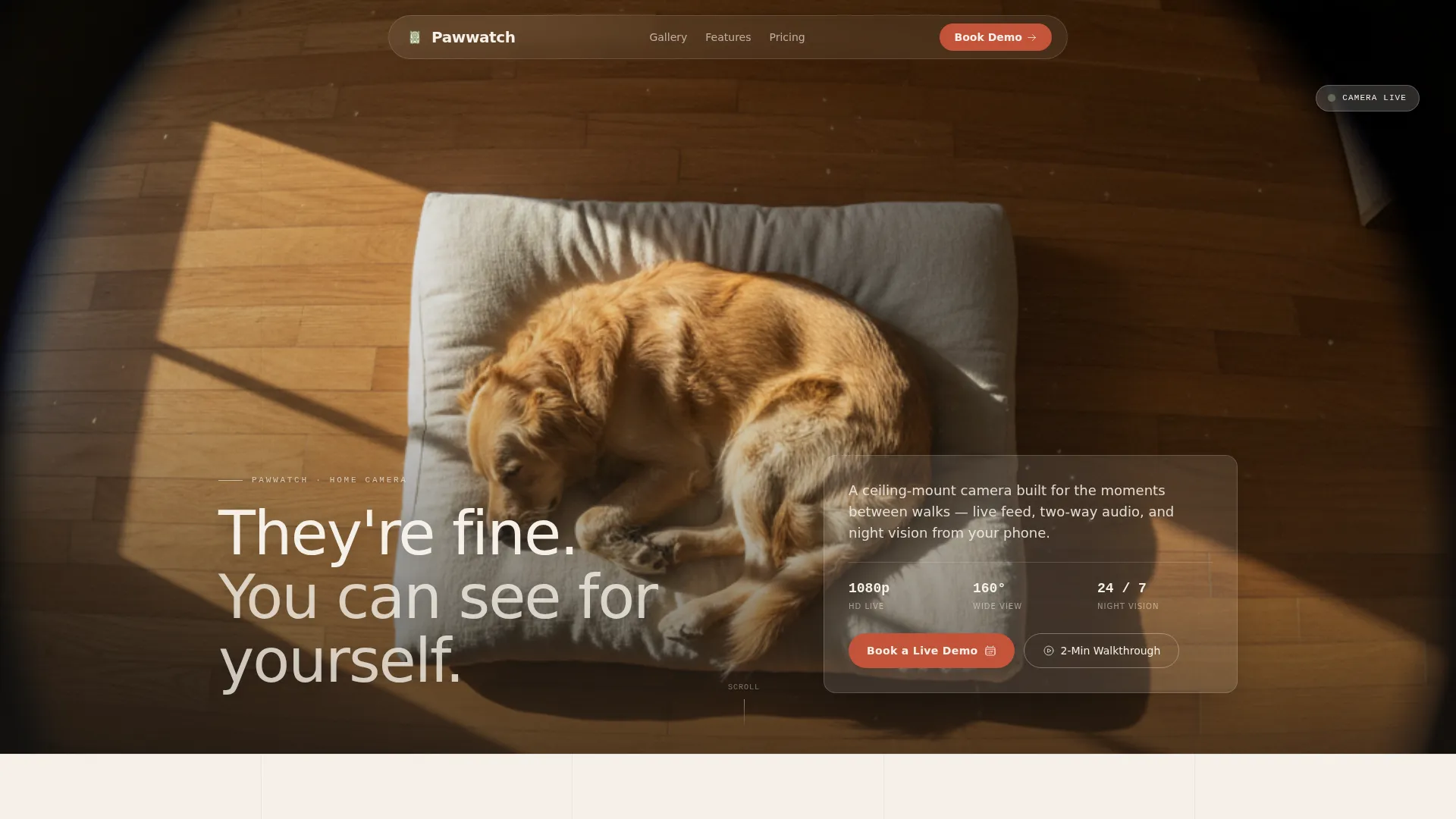
- A full-bleed hero section with a camera-perspective photo and a single floating headline
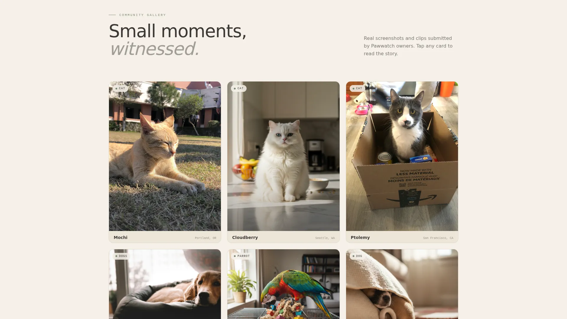
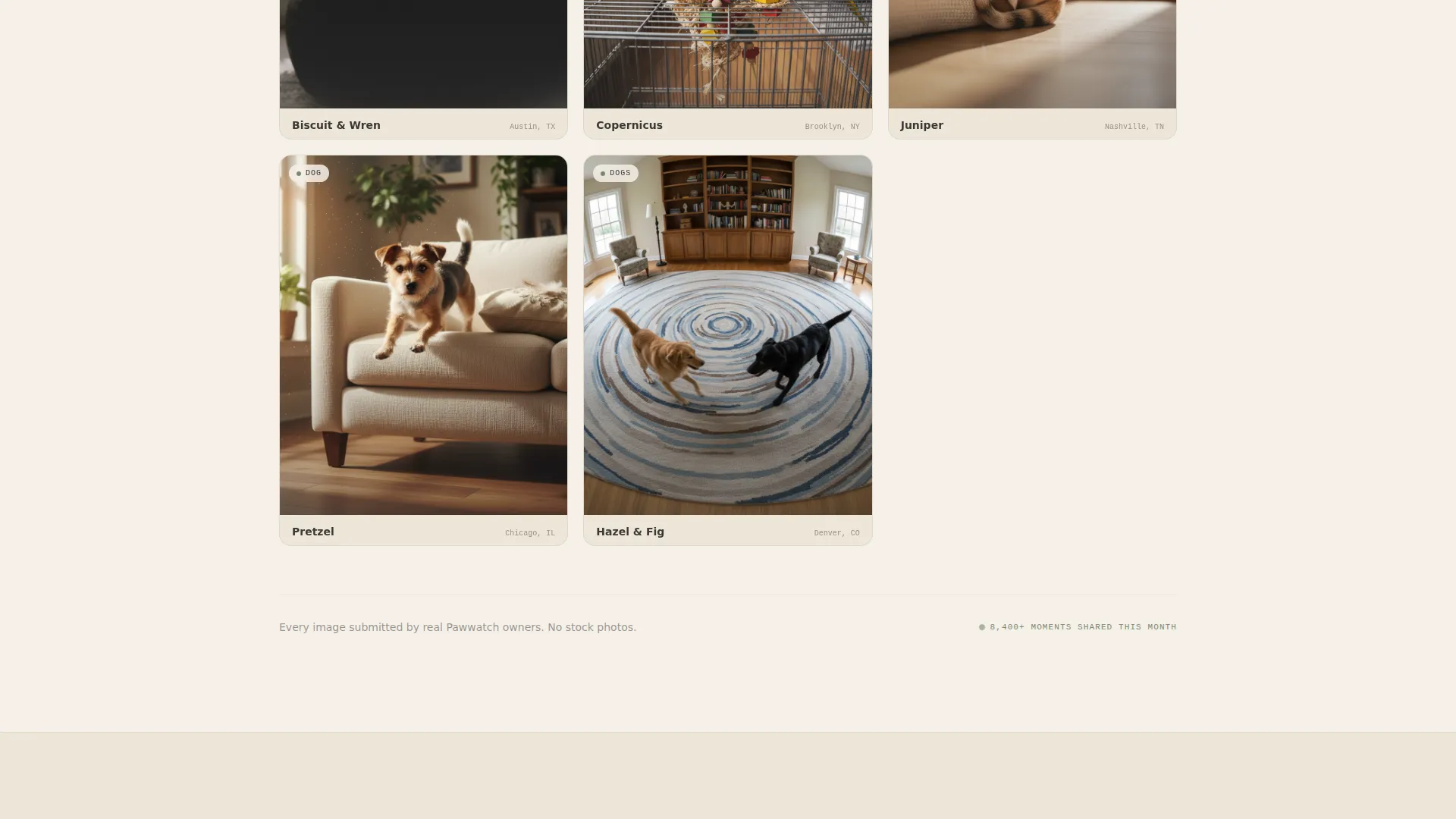
- An asymmetric masonry community gallery showing real user-submitted pet clips and screenshots
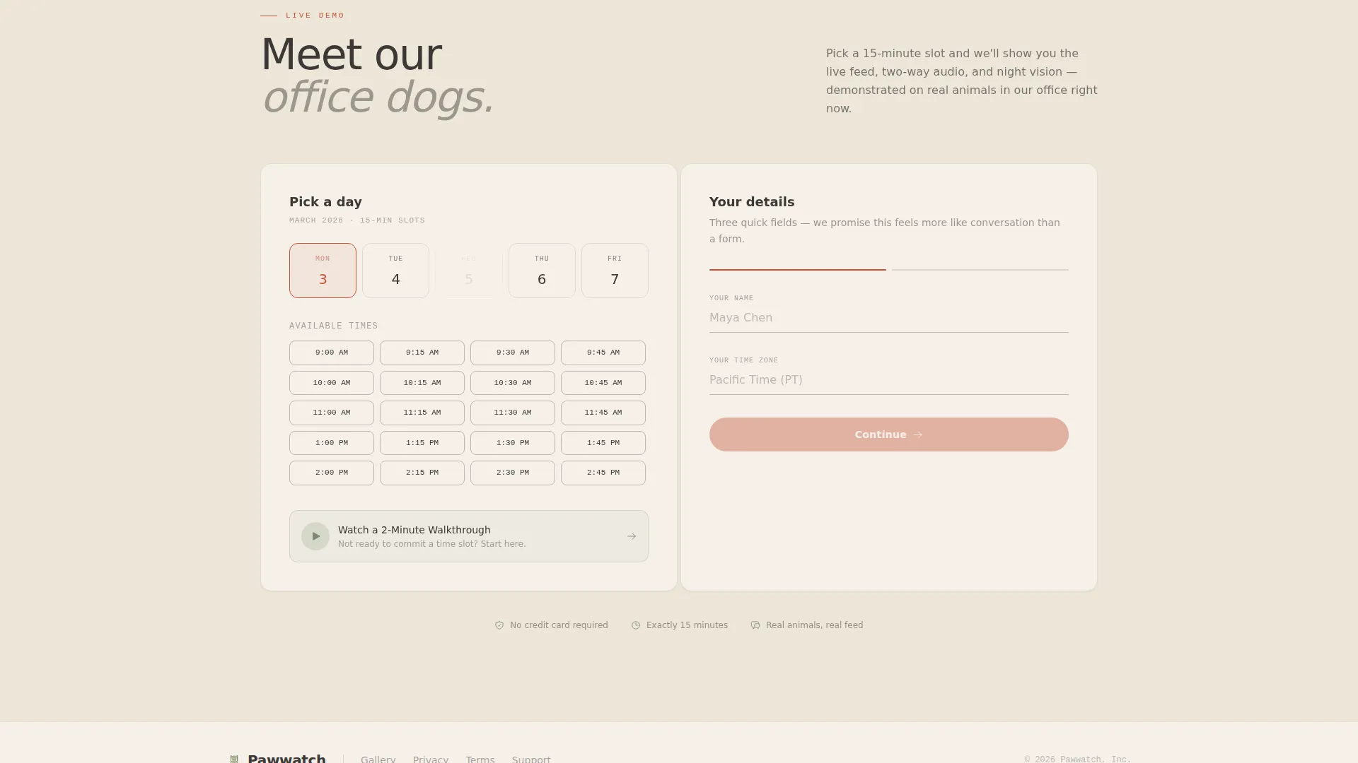
- An embedded scheduling block with a lightweight qualifying form and a secondary video walkthrough option
Feature list
This template ships with six thoughtfully designed components drawn directly from the brief.
Full-Bleed Hero with Ceiling-Mount Perspective
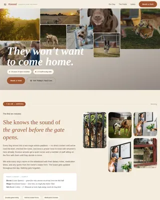
The hero fills ninety percent of the viewport with a golden-retriever-on-linen-cushion photo shot from a ceiling-mount angle. Late-afternoon light creates a warm diagonal across hardwood floors. A single cream headline near the bottom third reads: "They're fine. You can see for yourself." The image sets tone before a single word of copy loads.
Asymmetric Masonry Community Gallery
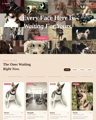
Below the fold, a curated masonry grid displays real user-submitted screenshots and short clips. Each thumbnail expands to show the pet's name, the owner's city, and the moment captured. The layout feels like a small photo exhibition, not a social feed, and each story quietly proves the product works.
Embedded Demo Booking Calendar
The primary call to action opens an embedded calendar where visitors pick a fifteen-minute live demo slot. The demo uses the company's own office dogs to show the live feed, two-way audio, and night vision in real time. This makes the booking feel like a genuine introduction, not a sales call.
Low-Friction Qualifying Form
The booking form captures only three fields: name, time zone, and one conversational question asking what kind of pet the visitor is watching. This approach lowers resistance while giving the sales team a useful qualifier before the demo begins.
Secondary Video Walkthrough Path
Visitors who are not ready to book a live slot can choose "Watch a 2-Minute Walkthrough" instead. This secondary path keeps hesitant visitors on the page and moves them forward without forcing a calendar commitment.
Warm Artisan Color System
The Japanese Zen palette uses washi paper cream for backgrounds, kiln-fired charcoal for body text, bamboo grove green for icons and secondary interface elements, and torii gate vermillion exclusively for buttons and notification pings. Color usage is disciplined: each tone appears only where it belongs.
Page sections overview
| Section | Purpose |
|---|---|
| Full-Bleed Hero | Opens emotional connection with a calm, intimate camera-perspective image and a single reassuring headline |
| Floating Hero Headline | Delivers the core product promise in one line without competing with the photograph |
| Community Gallery Grid | Shows real user moments in an asymmetric masonry layout to build social proof through life witnessed |
| Gallery Thumbnail Detail | Expands each clip to reveal the pet name, owner city, and story behind the captured moment |
| Demo Booking Block | Embeds a scheduling calendar for visitors to pick a fifteen-minute live demo slot |
| Qualifying Form Fields | Captures name, time zone, and pet type to personalize the demo experience with minimal friction |
| Secondary Walkthrough call to action | Offers a two-minute video path for visitors not yet ready to book a time slot |
Design & branding system
The visual identity follows a Warm Artisan theme expressed through a Japanese Zen color system. Every color has a single defined role, and nothing competes for attention outside its lane.
- Cream (#F5F0E8) covers all backgrounds, giving the page the quiet negative space of a woodblock print
- Charcoal (#3B3836) carries all body text with the visual weight of sumi ink, while bamboo grove green (#7A8B6F) marks icons and secondary interface elements like moss between stepping stones
- Vermillion (#C4533A) appears only on buttons and notification pings, pulling the eye precisely where action lives
Mobile & speed optimization
The template is structured to load its hero image first and keep subsequent sections lean. The masonry gallery and embedded calendar are positioned below the fold so the initial viewport experience stays fast and focused.
- The hero section is designed to fill the screen cleanly on both mobile and desktop without layout shift
- The masonry grid adapts gracefully to narrower screens, keeping thumbnail spacing and expand interactions intact
- The booking form uses a minimal three-field structure, reducing input load for mobile users filling it out on a phone
How this template helps you convert
Pawwatch is built around a dual-path conversion model. Visitors who are ready commit to a live demo; visitors who need more time take the video path. Neither path loses the prospect.
- The hero image earns emotional trust before any copy asks for anything, removing the instinct to scroll away
- The community gallery provides living social proof by showing real animals in real moments, which bridges the gap between product claim and lived experience
- The booking form's conversational tone and three-field simplicity lower perceived commitment so visitors complete the action rather than deferring it
Other information about this template
Pawwatch is a hero-dominant landing page template with a ninety-to-ten content ratio, meaning the visual and emotional experience outweighs dense written copy by design. This structure suits pet tech and wearable product categories where first impressions carry more weight than long descriptions.
- The template style is Hero-Dominant (90/10), a ratio that prioritizes atmosphere and immediate emotional response over text-heavy explanation
- The creative direction is Community Gallery, which means the page builds trust through user-generated content rather than brand-authored claims
- The landing page direction is Booking and Scheduling, making the embedded calendar the functional heart of the conversion flow
- The header concept is Full-Bleed Photo, using a real camera-perspective image to demonstrate the product's point of view rather than describing it
Theme
Warm Artisan
Creative direction
Community Gallery
Color system
Japanese Zen
Style
Hero-Dominant (90/10)
Direction
Booking/Scheduling
Page Sections
Full-bleed Camera-perspective Hero
Asymmetric Masonry Community Gallery
Embedded Demo Booking Calendar
Low-friction Three-field Form
Secondary Video Walkthrough Path
Japanese Zen Color System
Related questions
Can I replace the hero image with my own pet camera photography?
Does the embedded booking calendar connect to my scheduling tool?
What if I don't have user-submitted clips for the community gallery yet?
Is the secondary walkthrough video included in the template?
Can this template work for a pet monitor product that isn't a camera?