Trusted Startup | Free Website Template | Rocket
This landing page template is built for a startup and scale-up payroll provider that competes on calm competence rather than feature bloat. It leads with a bold teal hero, introduces real specialist team members through a portrait-and-quote grid, and anchors trust with a three-column comparison table. The primary goal is recruiting payroll specialists, with a low-friction three-field application form and a sticky referral banner.
by Rocket studio
Quick summary
This single-page template helps a payroll provider attract and recruit specialist talent. It opens with a giant teal headline, introduces the human team through a portrait grid, and builds trust with a side-by-side comparison table. A minimal three-field application form and a sticky referral banner keep recruitment momentum flowing from the first scroll to the last.
Who this template is for
This template is designed for payroll service companies that want to grow their specialist team. It works especially well for businesses operating across UK and US payroll markets, where compliance tone and human credibility matter deeply.
- Startup and scale-up payroll providers recruiting experienced payroll specialists
- People Ops leads and finance directors evaluating providers while also spotting a career move
- HR-focused founders who want a page that feels warm, credible, and unhurried
What problem this template solves
Most recruitment pages for payroll roles feel cold, generic, and indistinguishable from job boards. This template solves the problem of attracting specialists who care deeply about their craft by showing them a team they would actually want to join.
- Payroll professionals see real colleagues, not stock photos, which builds immediate trust
- The comparison table answers the unspoken question: "Is this company doing payroll the right way?"
- The minimal application form removes the friction of an uploaded CV at first contact
What you get with this template
You get a complete, single-page recruitment landing page built around three distinct content zones. Each zone builds on the last, moving a visitor from curiosity to genuine interest to application.
- A teal hero section with a centered headline, subhead, and a stats bar for key proof points
- A team portrait grid with names, years of experience, and individual specialist focus areas
- A three-column comparison table, a three-field application form, and a sticky footer referral banner
Feature list
This template is built from prompt-defined sections and interactions that serve both recruiters and prospective team members.
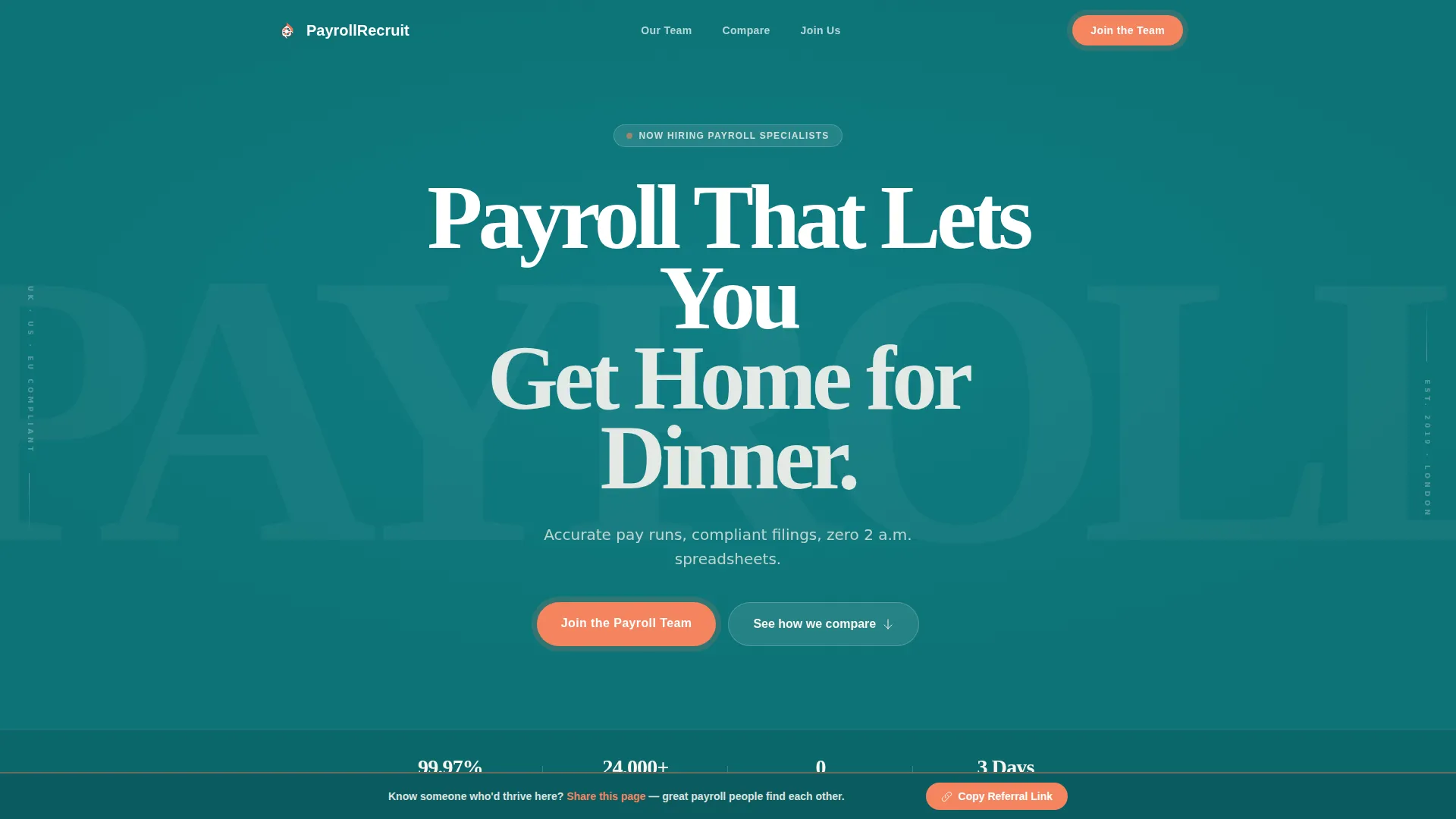
Giant Headline Hero Section
The hero uses white display type on a deep teal background with no imagery. The headline is centered and large enough to command the full viewport. A warm pearl subhead sits directly beneath it, naming the core pain in a single line. A horizontal stats bar carries key proof points at a glance.
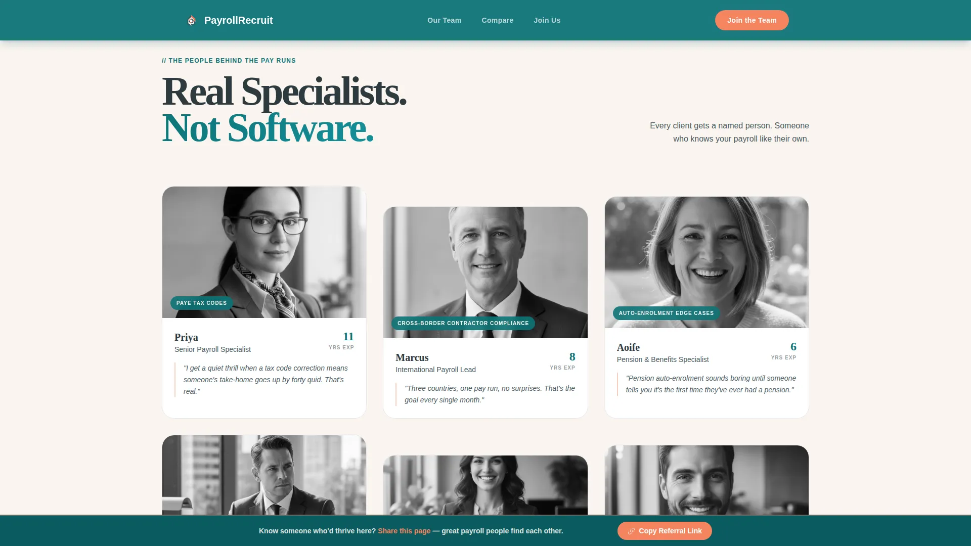
Team Portrait and Quote Grid
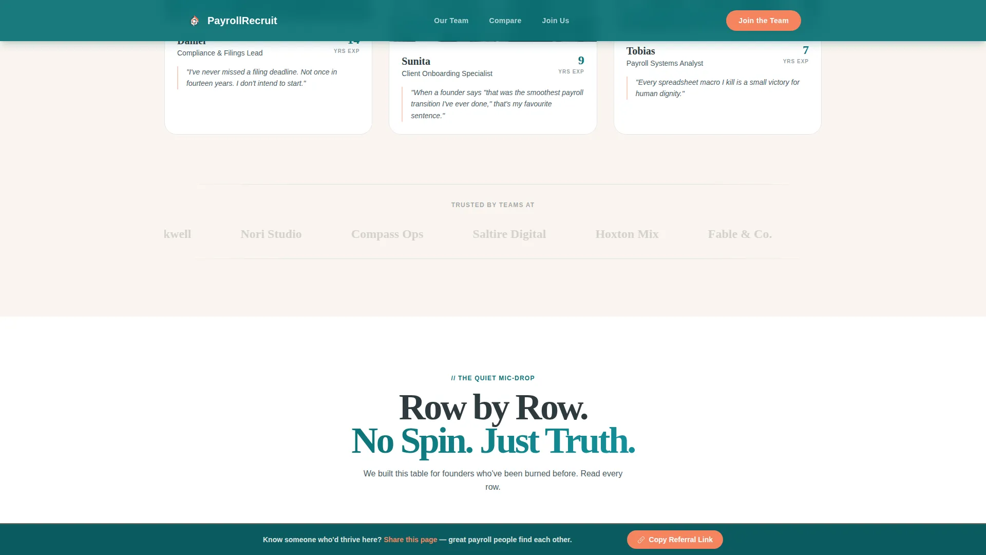
Scrolling past the hero, visitors meet named payroll specialists in a portrait-and-quote layout. Each card shows a first name, years of experience, and the one area that specialist genuinely cares about most. Entries animate in with staggered scroll reveals, giving the grid a warm, unhurried feel.
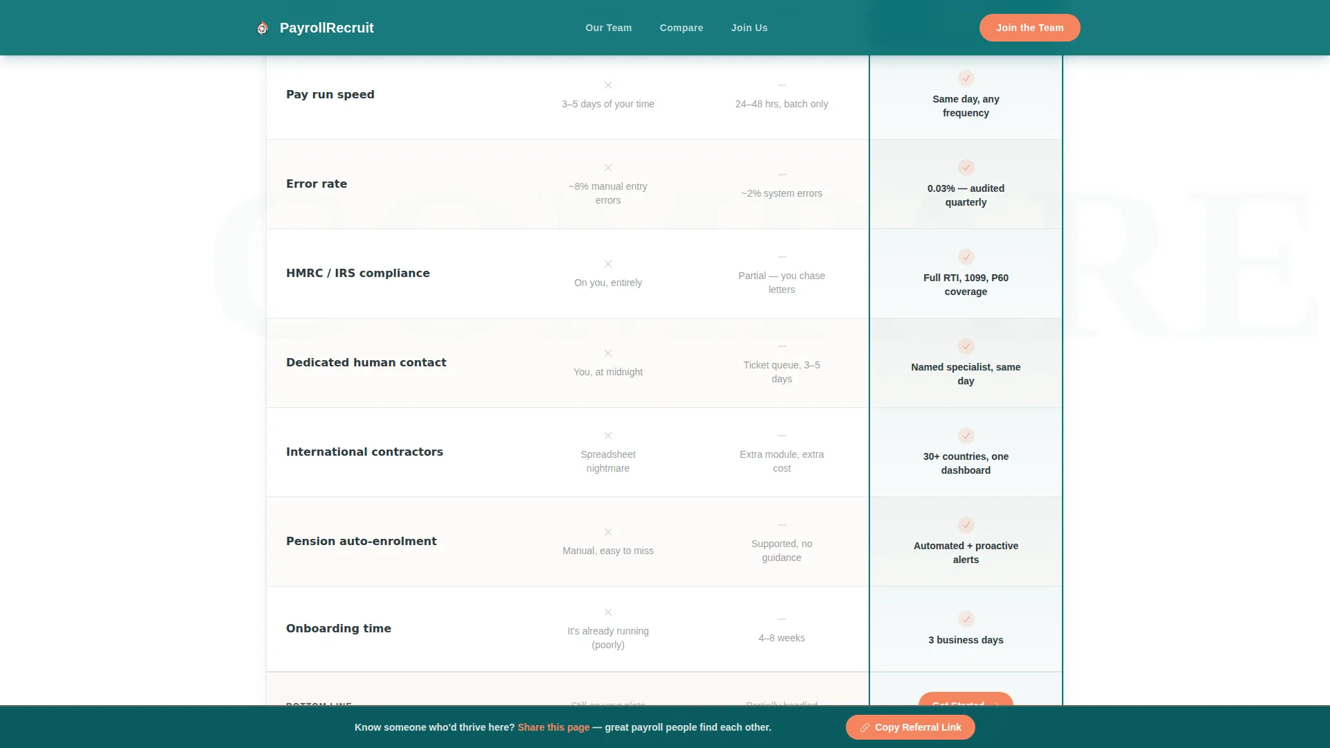
Three-Column Comparison Table
The comparison table runs three columns: DIY Spreadsheet, Legacy Provider, and the company itself. Rows compare speed, error rate, compliance coverage, dedicated human contact, and onboarding time. Table rows reveal on scroll using GSAP, and each row is styled to feel like a quiet, confident statement rather than aggressive marketing.
Low-Friction Application Form
The recruitment form asks for only three inputs: first name, current role title, and a single open-ended question about the toughest payroll problem the applicant has ever solved. No CV upload is required at first touch. Form validation is built in, keeping the experience smooth on both desktop and mobile.
Sticky Referral Footer Banner
A secondary banner stays pinned at the bottom of the page once the visitor scrolls past the hero. It invites the visitor to share the page with someone who might thrive in the role. A one-click referral copy button turns passive visitors into active recruiting channels.
GSAP Scroll Animations
Medium-intensity animations power portrait entries, table row reveals, and section transitions throughout the page. Animations are handled on the client side, while static sections use server components to keep the experience stable and consistent.
Page sections overview
| Section | Purpose |
|---|---|
| Hero with headline | Establish brand tone and headline the core value instantly |
| Stats proof bar | Surface key credibility numbers below the main headline |
| Team portrait grid | Introduce named specialists and build human connection |
| Comparison table | Show clearly why this provider outperforms DIY and legacy options |
| Join the team form | Capture interest from qualified candidates with minimal friction |
| Arc split footer | Close the page with brand identity and legal footer content |
| Sticky referral banner | Turn every visitor into a passive referral source |
Design & branding system
The visual identity follows a Family First theme built on the Teal Catalyst color system. The palette is warm and deliberate, with each color carrying a distinct role across the page.
- Deep trust teal (#0D7377) anchors the hero background, section headers, and comparison table column highlights
- Warm pearl (#FAF5EF) fills open backgrounds and breathes generous whitespace between content rows
- Soft charcoal (#2E3A3F) handles all body text, giving it the feel of a handwritten note rather than a legal document
- Sunrise coral (#F4845F) is reserved exclusively for call-to-action buttons and notification badges, drawing the eye without shouting
- Typography pairs Fraunces display serif for headlines with Manrope body sans for supporting text
Mobile & speed optimization
The template is designed desktop-first for a Finance and HR audience, with full responsiveness across all screen sizes. Layout and animation choices reflect that priority without sacrificing the mobile experience.
- Portrait grid and comparison table reflow cleanly into single-column stacks on smaller screens
- Server Components handle all static sections, while Client Components manage the form and GSAP animations
- GSAP scroll reveals are scoped to their respective client-side components to avoid blocking static render
How this template helps you convert
Every section of this page is sequenced to move a payroll specialist from passive visitor to active applicant. The emotional and rational case builds together as the page scrolls.
- The hero creates immediate emotional relief, the headline and subhead speak directly to the exhaustion of doing payroll badly, and the teal backdrop signals calm authority before a single word is read
- The team portrait grid delivers the social proof that matters most to specialists: proof that their future colleagues are real, named, and experienced people who care about the same craft
- The comparison table and low-friction form remove the two biggest conversion barriers, doubt about the company's quality and the effort required to apply, completing the journey from interest to action
Other information about this template
This template is localized for both UK and US payroll contexts. References cover HMRC filings, IRS compliance, pension auto-enrolment, and direct deposit timing, making it relevant across both markets without awkward switching.
- Designed for desktop-first audiences in Finance and HR roles, with a DD/MM/YYYY date convention and GBP/USD currency references available
- Typography uses Fraunces for display headings and Manrope for body text, both chosen for warmth and readability at large and small sizes
- The Arc split footer pattern (Pattern 7) provides a visually distinct close to the page while maintaining brand tone
- The page supports dual secondary audiences: payroll specialists evaluating a career move, and startup founders or People Ops leads quietly assessing the provider at the same time
Theme
Family First
Creative direction
Team & People
Color system
Teal Catalyst
Style
Comparison Table
Direction
Recruitment/Hiring
Page Sections
Giant Headline Hero with Stats Bar
Team Portrait and Quote Grid
Three-column Comparison Table
Low-friction Recruitment Form
Sticky Referral Footer Banner
Related questions
Is this template designed for a single page or multiple pages?
Can this template support both UK and US payroll market language?
Do candidates need to upload a CV to apply through the form?
Who is the primary audience this landing page is built to convert?
What animations and interactions are included in this template?


