Assembly Landing Page Template, Card Grid & Comparison
A modular card-grid landing page built for PCB assembly services. It leads with a five-counter stats wall, then walks visitors through a split comparison of your process versus the competition. Every section builds credibility through real data, annotated DFM examples, and transparent pricing before asking for a Gerber upload. Designed for hardware founders, procurement engineers, and contract engineers under deadline pressure.
by Rocket studio
Quick summary
This landing page template is purpose-built for printed circuit board assembly services. It opens with a live-feel metrics wall, then unfolds a card-grid comparison narrative that earns trust through visible data. The primary call to action drives Gerber uploads for a side-by-side quote. A secondary gated PDF path captures visitors who are not yet ready to commit.
Who this template is for
This template is designed for PCB assembly service providers who need to win technical buyers on a deadline. It speaks directly to buyers who have been burned before and want proof, not promises.
- Hardware startup founders racing to populate prototype boards before a demo date
- Procurement engineers at mid-volume original equipment manufacturers requalifying a supplier after a missed delivery
- Contract engineers who need a Rev B panel turned around in under a week
What problem this template solves
Most PCB assembly service pages look like brochures. They list capabilities without context and hide fees inside quotes. Technical buyers need to compare options fast, and a generic page forces them to do that work elsewhere.
- Hidden non-recurring engineering fees buried in competitor quotes erode trust before the first board ships
- Slow or generic design-for-manufacturability reviews waste days on revisions that should never have reached production
- Vague lead-time claims make it impossible for buyers to commit to a supplier before a deadline
What you get with this template
You get a fully structured, single-page layout built around comparison-driven persuasion. Every section is designed to make a visitor more confident in choosing your service and less comfortable staying with their current supplier.
- A five-counter stats header with animated number counters covering throughput, yield, component capability, lead time, and certification
- Three split-comparison card modules with flip or expand behavior revealing quote transparency, design-for-manufacturability review evidence, and visual lead-time timelines
- A dual call-to-action system: a primary Gerber upload form and a secondary gated PDF download path for undecided visitors
Feature list
This section covers the core functional and visual components included in the template as described in the design brief.
Animated Stats Header Wall
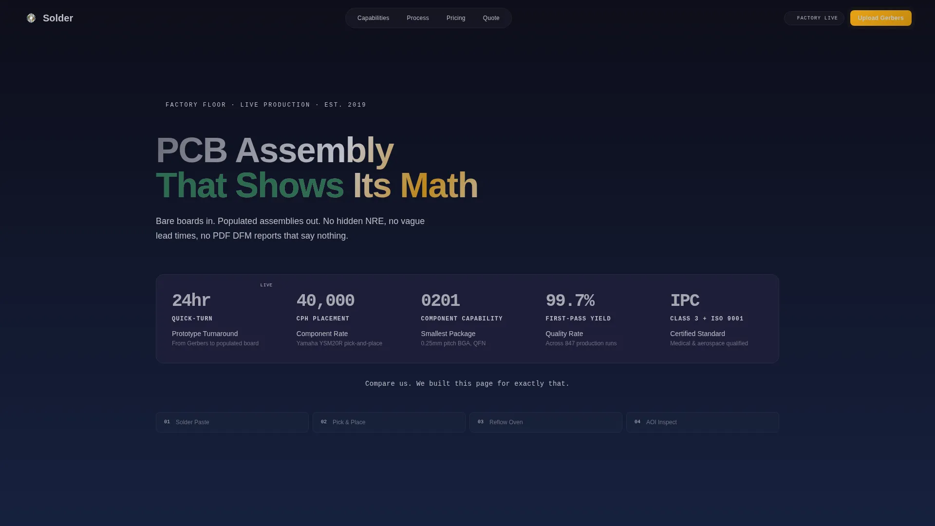
Five oversized metric counters sit on a dark graphite field and animate as if counting in real time. Covered figures include 24-hour quick-turn, 40,000 components-per-hour placement speed, 0201 component capability, 99.7% first-pass yield, and dual certification. A single amber callout line sits beneath the counters as an immediate trust signal.
Split Comparison Card Grid
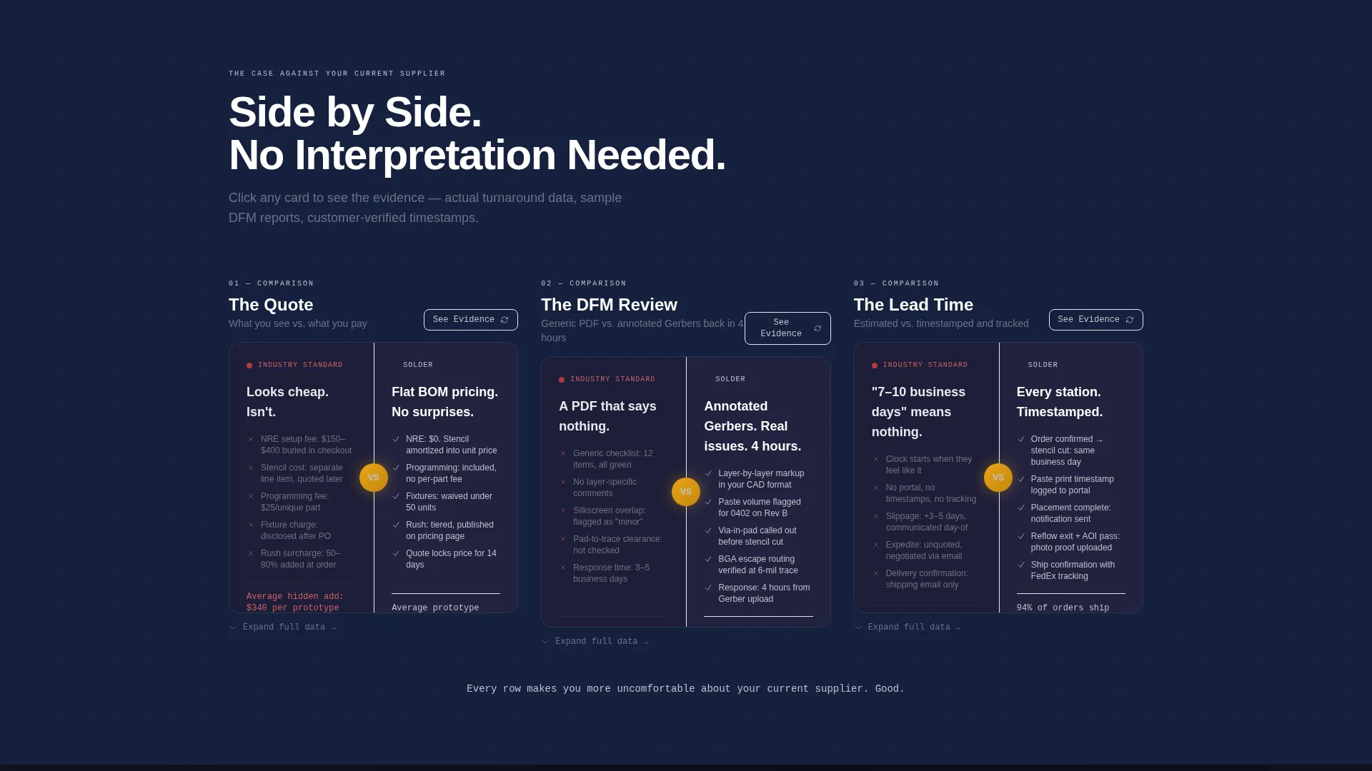
Each card presents a direct side-by-side contrast between a competitor approach and the service offering. Topics cover quoting transparency, design-for-manufacturability review quality, and lead-time accuracy. Cards flip or expand on click to reveal supporting evidence such as turnaround data, sample reports, and verified timestamps.
Dual Conversion Path System
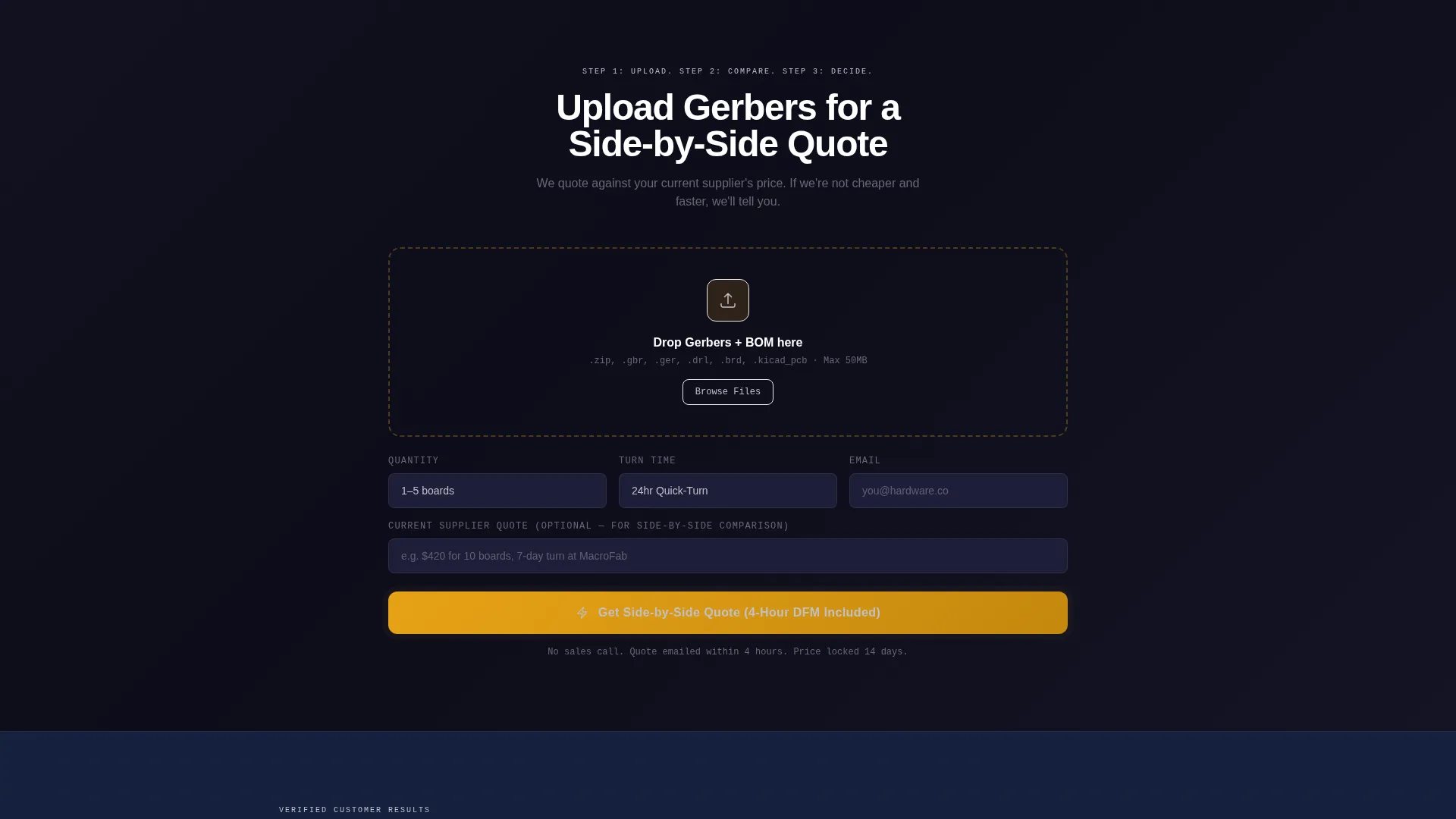
The primary path is a Gerber and bill-of-materials upload form that captures file, quantity, turn-time preference, and email. The secondary path offers a gated pricing comparison document for visitors in the research phase. Both paths are woven into the page flow so neither feels like an interruption.
Floating Call-to-Action Bar
After the third card row, a persistent bar pins to the screen on scroll and keeps the primary upload prompt visible at all times. This ensures the action step is never more than one glance away regardless of where the visitor pauses to read.
Carbon Fiber Visual Identity System
The color palette uses deep graphite backgrounds, solder-mask green accents, exposed-pad silver for data numerals, and trace-route amber reserved exclusively for calls to action and interactive highlights. Cards are rendered on slightly lighter surfaces to mimic components raised off a populated board.
Modular Card-Grid Layout
The template is structured as an independent grid of cards that can be read in sequence or scanned out of order. This modularity makes the layout adaptable for different service tiers, component classes, or volume ranges without breaking the visual rhythm.
Page sections overview
| Section | Purpose |
|---|---|
| Stats Metrics Header | Displays five live-feel performance counters as immediate proof points |
| Quote Comparison Card | Contrasts hidden fees with transparent flat billing |
| DFM Review Card | Shows generic PDF feedback versus annotated Gerber markup |
| Lead Time Card | Visual timeline comparing vague versus verified turnaround |
| Primary call to action Block | Gerber and BOM upload form with quantity and turn-time fields |
| Floating call to action Bar | Persistent scroll-pinned upload prompt active after card row three |
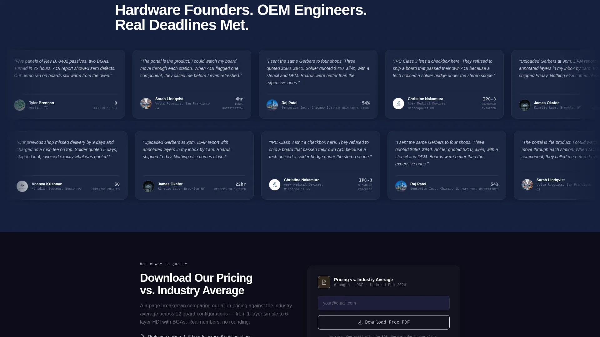
| Gated PDF Offer | Secondary download path for visitors still evaluating suppliers |
Design & branding system
The visual language is built on a Carbon Fiber palette that references the physical materials of a populated circuit board. Every color choice has a functional role, not just a decorative one.
- Background gradients run from deep graphite (#1A1A2E) to near-black, keeping focus on data and card content
- Solder-mask green (#2D6A4F) and exposed-pad silver (#C0C0C8) handle labels and numeric values respectively
- Trace-route amber (#E8A317) is used only for calls to action and interactive highlights so it retains full visual weight when it appears
Mobile & speed optimization
The card-grid structure is built to reflow cleanly on smaller screens. Comparison cards stack vertically on mobile so the versus narrative stays readable without horizontal scrolling.
- Modular card units resize and restack independently, keeping each comparison self-contained on any viewport
- The floating call-to-action bar adapts to mobile bottom positioning so the upload prompt remains accessible throughout the scroll
- Animated counters in the header are scoped to the stats block and do not affect the rendering of card content below
How this template helps you convert
The page is engineered as a case-building sequence, not a feature list. Each section lowers a specific objection before the visitor reaches the upload form.
- The stats header establishes credibility in the first five seconds by showing verified performance numbers rather than marketing language, giving technical buyers a reason to keep reading.
- The comparison card grid converts hesitation into intent by surfacing the exact gaps a buyer already suspects in their current supplier, making the decision feel obvious rather than risky.
- The dual call-to-action structure ensures visitors convert at different stages of readiness, either by uploading files immediately or by downloading a pricing document that keeps the service top of mind.
Other information about this template
This template is categorized under Manufacturing and Industrial, specifically within the Electronics Manufacturing and PCB Assembly niche. It is matched to a Service Utility theme with a Transparent Process creative direction.
- The template style is a Card Grid (Modular) layout, making individual comparison units easy to update or reorder
- The header concept is a Stats and Metrics wall, a format that resonates with technically literate buyers who evaluate suppliers by numbers
- The Comparison and Versus landing-page direction is a proven structure for industries where buyers are actively switching providers
- This template is well suited to services offering printed circuit board assembly, surface-mount technology placement, automated optical inspection, and reflow soldering workflows
Theme
Service Utility
Creative direction
Transparent Process
Color system
Carbon Fiber
Style
Card Grid (Modular)
Direction
Comparison/Versus
Page Sections
Animated Stats Metrics Header
Split Comparison Card Grid
Dual Conversion Path Design
Floating Scroll-pinned Call to Action Bar
Carbon Fiber Color System
Modular Card Layout Structure
Related questions
Who is this landing page template designed for?
Can I update the stats counters to match my own service metrics?
How does the comparison card grid work?
What does the Gerber upload form collect?
Is the gated PDF path included in the template?