Subscription Box Services Pre-Launch & Coming Soon Website Template
Peel is a bold, overlap-layered landing page template built for sticker subscription box brands. It combines a live countdown timer, before-and-after box reveal sections, and a clickable artist grid to turn casual browsers into eager subscribers. Every design choice, from the dopamine-pop color palette to the peeling sticker aesthetic, is engineered to make choosing a plan feel irresistible.
by Rocket studio
Quick summary
Peel is a single-page, click-through landing page template for sticker subscription boxes. It opens with a scarcity-driven countdown header, moves through before-and-after themed box reveals, and closes every scroll section with a repeated call to action pushing visitors into a plan selector. The visual language feels like a freshly cracked sticker sheet, layered, tactile, and impossible to ignore.
Who this template is for
This template suits any creative subscription brand that leads with visual identity and community. It is especially well suited for founders who source from independent artists and want the page to feel as considered as the product inside the box.
- Sticker subscription box operators curating monthly themed packs
- Independent illustrator collectives selling packaged art drops
- Creative product brands targeting bullet journal enthusiasts, laptop decorators, and collector communities
What problem this template solves
Most subscription box landing pages look like checkout pages with a photo bolted on top. Peel solves the specific challenge of converting a visitor who has never touched the product into someone who genuinely covets what is inside the box before they click anything.
- Visitors leave without understanding what makes each box unique or who made the art inside
- Generic layouts fail to convey scarcity, theme excitement, or the collector satisfaction of a curated monthly drop
- No single moment on a standard page creates the emotional pull that sticker lovers respond to
What you get with this template
You get a fully structured, overlap-layered landing page with every section pre-built and purposefully sequenced to move a visitor from curiosity to conversion. The layout handles the storytelling so you focus on swapping in your own sticker art and artist details.
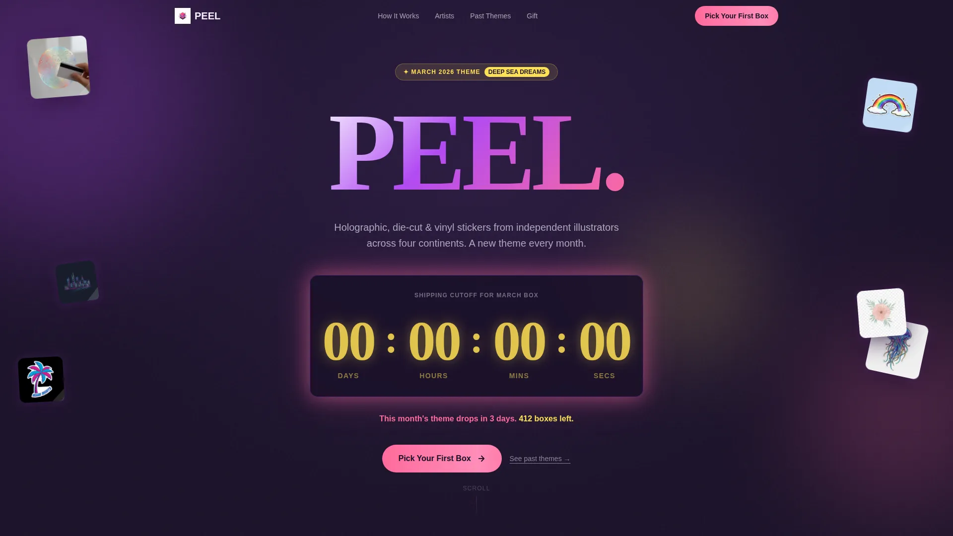
- Countdown timer header with scarcity messaging and sticker preview art
- Scrollable before-and-after box reveal sections with artist attribution per sticker
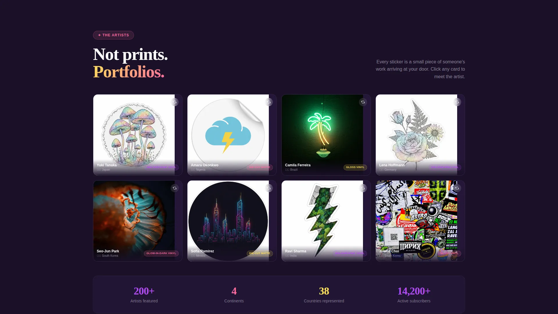
- Full-width marketplace grid of sticker close-ups with flip-card artist story panels
- Sticky bottom call-to-action bar and a plan selector click-through flow (monthly, 3-month, 6-month)
Feature list
This template is built around a focused set of components. Each one earns its place by doing a specific conversion job.
Countdown Timer Header
An oversized timer counts down to the current box's shipping cutoff. Numerals render in highlighter yellow against a deep grape background. Scattered sticker art with curled, peeling corners frames the clock, and a single pink scarcity line below confirms boxes remaining and days until theme reveal.
Before and After Box Reveal
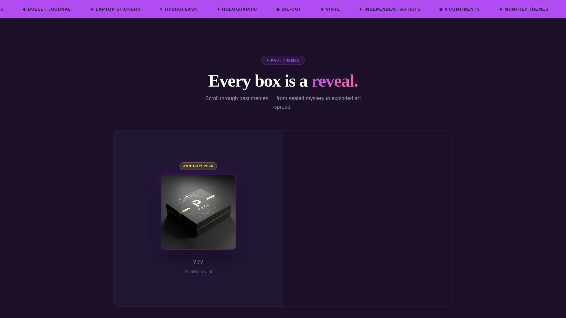
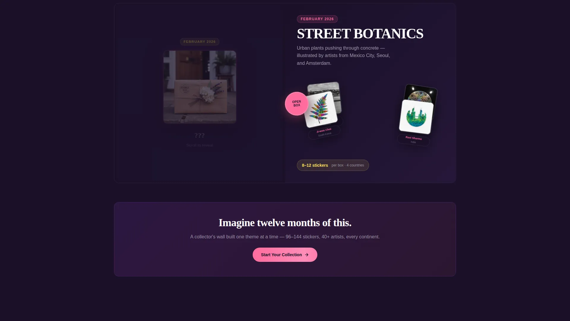
Each scroll section pairs a sealed, mystery-box visual on the left layer with an exploded sticker spread on the right. As the visitor scrolls, the box tears open and individual stickers fan out, each tagged with the contributing artist's name and country of origin.
Clickable Artist Marketplace Grid
A full-width tile grid displays individual sticker close-ups. Each tile is clickable and flips to show the artist's story on the reverse side. This component reinforces that every sticker in the box comes from a real illustrator's portfolio.
Sticky Call-to-Action Bar
After the second scroll section, a persistent bottom bar appears carrying the primary call to action. It stays visible as the visitor continues scrolling, removing the need to hunt for a button when they are ready to commit.
Plan Selector Click-Through
Clicking the primary call to action lands visitors on a plan picker showing monthly, 3-month, and 6-month options. A live preview displays the current month's theme sticker count. No form fields appear on the landing page itself.
Overlap and Layered Layout System
Sticker illustrations break out of their section containers and cast soft drop shadows onto the layers beneath. This stacking effect makes the page feel physically assembled, like sheets in a fresh sticker pack, reinforcing the tactile appeal of the product.
Page sections overview
| Section | Purpose |
|---|---|
| Countdown Timer Header | Drives urgency with shipping cutoff clock and box scarcity line |
| Primary call to action Block | First appearance of "Pick Your First Box" button below the header |
| Before and After Reveal One | Introduces a past month's theme from sealed box to exploded sticker spread |
| Artist Attribution Tags | Names and countries overlaid on each sticker in the reveal spread |
| Before and After Reveal Two | Escalates the collector narrative with a second themed box opening |
| Sticker Marketplace Grid | Full-width close-up tiles that flip to show individual artist stories |
| Sticky call to action Bar | Persistent bottom bar repeating the primary call to action after scroll two |
| Plan Selector Landing | Click-through destination showing subscription tiers and live sticker count preview |
Design & branding system
The color system is built on four values that work specifically because of their contrast against each other. Every hue runs at full saturation so nothing feels washed out or muted.
- Electric lilac (#B24BF3) washes section backgrounds; gummy bear pink (#FF6B9D) drives every button and hover state
- Highlighter yellow (#FFE156) marks badges, scarcity tags, and countdown numerals to draw the eye instantly
- Near-black grape (#1A1028) anchors all body typography and deep backgrounds, keeping the bright palette readable and grounded
Mobile & speed optimization
The overlap and layered layout is structured so sticker illustrations reflow cleanly at smaller screen widths. The stacking effect scales down without losing the visual depth that makes the template distinctive.
- Layered section components collapse into readable single-column stacks on mobile viewports
- The sticky call-to-action bar remains fixed at the bottom of the screen on all device sizes, keeping the conversion path accessible at every scroll depth
How this template helps you convert
Peel is a click-through template with one job: build enough sticker envy that choosing a plan feels like the obvious next step, not a considered commitment.
- The countdown timer and scarcity line create immediate urgency at the top of the page, before the visitor has read a single product description.
- The sequential before-and-after reveals escalate desire across multiple scroll moments, progressing from a single month's theme to the vision of a full collector's wall built over twelve months.
- The sticky call-to-action bar and the no-form-field approach eliminate friction at the final decision point, making the click-through to the plan selector feel effortless.
Other information about this template
This template is built for the Retail and E-Commerce category under the Subscription Box Services subcategory. It was designed with a Marketplace Grid layout direction and uses an Overlap and Layered template style throughout.
- The template follows a Neo-Retro theme with a Dopamine Pop color system, giving it visual energy that stands apart from minimal or pastel-led subscription layouts
- The Curated Collection creative direction shapes the narrative arc, moving visitors through artist-attributed reveals rather than generic product photography
- The design is purpose-built for brands sourcing from independent illustrators, where showing the human story behind each sticker is as important as showing the sticker itself
Theme
Neo-Retro
Creative direction
Curated Collection
Color system
Lavender Dream
Style
Overlap/Layered
Direction
Marketplace/Multi
Page Sections
Countdown Timer with Scarcity Line
Before and After Box Reveal Sections
Clickable Artist Marketplace Grid
Sticky Bottom Call-to-action Bar
Plan Selector Click-through Flow
Overlap and Layered Layout System
Related questions
Does this template include any form fields on the landing page?
Can I use this template for a subscription box that is not sticker-related?
How many subscription plan options does the plan selector support?
What makes the layered layout different from a standard landing page grid?
Is the scarcity messaging on the countdown header editable?



