Copywriter Portfolio Professional Website Template
Pencraft is a dark, minimalist copywriter landing page template built around an asymmetric 60/40 grid and a manifesto-style scroll. It uses a Cloud Canvas color system of deep charcoal, graphite, and cloud white with pale lavender accents. Designed for freelance copywriters, it leads visitors from bold creative philosophy straight to a qualified lead-capture form.
by Rocket studio
Quick summary
Pencraft is a single-page copywriter portfolio template with a dark immersive aesthetic and an asymmetric 60/40 grid layout. The scroll reads like a manifesto: beliefs first, proof second, conversion last. A Photo Grid Mosaic header, a diagnostic lead form, and a fixed newsletter bar make this a focused lead generation tool for serious copywriting professionals.
Who this template is for
This template suits freelance copywriters who want their portfolio to argue a point of view rather than simply display past work. It speaks directly to professionals whose clients include demanding, high-stakes briefs.
- Freelance copywriters building a minimalist portfolio that reflects their craft and voice
- Brand and campaign writers who want to attract startup founders, creative directors, and product teams
- Solo copywriting professionals ready to replace a generic portfolio with a focused, lead-generating page
What problem this template solves
Most copywriter portfolios look like project archives. They list work without context and ask visitors to judge quality without understanding philosophy. Pencraft fixes this by leading with conviction and letting the proof follow naturally.
- Generic portfolio layouts fail to communicate a copywriter's distinct worldview or creative standards
- Scattered case study formats make it hard for prospective clients to understand what they are actually hiring
- Weak contact forms attract unqualified inquiries instead of ready, high-intent leads
What you get with this template
Pencraft delivers a complete single-page layout with every structural and visual decision already made. You get a cohesive dark theme, a defined grid rhythm, and conversion-focused copy architecture out of the box.
- An asymmetric 60/40 grid manifesto layout with a Photo Grid Mosaic header section
- A lead generation form with a diagnostic open-field question and project type selector
- A fixed-bottom newsletter bar for a secondary, low-friction conversion path
Feature list
This template packs a focused set of design and structural features that serve one purpose: turning a copywriter's page into a compelling, client-attracting argument.
Asymmetric 60/40 Grid Layout
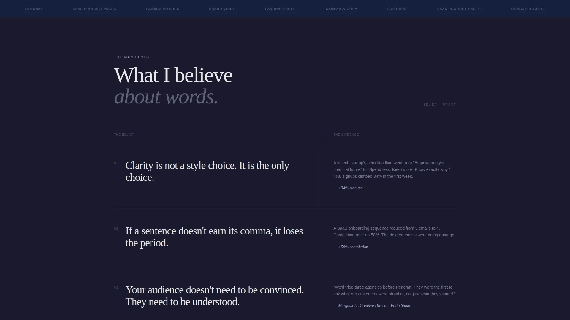
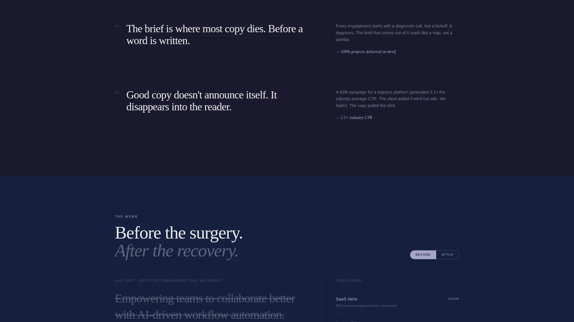
The page uses a two-column asymmetric grid throughout the scroll. The wider 60% column carries each manifesto statement. The narrower 40% column anchors supporting proof: client results, before-and-after headline rewrites, and testimonial fragments. The rhythm is deliberate and editorial.
Photo Grid Mosaic Header
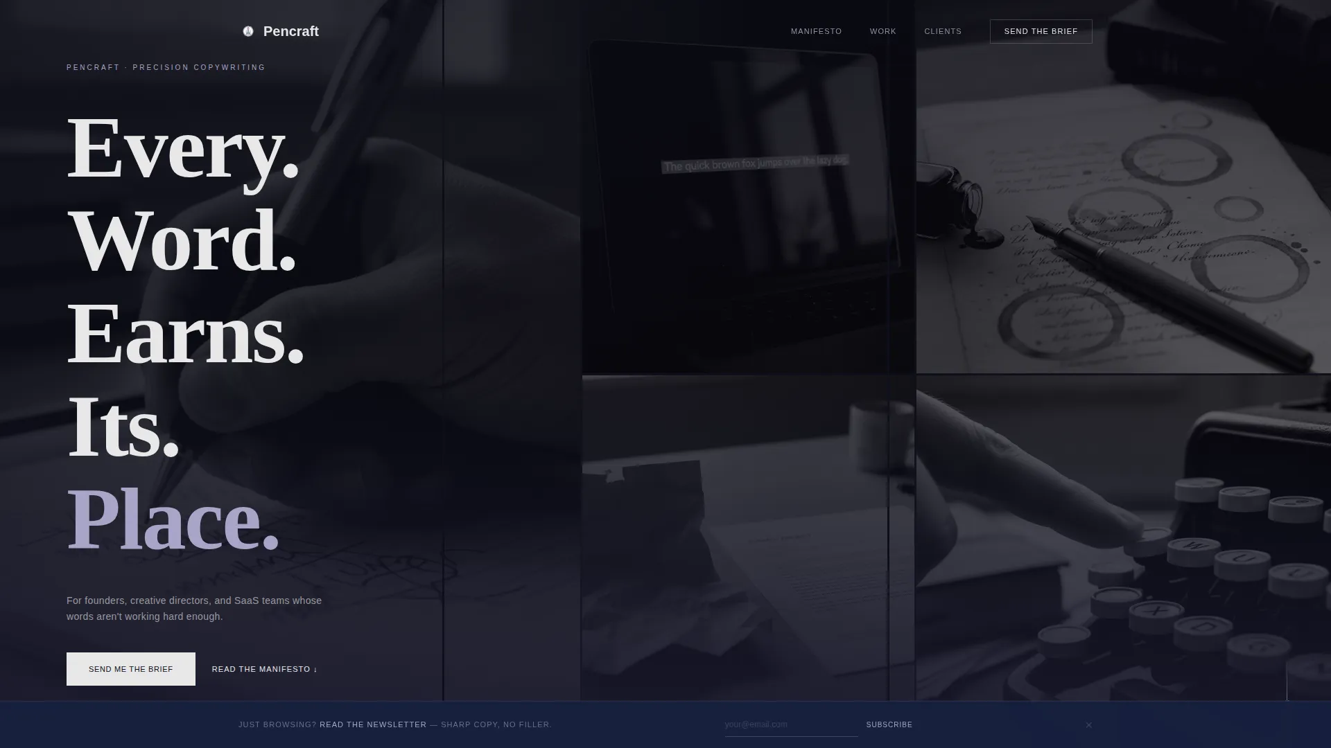
The header is a tight, edge-to-edge mosaic of cropped black-and-white images. Subjects include a hand writing on a legal pad, a laptop showing a highlighted sentence, a crumpled draft beside a clean final, and coffee rings on manuscript pages. No faces and no color. Large tracked-out serif type overlays the mosaic, reading one word per line: "Every. Word. Earns. Its. Place."
Manifesto Scroll Architecture
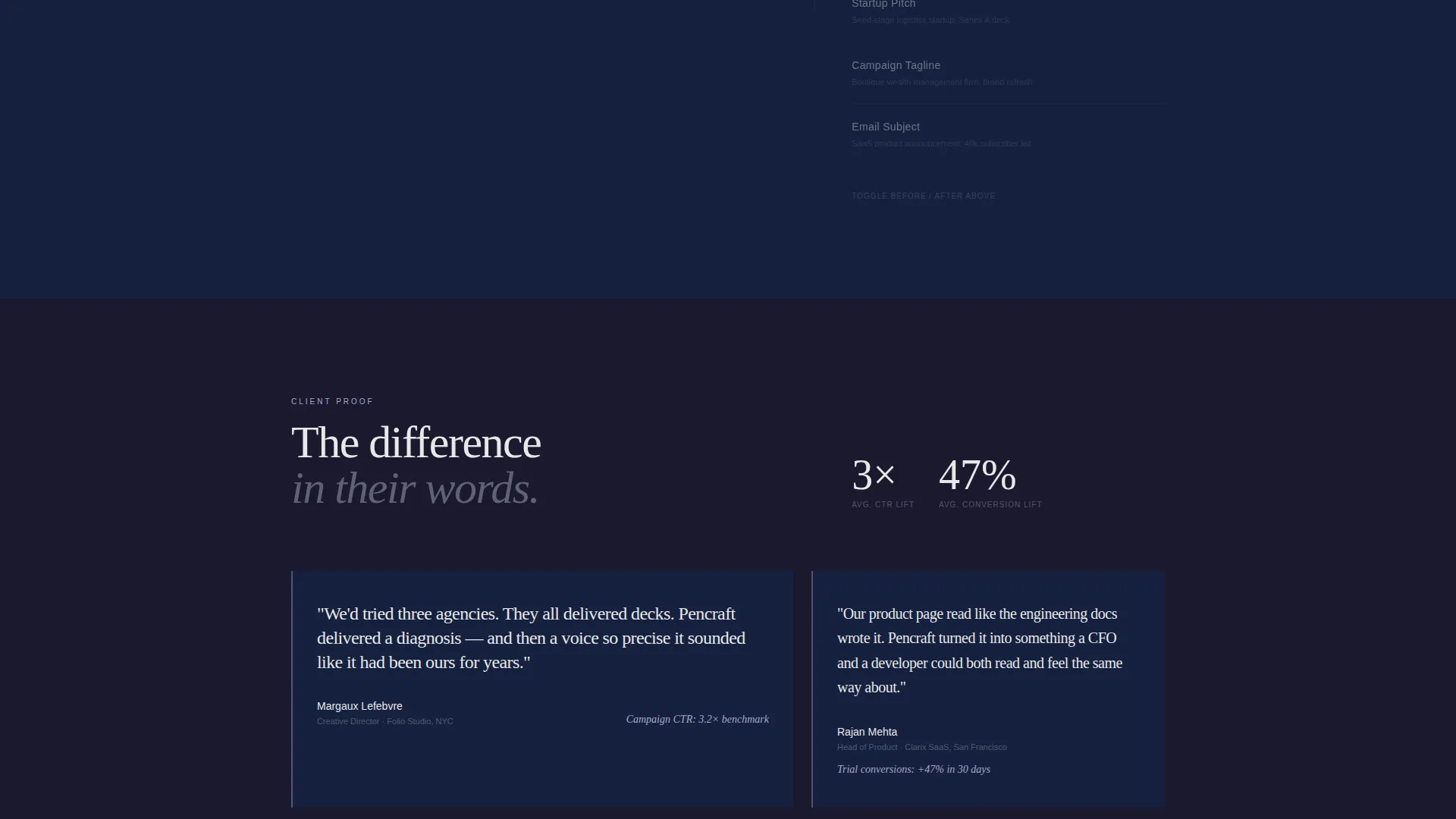
The page is structured as one continuous declaration. Each section presents a single belief in the 60% column with quiet evidence in the 40% column. The scroll escalates from conviction to proof to social validation, building a persuasive case rather than a standard project tour.
Diagnostic Lead Capture Form
The primary call to action is a form labeled "Send Me the Brief." It collects the visitor's name, a project type selection (brand voice, landing page, campaign, or editorial), and one open field asking "What's broken about your current copy?" This question qualifies intent before a conversation even begins.
Fixed-Bottom Newsletter Bar
A subtle bar is pinned to the bottom of the page at all times. It offers a secondary conversion path for visitors who are not yet ready to inquire. The bar reads "Just browsing? Read the newsletter" and accepts an email address only, keeping the ask minimal.
Cloud Canvas Dark Color System
The palette runs from deep charcoal to muted graphite for backgrounds, with cloud white body text and pale lavender reserved strictly for hover states and pull quotes. The result is a near-monochrome, intimate visual tone that feels focused and intentional.
Page sections overview
| Section | Purpose |
|---|---|
| Photo Grid Mosaic Header | Opens with a strong visual statement and tracked serif headline |
| Manifesto Belief Sections | Presents the copywriter's philosophy in 60/40 column rhythm |
| Proof and Evidence Column | Anchors client results and testimonial fragments in the 40% column |
| Primary Lead Form | Captures qualified inquiries with a diagnostic open-field question |
| Fixed Newsletter Bar | Provides a low-friction secondary conversion path |
Design & branding system
The visual identity is built on the Cloud Canvas color system, a palette chosen to feel intimate and deliberate rather than cold or corporate. Every color choice reinforces the dark immersive theme without becoming oppressive.
- Deep charcoal (#1A1A2E) and muted graphite (#16213E) form the full background range across all sections
- Cloud white (#E8E8E8) is used for all body text to maintain readability against dark backgrounds
- Pale lavender (#A8A5C8) appears only on hover states and pull quotes, adding just enough warmth to break the near-monochrome tone
Mobile & speed optimization
The template is designed with a layout approach that translates the asymmetric desktop grid into a clean, readable single-column flow on smaller screens. The dark palette and minimal image use keep the page visually tight across device sizes.
- The 60/40 asymmetric grid collapses gracefully so manifesto statements and proof elements read in natural sequence on mobile
- The fixed-bottom newsletter bar remains visible and functional on smaller screens without obscuring primary content
- Black-and-white image tiles in the mosaic header are cropped and positioned to maintain visual impact at any viewport width
How this template helps you convert
Pencraft is structured to earn trust before it asks for anything. Every section moves the visitor closer to the form with a clear sense of purpose and escalating persuasion.
- The manifesto scroll builds credibility gradually, moving from stated beliefs to demonstrated results to client testimonials, so the visitor arrives at the form already convinced.
- The diagnostic form question "What's broken about your current copy?" filters for high-intent leads naturally, reducing unqualified inquiries without any additional screening step.
- The fixed newsletter bar gives hesitant visitors a low-commitment way to stay connected, keeping them in reach for a future inquiry.
Other information about this template
Pencraft is built specifically for the copywriter minimalist portfolio niche. It combines a dark immersive theme with an editorial structure that prioritizes voice and philosophy over a traditional project gallery format.
- The template falls under the Portfolio and Agency category, with a specific fit for the Copywriter Portfolio subcategory
- The Manifesto creative direction and Lead Generation page structure give this template a high intersection match for copywriters who want their page to do active sales work
- The asymmetric grid style is uncommon in copywriter portfolio templates, making Pencraft visually distinctive in a space dominated by clean but unremarkable layouts
- This template is well suited to pairing with a personal domain and a newsletter platform for the secondary conversion bar
Theme
Dark Immersive
Creative direction
Manifesto
Color system
Cloud Canvas
Style
Asymmetric Grid (60/40)
Direction
Lead Generation
Page Sections
Asymmetric 60/40 Manifesto Grid
Photo Grid Mosaic Header
Diagnostic Lead Capture Form
Fixed-bottom Newsletter Bar
Cloud Canvas Dark Color System
Related questions
Can I edit the manifesto copy to reflect my own creative philosophy?
What information does the lead form collect from potential clients?
Does the fixed-bottom newsletter bar interfere with the main page content?
Can I replace the placeholder images in the Photo Grid Mosaic header?
Is Pencraft suitable for a copywriter who only offers one or two services?



