Periodontist Advanced Booking Website Template
Perio is a single-page periodontist landing page built around FAQ-driven comparison tables and a six-question Gum Health Score quiz. It converts confused dental referrals and self-referred patients into booked consultations by turning clinical data into a clear risk picture. The layout pairs scroll-reveal animations with embedded patient testimonials and a lead-capture quiz that delivers a personalized next step.
by Rocket studio
Quick summary
Perio is a focused periodontist landing page template designed for clinical gum care practices. It uses FAQ comparison tables to build patient literacy, embeds anonymized outcome metrics directly inside table cells, and closes each content cycle with a six-step Gum Health Score quiz. The result is a page that earns trust while capturing qualified leads.
Who this template is for
This template suits periodontal practices that receive referral patients and need a clear, credible first impression online. It works especially well for practices whose patients arrive confused, anxious, or long overdue for treatment.
- Periodontists converting general dentist referrals into booked consultations
- Practices targeting adults aged 35 to 65 with bleeding gums, mobility concerns, or a "deep cleaning" recommendation
- Clinicians serving post-menopausal women, smokers, and patients with a family history of tooth loss who need education before they commit
What problem this template solves
Most patients referred to a periodontist arrive with a printed sheet and a circled number they cannot interpret. Generic practice websites do not explain what that number means or why it matters. This template closes that gap.
- It translates clinical language into plain risk tiers that patients actually understand
- It replaces passive "about us" copy with active FAQ sections that answer the exact questions patients Google at midnight
- It removes the anxiety barrier between "I should probably call" and "I just booked"
What you get with this template
You get a fully structured single-page layout with five major content sections, a working quiz flow, and a footer. Every section is purpose-built to move a hesitant patient one step closer to booking.
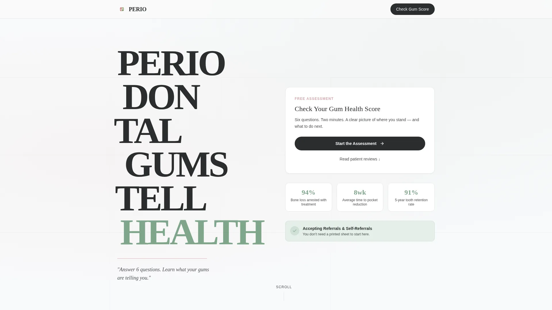
- A stacked typographic hero with a single clarifying sub-line and a primary quiz call to action
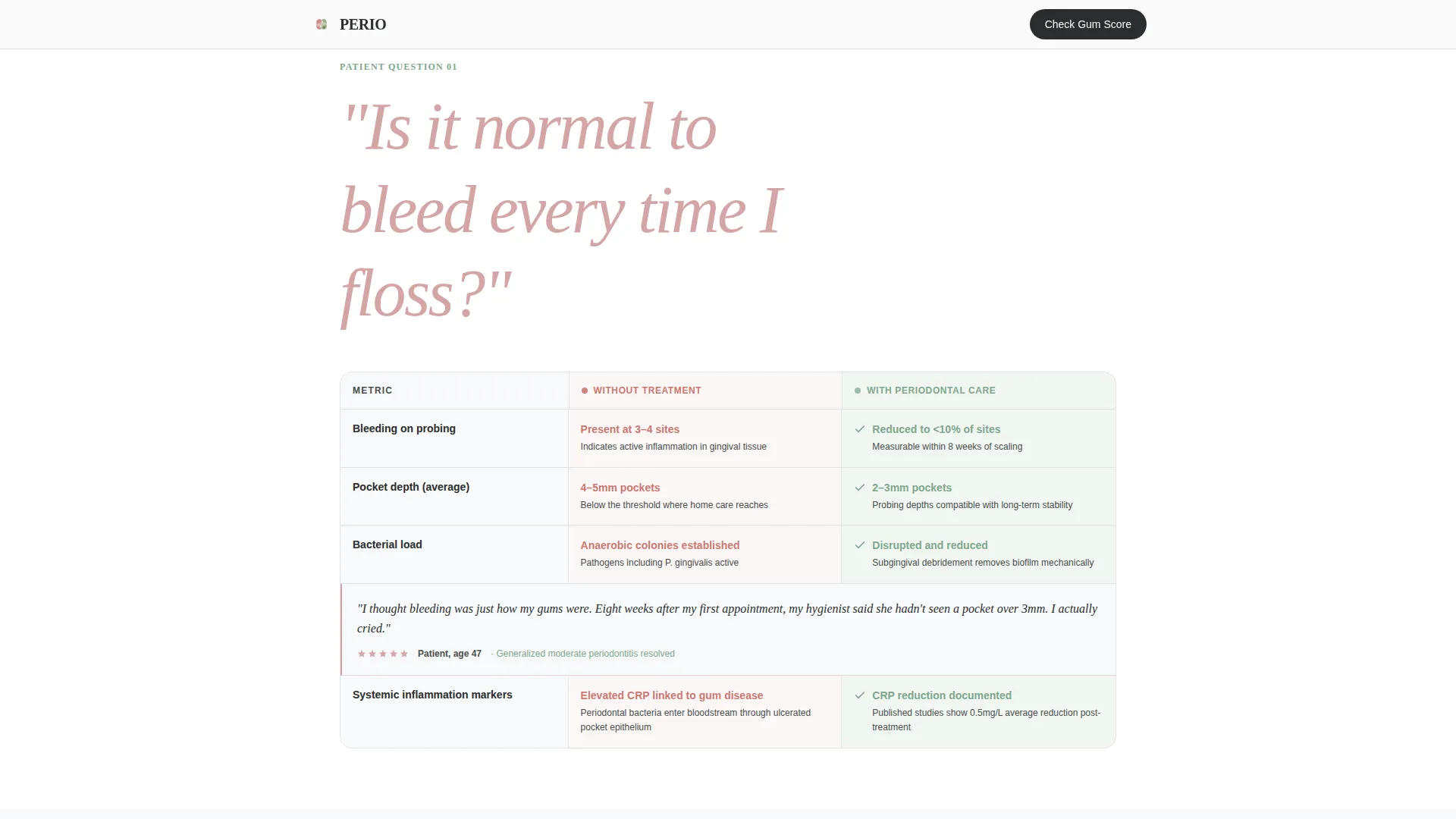
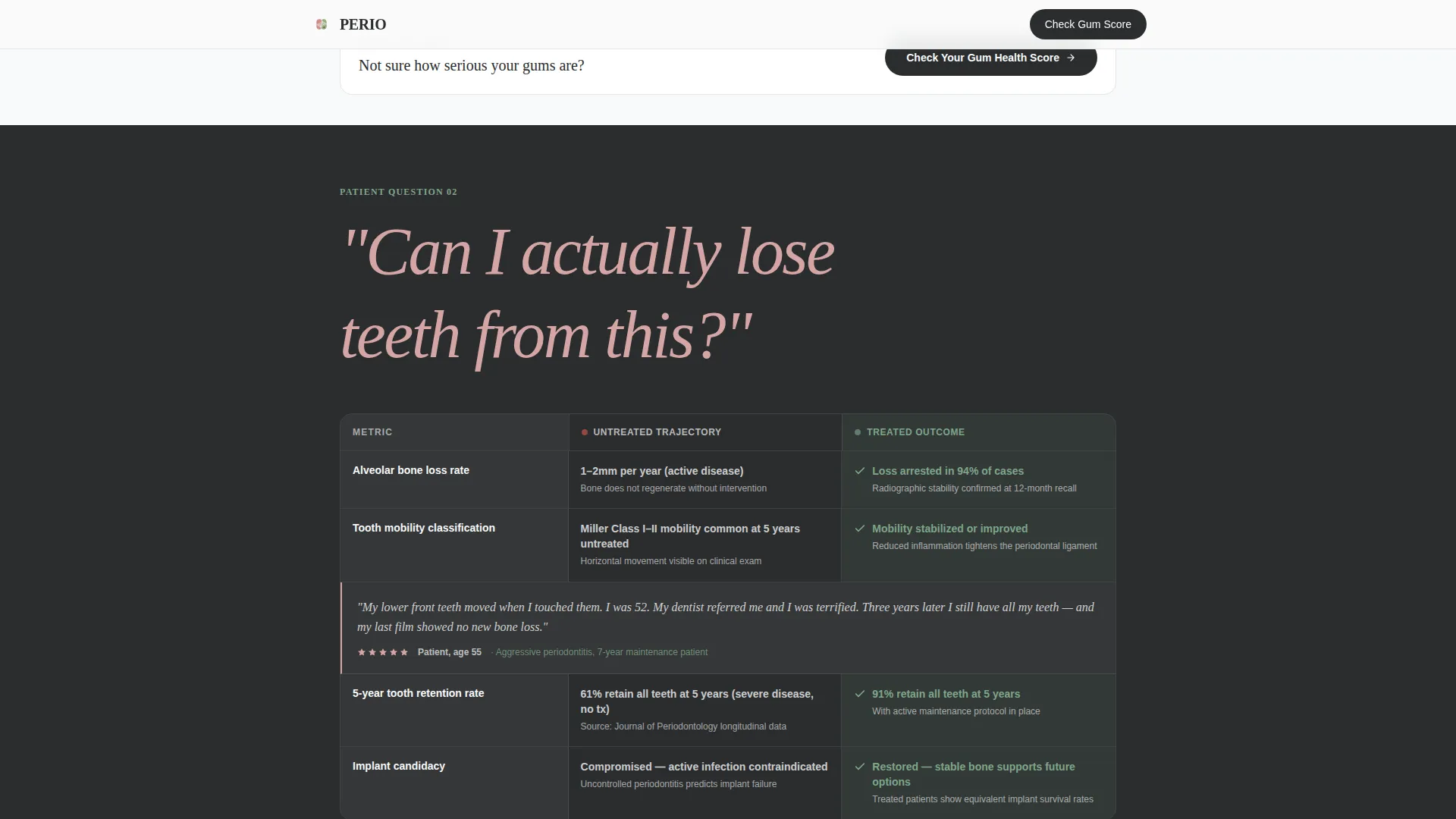
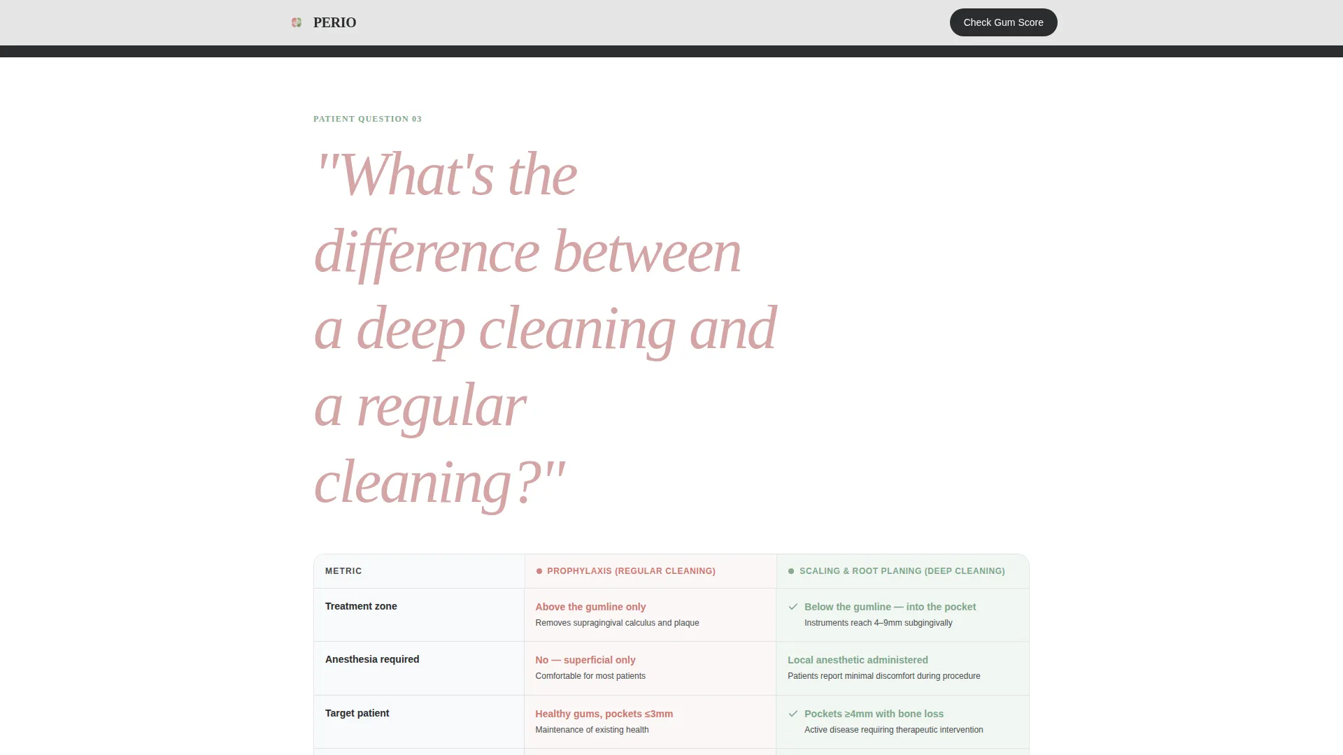
- Three FAQ comparison table sections, each anchored by a real patient question and populated with outcome metrics and embedded testimonials
- A six-step interactive quiz that scores gum health risk, captures name, email, and phone, and returns a red, yellow, or green result tier with a personalized next step
Feature list
This template is built around a focused set of components that work together to educate and convert.
FAQ Comparison Table Layout
Each of the three FAQ sections opens with a large italic patient question. Below it, a two-column table contrasts the untreated trajectory on the left with the treated outcome on the right. Anonymized patient review metrics and direct testimonial quotes live inside the table cells themselves, not in a separate carousel.
Six-Step Gum Health Score Quiz
The interactive quiz asks six progressive questions covering bleeding frequency, tooth mobility, family history, smoking status, time since last dental visit, and whether the patient has been told they need a deep cleaning. A state machine handles each step transition. After the final answer, the quiz captures name, email, and phone before revealing the score.
Risk-Tier Result Screen
Quiz results return one of three color-coded tiers: red for high concern, yellow for moderate concern, and green for low concern. Each tier includes a brief personalized next step so the patient knows exactly what to do after seeing their score.
Stacked Type Tower Header
The hero uses a tall, narrow sans-serif treatment that breaks the word PERIODONTAL across six offset lines, with the final word HEALTH rendered in new-attachment green. There is no hero image. The typography and negative space do the work of a sterile, reassuring operatory.
Scroll-Reveal Animations
The page uses medium-intensity staggered load animations and scroll-triggered table row entrances. Each FAQ section and quiz call-to-action block enters the viewport with a subtle reveal that keeps the reading flow intentional without feeling distracting.
Repeating Quiz Call to Action
The primary "Check Your Gum Health Score" call to action appears directly beneath the header and repeats after every third FAQ section. A secondary anchor link, "Read More Reviews," guides patients who prefer to keep reading before committing.
Page sections overview
| Section | Purpose |
|---|---|
| Stacked Type Hero | Introduces practice identity and quiz call to action |
| FAQ Comparison Table 1 | Answers "Is it normal to bleed every time I floss?" with outcome data |
| FAQ Comparison Table 2 | Answers "Can I actually lose teeth from this?" with risk metrics |
| FAQ Comparison Table 3 | Answers "What's the difference between deep cleaning and regular cleaning?" |
| Quiz call to action Repeat | Reinforces lead capture after third FAQ section |
| Gum Health Score Quiz | Six-step scored assessment with risk tier and lead capture form |
| Linear Footer | Single-row footer with practice contact and navigation anchors |
Design & branding system
The visual identity follows an Organic Flow theme built on an Arctic White color system. The palette is described in the brief as feeling like a sterile tray lined with fresh gauze beside a single living succulent, immaculate but breathing.
- Colors: clinical porcelain (#F8F9FA) for backgrounds, subgingival charcoal (#2B2D2E) for body text and structure, healthy-tissue pink (#D4A5A5) for warm accent elements, and new-attachment green (#7FA68A) reserved for progress indicators and positive outcome moments
- Typography: Fraunces serif display for headers and large italic patient questions, paired with Manrope for body copy, quiz interface labels, and table content
- The Organic Flow style avoids hard institutional edges while maintaining clinical credibility, creating a medical-grade feel without the cold fluorescent atmosphere
Mobile & speed optimization
The template is designed mobile-first because the brief identifies late-night phone searches as the primary discovery path for this patient audience. Layout decisions prioritize the small-screen reading and quiz experience above all else.
- Comparison tables stack and reflow cleanly for single-column mobile viewports
- The six-step quiz is built as a client component with a state machine so each question renders in a focused, tap-friendly single view
- Static content sections, including the hero and FAQ table blocks, use server component architecture to keep initial load lightweight while reserving interactivity for the quiz module
How this template helps you convert
The page is engineered around one insight: doing nothing feels safer than acting, until it no longer does. Each scroll section raises the clinical stakes slightly, and the quiz turns that tension into a concrete next step.
- The FAQ comparison tables build clinical literacy progressively. By the third table, patients understand what untreated gum disease actually costs them, and the comparison format makes that cost visible without being alarmist.
- The Gum Health Score quiz captures a qualified lead at the moment of highest intent. Because the score is only revealed after name, email, and phone are submitted, the practice receives a contact record along with a risk-tier signal for every completed quiz.
Other information about this template
This template is part of a Health and Medical category build designed specifically for the Periodontist Website subcategory. It is built for English (US) audiences with date formatting in MM/DD/YYYY and no currency display.
- The Intersection Match Score for this template is 13, indicating a strong alignment between the niche, creative direction, and conversion approach
- The template style is Comparison Table, and the creative direction is FAQ-Driven, meaning the educational architecture is the conversion architecture
- The landing page direction is Quiz and Assessment, which means the interactive quiz is the primary lead generation mechanism, not a passive contact form
- The header concept is Stacked Type Tower with no hero image, relying on typography alone to establish clinical authority and set the tone for the rest of the page
Theme
Organic Flow
Creative direction
FAQ-Driven
Color system
Arctic White
Style
Comparison Table
Direction
Quiz/Assessment
Page Sections
FAQ Comparison Tables with Embedded Testimonials
Six-step Gum Health Score Quiz
Color-coded Risk Tier Results
Stacked Type Tower Hero
Repeating Quiz Call to Action
Scroll-reveal Section Animations
Related questions
Can I edit the comparison table content to reflect my own patient outcomes?
Does the quiz send leads somewhere automatically?
Is this template designed for patients who are not yet sure they need a periodontist?
How many pages does this template include?
Can the quiz risk tier colors be changed to match a different brand palette?



