Periodontist Specialist Booking Website Template
Perio is a single-page periodontist landing page template built for patient education and appointment booking. It follows a Problem-to-Solution narrative arc across zigzag sections, moving visitors from symptom recognition through diagnosis and treatment to a streamlined three-field scheduling form. The Medical Clarity design system pairs clinical teal with catalyst coral to build trust and prompt action.
by Rocket studio
Quick summary
Perio is a landing page template designed for periodontal practices that need to educate anxious patients and convert them into booked consultations. It guides visitors through a calm, clinically grounded story: here is the symptom you recognized, here is what it means, here is what we do, and here is how to get started.
Who this template is for
This template suits periodontal specialists who receive referrals from general dentists and need a patient-facing page that explains complex diagnoses in plain language. It works equally well for practices launching a new patient education resource or refreshing an outdated booking flow.
- Periodontists treating referred patients with pocket depths of 5 millimeters or greater, bleeding gums, or recession concerns
- Specialists serving patients managing systemic conditions such as diabetes, where gum inflammation is a recurring concern
- Practices looking to capture second-opinion seekers before they search elsewhere
What problem this template solves
Patients referred with a periodontal chart rarely understand what the numbers mean. That gap between clinical language and patient comprehension creates anxiety, delays bookings, and increases no-shows. This template closes that gap by meeting patients where they are.
- Referred patients often arrive confused about Stage classifications and pocket depth measurements, and leave without booking
- Patients in the research phase need educational content before they feel ready to schedule, yet most practice pages offer no middle path
- A generic contact form does nothing to reduce the fear that keeps high-risk patients from acting on their referral
What you get with this template
You get a fully structured, single-page landing page that walks a prospective patient through every stage of the decision journey. The layout, copy placeholders, form sections, and visual flow are all pre-built and ready to customize.
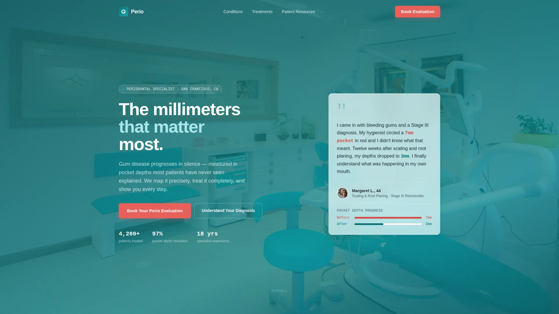
- A hero section with a frosted-glass testimonial card, a teal gradient background, and a coral "Book Your Perio Evaluation" call-to-action button
- Four zigzag content sections covering problem recognition, diagnosis explanation, procedure walkthrough, and outcome with a booking form
- A secondary email-capture path offering a downloadable Pocket Depth Guide for patients not yet ready to schedule
Feature list
This section walks through the core capabilities built into the Perio template.
Frosted-Glass Testimonial Hero
The hero opens with a specific patient quote displayed on a frosted-glass card over a softly blurred operatory background. The card includes the patient's name, age, procedure type, and a measurable outcome such as pocket depth reduction. This leads with credibility before the visitor reads a single line of marketing copy.
Zigzag Problem-to-Solution Layout
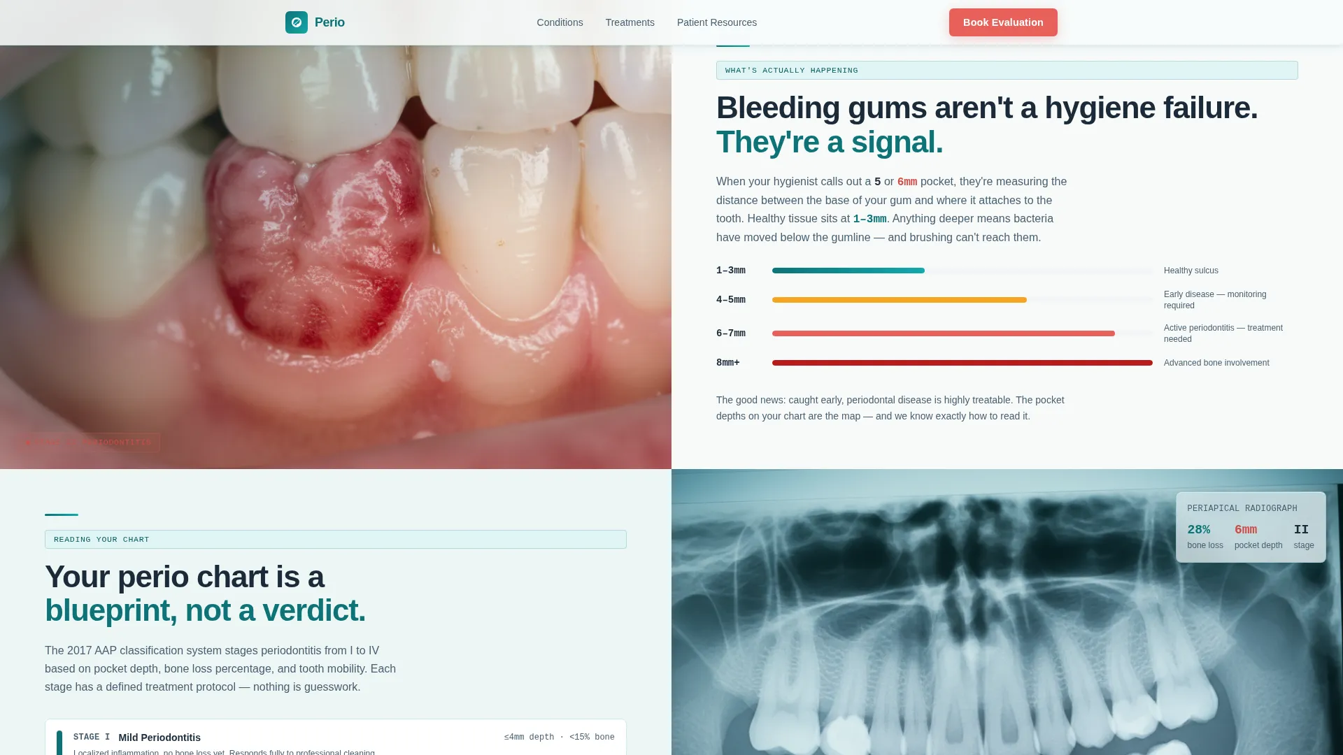
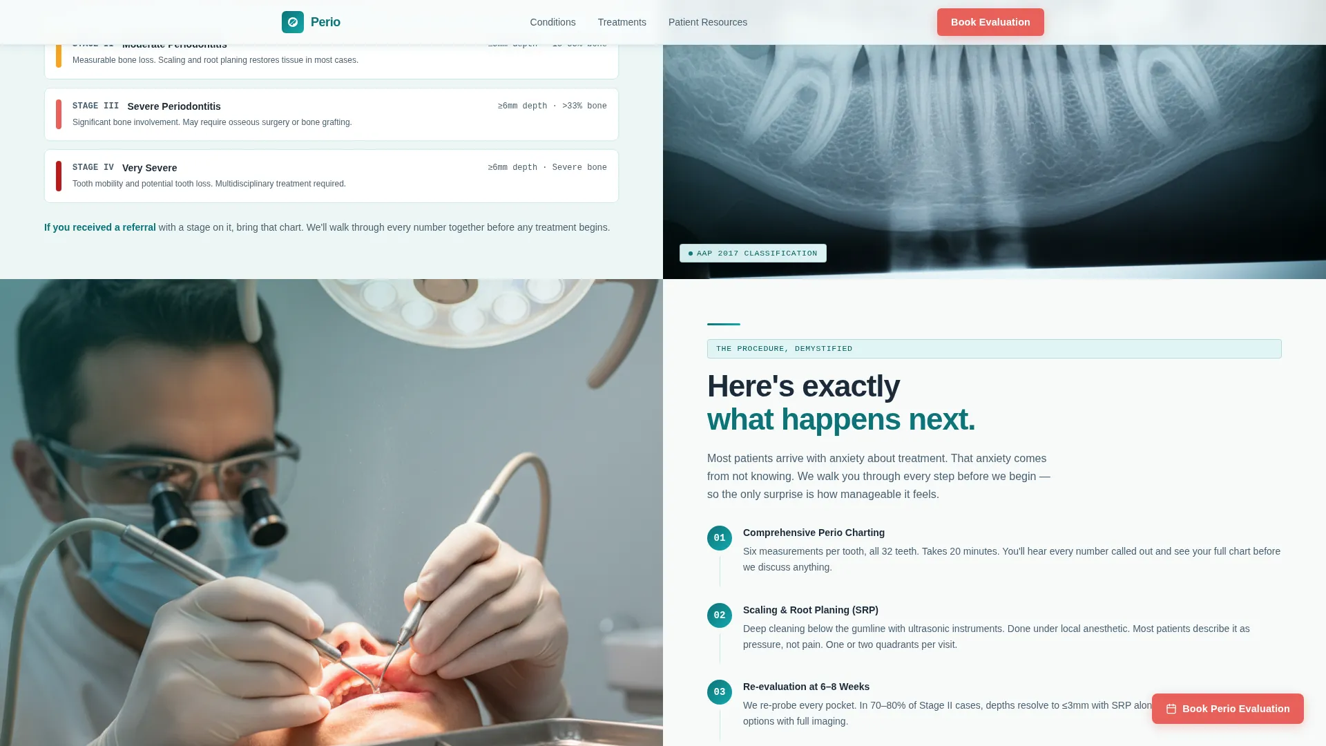
Each alternating section pairs a visual on one side with explanatory text on the other, then flips the arrangement in the next row. The sequence moves from symptom recognition to diagnosis demystification to procedure walkthrough to healed outcome. This rhythm pulls the visitor deeper by answering each question the previous section raised.
Three-Field Scheduling Form
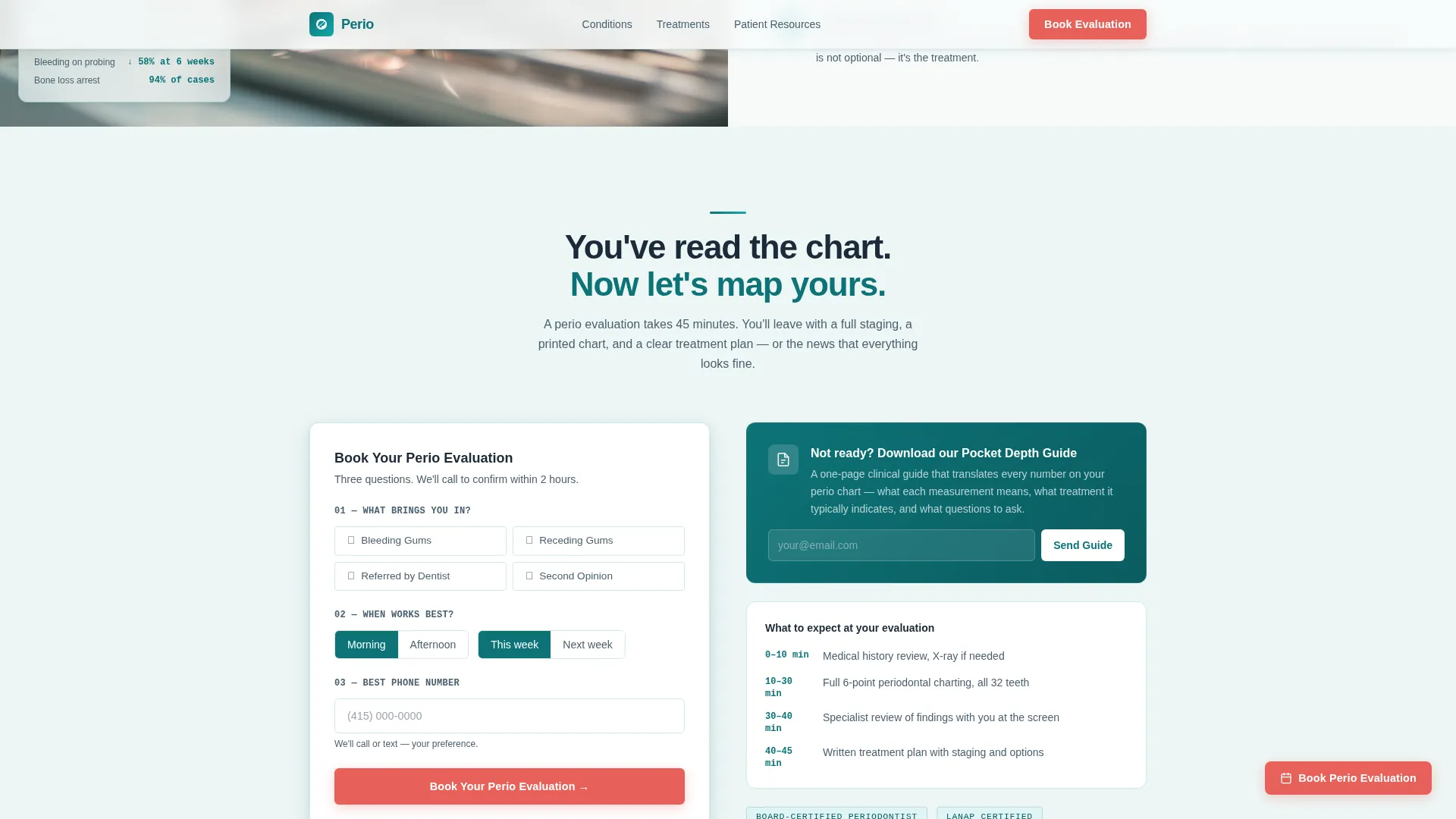
The booking form asks only three things: concern type selected from a short list, a morning or afternoon time preference toggle for this week or next, and a phone number for confirmation. Keeping the form short reduces friction at the moment a patient is ready to commit.
Secondary Email Capture Path
Below the primary call-to-action, a softer prompt invites visitors to download a Pocket Depth Guide in exchange for their email address. This captures patients who are still researching and gives the practice a follow-up channel without pressuring an immediate booking.
Floating Sticky Call-to-Action Button
After the visitor scrolls past the second content section, a coral booking button appears as a fixed floating element. It stays visible throughout the rest of the page so the scheduling option is always one tap away.
Scroll-Triggered Section Reveals
Each content section animates into view as the visitor scrolls, with staggered text entry and card shadow depth on hover. These medium-intensity animations create a sense of pacing that mirrors the calm, step-by-step rhythm of a specialist consultation.
Page sections overview
| Section | Purpose |
|---|---|
| Hero with Testimonial | Opens with social proof and a primary coral call-to-action over a teal gradient |
| Problem Recognition | Zigzag: macro gum photography left, plain-language symptom explanation right |
| Diagnosis Demystified | Zigzag reversed: pocket depth chart right, Stage I through IV explanation left |
| Procedure Walkthrough | Zigzag: healing tissue photography left, step-by-step treatment explanation right |
| Outcome and Booking | Healed tissue visual, three-field scheduling form, and secondary email capture |
| Footer | Single-row links: logo, conditions, treatments, patient resources, privacy, terms |
Design & branding system
The Medical Clarity theme combines antiseptic precision with unexpected warmth. Clinical teal anchors the layout as the primary trust color, while a catalyst coral is reserved strictly for calls to action and urgent callouts. Deep charcoal text on sterile cotton white backgrounds keeps the reading experience clean and fatigue-free.
- Colors: clinical teal (#0D7377) for trust anchors, deep surgical charcoal (#1B2A38) for body text and dividers, sterile cotton white (#F7FAFA) for backgrounds, and catalyst coral (#E8615A) for calls to action only
- Typography: DM Sans for all headings and body text, with JetBrains Mono used specifically for clinical numbers and measurements such as pocket depths and stage classifications
- Visual style: frosted-glass card components, halogen-white open backgrounds, and macro periodontal photography that grounds each section in clinical reality
Mobile & speed optimization
The template is designed desktop-first, reflecting how patients typically research specialist care. On smaller screens, the zigzag columns stack vertically so each image and its paired text block remain readable and in sequence.
- Zigzag columns reflow to a single stacked column on mobile, preserving the problem-to-solution narrative order
- Images are lazy-loaded so the initial page view is fast even on slower connections
- Static sections use server-rendered components to reduce the work the browser must do on first load
How this template helps you convert
The page is built on the principle that informed patients are more willing to book. Every structural decision reduces the distance between confusion and commitment.
- The testimonial hero leads with a measurable patient outcome before any service claim, establishing trust in the first few seconds of a visit
- The zigzag education arc answers the questions a referred patient brings to the page, so by the time the booking form appears, the visitor already understands their diagnosis and feels ready to act
- The secondary email-capture path keeps research-phase visitors inside the practice's orbit, giving them a reason to return when they are ready to schedule
Other information about this template
This template is part of a health and medical category focused on periodontist patient education. It is built for the specific niche where specialist referral volume is high and patient comprehension is low.
- The footer follows a linear single-row pattern with links to conditions, treatments, patient resources, privacy policy, and terms, keeping navigation minimal and focused
- The template is localized for English-language, United States-based practices and uses general United States conventions for scheduling and contact
- Clinical numbers such as millimeter pocket depths and stage designations are styled in JetBrains Mono to visually distinguish data from explanatory prose, reinforcing the specialist tone
Theme
Medical Clarity
Creative direction
Problem→Solution Arc
Color system
Teal Catalyst
Style
Zigzag/Alternating
Direction
Booking/Scheduling
Page Sections
Frosted-glass Testimonial Hero
Zigzag Problem-to-solution Layout
Three-field Scheduling Form
Secondary Email Capture Path
Floating Sticky Call-to-action Button
Scroll-triggered Section Animations
Related questions
Who is this landing page template designed for?
Can I customize the testimonial card in the hero section?
Does the booking form connect to an external scheduling system?
What is the secondary email capture path for?
Can this template support patients with systemic conditions alongside periodontal concerns?



