Driving School Lead Generation Landing Page Template
Permit is a sidebar companion landing page built for driving schools targeting Facebook traffic. It guides nervous first-timers, anxious adults, and new immigrants through a transparent lesson roadmap, from free assessment drive to test day. A charcoal and amber visual system, sticky progress sidebar, and a three-field booking form make the path to getting licensed feel calm, clear, and completely achievable.
by Rocket studio
Quick summary
Permit is a lead generation landing page designed for driving schools. It pairs a dark, immersive header with a scrollable lesson roadmap and a sticky sidebar call to action. The page speaks directly to three audiences: teenage first-timers, adults who never got around to it, and recent immigrants building local road confidence. Every detail is laid out openly, costs, timelines, and outcomes included.
Who this template is for
This template is built for driving schools that want to turn Facebook ad clicks into booked assessment drives. It works especially well for instructors and school owners who rely on paid social traffic and want a page that earns trust before asking for a commitment.
- Driving schools marketing to anxious first-time learners and their parents
- Schools serving adult learners or recent immigrants seeking local licensing
- Instructors running Facebook ad campaigns who need a focused, conversion-ready page
What problem this template solves
Most driving school pages bury pricing, skip the lesson structure, and ask visitors to call before they feel ready. Facebook traffic arrives skeptical. Visitors need to feel informed and confident before they hand over a phone number.
- Visitors leave without booking because pricing and process are unclear
- Generic pages fail to address the real fears of nervous adult learners or first-timers
- There is no secondary path for visitors who are curious but not yet ready to commit
What you get with this template
You get a single-page layout built around a transparent lesson journey. The page is structured so that every question a hesitant visitor might have is answered before the booking form appears.
- A numbered roadmap section covering booking, assessment, lesson plan, mock test, and test-day prep
- A sticky sidebar with a progress bar and call to action that shifts from ghost-outlined to solid amber as visitors scroll past pricing
- Two conversion paths: a three-field booking form and a downloadable PDF checklist gated behind an email field
Feature list
A paragraph overview: this template packs deliberate, purpose-built components into every section of the page. Each feature below comes directly from the template brief and serves a specific role in moving a skeptical visitor toward a booking.
Immersive Twilight Header
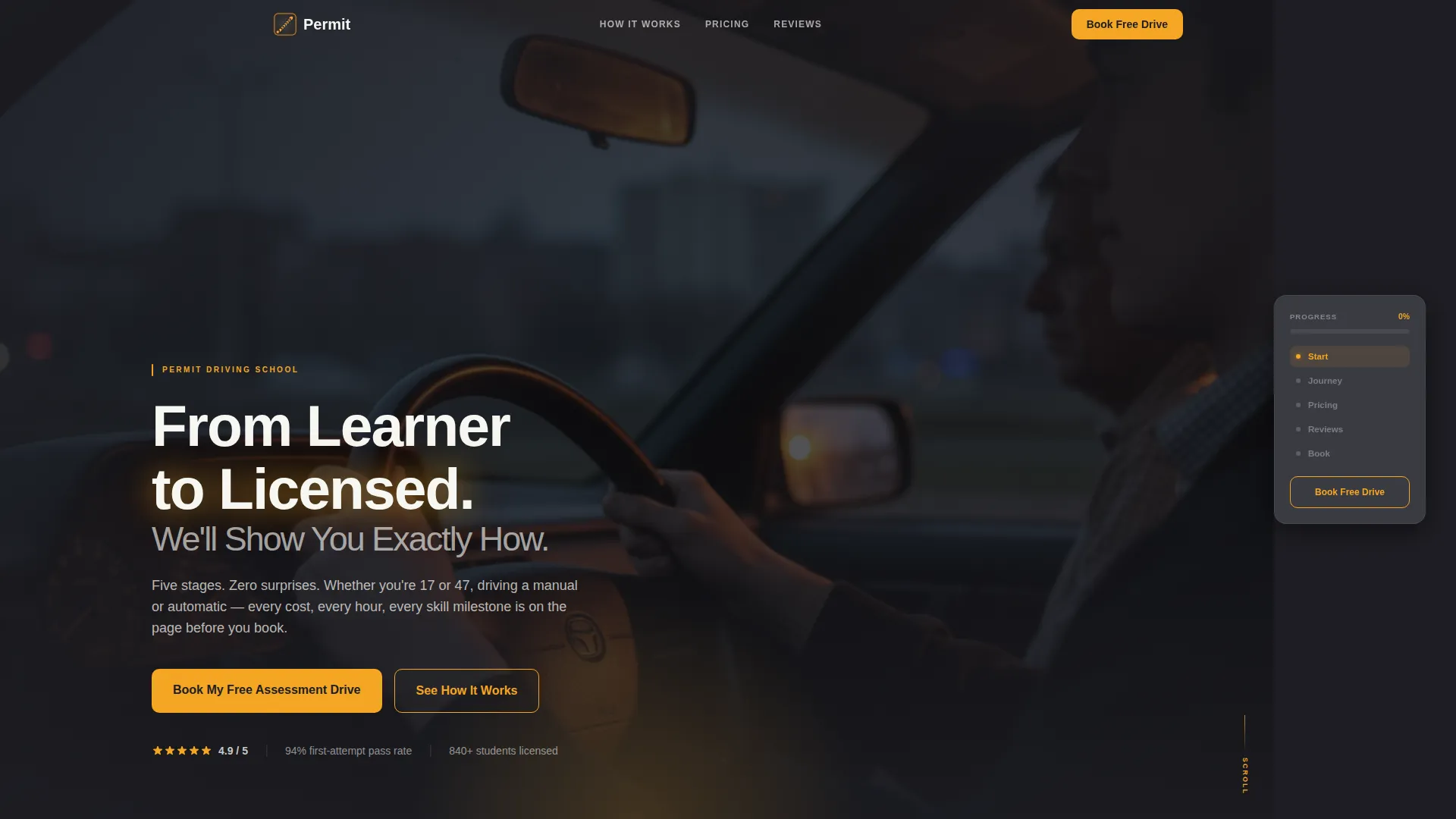
The header uses a dark, full-bleed photograph shot from inside a car at twilight. A learner's hands rest at ten-and-two, the dashboard glows amber, and an instructor's calm silhouette sits at the periphery. Amber glow traces the headline text, making the emotional tone unmistakable from the first second on the page.
Transparent Lesson Roadmap
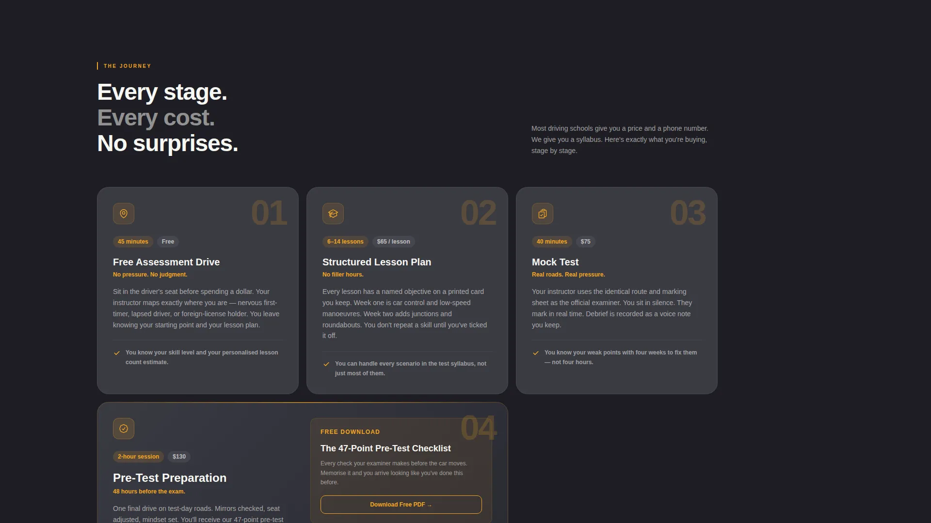
A numbered scroll section walks visitors through every stage of the learning journey: booking, assessment drive, structured lesson plan, mock test, and test-day preparation. Each stage names what happens, how long it takes, what it costs, and what the student will be able to do by the end.
Sticky Sidebar with Progress Bar
A dashboard-gray sidebar stays fixed as the visitor scrolls. It contains the primary call to action and an amber-filled progress bar that advances through the lesson stages. Once the visitor passes the pricing section, the call to action button shifts from ghost-outlined to solid amber, signaling that intent is at its highest.
Honest Pricing Comparison Table
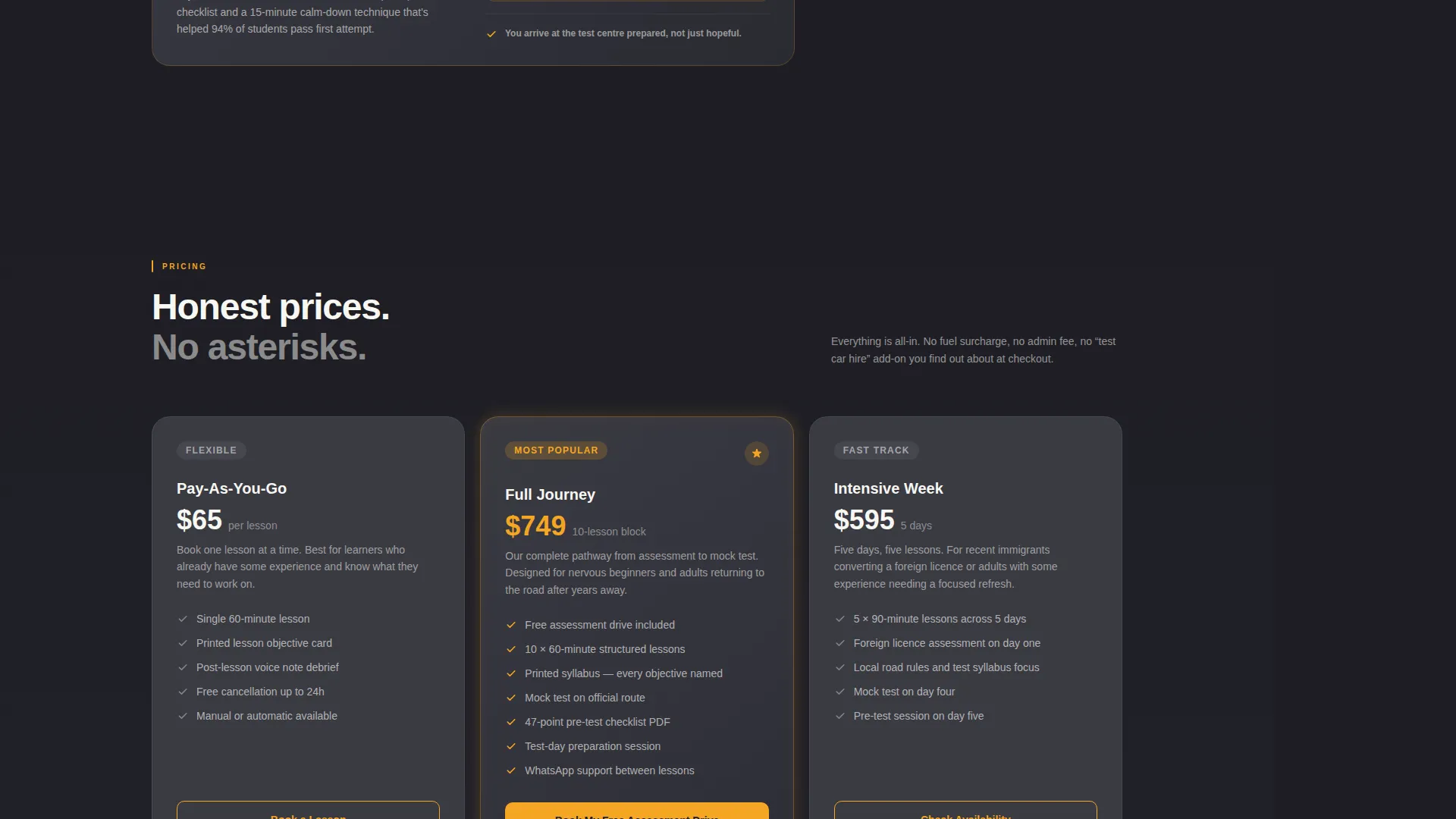
Pricing is presented mid-page inside a clean comparison table. Nothing is buried or vague. Visitors can read exactly what each package includes before they decide whether to book.
Voice-Note Style Testimonials
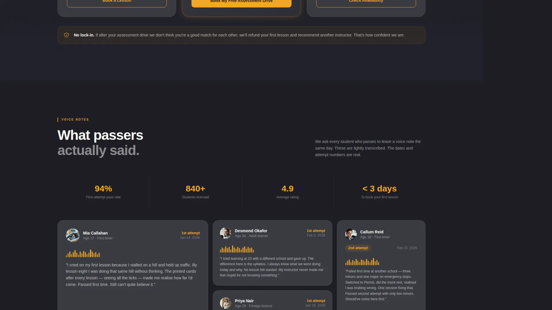
Testimonials are formatted as short transcripts from recent test passers. Each one is timestamped with the student's test date and attempt number, making the social proof feel real and specific rather than polished and generic.
Dual Conversion Path Design
The primary path is a three-field booking form: first name, phone number, and a single manual-or-automatic toggle. The secondary path offers a downloadable checklist titled "The 47-Point Pre-Test Checklist," gated behind an email field for visitors who want more before they commit.
Page sections overview
| Section | Purpose |
|---|---|
| Twilight Hero Header | Sets emotional tone and introduces the headline offer |
| Sticky Progress Sidebar | Tracks scroll position and keeps the call to action visible throughout |
| Lesson Stage Roadmap | Breaks the learning journey into clear, costed, timed stages |
| Pricing Comparison Table | Presents package options honestly mid-page |
| Voice-Note Testimonials | Builds trust with timestamped, real-sounding student quotes |
| Primary Booking Form | Captures name, phone, and lesson preference in three fields |
| PDF Checklist Gate | Offers a secondary opt-in for visitors not ready to book |
| Page-Close call to action | Repeats the booking prompt at full commitment momentum |
Design & branding system
The color system is built around the feeling of driving at dusk. Deep charcoal dominates backgrounds and text blocks, amber marks every interactive and progress element, and headlight white gives body copy room to breathe against darker frames.
- Deep asphalt charcoal (#1E1E24) for backgrounds; dashboard gray (#3A3A42) for the sticky sidebar panel
- Warm amber signal (#F5A623) for all calls to action, progress indicators, and interactive highlights
- Headlight white (#F7F7F2) for body copy, keeping text legible against dark containers
Mobile & speed optimization
The layout is structured to adapt cleanly to smaller screens. The sticky sidebar behavior is built into the template, and the scroll-triggered call to action state change functions as part of the page's native design.
- Sidebar and roadmap sections are designed to reflow logically on narrower viewports
- The booking form's three-field sequence keeps friction low on touchscreens
- Dark backgrounds and minimal image-heavy sections help the page feel fast and focused
How this template helps you convert
The page is built on the principle that a skeptical visitor converts only after they feel informed. Every layout decision serves that goal.
- The roadmap removes uncertainty by showing every stage of the journey with timing and cost before the form appears, so the visitor feels prepared rather than pressured.
- The sidebar call to action stays visible throughout the scroll and changes state at the exact moment intent is highest, reducing the gap between decision and action.
- The secondary PDF opt-in captures leads from visitors who are not yet ready to book, turning hesitation into a recoverable conversion rather than a lost click.
Other information about this template
This template was designed specifically for the driving school marketing niche, where Facebook ad traffic tends to arrive with high awareness but low commitment. The Educational Guide theme and Transparent Process creative direction work together to position the school as a trustworthy, organized authority.
- Template style: Sidebar Companion layout with a fixed progress panel
- Theme: Educational Guide, structured around a clear course-style visual language
- Creative direction: Transparent Process, with every stage of the lesson journey made explicit
- Header concept: Dark Full-Bleed with Amber Glow text treatment
- Landing page direction: Lead Generation, optimized for Facebook ad traffic landing sequences
- The dual call to action structure supports both high-intent visitors ready to book and lower-intent visitors who need more before committing
Theme
Educational Guide
Creative direction
Transparent Process
Color system
Charcoal & Amber
Style
Sidebar Companion
Direction
Lead Generation
Page Sections
Immersive Twilight Hero Header
Numbered Lesson Stage Roadmap
Sticky Sidebar with Progress Bar
Honest Mid-page Pricing Table
Voice-note Style Testimonials
Dual Conversion Path Design
Related questions
Who is this landing page template designed for?
What are the two ways a visitor can convert on this page?
How does the sticky sidebar work?
Can I customize the pricing table and lesson stages?
Does this template work for traffic sources other than Facebook ads?



