Driving School Emergency Session Landing Page Template
Permit is a precision-built landing page template for driving schools that offer post-test emergency recovery sessions. It speaks directly to failed candidates and frustrated parents, guiding them toward a booking with calm authority. The single-column layout, plum and amber palette, and click-through structure turn hesitation into action without a single wasted word.
by Rocket studio
Quick summary
Permit is a single-column, click-through landing page built for driving schools that specialise in emergency recovery sessions after a failed test. The design commands immediate trust through a Corporate Precision visual identity, an authority wall of institutional logos, and a three-step process timeline. Every element points the visitor toward one action: booking a session.
Who this template is for
This template is built for driving school operators who offer targeted, post-failure intervention rather than standard lesson packages. If your service is fast, specific, and results-focused, this page speaks your language.
- Driving schools dispatching certified instructors within 48 hours of a failed test
- Instructors targeting 17-year-olds, parents managing costs, and international licence holders struggling with UK road protocol
- Driving school marketers who need a high-trust, low-friction click-through page that connects directly to a booking calendar
What problem this template solves
After a failed driving test, candidates and their families feel deflated and financially stretched. They do not need a brochure. They need a calm, credible voice that says exactly what happens next. Most driving school pages fail this moment with generic copy and cluttered layouts.
- There is no focused page that speaks to post-failure urgency without sounding desperate or salesy
- Visitors abandon when they face a long form, a generic homepage, or unclear next steps
- Trust collapses when a page cannot demonstrate institutional credibility quickly
What you get with this template
You get a fully structured, single-column landing page designed to convert a distressed visitor into a booked session. Every section has a clear role, and nothing is decorative without purpose.
- A half-page header combining left-aligned headline copy with a passenger-seat photograph framing the instructor's authority
- A horizontal logo wall showing test centre logos, examiner association badges, DVSA approval marks, and insurance partner crests in plum-toned monochromes
- A three-step process timeline, a live student pass counter, and a pinned mobile call-to-action button connecting directly to a 72-hour booking calendar
Feature list
This section covers the core template capabilities as built in the source brief.
Half-Page Header with Split Composition
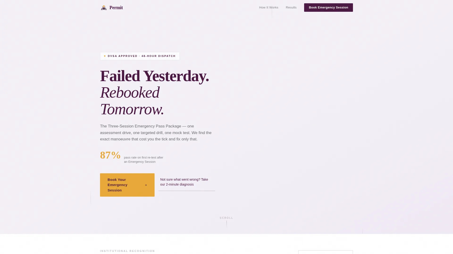
The header divides into two intentional halves. Left-aligned headline text sits over a pale lavender wash, with a subline naming the three-session emergency pass package and the current pass rate in bold amber. The right half holds a photograph taken from the passenger seat, showing an instructor's clipboard and the test centre through the windshield in soft focus.
Plum Executive Colour System
The palette is purposeful and controlled. Deep plum (#4A1942) anchors key section backgrounds. Charcoal boardroom gray (#2D2D2D) carries body text. Muted silver (#C0B8C9) marks dividers and secondary elements. Decisive amber (#E8A838) is reserved exclusively for calls to action and pass-rate statistics, making every important number and button unmissable.
Logo Wall Authority Section
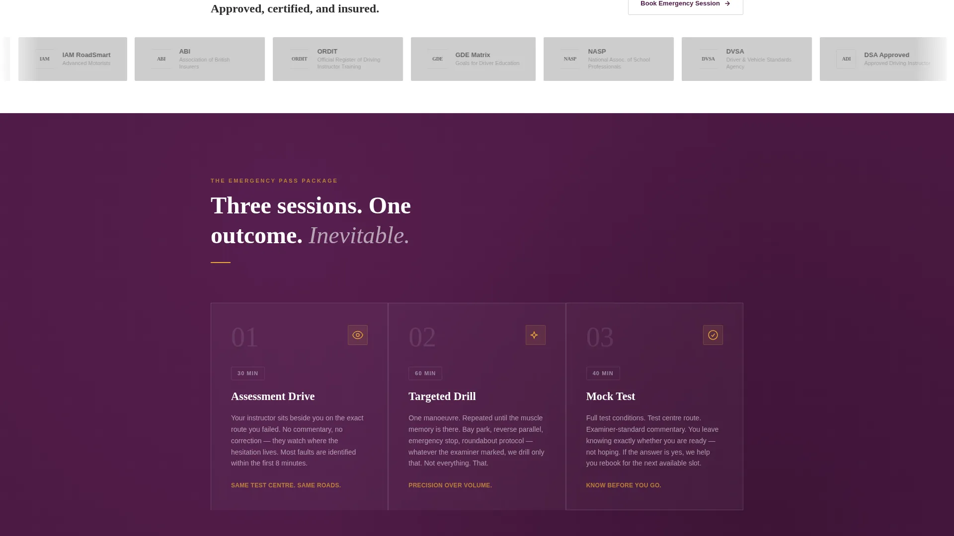
A horizontal scroll of institutional marks builds trust before the visitor reaches the offer. Test centre logos, driving examiner association badges, DVSA approval marks, and insurance partner crests are rendered in plum-toned monochromes so the wall feels curated, not cluttered.
Three-Step Process Timeline
The assessment drive, targeted drill, and mock test are laid out in a sequential timeline that makes the recovery process feel inevitable rather than hopeful. Visitors understand exactly what the next sixty minutes will look like before they ever click a button.
Live Pass Counter with Social Proof
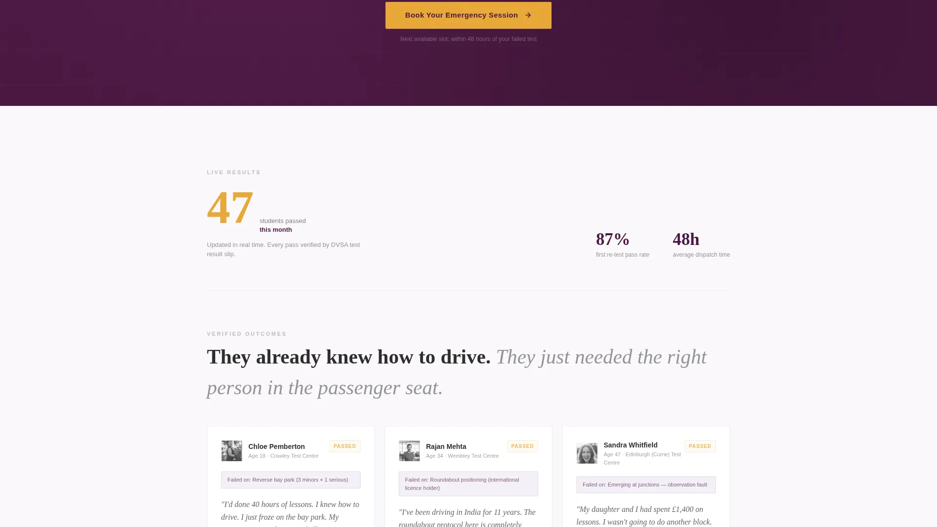
A live counter showing students passed this month adds numerical weight to the page's credibility. It sits between the process timeline and the final call to action, reinforcing confidence at the precise moment the visitor is ready to decide.
Pinned Mobile Call-to-Action
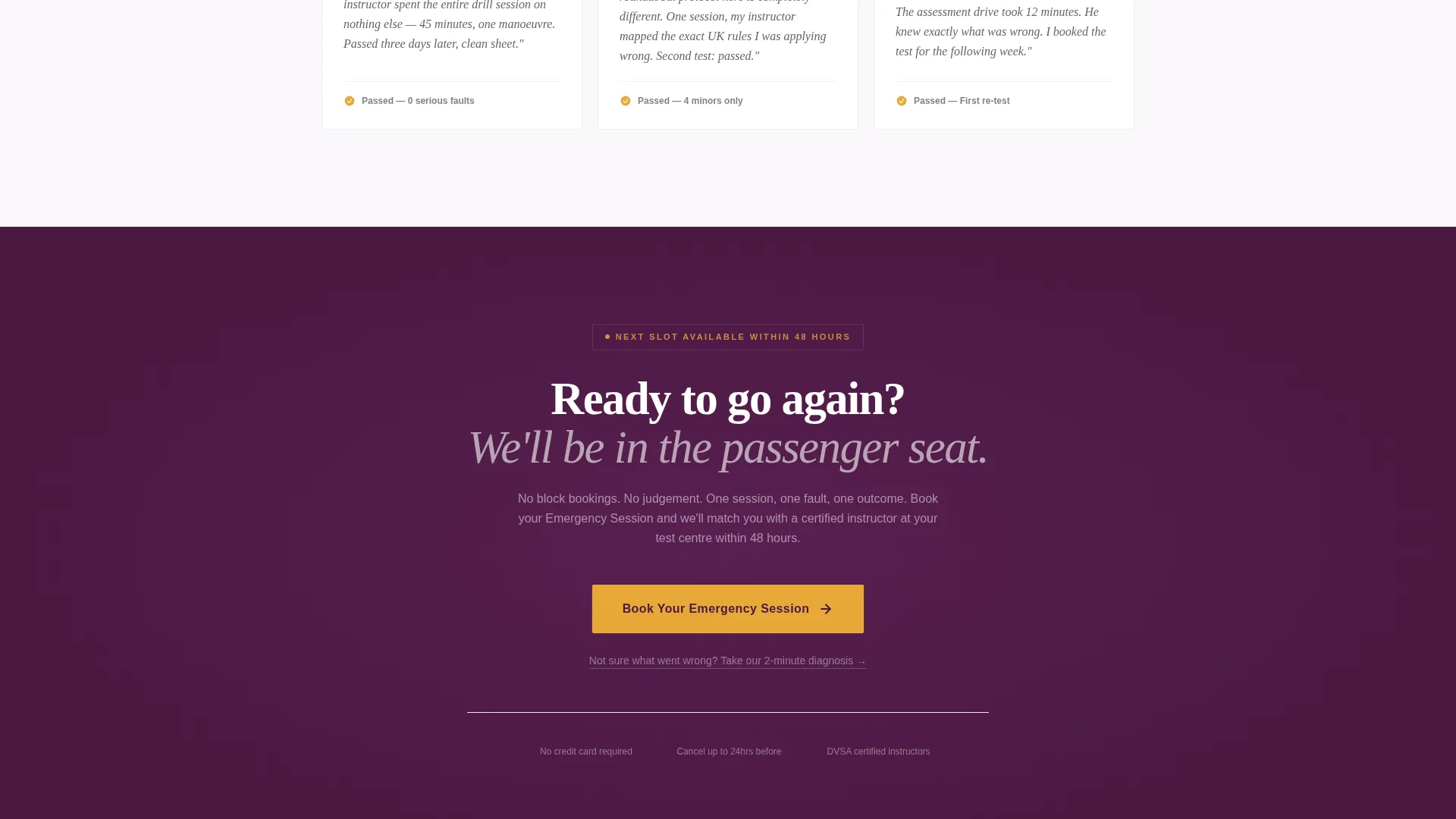
On mobile, the primary call-to-action button stays fixed to the bottom of the viewport at all times. A secondary text link, reading "Not sure what went wrong? Take our 2-minute diagnosis", catches hesitant visitors and routes them through a short quiz that ends at the same booking page.
Page sections overview
| Section | Purpose |
|---|---|
| Header composition | Establishes authority and urgency with headline, pass-rate stat, and instructor photograph |
| Logo wall authority | Builds institutional trust through desaturated credential marks |
| Three-step timeline | Makes the recovery process feel structured, specific, and achievable |
| Live pass counter | Adds real-time social proof with a monthly student pass statistic |
| Primary call to action block | Drives the click to the 72-hour booking calendar after each trust layer |
| Secondary diagnosis link | Catches hesitant visitors with a quiz routed to the same booking destination |
| Pinned mobile button | Keeps the booking action visible at all times on smaller screens |
Design & branding system
The visual identity follows a Corporate Precision theme. The palette is drawn from the idea of a well-maintained executive vehicle interior: controlled, serious, and quietly reassuring.
- Deep plum (#4A1942) as the primary section background, pale lavender (#F4F0F7) for the header wash, and amber (#E8A838) reserved strictly for calls to action and statistics
- Charcoal gray (#2D2D2D) for body text legibility, muted silver (#C0B8C9) for dividers and secondary elements, and plum-toned monochromes for logo wall imagery
- Generous whitespace between sections keeps the single-column layout readable and focused, pulling the eye downward like a confident, well-structured letter
Mobile & speed optimization
The template is built with mobile visitors in mind. A failed-test candidate checking their phone in a car park is the exact user this layout serves.
- The pinned call-to-action button stays fixed at the bottom of the mobile viewport so the booking action is always one tap away
- The single-column flow removes horizontal complexity, making every section stack cleanly on smaller screens without losing hierarchy or impact
- Generous whitespace and a disciplined type scale keep the layout readable at any screen size without crowding key statistics or process steps
How this template helps you convert
Every design and copy decision in this template is engineered to remove friction between a distressed visitor and a confirmed booking.
- The amber pass-rate statistic in the header delivers a credibility hook in the first five seconds, before the visitor has scrolled a single pixel
- The authority wall, timeline, and live counter build a layered trust case as the visitor scrolls, so the booking click feels earned rather than pressured
- The absence of a form on the page removes the biggest friction point; the click lands directly on a scheduling tool pre-filtered to the next 72 hours of availability
Other information about this template
This template is categorised under Professional Services and sits within the Driving School Marketing subcategory. It is specifically designed for the Driving School Emergency Service Page niche and carries an intersection match score of 13 across all context fields.
- The template style is Single Column Flow, the landing page direction is Click-Through, and the creative direction is Logo Wall Authority
- The header concept is Half-Page Photo and Text, aligning the Corporate Precision theme with an emotionally resonant entry point for post-failure visitors
- This page never uses the phrase "learn to drive"; all copy assumes the visitor already has driving ability and simply needs targeted, expert intervention
Theme
Corporate Precision
Creative direction
Logo Wall Authority
Color system
Plum Executive
Style
Single Column Flow
Direction
Click-Through
Page Sections
Half-page Split Header Layout
Plum Executive Colour System
Logo Wall Authority Section
Three-step Process Timeline
Live Student Pass Counter
Pinned Mobile Booking Button
Related questions
Is this a single-page template or a multi-page website?
Does the template include a contact form?
Who is this landing page template built for?
Can I edit the colours, statistics, and headline copy?
Where does the primary call-to-action button link?



