Pet Care Marketing & Agency Portfolio Website Template
Petwise is a masonry-style landing page template built for pet care pay-per-click agencies. It combines a full-bleed photo header, gallery-walk case study cards, and a frosted-glass sticky lead capture bar. The Tech Glass visual theme keeps results front and center, while a gated playbook flow turns curious visitors into qualified leads.
by Rocket studio
Quick summary
Petwise is a high-converting pay-per-click agency landing page template designed exclusively for the pet industry. It uses a masonry card layout to display case studies like a curated exhibition, pairs clean Cloud Canvas colors with a Tech Glass aesthetic, and leads visitors toward a downloadable Pet PPC Playbook through a smart two-path conversion flow.
Who this template is for
This template is built for performance marketing agencies and freelancers who run paid advertising campaigns for pet brands. If your clients judge every campaign by return on ad spend (ROAS) or customer acquisition cost (CAC), this template speaks their language from the first scroll.
- Pay-per-click agencies specializing in the pet care vertical
- Performance marketers working with direct-to-consumer pet food brands, veterinary chains, or pet subscription box operators
- Agency founders who want a polished portfolio page that leads with data before pitching services
What problem this template solves
Most agency landing pages lead with services. Pet brand founders and marketing directors do not want a list of services, they want proof. This template solves the credibility gap by leading with results, letting the data do the persuading before any sales copy appears.
- Agencies struggle to show proof of performance in a visually compelling way without building a custom site
- Generic agency templates do not speak to niche verticals like pet food, veterinary growth, or subscription commerce
- Standard lead forms feel abrupt; this template warms visitors with ungated case study previews before asking for contact details
What you get with this template
You get a fully structured, single-page layout ready to showcase pet industry ad results and capture qualified leads. Every section is purpose-built around the Gallery Walk creative direction, so the page functions as both a portfolio and a lead generation tool.
- A full-bleed photo header with a headline overlay and a masonry case study grid that deepens from results into methodology
- A frosted-glass sticky lead capture bar that appears after the third tile row, offering a downloadable Pet PPC Playbook in exchange for an email, industry vertical, and monthly ad spend range
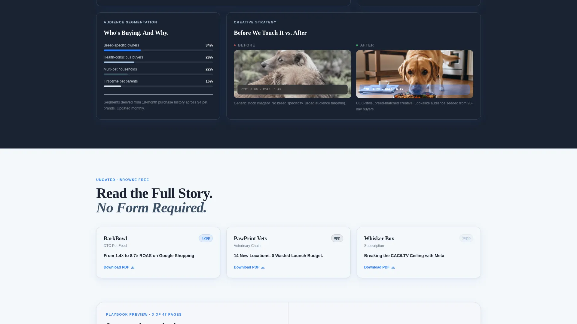
- Ungated individual case study PDF links that build trust before the gated form appears, plus three redacted playbook preview pages that make the full download irresistible
Feature list
This section walks through the core built-in components that make Petwise work as a conversion-focused agency landing page.
Full-Bleed Photo Header with Headline Overlay
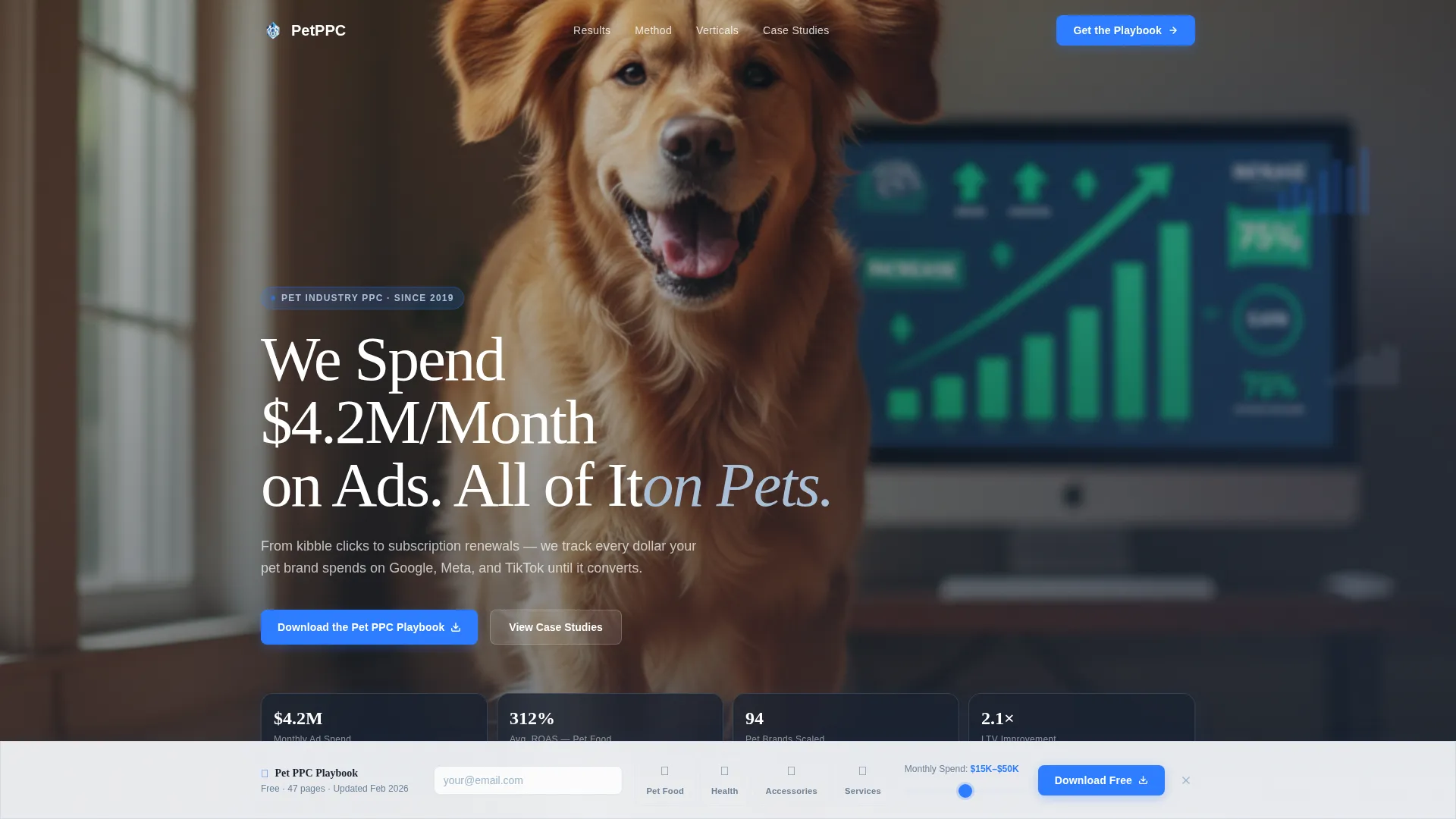
The header uses a shallow depth-of-field hero image featuring a golden retriever against a softly blurred analytics dashboard backdrop. A single fade-in headline reads: "We Spend $4.2M/Month on Ads. All of It on Pets." The juxtaposition of warmth and data sets the agency's authority immediately.
Masonry Case Study Grid
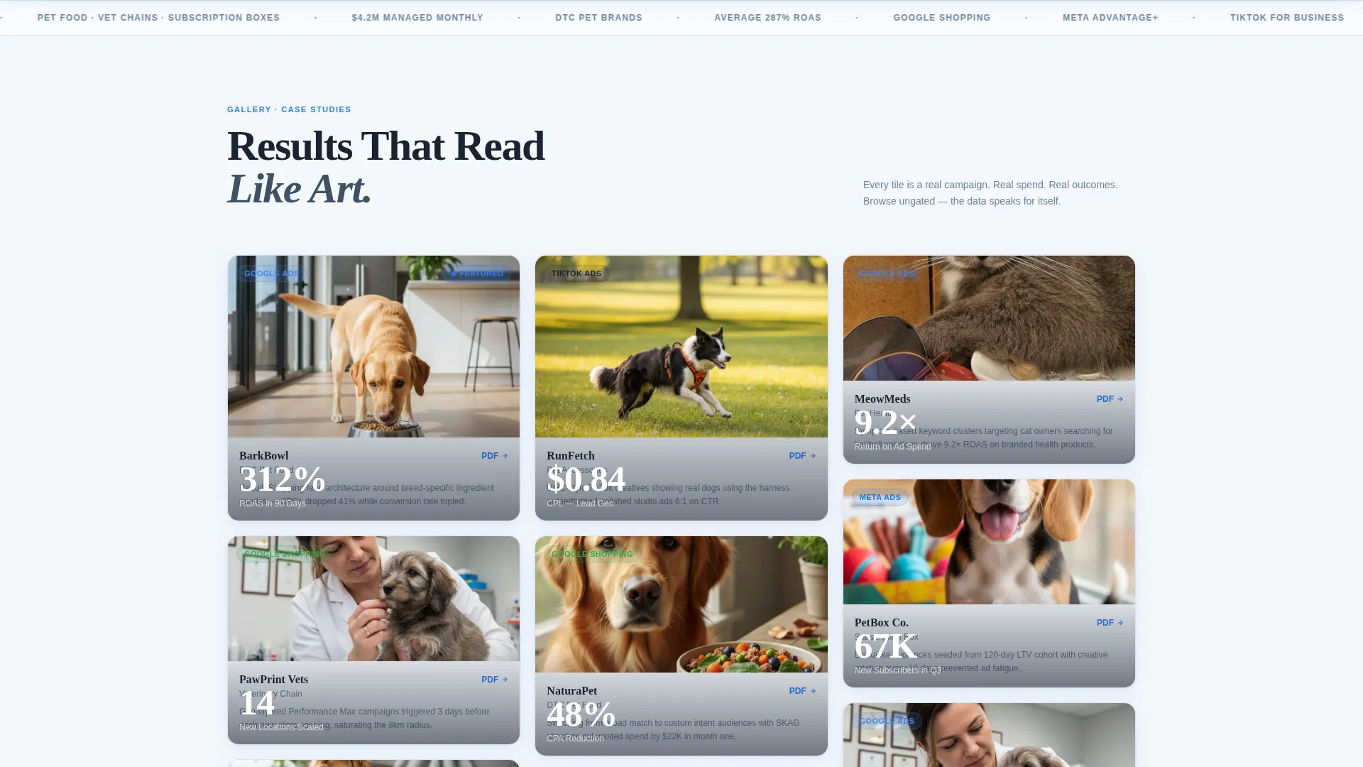
Cards are arranged in a Pinterest-style masonry layout with variable heights and widths. Tall portrait tiles highlight flagship wins. Square tiles break down platform-specific results for Google Shopping, Meta, and TikTok. Wide tiles host before-and-after ad creative comparisons. Each card shows a brand logo, a hero product image, one knockout metric, and a one-sentence strategy note.
Frosted-Glass Sticky Lead Bar
After the visitor passes the third tile row, a frosted-glass sticky bar slides in from the bottom. It presents the primary call to action: "Download the Pet PPC Playbook." The three-step form captures email first, then pet industry vertical via an icon selector, and finally monthly ad spend range through a slider input.
Dual Conversion Path Design
Alongside the gated playbook, ungated case study PDF links are available throughout the grid. This two-path approach lets hesitant visitors explore proof points freely. The trust built through ungated content makes the gated form feel like a natural next step rather than a barrier.
Redacted Playbook Preview
Three partially blurred playbook pages are shown inline before the download gate. Enough data is visible to communicate value. The blurred sections create genuine curiosity, making the full download feel earned rather than arbitrary.
Deepening Gallery Rows
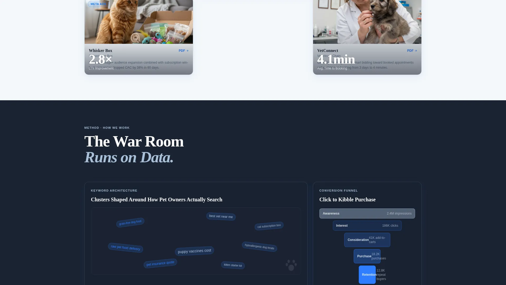
As the visitor scrolls, the grid evolves from results into method. Later rows introduce audience segmentation maps, keyword cluster visuals styled as paw print shapes, and funnel diagrams. Each new row feels like stepping into a deeper room of the exhibition, rewarding continued engagement.
Page sections overview
| Section | Purpose |
|---|---|
| Full-Bleed Header | Establish authority with a bold visual and headline |
| Headline Overlay | Deliver the core proof statement immediately |
| Opening Tile Row | Showcase top-performing case study results |
| Platform Breakdown Tiles | Break down results by Google Shopping, Meta, TikTok |
| Before/After Tile | Compare ad creative performance visually |
| Sticky Lead Bar | Capture leads with the playbook download offer |
| Methodology Rows | Reveal audience maps, keyword clusters, funnel diagrams |
| Playbook Preview | Show redacted pages to drive download intent |
| Ungated PDF Links | Build trust through freely accessible case studies |
Design & branding system
The template follows a Tech Glass visual theme using the Cloud Canvas color system. The palette is cool, light, and precise, every card appears to hover just above the surface, making the data feel as clean as the design.
- Colors: soft vapor white (#F4F7FA) for backgrounds, frosted panel gray (#DFE6ED) for card surfaces, translucent sky (#A8C0D8) for accents, and signal blue (#2E7DFF) for buttons and metric highlights
- Cards use frosted-glass panel styling with subtle translucency, variable masonry sizing, and luminous framing that gives each result its own visual weight
- The overall feel is like a freshly wiped retina display reflecting an overcast sky, cool, weightless, and impossible to ignore
Mobile & speed optimization
The masonry layout is designed to reflow cleanly on smaller screens without losing the gallery aesthetic. The sticky lead bar adapts to mobile viewports so the call to action remains accessible throughout the scroll.
- Masonry columns reduce gracefully from a multi-column desktop grid to a single-column mobile stack
- The sticky lead bar remains anchored at the bottom of the viewport on mobile, keeping the playbook offer visible without obscuring content
- Card images and metric badges are sized to stay legible and impactful at every screen width
How this template helps you convert
The conversion strategy is layered deliberately. Visitors move through trust, proof, and desire before they ever see a form field.
- The full-bleed header and knockout metric cards establish credibility immediately, so the visitor arrives at the lead form already convinced of the agency's performance record.
- The ungated PDF case studies lower the barrier to engagement, letting skeptical visitors sample results freely before committing their email address.
- The redacted playbook preview creates visible tension, enough data to confirm value, but enough blur to make the download feel necessary.
Other information about this template
This template is built for a specific kind of agency page: one where the portfolio is the pitch. It suits teams who have real results to show and want a layout that treats those results as the hero of every section.
- The template style is Masonry/Pinterest, suited to agencies with multiple client wins across different pet care verticals
- The landing page direction is Content/Resource, meaning the primary conversion goal is a lead magnet download rather than a direct service inquiry
- The header concept is Full-Bleed Photo, pairing emotional pet imagery with performance data to signal the agency's dual fluency in brand and growth marketing
- The creative direction is Gallery Walk, which means the scroll journey is curated like an exhibition rather than a typical agency page
Theme
Tech Glass
Creative direction
Gallery Walk
Color system
Cloud Canvas
Style
Masonry/Pinterest
Direction
Content/Resource
Page Sections
Full-bleed Photo Header with Overlay
Masonry Case Study Grid
Frosted-glass Sticky Lead Bar
Dual Conversion Path
Redacted Playbook Preview
Deepening Gallery Methodology Rows
Related questions
Can I customize the case study cards with my own client results?
Does the playbook lead form work out of the box?
Can I use this template if I serve multiple pet care verticals?
Is the ungated case study path easy to set up?
How many case study cards can the template support?



