Mining Landing Page Template | Card Grid Spec Comparison
Phosphate is a card grid landing page template built for open-pit phosphate mining operations targeting industrial buyers. It leads with a geological cross-section infographic, then builds a modular comparison grid that stacks purchasing evidence card by card. Two conversion paths capture both ready buyers and early-stage researchers, making every visit count.
by Rocket studio
Quick summary
Phosphate is a single-page, card grid template designed for a phosphate mining operation selling to agrochemical procurement teams and fertilizer manufacturers. A vector-rendered geological infographic anchors the top of the page, and a modular comparison grid accumulates spec-by-spec evidence below it. Two targeted conversion paths move visitors from curiosity to qualified inquiry.
Who this template is for
This template is built for B2B mining operations that sell processed phosphate rock into fertilizer, feed, and industrial supply chains. It works best when the buyer audience is technical and data-driven, comparing multiple suppliers on measurable quality criteria.
- Agrochemical procurement directors evaluating bone phosphate of lime (BPL) grade and cadmium limits across competing suppliers
- Fertilizer blenders sourcing consistent particle size distributions for granulation production lines
- Sovereign food-security agencies negotiating long-term offtake contracts with verifiable quality assurances
What problem this template solves
Industrial phosphate buyers do not trust vague supplier claims. They need specific numbers, transparent comparisons, and a clear reason to request a formal assay before committing to a conversation. Most supplier pages bury the data or skip it entirely, leaving procurement teams searching elsewhere.
- Buyers cannot quickly compare a supplier's specifications against industry benchmarks on a single page
- Early-stage researchers need a low-friction way to access quality data without a full sales conversation
- Procurement teams require a structured, evidence-rich format that justifies supplier shortlisting
What you get with this template
You get a fully structured, single-page layout that moves a technical buyer from geological credibility through specification comparison to a gated conversion step. Every section is built from the source brief and reflects the actual purchasing logic of phosphate supply chains.
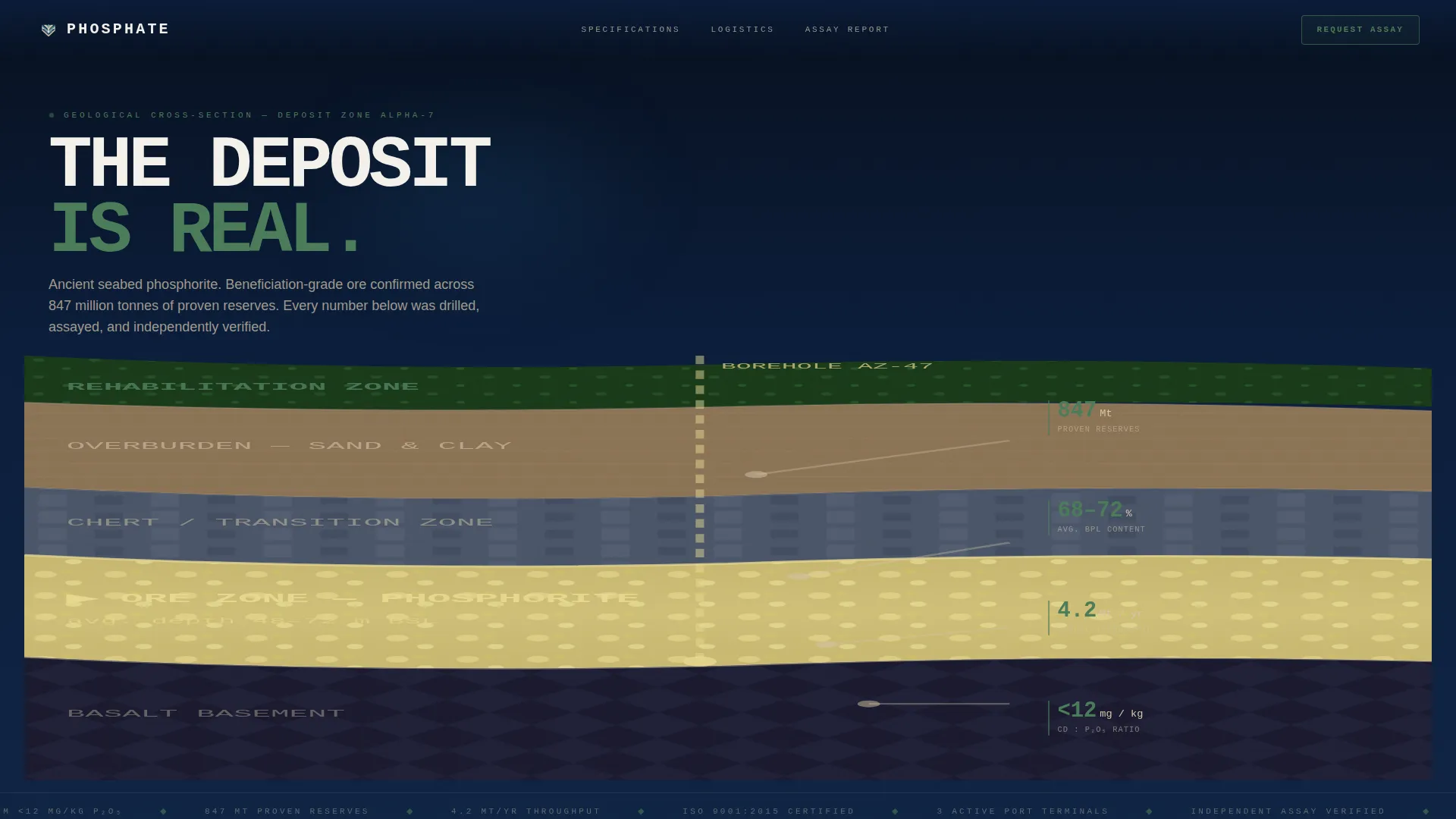
- A full-width animated geological cross-section header with live-style data callouts for reserves, BPL content, throughput, and cadmium ratios
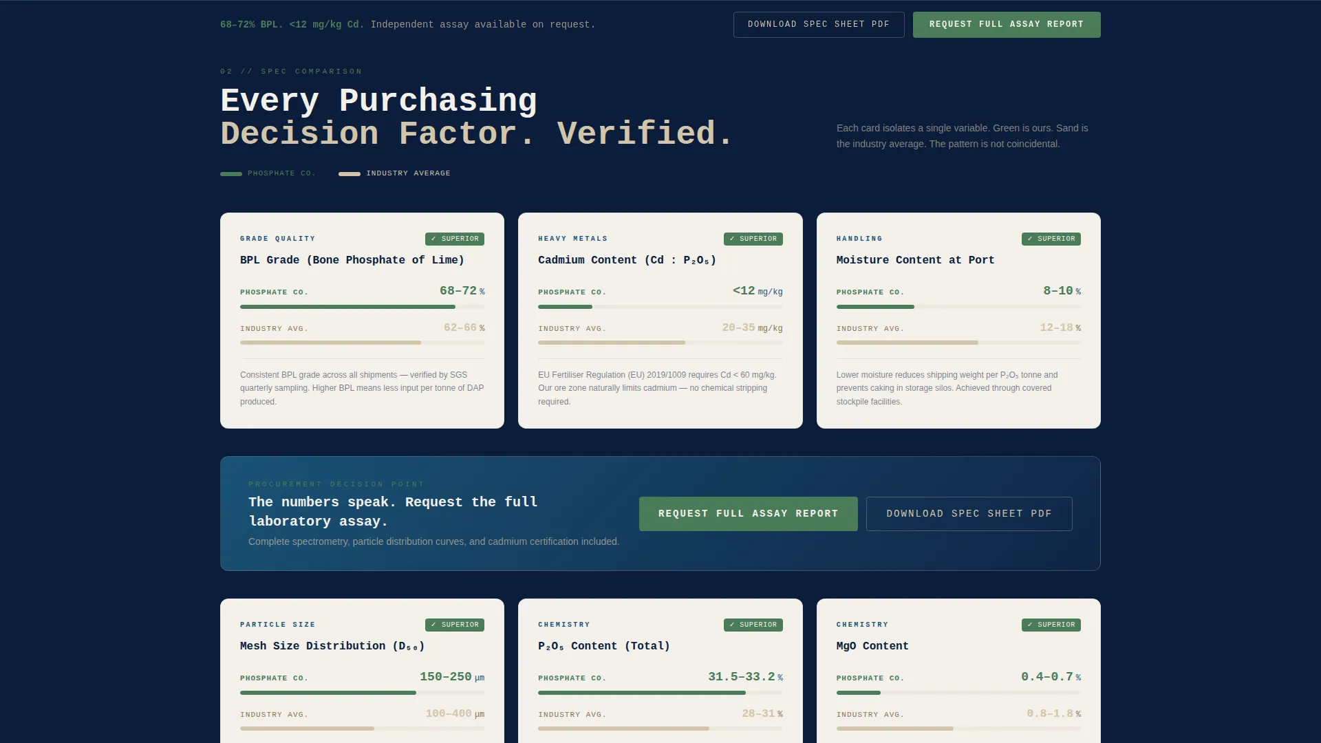
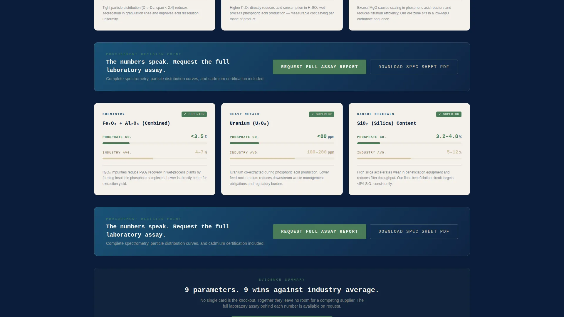
- A modular card grid where each card isolates one purchasing decision factor and shows a direct "Us versus. Industry Average" comparison
- Two conversion paths: a sticky "Request Our Full Assay Report" form and a lower-barrier "Download Spec Sheet PDF" email gate
Feature list
This template includes the following purpose-built components grounded in the source brief.
Animated Geological Cross-Section Header
The header renders a stylized vector cross-section of a phosphate deposit, showing geological strata from topsoil through overburden down to the ore zone. Animated data callouts rise from each layer, revealing proven reserves in million tonnes, average BPL content ranging from 68 to 72 percent, annual throughput capacity, and cadmium-to-phosphorus ratio. No stock photography is used; the geology itself functions as the hero visual.
Modular Specification Comparison Grid
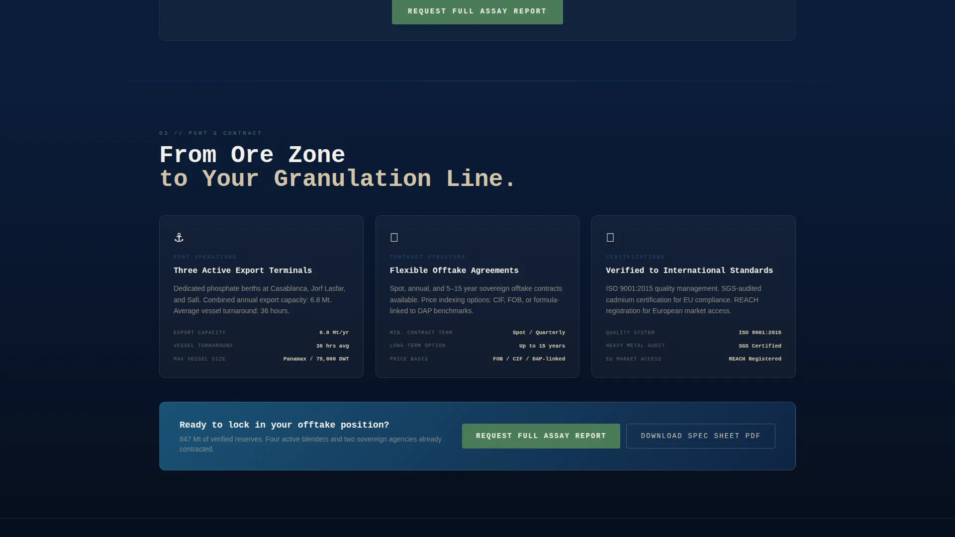
The core layout is a card grid where every card isolates a single purchasing decision factor. Each card displays the operation's figures in living-green alongside the industry average in overburden sand. Factors covered include BPL grade, particle size distribution, moisture content, heavy metal trace levels, port logistics, and contract flexibility.
Dual Conversion Path System
The primary conversion path uses a sticky bottom bar reading "Request Our Full Assay Report," repeated after every third row of cards. The form collects company name, annual tonnage requirement, end-use application via dropdown (DAP/MAP, SSP, animal feed, industrial), and a free-text field for specific quality thresholds. A secondary path offers a "Download Spec Sheet PDF" gated behind an email address only, capturing researchers not yet ready to discuss volume.
Evidence Wall Scroll Structure
The page is designed so that each additional comparison card adds cumulative weight. No single card is the decisive argument; together, the accumulated specifications leave no room for a competing supplier to appear more transparent. The scroll structure rewards patience and matches how procurement teams actually evaluate suppliers.
Navy Authority Color System
The palette uses deep deposit navy (#0B1D3A) as the dominant background, beneficiation-plant teal (#1A5276) for structural contrast, overburden sand (#D4C5A9) for benchmark figures, phosphogypsum white (#F4F1EB) for card surfaces, and living-green (#4A7C59) reserved exclusively for the operation's winning figures and positive differentials. The overall effect mirrors a satellite view of a reclaimed mine site.
Page sections overview
| Section | Purpose |
|---|---|
| Geological Header Infographic | Establishes credibility with animated deposit data callouts |
| BPL Grade Card | Compares bone phosphate of lime content against industry average |
| Particle Size Card | Shows mesh distribution relevant to granulation line buyers |
| Moisture Content Card | Displays moisture figures versus benchmark for processing reliability |
| Heavy Metals Card | Highlights cadmium and trace metal limits against industry norms |
| Port Logistics Card | Covers shipping, loading rates, and supply chain reliability factors |
| Contract Flexibility Card | Outlines offtake term options versus standard industry offerings |
| Primary call to action Bar (Sticky) | Persistent "Request Our Full Assay Report" form at bottom of viewport |
| Repeated call to action Rows | Full assay request form reinserted after every third card row |
| Secondary Email Gate | "Download Spec Sheet PDF" low-friction capture for early researchers |
Design & branding system
The visual identity follows a Nature-Inspired theme built on a Navy Authority color system. The palette is drawn directly from the visual language of open-pit mining and ecological rehabilitation, giving the page a grounded, authoritative feel that resonates with industrial buyers.
- Core colors: deep deposit navy (#0B1D3A), beneficiation-plant teal (#1A5276), overburden sand (#D4C5A9), phosphogypsum white (#F4F1EB), and living-green accent (#4A7C59)
- Card surfaces use phosphogypsum white to keep specification data clean and legible against the dark structural palette
- Living-green is used exclusively for the operation's figures and positive comparison outcomes, creating an immediate visual hierarchy that guides the buyer's eye
Mobile & speed optimization
The card grid layout adapts to narrower viewports without losing the comparison logic that makes each card meaningful. Sticky conversion elements remain accessible on mobile screens, preserving both conversion paths regardless of device.
- Modular card grid reflows cleanly for tablet and mobile screen widths without breaking the "Us versus. Industry Average" layout
- The sticky bottom conversion bar remains fixed and accessible on mobile, so the primary call to action is never out of reach
- The vector-based geological header avoids heavy image files, keeping the infographic sharp and load-friendly on all devices
How this template helps you convert
The page is built around a Comparison/Versus conversion strategy. Every design and layout decision is aimed at moving a skeptical procurement director from passive browsing to active inquiry.
- The animated geological header leads with verifiable reserve and quality data, establishing supplier credibility before any marketing claim is made, so buyers arrive at the comparison grid already primed to trust the numbers.
- The modular card grid accumulates specification evidence across BPL grade, particle size, moisture, heavy metals, logistics, and contract terms, making it increasingly difficult for a buyer to justify choosing a less transparent supplier.
- Two conversion paths are calibrated to different stages of the buying cycle: the email gate captures early researchers with a low-friction PDF download, while the full assay request form qualifies buyers who are ready to commit to a volume conversation.
Other information about this template
This template was built at the intersection of the Mining and Natural Resources category, the Mineral and Ore Mining subcategory, and the Phosphate Mining niche. It is designed specifically for a single-page, section-led flow.
- The Spec Sheet creative direction means the template prioritizes data density and side-by-side comparison over narrative storytelling
- The Infographic header concept is a deliberate departure from photography-based hero sections common in commodity supplier pages
- The template style is Card Grid (Modular), which allows individual specification panels to be added, removed, or reordered without breaking the overall layout
- The Nature-Inspired theme combined with the Navy Authority color system positions the brand as both technically rigorous and environmentally aware, which aligns with sovereign and institutional buyer expectations
- The intersection match score of 13 reflects a tightly aligned combination of theme, creative direction, color system, template style, landing page direction, and header concept, all drawn from the same source brief
Theme
Nature-Inspired
Creative direction
Spec Sheet
Color system
Navy Authority
Style
Card Grid (Modular)
Direction
Comparison/Versus
Page Sections
Animated Geological Cross-section Header
Modular Specification Comparison Grid
Dual Conversion Path System
Evidence Wall Scroll Structure
Navy Authority Color System
Related questions
Who is this landing page template designed for?
Can I adjust which specification factors appear in the card grid?
What are the two conversion paths included in this template?
Does the header use photography or stock imagery?
What information does the assay request form collect?