Subscription Box Services Pre-Launch & Coming Soon Website Template
Piece is a gallery and detail landing page built for a puzzle subscription box. It combines a flash-deal countdown, flip-card tier gallery, and urgency-driven upgrade flow to turn browsing subscribers into paying ones. The Citrus Burst palette and Playful Geometric style make every scroll feel as satisfying as tipping a fresh puzzle onto a clean table.
by Rocket studio
Quick summary
Piece is a single-page upgrade experience for a puzzle subscription box. It leads with a ticking countdown, walks visitors through three subscription tiers via a flip-card gallery, and closes with a pinned "Upgrade My Box" call to action. Every design decision pushes toward one outcome: getting a subscriber to tap the next tier before the timer runs out.
Who this template is for
This template is built for subscription box brands that sell physical, experience-driven products. It works best when your audience already knows you and needs a reason to level up, not a reason to sign up from scratch.
- Puzzle and hobby subscription businesses running limited-time upgrade promotions
- Subscription box operators who want to show tier differences visually, not just in text
- Founders and marketers who need a ready-to-launch flash-deal page without custom development
What problem this template solves
Most subscription upgrade pages are flat. They list tier names and prices, but they never make the visitor feel what they are missing. A burnt-out millennial or a retired couple mid-puzzle marathon does not respond to a pricing table. They respond to seeing the wax-sealed mystery envelope they almost skipped.
- Visitors can not feel the difference between tiers, so they stay on their current plan
- Urgency is stated in words but never felt in layout, so the countdown means nothing
- The upgrade path requires too many clicks and too much commitment to feel worth it
What you get with this template
You get a complete flash-deal landing page structured around gallery cards, a live countdown, and a layered upgrade flow. Every component is tied to a specific persuasion job.
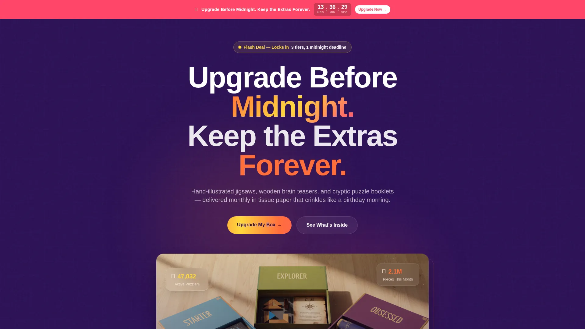
- A sticky geometric countdown bar fixed at the top of the page
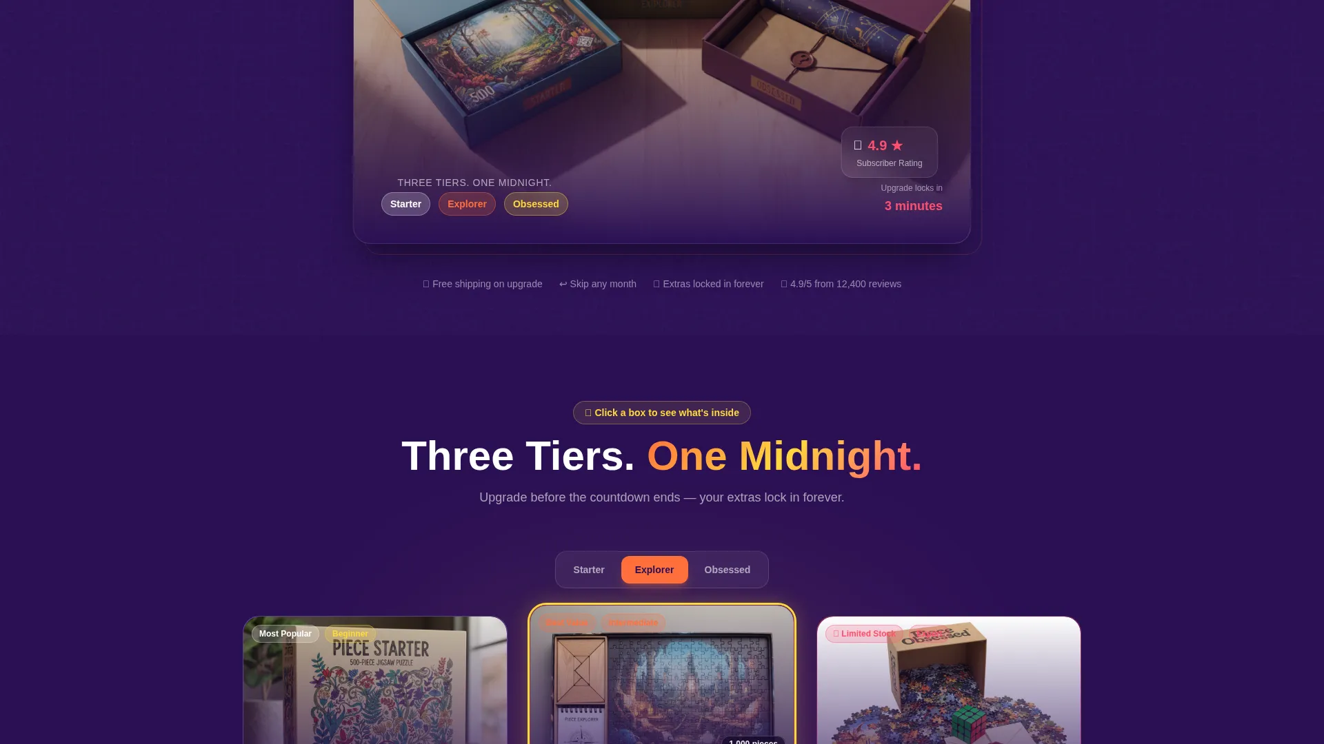
- Flip-card tier gallery with inside-the-box photography and difficulty badges per tier
- Social proof pulse strips and a floating upgrade bar that appears after the second scroll
Feature list
This section walks through the core built-in components that make the Piece template work as a conversion-focused upgrade page.
Sticky Countdown Timer Bar
A grapefruit-colored countdown bar locks to the top of the screen as the visitor scrolls. It displays hours, minutes, and seconds, and holds its position throughout the entire page experience. This keeps the deadline visible without interrupting content flow.
Flip-Card Tier Gallery
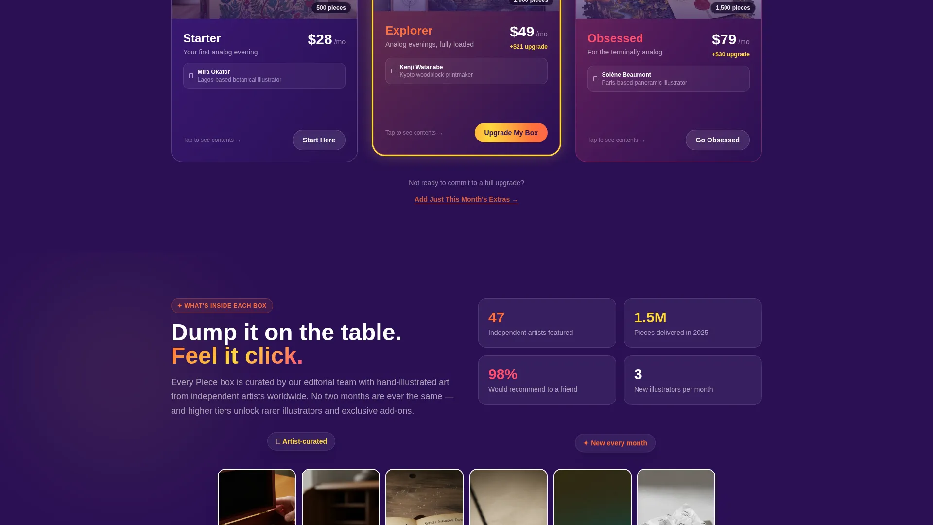
Each subscription tier is presented as a gallery card. Clicking or tapping a card flips it to reveal the detail panel: box contents, subscriber photos mid-solve, and a difficulty badge. The gallery escalates tier by tier, showing more pieces, rarer illustrators, and exclusive add-ons at higher levels.
Upgrade-Focused Call to Action System
The primary "Upgrade My Box" button appears in tangerine at the bottom of every tier card. It also reappears in a floating bar that pins to the screen after the visitor passes the second scroll section. Current subscribers see their active plan pre-selected with a single-tap toggle to the next tier.
Price Difference Highlight
Rather than showing the full price of the next tier, the template highlights only the price difference in lemon yellow. This framing makes the upgrade feel smaller and more approachable for subscribers who are already paying.
Social Proof Pulse Strips
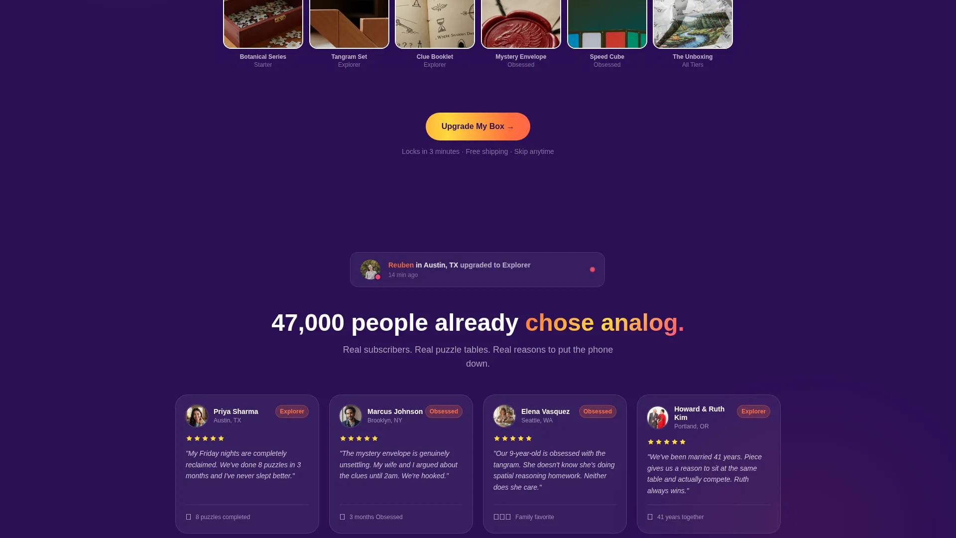
Between tier sections, timestamped social proof messages pulse on screen. These are short, real-feeling lines such as "Sarah in Portland upgraded 4 minutes ago." They create a sense of live activity and compress the decision window around the visitor.
Secondary Commitment-Shy Path
A secondary call to action offers "Add Just This Month's Extras" for visitors who are not ready to commit to a full tier change. This path captures revenue from hesitant subscribers without losing them entirely.
Page sections overview
| Section | Purpose |
|---|---|
| Sticky Countdown Bar | Keeps the deadline visible at all times |
| Bundle Deal Header | Shows all three tiers fanned open on a tabletop |
| Tier Gallery Row 1 | Introduces the Starter box with flip-card detail |
| Tier Gallery Row 2 | Presents the Explorer tier with added components |
| Tier Gallery Row 3 | Reveals the Obsessed tier with premium exclusives |
| Social Proof Strips | Pulses upgrade activity between gallery rows |
| Floating Upgrade Bar | Pins upgrade call to action after second scroll |
| Secondary Add-On Path | Offers a lower-commitment extras purchase |
Design & branding system
The Citrus Burst color system and Playful Geometric theme give this template a warm, tactile energy that matches the physical product. The palette feels like peeling a clementine in a bright kitchen: sticky, vivid, and immediately inviting.
- Deep aubergine (#2B1055) anchors backgrounds and carries typographic weight
- Tangerine pulp (#FF6F3C) fires on buttons, hover states, and the primary call to action
- Lemon zest (#FFD93D) highlights card borders, badges, and price difference callouts
- Grapefruit rind (#FF4F6F) marks urgency elements including the countdown timer and limited-stock flags
Mobile & speed optimization
The template is built with a mobile-first scroll rhythm. The sticky countdown and floating upgrade bar are sized and spaced for thumb-friendly interaction on small screens.
- Flip cards are touch-activated and sized to avoid accidental triggers on mobile viewports
- The floating upgrade bar stays clear of system navigation zones on iOS and Android devices
- Gallery rows reflow into a single-column stack on narrow screens without losing the escalation effect
How this template helps you convert
Every layout decision in this template is designed to shorten the time between a subscriber arriving and tapping the upgrade button. The page does not ask for trust; it earns it by showing exactly what is inside each box.
- The countdown timer and social proof pulse strips create a closing window of opportunity that motivates action without requiring aggressive copy.
- The flip-card gallery replaces a static pricing table with a tactile reveal experience, letting visitors discover the value of higher tiers through interaction rather than reading.
- The price difference highlight and secondary add-on path reduce the perceived commitment of upgrading, catching subscribers at every hesitation point before they leave.
Other information about this template
This template is categorized under Retail and E-Commerce, specifically within the Subscription Box Services segment. It is designed as a single landing page optimized for flash-deal and upgrade campaigns rather than ongoing evergreen storefronts.
- The page structure supports a bird's-eye header photograph of three open subscription tiers as the hero image
- Micro-copy beneath the primary button, such as "locks in 3 minutes," is built into the tier card layout
- The template suits any physical subscription product where tier differentiation can be shown visually
- It is particularly effective for analog, lifestyle, and hobby products where unboxing photography carries persuasive weight
Theme
Neo-Retro
Creative direction
Curated Collection
Color system
Lavender Dream
Style
Overlap/Layered
Direction
Marketplace/Multi
Page Sections
Sticky Countdown Timer Bar
Flip-card Tier Gallery
Floating Upgrade Call to Action
Price Difference Highlight
Social Proof Pulse Strips
Secondary Add-on Path
Related questions
Can I use this template for a brand-new subscriber sign-up, not just upgrades?
How does the flip-card gallery work?
Is the countdown timer connected to a real deadline?
What kind of photography works best in this template?
Can I adapt this template for a subscription box product other than puzzles?



