Elegant Mall Architecture Showcase Landing Page Template
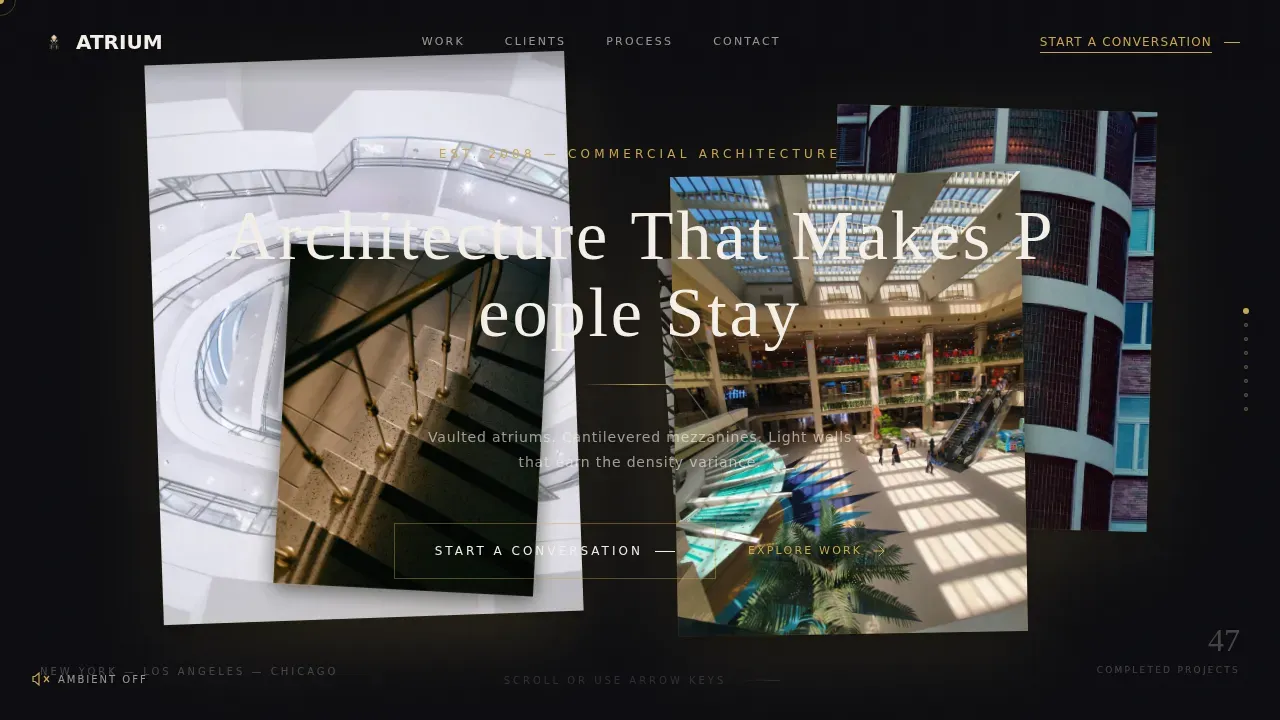
Atrium is a horizontal scroll landing page template built for luxury commercial architecture firms specializing in shopping mall and mixed-use design. It combines cinematic parallax photography, a dramatic obsidian and gold color system, and a full-viewport lead generation form to help firms attract retail developers, real estate investment trust managers, and municipal planners to start a conversation or download a portfolio.
by Rocket studio
Quick summary
Atrium is a single-page horizontal scroll template designed for high-end commercial architecture firms. It moves visitors through eight cinematic panels, from a silent twilight exterior to a full-viewport contact form, using floating parallax photography, letter-by-letter headline reveals, and crossfade transitions. The page earns trust through atmosphere before it ever asks for anything.
Who this template is for
This template is built for architecture and interior design firms that work on large-scale commercial projects. It speaks directly to the clients those firms need to win, and gives the firm a page that matches the ambition of the work itself.
- Retail developers and real estate investment trust asset managers assembling or repositioning mixed-use portfolios
- Municipal planners commissioning town-center anchors that require density variance justification
- Architecture and interior design studios, architects, and designers who want to present a body of commercial work with precision and visual authority
What problem this template solves
Most architecture firm websites present work the way a report presents data: organized, correct, and easy to skip. Atrium solves the problem of a page that fails to communicate scale, material quality, or commercial intent to the sophisticated buyers who approve eight-figure projects.
- Standard portfolio pages cannot convey the spatial experience of a four-story atrium or a curved retail promenade; Atrium uses full-format photography and parallax depth to close that gap
- Retail developers and real estate investment trust managers want proof of commercial performance, not just beautiful images; the template includes a dedicated proof panel for dwell-time statistics and a case study panel with materiality close-ups, aerial site plans, and foot-traffic heat maps
- Top-of-funnel visitors who are not ready to call still need a path forward; a gated portfolio download captures their contact details without pressure
What you get with this template
You get a complete horizontal scroll landing page structured across eight carefully sequenced panels. Every panel has a defined purpose, and the visual system is ready to use without rebuilding from scratch.
- Eight horizontal panels: hero with five floating parallax photographs, a silent atmosphere panel, a proof panel, a case study panel, a client archetypes panel, a four-phase process panel, a testimonial panel, and a full-viewport contact panel
- A dual lead generation system with a primary consultation form collecting name, company, project stage, estimated gross leasable area, and preferred contact method, plus a secondary gated portfolio download
- A complete design system using Cormorant Garamond for display typography, DM Sans for body and interface text, and an obsidian and gold color palette with a noise-textured background and gold hover states throughout
Feature list
This section covers the core capabilities displayed across the template and built into its design system.
Cinematic Horizontal Scroll Engine
The page moves horizontally through eight panels using a scroll-triggered engine. Each transition uses a cinematic crossfade rather than a hard cut. The momentum is designed to feel like walking through the mall itself, where each new bay reveals something that earns another step forward.
Five-Photo Floating Parallax Hero
The hero section displays five large-format interior photographs suspended at staggered depths against the obsidian background. Each image drifts with subtle parallax as the cursor moves, and each casts a soft gold drop shadow as though lit from behind. The headline appears letter by letter as the images settle into position.
Dual Lead Generation Forms
The contact panel is a full-viewport form that collects name, development company, project stage, estimated gross leasable area in square feet, and a preferred contact method toggle between call and email. A secondary path offers a gated portfolio download behind an email field, capturing visitors who are researching but not yet ready to speak.
Case Study Deep-Dive Panel
One panel expands into a full project case study. Visitors scroll through materiality close-ups, aerial site plans, and foot-traffic heat maps layered over floor plates. This panel communicates commercial performance, not just design aesthetics, which is exactly what retail developers and real estate investment trust managers need to see.
Ambient Audio Toggle
A small gold speaker icon lets visitors opt into environmental audio, including distant fountain sounds and a soft ambient hum. The feature is entirely optional and adds atmospheric depth for visitors who want the full spatial impression of the space displayed on screen.
Obsidian and Gold Design System
The color system pairs deep obsidian black with brushed gold accent lines, warm gallery white for typography, and recessed charcoal for secondary panels. Gold never shouts. It traces edges, underlines project names, and pulses gently on hover states. The obsidian background carries a barely perceptible noise texture, like honed basalt under gallery lighting.
Page sections overview
| Section | Purpose |
|---|---|
| Hero Parallax Panel | Display five floating interior photographs with letter-by-letter headline reveal |
| Silence Panel | Single twilight exterior image, atmospheric, no copy |
| Proof Panel | Animated dwell-time statistic with credibility copy |
| Case Study Panel | Project deep-dive with materiality, aerial, and heat map views |
| Client Archetypes Panel | Three client profiles with project-specific details |
| Process Panel | Four-phase Atrium workflow overview |
| Testimonial Panel | Client voice displayed on stacked card depth layout |
| Contact Panel | Full-viewport consultation form and portfolio download gate |
Design & branding system
Atrium follows a Luxe Minimal design direction. The palette and typography are calibrated to communicate exclusivity without ornamentation. The result feels like a private elevator lobby at midnight, where polished stone reflects a single strip of brass light.
- Colors: deep obsidian black (#0B0B0F) as the primary canvas, brushed gold (#C9A84C) for accent lines and interactive elements, warm gallery white (#F5F0E8) for typography and negative space, and recessed charcoal (#1C1C22) for secondary panels; teal is not part of this palette, though combining teal with neutral tones is a recognized approach in minimalist architecture design
- Typography: Cormorant Garamond as the display serif for headlines and Atrium branding moments, DM Sans as the body and interface typeface for clean lines and readability
- Interactive graphics: a gold custom cursor, magnetic call-to-action behavior, and smooth crossfade transitions throughout all eight panels
Mobile & speed optimization
The template is built desktop-first around its horizontal scroll experience. A mobile fallback converts the horizontal panel sequence to a vertical scroll layout so the content remains fully readable on smaller screens.
- The horizontal scroll engine uses Server Components for static panels and a dedicated Client Component for the scroll engine, keeping the interactive layer separate from static content
- Optimized images and minimal code support fast loading on high-end visual pages where photography is the primary product
- The page is designed to be fully responsive, retaining the visual experience across device sizes without compromising the design system
How this template helps you convert
The page is structured to earn trust before it asks for anything. Visitors move through seven full horizontal panels of architecture before they reach a form. That sequence is intentional.
- The early panels establish spatial credibility through large-format glass and atrium photography, dwell-time statistics, and case study evidence, so the visitor arrives at the contact panel already convinced of the firm's commercial value
- The dual form structure means every visitor has a path forward: serious developers can request a consultation with full project details, while researchers and early-stage visitors can access the portfolio through the gated download, protecting the firm's lead pipeline at both ends of the funnel
Other information about this template
This section covers additional context about the template's design philosophy, recommended use cases, and how it fits within the broader landscape of architecture web design.
- The Atrium luxe minimal shopping mall architecture landing page template is a sophisticated template designed for creative professionals who want to present their body of work sublimely; it is ideal for architecture and interior design studios, architects, designers, photographers, and furniture brands
- Landscaping plays a crucial role in complementing minimalist architecture; integrating grasslands and strategically placed greenery can soften the starkness of modern designs, and the use of simple yet striking plant arrangements not only beautifies a shopping center but also promotes sustainability, creating a serene environment that invites visitors to explore
- Large glass panels invite natural light into minimalist spaces, enhancing the overall atmosphere; utilizing large glass panels in facades invites abundant natural light, which is a key feature in minimalist shopping center designs contributing to an airy atmosphere
- Efficient interior layouts are essential for maximizing the shopping experience; open spaces are prioritized in minimalist shopping centers, allowing for easy navigation and a sense of freedom, with efficient circulation paths, ample vertical space, simple wayfinding signage, and calming greenery all contributing to the overall product of the space
- An aesthetically pleasing minimalist page should use a neutral color palette, ample white space, and subtle high-quality animations; combining teal with neutral tones is a recognized approach, while clean lines and monochromatic colors maintain a cohesive aesthetic across the design
- Security, bot protection, and site integrity matter for any professional website; a security service that verifies legitimate visitors and filters malicious bots helps protect a firm's contact forms and portfolio download gates; when security verification is working correctly, a verification successful response is displayed to the user, while suspicious requests are logged and a respond ray id is generated for review; this security layer runs in the background, so visitors are never left waiting unnecessarily, and the security service protects the page without interrupting the user experience
- The template page structure encourages visitors to sign up or make contact at the end of a carefully sequenced experience; access to the gated portfolio is controlled through an email field, log of submissions, and a contact method toggle displayed in the final panel



Theme
Luxe Minimal
Creative direction
Atmosphere & Mood
Color system
Obsidian & Gold
Style
Horizontal Scroll
Direction
Lead Generation
Page Sections
Cinematic Horizontal Scroll Engine
Five-photo Floating Parallax Hero
Dual Lead Generation System
Case Study Deep-dive Panel
Obsidian and Gold Design System
Optional Ambient Audio Toggle
Related questions
What type of architecture firms is this template built for?
Can I use this template if my firm does not specialize in shopping mall architecture?
Does the template include the contact form layout and all displayed fields?
What makes the horizontal scroll design effective for architecture firms?
Is this template suitable for mobile visitors?



