Oil & Gas Professional Website Template
Pipeline is a split-screen natural gas distribution landing page template built for utilities that need to earn trust with hard data before asking anything in return. It pairs enormous stat callouts with contextual evidence panels, guides visitors toward a gated System Reliability Report, and offers segmented resource downloads for municipal planners, developers, and facility managers.
by Rocket studio
Quick summary
Pipeline is a single-page, stats-first landing page template designed for natural gas distribution utilities. It uses a 50/50 split-screen layout to pair bold data callouts with supporting evidence, builds credibility across four escalating content sections, and converts visitors through a low-friction report download form backed by segmented resource tiles.
Who this template is for
This template is built for natural gas distribution utilities that serve complex, multi-audience service territories. It speaks directly to the professionals those utilities need to reach and influence.
- Municipal planners and government officials negotiating franchise agreements or service-territory expansions
- Industrial facility managers balancing load forecasts against curtailment risk and supply reliability
- Residential developers who need confirmed gas service availability before breaking ground on new lots
What problem this template solves
Utilities often rely on dense PDFs or generic corporate pages that fail to communicate operational credibility at a glance. Stakeholders with real decisions to make need proof before they engage.
- Visitors leave without understanding the scale, safety record, or investment posture of the utility
- No clear conversion path exists for high-value contacts such as developers or municipal officials
- Downloadable resources are buried, ungated, or presented without enough context to feel credible
What you get with this template
You get a fully structured landing page that leads with data, earns trust through escalating evidence, and then asks for contact information at exactly the right moment. Every visual and copy decision supports the goal of converting informed, high-value visitors.
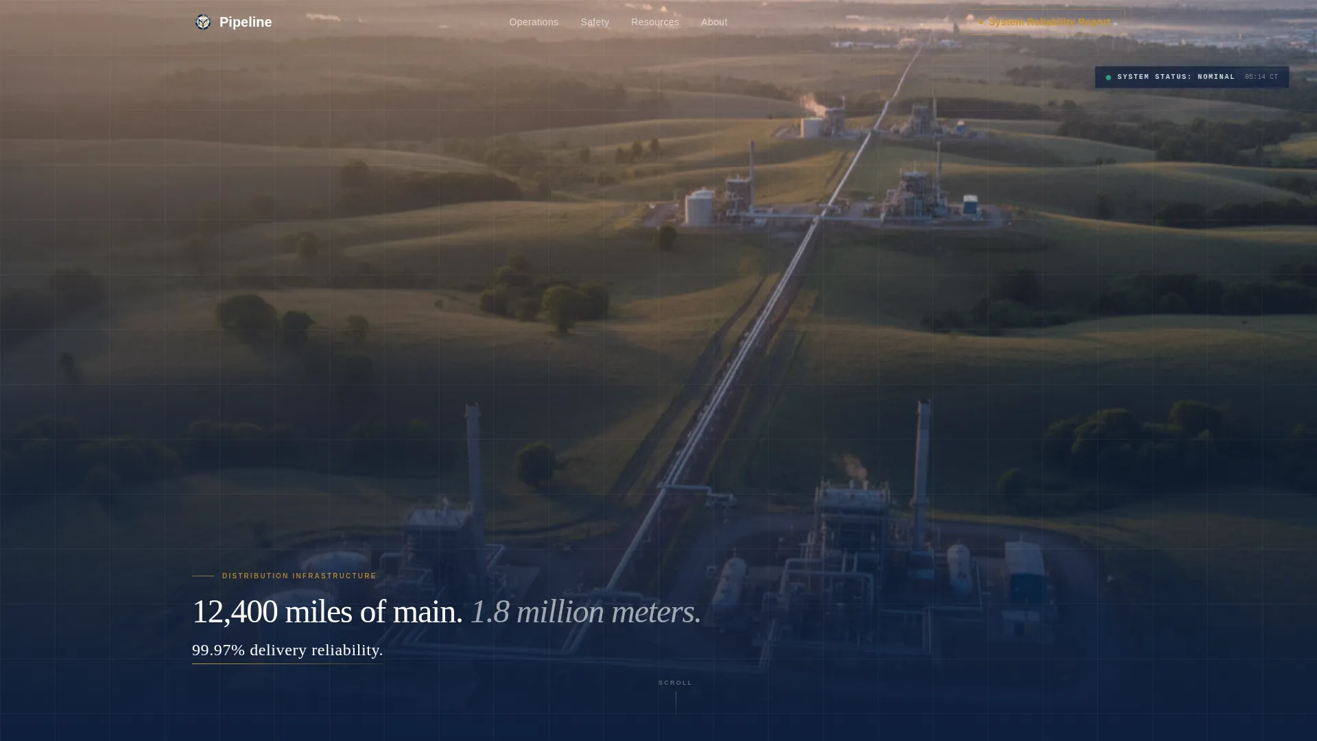
- A panoramic aerial header with a fade-in stat overlay that establishes system scale immediately
- A four-section split-screen body that moves from operational scale to safety to capital investment to sustainability
- A primary gated download form for the System Reliability Report plus segmented secondary resource tiles
Feature list
This template is built around a set of purposeful design and layout decisions drawn directly from the brief. Each feature serves the conversion goal without adding unnecessary complexity.
Panoramic Aerial Header
A full-width, edge-to-edge aerial photograph opens the page at dawn. A single three-part stat fades in over the image in thin white type with a gold underline. No button appears yet. The image and the number do all the work.
Split-Screen Stat Panels
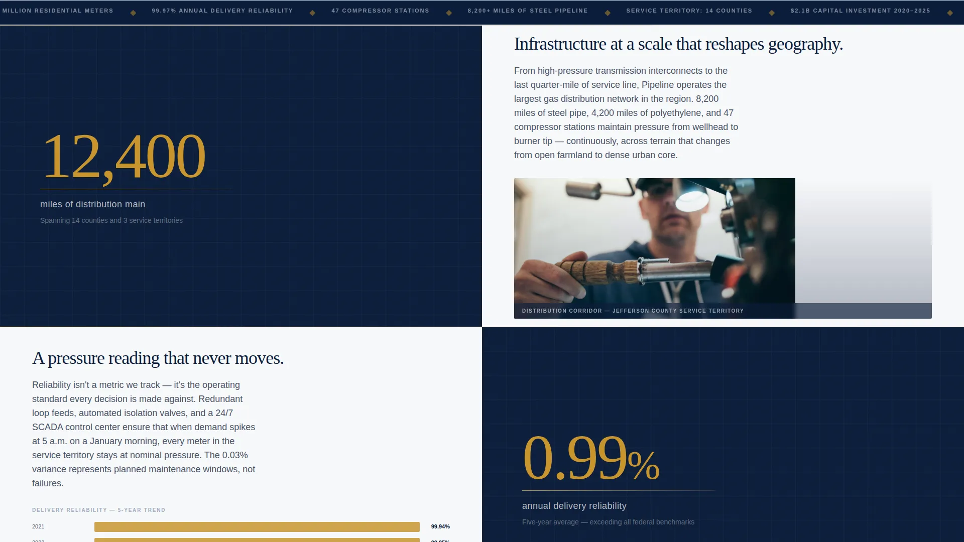
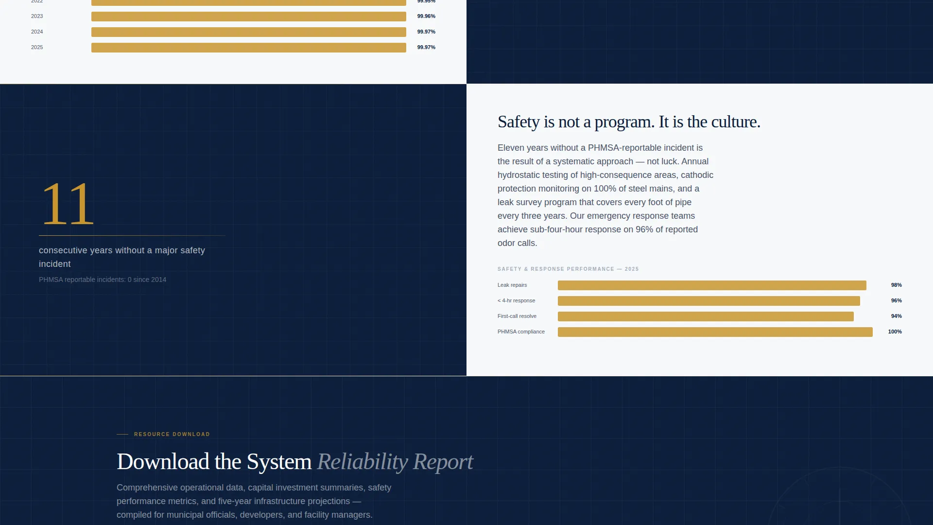
Each content section divides the viewport evenly. The left half displays a single large number in regulatory gold on command-center navy. The right half delivers a short paragraph, a chart, or a captioned photograph. The rhythm is consistent: claim first, then evidence.
Gold Rule Section Transitions
A thin gold horizontal rule separates each escalating content section. The transitions mark a clear shift in topic, from operational scale to safety record to capital investment to sustainability commitments, keeping the scroll feel structured and purposeful.
Primary Gated Download Form
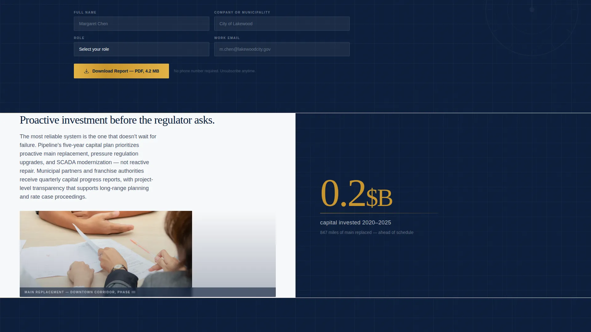
After the third stat pair, when credibility has been established, the page presents a slim inline form. It asks for name, company or municipality, role via a dropdown, and work email. Four fields only. No phone number field is included.
Segmented Resource Tile Library
Below the primary form, a row of resource tiles offers rate schedules, franchise agreement guides, developer gas service applications, and emergency preparedness documents. Each tile is downloadable with a single click after the initial form is completed.
Navy Authority Color System
The palette uses command-center navy for headers and footers, pipeline steel for body text and dividers, pressure-gauge white for content panel backgrounds, and regulatory gold reserved exclusively for data callouts, active states, and download icons.
Page sections overview
| Section | Purpose |
|---|---|
| Panoramic aerial header | Establishes system scale with a full-width image and fade-in stat overlay |
| Operational scale panel | Leads the split-screen body with miles-of-main and meter-count data |
| Safety record panel | Presents delivery reliability figures with supporting visual evidence |
| Capital investment panel | Communicates infrastructure spend and long-term commitment |
| Sustainability panel | Closes the evidence sequence with environmental and community impact data |
| Report download form | Converts high-value visitors with a four-field inline gated form |
| Resource tile library | Offers segmented PDFs for each audience type after form completion |
Design & branding system
The visual identity follows a Corporate Precision theme. Every color choice is intentional and load-bearing within the layout.
- Navy (#0B1D3A) anchors headers and footers; pipeline steel (#4A5568) carries body text and dividers; pressure-gauge white (#F7F8FA) opens up content panels
- Regulatory gold (#C9952D) appears only on data callouts, active interface states, and download icons, preserving its visual authority by staying rare
- The overall palette reads like a freshly printed annual report: authoritative without being cold, institutional without feeling lifeless
Mobile & speed optimization
The template is structured for clean rendering across screen sizes. The layout decisions reflect practical considerations for a professional audience that may access the page on a tablet in the field or a laptop in a boardroom.
- The 50/50 split-screen panels are designed to reflow gracefully on narrower viewports so stat callouts remain legible
- The inline form keeps field count to four, reducing tap friction on mobile devices
- Resource tiles are designed as single-click downloads after form completion, minimizing steps for returning visitors
How this template helps you convert
The conversion strategy is built into the scroll sequence itself. Visitors earn the right to be asked for their information only after the page has demonstrated credibility.
- The aerial header and fade-in stat establish scale and reliability before any call to action appears, setting a high-trust baseline for everything that follows.
- Four escalating split-screen sections build cumulative credibility across operations, safety, investment, and sustainability before the download form appears.
- The segmented resource tile library gives each audience type a relevant next step, increasing the chance that municipal officials, developers, and facility managers all find a reason to engage.
Other information about this template
This template was designed specifically for the natural gas distribution segment within the broader oil and gas industry. It reflects the operational seriousness and regulatory context of that niche.
- The template style is Split Screen (50/50), the creative direction is Stats-First Impact, the header concept is Panoramic/Wide, and the landing page direction is Content/Resource
- The theme is Corporate Precision and the color system is Navy Authority, both chosen to match the institutional communication standards of regulated utilities
- The page is categorized under Mining and Natural Resources, with a subcategory of Oil and Gas and a niche focus on natural gas distribution
Theme
Corporate Precision
Creative direction
Stats-First Impact
Color system
Navy Authority
Style
Split Screen (50/50)
Direction
Content/Resource
Page Sections
Panoramic Aerial Header with Stat Overlay
Split-screen Stat and Evidence Panels
Escalating Four-section Content Flow
Low-friction Gated Download Form
Segmented Resource Tile Library
Navy Authority Color System
Related questions
Who is this landing page template designed for?
What is the primary conversion goal of this template?
How does the stats-first layout build trust with visitors?
Can the resource tiles serve different visitor types?
Is the inline form designed to reduce sign-up friction?