Recruiting & Staffing Agency Appointment Booking Website Template
Pipeline is a modular card-grid landing page built for recruitment process outsourcing (RPO) providers. It leads with a full-width stats wall, transitions into a person-first team grid with flip-card interactions, and closes with a scoping consultation click-through. The result is a high-velocity single page that turns open requisition pressure into booked discovery calls.
by Rocket studio
Quick summary
Pipeline is a dark-slate, sky-blue landing page template built for embedded RPO teams. It opens with animated live-counter metrics, moves through a dense modular team grid, and ends with a structured click-through to a scoping consultation. Every section is designed to communicate team depth, placement velocity, and execution credibility to founders and VP-level talent leaders.
Who this template is for
This template is built for RPO providers whose buyers are high-pressure, deadline-driven, and skeptical of vendor pitch decks. It speaks directly to the people signing the contract, not the people reading a blog post.
- Series B founders scaling headcount from forty to four hundred people
- VP Talent leaders managing twenty or more open roles across multiple time zones
- PE-backed portfolio companies with ninety-day headcount mandates and no internal recruiting infrastructure
What problem this template solves
Most recruiting agency pages lead with process diagrams and service tiers. Buyers at the Series B or portfolio-company level do not have time for that. They need to trust the team in front of them and move fast.
- There is no visible proof of team depth, so buyers cannot quickly assess whether the provider can handle their volume
- Metrics are buried in case studies instead of hitting the visitor before they scroll a single pixel
- The path from "interested" to "booked a call" is too long and too abstract
What you get with this template
You get a single, dense, conversion-focused landing page that front-loads credibility and removes every barrier between a curious VP and a completed scoping request. The layout is modular, so each grid section can be updated independently as the team or metrics change.
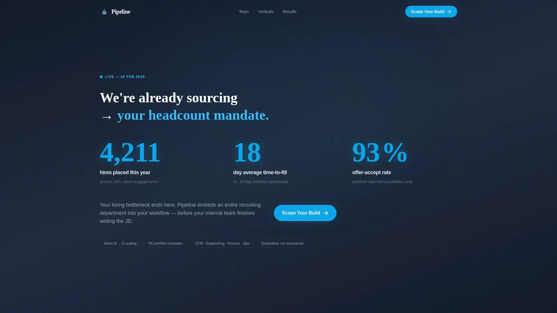
- A full-width animated stats wall that displays live-styled counters for hires placed, time-to-fill, and offer-accept rate
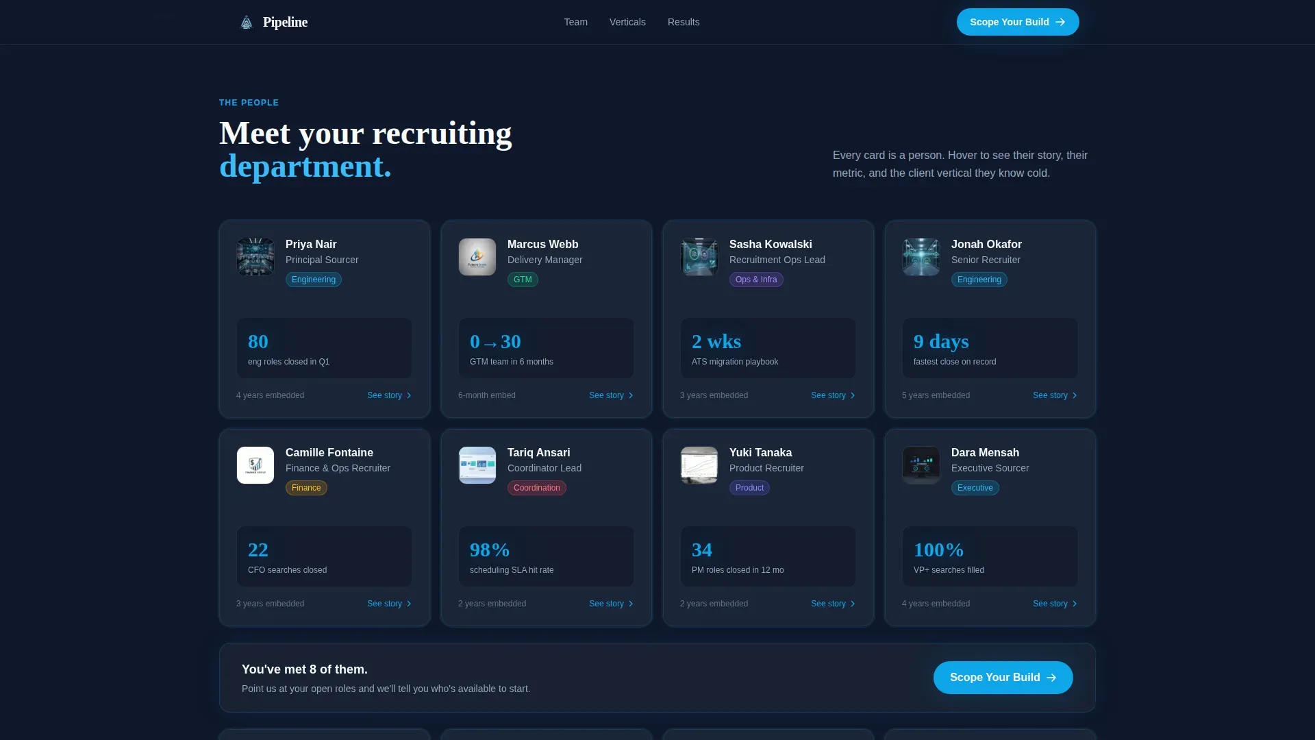
- A staggered card grid where each card represents a real team member with a flip or expand interaction revealing placement metrics and client vertical
- A sticky call-to-action bar that follows the visitor after the third card row and routes to a short qualifier page
Feature list
This template is built around a small set of high-impact components. Each one earns its place by doing specific persuasive work.
Animated Stats Wall Header
The header is a full-width slate panel with sky-blue numerals that tick upward on page load. Three counters display hires placed this year, average time-to-fill in days, and offer-accept rate as a percentage. No illustrations, no stock photography. The numbers carry the entire first impression.
Person-First Team Grid
The grid is card-based and modular. Each card represents a person on the recruiting team, not an abstract service tier. Cards flip or expand on interaction to reveal the recruiter's specific metric, the client vertical they served, and a one-line story of what they delivered. The grid grows denser as the visitor scrolls, visually simulating a team ramping up in real time.
Sticky Scoping Call-to-Action Bar
After the visitor passes the third row of team cards, a persistent bar appears at the bottom of the viewport. It carries the primary call to action and stays visible through the testimonials and conversion panel sections. It disappears only when the visitor reaches the footer.
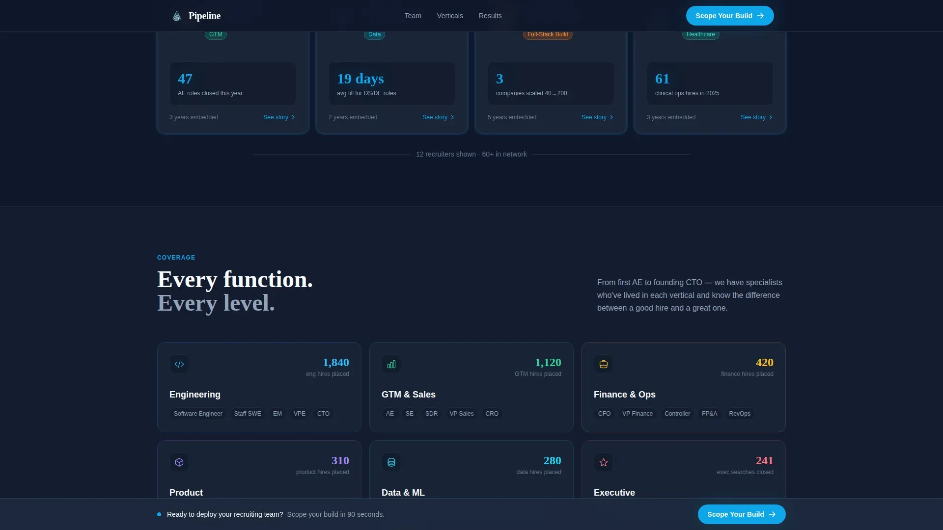
Vertical Specialization Tiles
A dedicated section displays industry tiles covering the verticals the team recruits for, such as fintech, go-to-market, and engineering. Each tile signals relevant coverage without requiring a separate page.
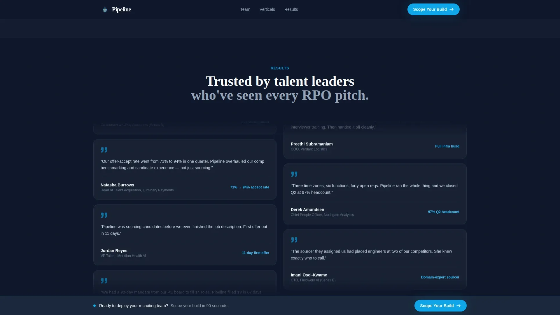
Scrolling Testimonial Marquee
Testimonials from hiring leaders are presented in scrolling marquee columns rather than a static carousel. The motion reinforces the velocity theme and keeps social proof visible without interrupting the page flow.
Scoping Consultation Click-Through
The primary call-to-action button labeled "Scope Your Build" appears first in the header and again in the sticky bar. Clicking routes to a short qualifier page asking for number of open roles, primary functions to fill, and target start date. No pricing walls, no gated content.
Page sections overview
| Section | Purpose |
|---|---|
| Stats wall header | Display animated placement metrics and primary call to action |
| Team grid cards | Show person-first recruiter profiles with flip interaction |
| Vertical specialization tiles | Signal industry coverage across key hiring functions |
| Testimonial marquee columns | Stream social proof from named talent leaders |
| Scoping conversion panel | Full-width call-to-action block before footer |
| Sticky call-to-action bar | Persistent prompt appearing after third card row |
| Linear footer row | Single-row footer with navigation and contact links |
Design & branding system
The visual language is built around a Startup Velocity theme. It feels like a SaaS operations dashboard at early morning: serious, fast, and uncluttered. The Slate and Sky color system creates strong contrast between data and background so every metric lands with impact.
- Deep operational slate (#1E293B) as the primary background, cool mid-gray (#475569) for card surfaces, and open-sky blue (#0EA5E9) on every number, button, and progress indicator
- Clean white (#F8FAFC) used in grid gaps and foreground text so the breathing room lets the numbers hit hard
- Plus Jakarta Sans handles body and user interface copy while Fraunces handles display numerals, keeping the data-forward aesthetic consistent throughout
Mobile & speed optimization
The template is designed desktop-first because VP-level buyers are typically reviewing on a laptop. A responsive mobile fallback ensures the page holds its structure and readability on smaller screens.
- Card grid reflows to a single-column stack on mobile, preserving the staggered reveal effect through scroll-triggered animation
- Counter animations and card flip interactions use CSS animations with Intersection Observer, avoiding heavy JavaScript libraries
How this template helps you convert
The conversion path on this landing page is intentional and short. Every design decision removes friction between the first impression and the completed scoping request.
- The animated stats wall creates immediate credibility before the visitor reads a single sentence of copy, making the "Scope Your Build" button feel low-risk to click.
- The person-first team grid replaces abstract service promises with specific humans and specific results, so by the time the visitor reaches the sticky bar, they feel like they have already met the team.
Other information about this template
This template is a strong fit for RPO providers who want to position themselves as an embedded recruiting function rather than a traditional staffing vendor. The card-grid format makes it straightforward to update individual team member cards as the roster grows or client verticals shift.
- Template style is Card Grid (Modular), making it easy to add, remove, or reorder cards without rebuilding the layout
- The click-through destination is a short qualifier form asking for open role count, target functions, and start date, keeping the handoff lightweight
- Animation intensity is high by design: counter tick-up on load, card flip on hover, marquee columns, and staggered grid reveal all work together to sustain the velocity feeling across the full scroll
- The footer uses a single linear row layout, keeping the bottom of the page clean and focused
Theme
Startup Velocity
Creative direction
Team & People
Color system
Slate & Sky
Style
Card Grid (Modular)
Direction
Click-Through
Page Sections
Animated Stats Wall Header
Person-first Team Grid
Sticky Scoping Call-to-action Bar
Scrolling Testimonial Marquee
Vertical Specialization Tiles
Scoping Consultation Click-through
Related questions
Who is this landing page template designed for?
Does this template include the scoping qualifier page?
Can I update individual team member cards without changing the full layout?
When does the sticky call-to-action bar appear on the page?
What animation effects are included in this template?


