Startup RPO | Free Website Template | Rocket
Pipeline is a dark-themed, stats-first comparison table landing page built for startup and scale-up recruitment process outsourcing (RPO) providers. It opens with an oversized founder testimonial card, escalates through viewport-filling metrics, and drives two conversion paths: a free two-week hiring sprint pilot and an interactive cost calculator. Designed for Series A founders and VP People leaders who need to hire fast.
by Rocket studio
Quick summary
Pipeline is a single-page, high-impact landing page template built for RPO providers targeting fast-growing startups. It leads with a founder testimonial card, rolls through bold stat reveals, and anchors on a three-column comparison table. Two conversion paths capture leads: a four-field free pilot form and an interactive cost calculator. The entire experience runs on a dark, dopamine-driven visual system.
Who this template is for
This template is purpose-built for recruitment process outsourcing (RPO) businesses that serve Series A and scale-up companies. It is ideal for agencies or embedded hiring partners who can back their pitch with real performance data and need to convert skeptical, cost-conscious operators.
- Founders and operators selling RPO or embedded recruiting services to startups
- VP People leaders and COOs evaluating external hiring partners against internal teams
- Recruiting firms that want to replace a traditional agency pitch deck with a live, data-led landing page
What problem this template solves
Series A founders and scale-up operators do not read long sales pages. They want proof before they read an explanation. Most recruiting service pages bury the value inside long paragraphs and vague promises, losing the visitor before the offer lands.
- No clear, instant comparison showing how an RPO partner outperforms an internal team or traditional agency
- No bold, specific data that earns trust in the first scroll before a visitor even reads a headline
- No low-friction conversion path that lets a skeptical founder commit to a pilot without a credit card
What you get with this template
You get a fully structured, single-page layout that moves a visitor from social proof to data to decision in one scroll path. Every section has a defined job, and the visual system does the persuasion work before the copy needs to.
- A floating testimonial card header with founder quote, stat pills, and company logo
- A viewport-filling stats impact section with staggered number reveals
- A color-coded three-column comparison table and a dual-path conversion section with a pilot form and cost calculator
Feature list
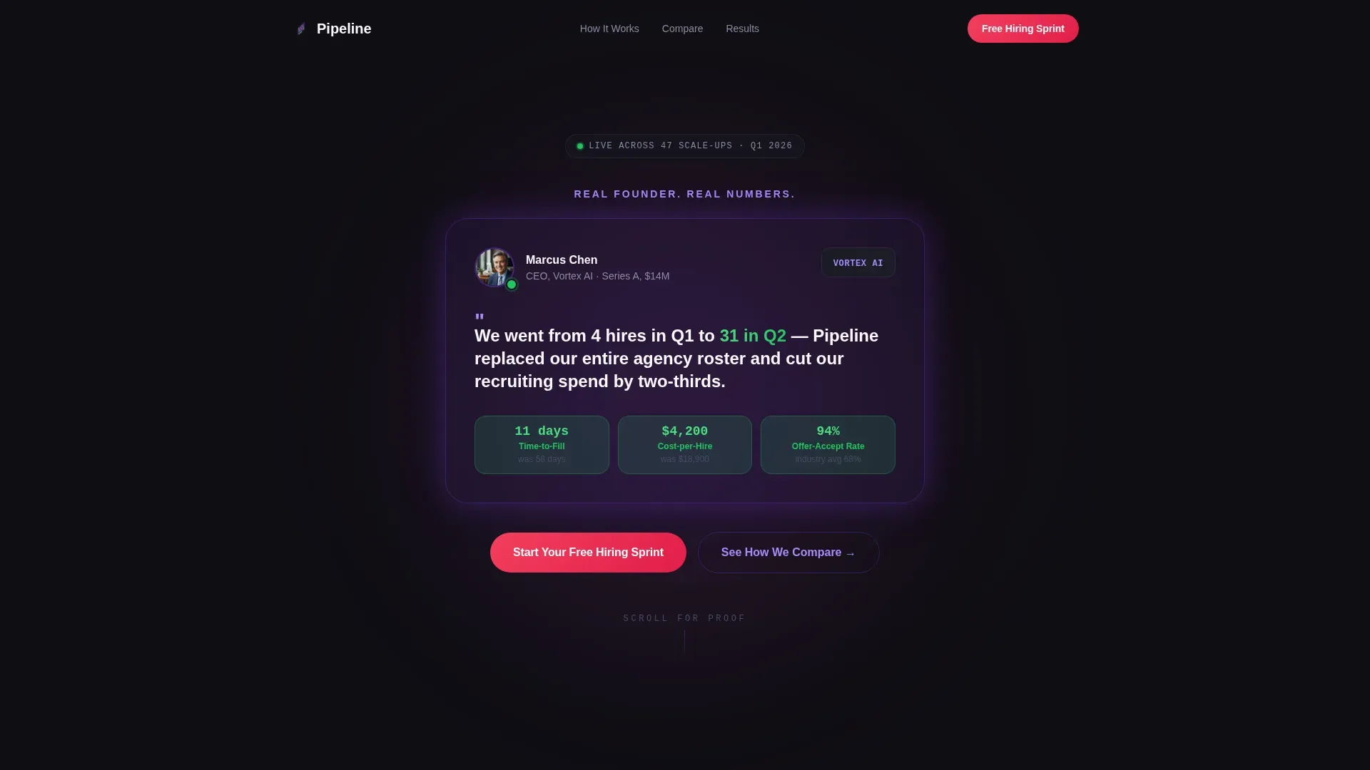
Floating Founder Testimonial Card
The header opens with a single oversized card component on a deep black background. It displays a founder headshot, company logo, a direct pull-quote, and three stat pills glowing in reactor green covering time-to-fill, cost-per-hire, and offer-accept rate. No stock photography. Just immediate, specific proof.
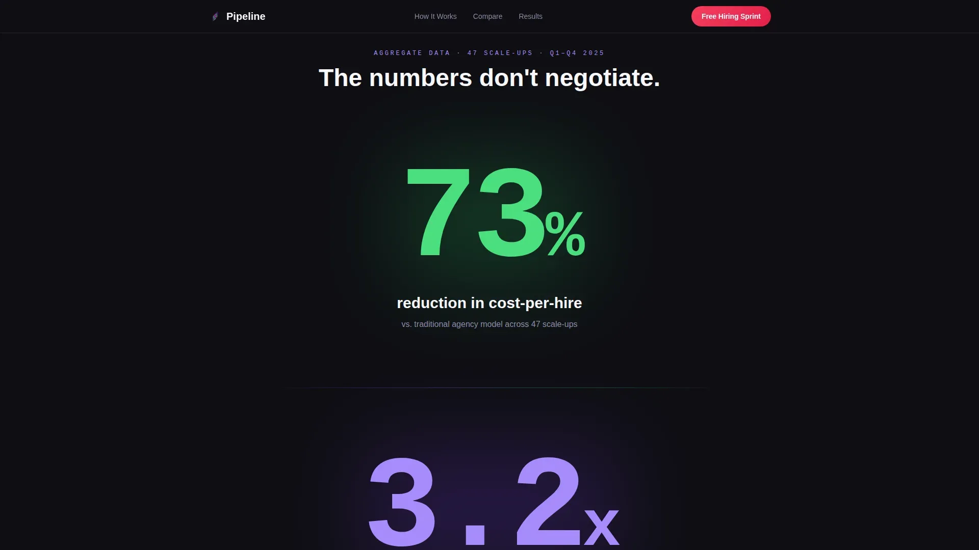
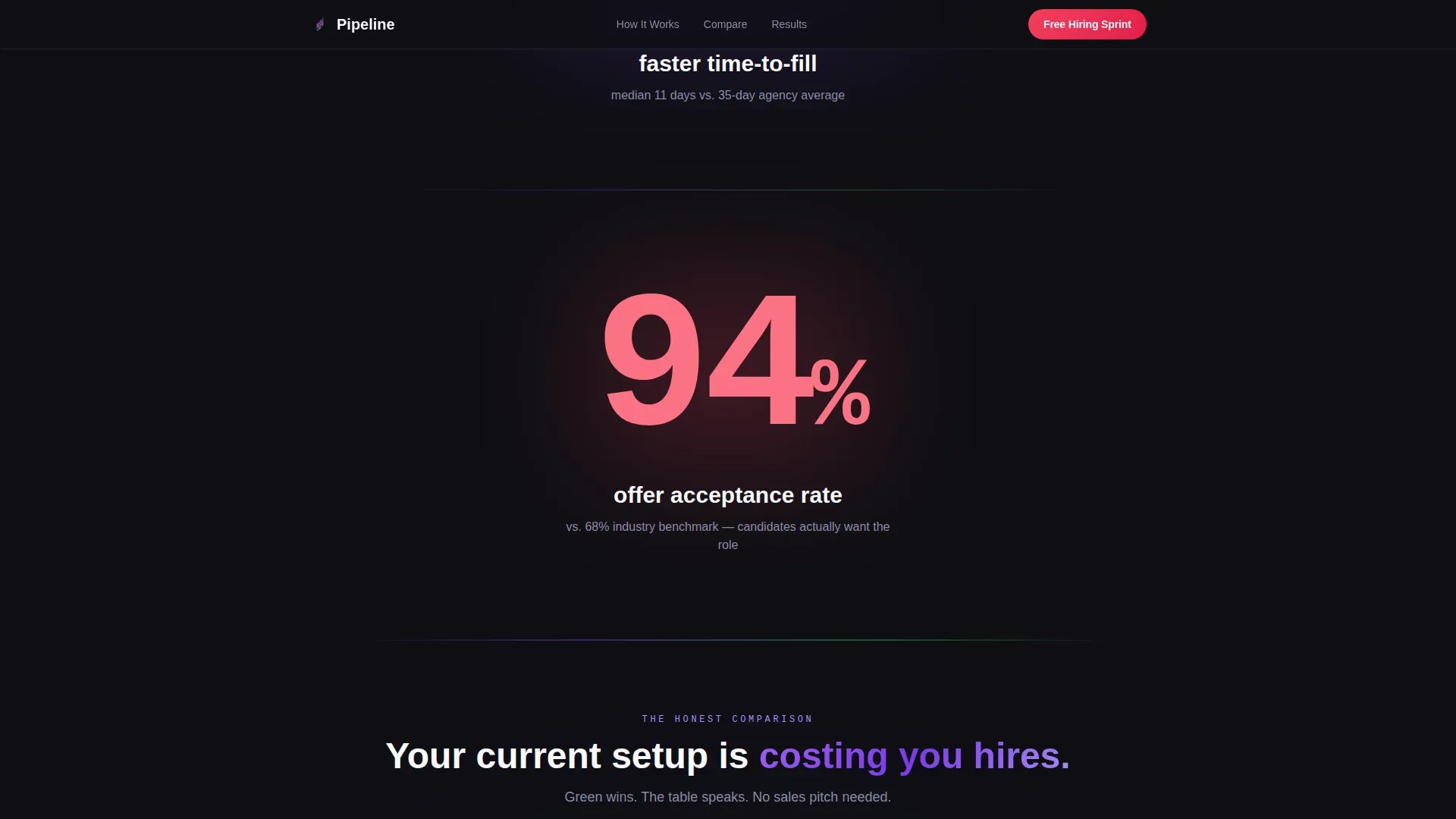
Viewport-Filling Stats Reveal
Bold numbers like "73%", "3.2x", and "94%" each fill the screen before their label fades in beneath. This staggered reveal pattern forces the visitor to register the number emotionally before processing the context. It turns data into a momentum-building sequence rather than a static chart.
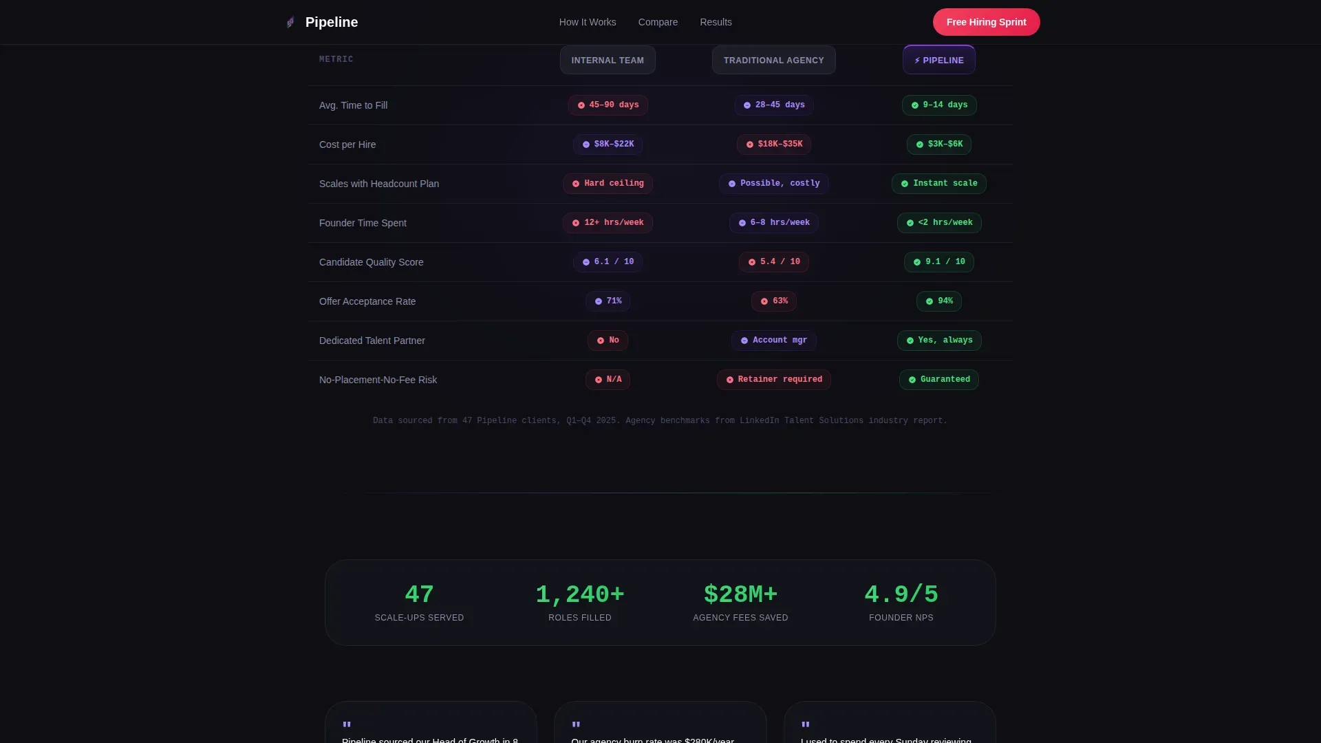
Three-Column Comparison Table
The centerpiece section compares Internal Team, Traditional Agency, and Pipeline across rows including speed, cost, scalability, founder time spent, and candidate quality score. Each cell is color-coded so the winner reads instantly without requiring the visitor to analyze text. Hot signal pink highlights the decisive Pipeline advantages.
Dual-Path Conversion Section
Two lead capture options run side by side. The primary path is a four-field pilot form offering a free two-week hiring sprint scoped to one open role, with no credit card required. The secondary path is an interactive cost calculator where visitors enter their current agency fees and receive a personalized savings projection.
Social Proof Evidence Wall
After the comparison table, the page builds an aggregate evidence section pulling together metrics from dozens of scale-ups, a company logo grid, and secondary founder quotes. This escalation from one story to collective data makes the decision feel grounded in pattern, not a single lucky outcome.
Dark Command-Center Visual System
The layout uses deep command-center black as the base, electric violet for headlines and interactive states, reactor green for wins and completed metrics, and hot signal pink for calls to action and comparison highlights. Typography is structured across three typefaces for hierarchy: Plus Jakarta Sans for headings, DM Sans for body, and JetBrains Mono for numbers and data cells.
Page sections overview
| Section | Purpose |
|---|---|
| Testimonial Card Header | Opens with founder proof and green stat pills before a single scroll |
| Stats Impact Reveal | Fills the viewport with bold metrics before their explanations appear |
| Comparison Table | Three-column color-coded grid that shows the winner without reading |
| Social Proof Wall | Aggregate scale-up data, logo grid, and secondary testimonial quotes |
| Free Sprint Form | Four-field pilot signup capturing leads with no credit card required |
| Cost Calculator | Interactive tool that converts agency fee input into savings projections |
| Linear Footer | Single-row footer keeping the exit path clean and distraction-free |
Design & branding system
The visual identity follows a Startup Velocity theme built on a Dopamine Pop color system. Every color carries a defined role, so the layout communicates hierarchy and priority without relying on copy alone.
- Deep command-center black (#0F0F14) grounds every background section
- Electric violet (#7C3AED) drives headlines and interactive states; reactor green (#22C55E) marks wins and completed metrics; hot signal pink (#F43F5E) fires on calls to action and comparison highlights
Mobile & speed optimization
The template is designed desktop-first, reflecting how Series A founders and VP People leaders typically review competitive tools during board preparation or at a desk. The layout is responsive and adapts for mobile without losing the stat-reveal or comparison table structure.
- Desktop layout prioritizes the full comparison table and dual-column conversion section in a single viewport
- Mobile layout stacks sections vertically, preserving the stat reveal sequence and keeping the pilot form accessible without horizontal scrolling
How this template helps you convert
Every layout decision in Pipeline is built to shorten the distance between a skeptical first impression and a low-risk commitment. The page removes friction at each stage of the decision.
- The testimonial card loads proof before the visitor scrolls, establishing credibility in under three seconds without requiring any reading
- The color-coded comparison table lets a founder absorb the competitive advantage visually, reducing the cognitive effort needed to reach a conclusion
- The dual-path conversion section meets two buyer mindsets: the founder ready to pilot immediately and the operator who needs to justify cost savings before committing
Other information about this template
This template is built specifically for the startup and scale-up RPO provider market in the United States, with pricing and data formatted in USD. The language is English and the tone targets operators who value speed, data, and directness over polished marketing language.
- The page structure supports high animation density using GSAP entrance effects, IntersectionObserver-based reveals, counter animations, and magnetic call-to-action behavior on the primary button
- Interactive states include comparison table hover effects, stat pill animations, and a live cost calculator that responds to visitor input without a page reload
- The template uses server-rendered components for static sections and client-side rendering for the calculator and animation layers, keeping the interactive experience smooth
Theme
Startup Velocity
Creative direction
Stats-First Impact
Color system
Dopamine Pop
Style
Comparison Table
Direction
Freemium/Trial
Page Sections
Floating Founder Testimonial Card
Viewport-filling Stats Reveal
Color-coded Comparison Table
Dual-path Conversion Section
Aggregate Social Proof Wall
Related questions
Who is this landing page template designed for?
What conversion paths does this template include?
Does the comparison table work on mobile devices?
What does the free pilot signup form collect?
Can the template be used without high animation or interactivity?


