Precision Organ Builder & Restorer Landing Page Template
Pipes is a split-screen landing page template built for organ builders and restorers. It opens with a statistics-first impact wall, then unfolds a layered content experience that educates visitors section by section. The design uses a monochrome steel palette and oversized monospaced numbers to communicate precision, authority, and craft before a single word of sales copy appears.
by Rocket studio
Quick summary
Pipes is a precision-crafted, single-page landing page template for organ builders and restoration workshops. It pairs a 50/50 split-screen layout with a statistics-first visual strategy, turning raw craft metrics into compelling headlines. Each scroll step deepens the visitor's understanding of what restoration actually requires, earning trust through specificity long before any call to action appears.
Who this template is for
This template is designed for specialist craftspeople and institutions in the organ building and restoration field. It speaks directly to service providers whose clients make high-stakes, long-horizon decisions.
- Organ builders and restorers presenting complex services to institutional buyers
- Heritage instrument workshops seeking commissions from churches, cathedrals, and universities
- Small specialist firms that need a credibility-first page to compete with larger contractors
What problem this template solves
Most professional services pages rush toward a contact form. In organ restoration, the buyer is a church music director, a cathedral dean, or a university department head. They need to understand the scope of work before they trust anyone with a century-old instrument.
- Generic templates cannot communicate the depth and precision that heritage clients expect
- Competitors' pages rarely teach the visitor anything, leaving decision-makers without confidence
- A shallow page fails to justify the weight of a million-dollar restoration decision
What you get with this template
You get a fully structured, single-page layout that leads with hard numbers, builds expertise through progressive content sections, and closes with two clear conversion paths. Every section is purposefully ordered to match how a serious institutional buyer actually thinks.
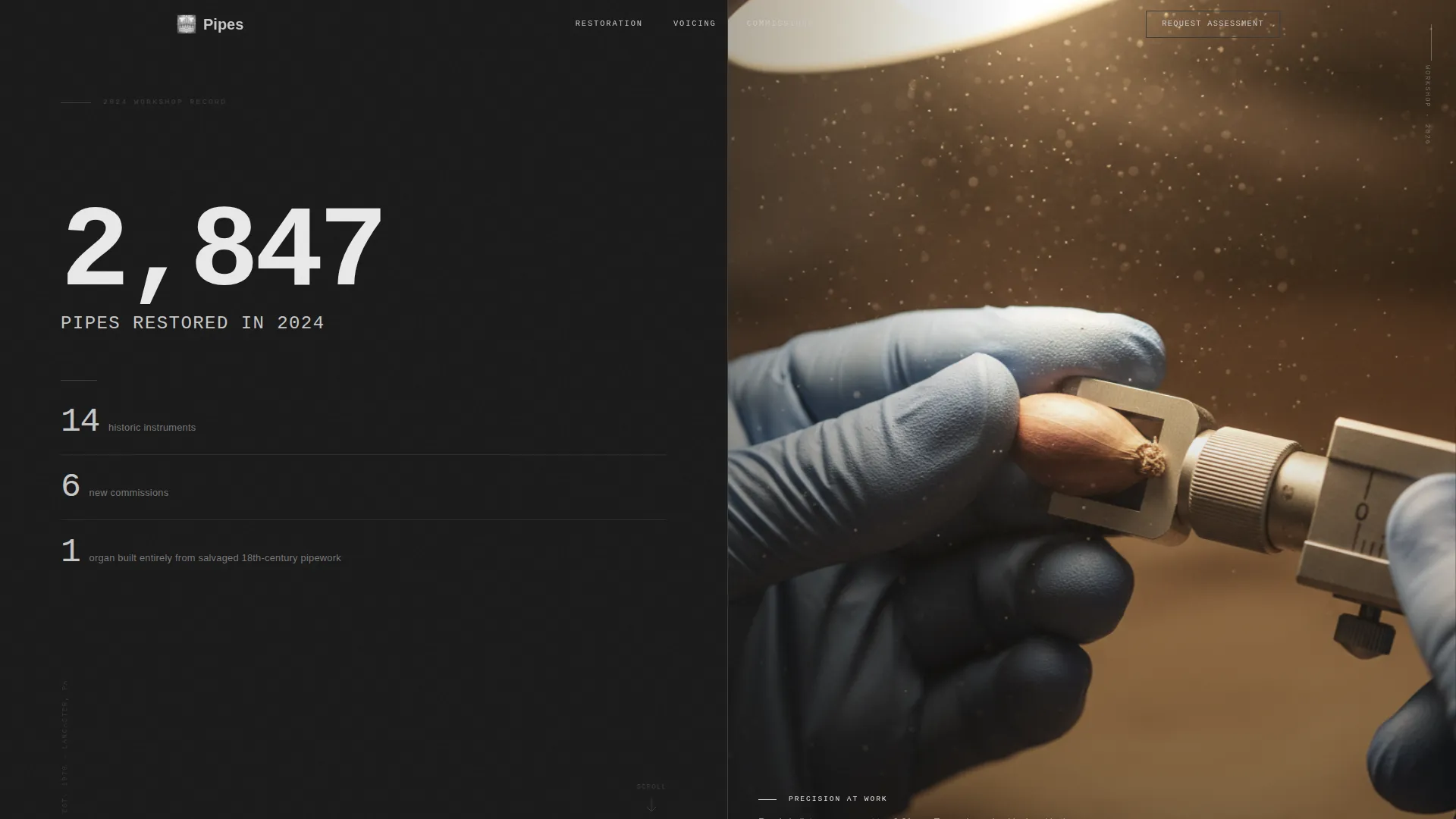
- A stats-first hero section with oversized monospaced metrics and a high-contrast workshop photograph
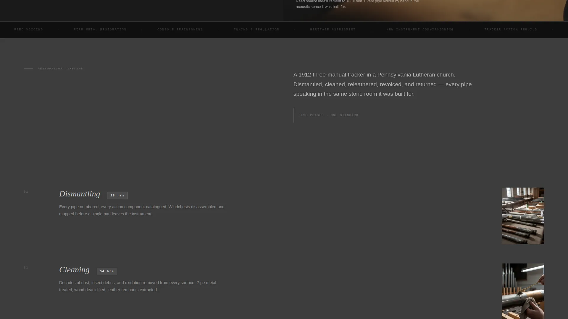
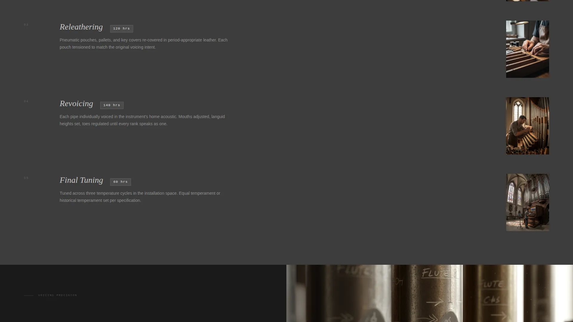
- A sequential educational content flow where each stat unlocks a detailed breakdown beside close-up process photography
- Two conversion paths: a downloadable Restoration Planning Guide form and a persistent navigation button for condition assessment requests
Feature list
A paragraph introducing the feature set: each feature below reflects a deliberate structural or design decision described in the brief, chosen to serve a technically informed audience that values proof over persuasion.
Stats-First Impact Header
The header is a full split-screen panel. The left side displays a single oversized metric in monospaced type, with three secondary figures stacked beneath it. The right side holds a tight, high-contrast workshop photograph with shallow depth of field. No portraits, no smiles, just hands and instruments under a single overhead lamp.
Progressive Stat-Led Sections
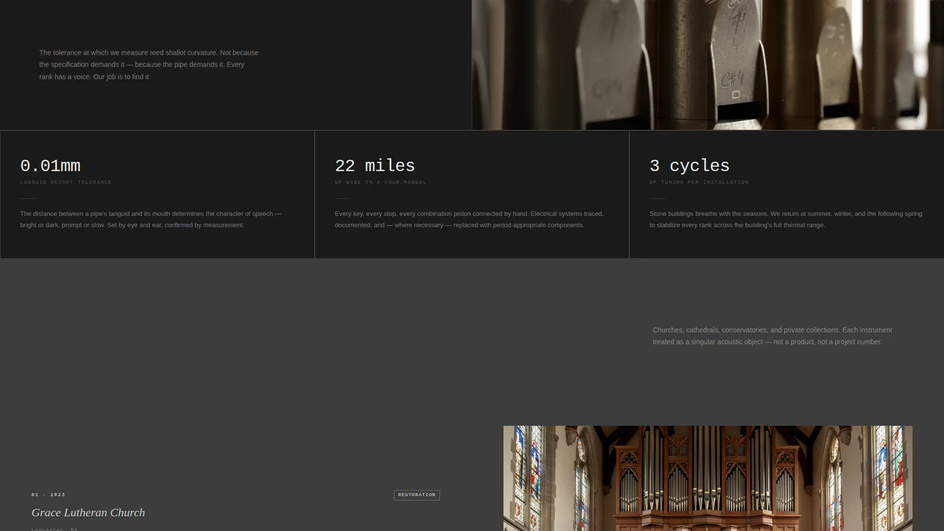
Every content section opens with a standalone number that acts as a headline. "412 hours" introduces a restoration timeline breakdown. "22 miles of wire" leads the electrical systems section. "1/100th of a millimeter" opens the voicing explainer. The stat earns the right to teach, and the educational content follows immediately on the paired panel.
Dual Conversion Path Design
The primary call to action is a download form placed after the third stats section. It collects name, church or institution name, and instrument age via a dropdown. A secondary "Request a Condition Assessment" button lives persistently in the navigation bar and links to a longer intake form.
Monochrome Steel Visual System
The color palette uses four values: forge black, brushed pipe tin, workshop shadow, and voicing-knife silver. Silver appears only on interactive elements and data callouts, making every actionable moment visually distinct. Backgrounds alternate between forge black and workshop shadow to create natural section breaks without color noise.
50/50 Split-Screen Layout
Every section of the page uses a two-panel structure. Left panels carry text, data, and educational copy. Right panels display corresponding close-up photography of each restoration phase. The layout keeps the reading experience anchored and visual evidence always within the same viewport.
Page sections overview
| Section | Purpose |
|---|---|
| Stats Impact Header | Opens with key 2024 metrics and a precision workshop photograph |
| Restoration Timeline | Breaks down 412 hours across dismantling, cleaning, releathering, revoicing, and tuning |
| Electrical Systems Panel | Introduces wiring scope with the "22 miles of wire" metric |
| Voicing Explainer Panel | Teaches pipe voicing precision using the "1/100th of a millimeter" callout |
| Download call to action Form | Offers the Restoration Planning Guide after complexity has been established |
| Navigation Bar | Carries the persistent "Request a Condition Assessment" secondary conversion button |
Design & branding system
The visual identity follows an Educational Guide theme expressed through a Monochrome Steel color system. Every color decision reinforces the feeling of a working workshop: cool, disciplined, and honest about material.
- Four-value palette: forge black (#1A1A1A), brushed pipe tin (#C8C8C8), workshop shadow (#3D3D3D), and voicing-knife silver (#E8E8E8)
- Oversized monospaced typography for metric headlines, contrasting with body copy set in pipe tin on dark backgrounds
- Silver accent reserved exclusively for interactive elements and data callouts, ensuring clear visual hierarchy throughout
Mobile & speed optimization
The split-screen structure is designed with stacked responsiveness in mind. On smaller screens, left and right panels reflow into a single-column sequence, keeping the stat-then-content logic intact without losing the educational rhythm.
- Each split-screen section collapses gracefully so the metric headline always appears before its explanatory content
- High-contrast photography is formatted to remain legible and impactful at mobile viewport widths
- The persistent navigation call to action stays accessible on scroll across all screen sizes
How this template helps you convert
This template earns conversion by teaching first and asking second. By the time the visitor reaches either call to action, they have already internalized the complexity of organ restoration and the depth of the builder's expertise.
- The stats-first header immediately establishes credibility with specific, verifiable 2024 figures, filtering in serious institutional buyers from the first scroll
- The sequential educational sections build progressive trust, so the download form feels like a natural next step rather than an interruption
- The dual conversion paths serve different stages of buyer readiness, capturing both early-stage researchers and decision-ready clients in the same visit
Other information about this template
This template is built specifically around the organ builder and restorer niche within professional services. The content flow, form fields, and visual language all reflect the real decision-making process of institutional buyers in this field.
- The intake form dropdown covers four instrument-age ranges: pre-1800, 1800 to 1900, 1900 to 1960, and post-1960, making it immediately relevant to a wide range of restoration contexts
- The page is designed as a content and resource hub, not a brochure, meaning visitors leave with practical knowledge even if they do not convert on the first visit
- The template suits organ building and restoration professionals operating at the intersection of heritage conservation, sacred music infrastructure, and specialist instrument commissioning
Theme
Corporate Precision
Creative direction
Case Study Narrative
Color system
Navy Authority
Style
Single Column Flow
Direction
Content/Resource
Page Sections
Stats-first Impact Header
Progressive Stat-led Content Sections
Dual Conversion Path Design
Monochrome Steel Color System
50/50 Split-screen Layout
Related questions
Who is this landing page template designed for?
Can I adapt the statistics and metrics to my own workshop figures?
What does the Restoration Planning Guide download form collect?
Does this template include photography?
What makes this template different from a standard professional services page?



