Mozambican Restaurant Landing Page Template
Piri is a full-width immersive landing page template built for Mozambican restaurants ready to turn browsers into diners. It pairs a UGC photo wall hero with scroll-linked dish sections, a sticky reservation call-to-action, and a warm Desert Rose color system rooted in terracotta, cassava green, and charcoal. Every design choice earns its place at the communal table.
by Rocket studio
Quick summary
Piri is a click-through restaurant landing page template built around the heat, smoke, and soul of Mozambican cuisine. It opens with a staggered UGC photo wall, pulls visitors through three full-viewport dish sections, and closes with a bold reservation banner. The Desert Rose palette and Agrarian Root visual style make the page feel as warm and alive as the food it represents.
Who this template is for
This template is built for restaurant owners, operators, and creative teams who want a page that does more than list a menu. It works equally well whether you are opening your first Mozambican fire kitchen or refreshing an established dining room that has finally outgrown a basic website. The design speaks directly to audiences who know what good food means and who will not settle for a dull digital presence.
- Mozambican and southern Africa diaspora restaurant owners who want a digital home that matches the ambition of their kitchen
- Independent dining rooms and experiential food concepts targeting adventurous couples, food bloggers, and community-driven diners who treat every trip to a new restaurant as an event
- Creative agencies and freelance designers building restaurant identities who need a production-ready, fully styled starting point that covers every stage of the visitor journey
What problem this template solves
Most restaurant landing pages treat the food as a supporting character. They lead with a logo, a generic hero image, and a reservation widget that the visitor has not yet earned the desire to click. Piri flips that sequence entirely. The template is built on the insight that a diner who already feels the fire, smells the marinade, and imagines the smoke on the grill is practically ready to book before the call-to-action even appears.
- Generic restaurant templates force visitors to scroll through irrelevant sections before reaching the food story, killing the interest that brought them to the page in the first place
- Static imagery and flat layouts cannot communicate the sensory intensity of a fire kitchen, leaving the wow factor trapped in the dining room rather than living on screen
- Click-through pages with no clear visual escalation lose visitors mid-scroll, sending them back to search results rather than forward to the reservation platform
What you get with this template
You get a single, fully designed landing page that handles the entire visitor journey from first impression to reservation click. Every section is purpose-built and sequenced to build appetite, not just awareness. The template ships with a defined color system, typography pairing, animation structure, and section layout so you can replace content without rebuilding the design from the ground up.
- A complete six-section page structure covering the UGC hero, origin story, three dish spotlight sections, communal atmosphere section, and a full-width call-to-action banner with footer
- A Desert Rose color system with five defined values: terracotta (#C1654A), cassava green (#2D4A22), sand white (#F5EBE0), smoked charcoal (#2B2118), and dried peri-peri red (#A83232) for hover states and call-to-action elements
- Instrument Serif display typography paired with DM Sans body text, GSAP-powered staggered cascade animations on the hero, scroll-linked parallax on dish sections, and a sticky floating reservation button that transforms into a full-width banner at the final stage of the page
Feature list
This template includes a focused set of features derived directly from the brief. Each one earns its place by solving a specific problem in the visitor-to-diner conversion journey.
UGC Photo Wall Hero with Staggered Cascade
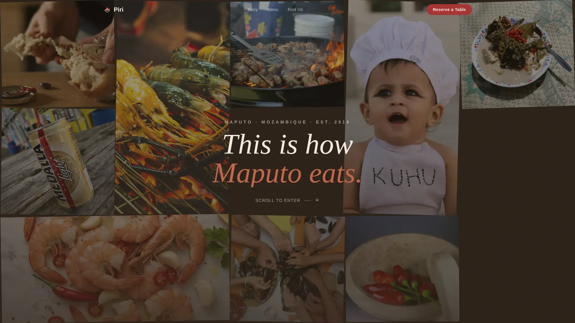
The hero section is a mosaic grid of guest photos that load in a staggered Polaroid-style cascade using GSAP animation. Images appear deliberately uneven in crop and color temperature, showing hands tearing bread, prawns piled on metal trays, flames on the grill, and real moments from the dining room. A single line of hand-set type fades in over the center: "This is how Maputo eats." No studio polish, no styled flatlay. The imperfection is the proof, and that authenticity is what stops the scroll before a single word about the food is read.
Three Full-Viewport Dish Sections with Scroll-Reveal Text
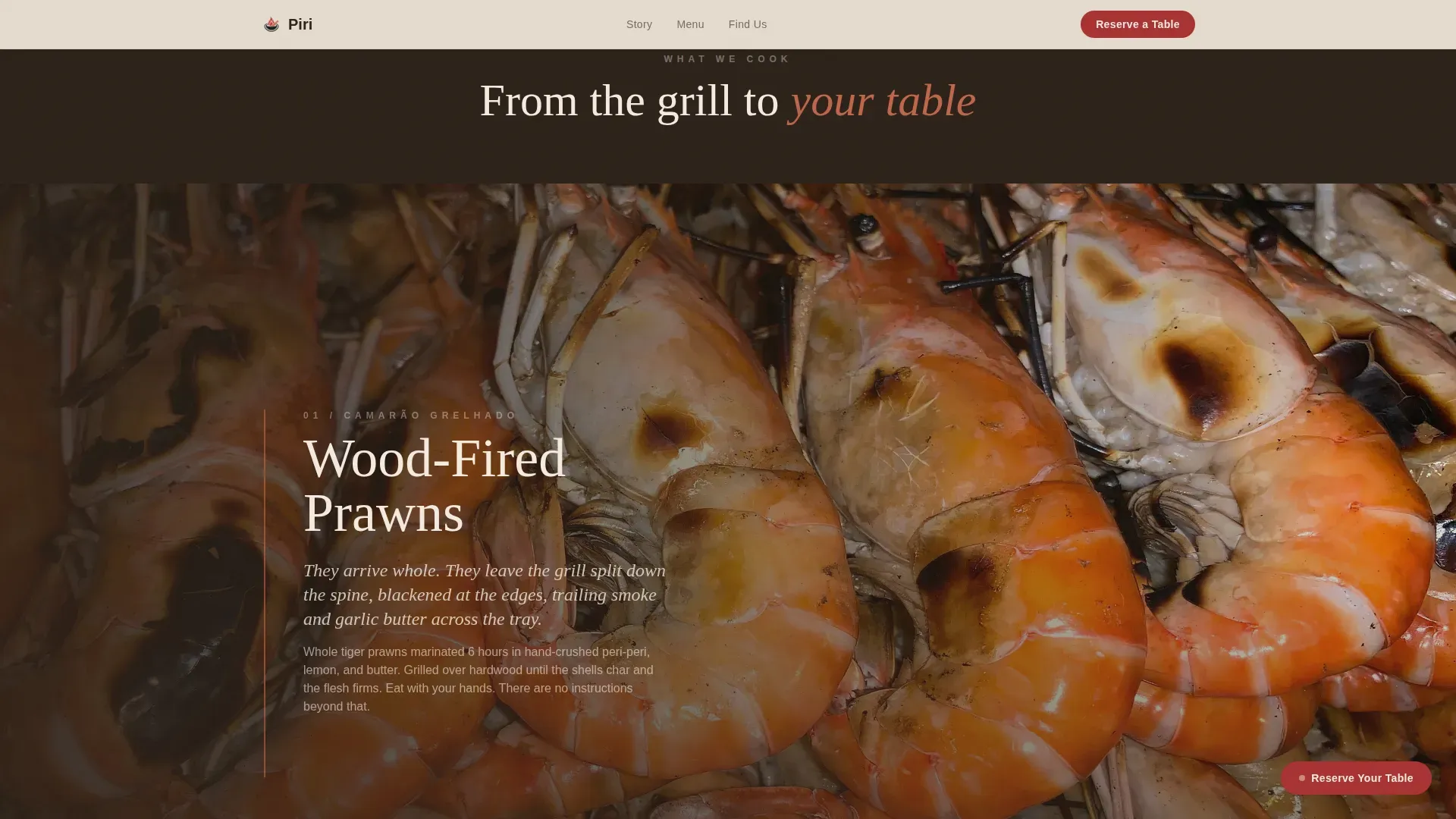
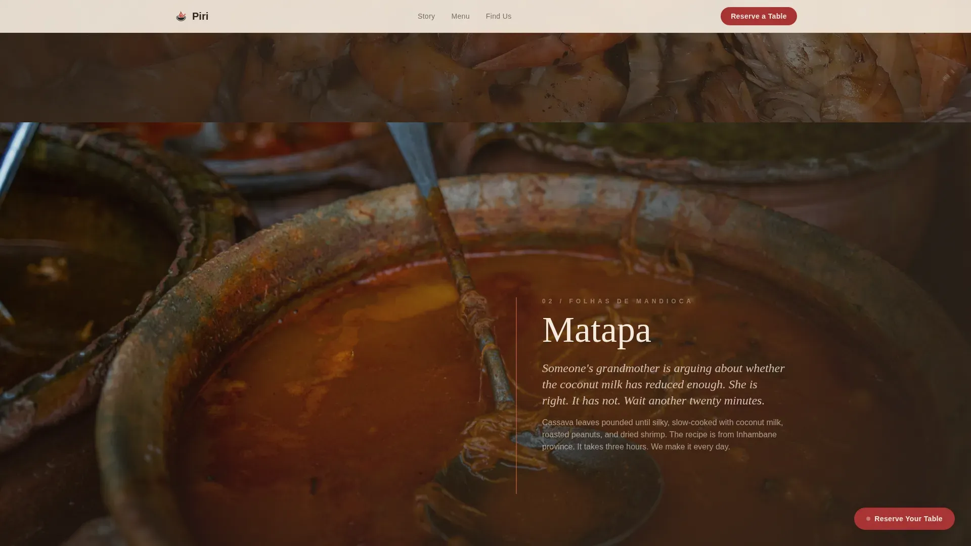
After the hero, the page drops into a full-bleed overhead shot of the open grill and then moves through three sequential dish sections: prawns, matapa, and peri-peri chicken. Each dish fills the entire viewport edge to edge. Short text blocks appear on scroll like handwritten notes, layered over the imagery. The sequence escalates in heat and intimacy, moving the visitor from the dining room to the prep table to the fire itself. By the time the final dish section closes, the visitor has traveled through the full sensory arc of the kitchen.
Sticky Floating Reservation Call-to-Action with Banner Transformation
The primary call-to-action, "Reserve Your Table," appears first as a subtle fixed button in the bottom corner of the screen. It stays present throughout the scroll without interrupting the storytelling. After the final dish section, it transforms into a full-width banner accompanied by the line: "Bring your appetite. We'll handle the fire." This two-stage call-to-action design keeps the conversion path visible without ever feeling pushy, and it delivers the visitor to the booking platform with location and party-size context already primed.
Secondary Menu Path to Retain Browsing Visitors
Below the reservation banner, a secondary call-to-action link reads "See the Full Menu." This path keeps visitors who are not yet ready to book inside the funnel rather than sending them back to search. It acknowledges that some visitors need more information before committing and gives them a clear next step that still moves forward rather than sideways.
Desert Rose Color System and Agrarian Root Visual Style
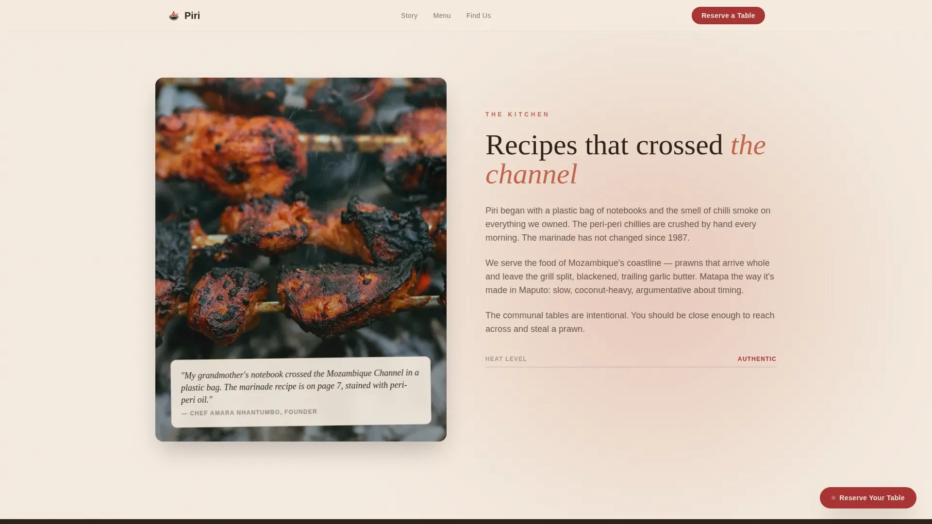
The entire template is built on a five-value Desert Rose palette that avoids every cool tone. Terracotta, cassava green, sand white, smoked charcoal, and dried peri-peri red work together to evoke red Mozambican soil, wood fire char, and the green growth of cassava trees. The Agrarian Root direction means the design celebrates imperfection, warmth, and rawness rather than minimalist polish. Nothing on this page feels cold, corporate, or distant from the land it represents.
Mouse Parallax on Hero and Scroll-Linked Parallax on Dish Sections
The hero section responds to mouse movement with a subtle parallax effect, giving the photo wall a tactile, three-dimensional quality. As visitors scroll through the dish sections, a scroll-linked parallax keeps the full-bleed imagery in motion. These two layers of interactivity work together to maintain engagement without overwhelming the food story they are designed to support.
Page sections overview
| Section | Purpose |
|---|---|
| UGC Photo Wall Hero | Opens with real guest images in a staggered cascade to establish authenticity immediately |
| Origin Story Section | Full-bleed overhead grill shot paired with the restaurant narrative and cultural context |
| Prawns Dish Spotlight | First full-viewport dish section; scroll-reveal text introduces the kitchen's signature seafood |
| Matapa Dish Spotlight | Second dish section escalating into traditional Mozambican cooking and flavor depth |
| Peri-Peri Chicken Spotlight | Third and final dish section, the hottest and most intimate, bringing the visitor to the fire |
| Communal Table Section | Atmosphere and audience section communicating who the restaurant is for |
| Reservation call to action Banner | Full-width closing banner with primary and secondary call-to-action paths |
| Minimal Footer | Vercel Horizontal pattern footer with essential links |
Design & branding system
The visual system is built entirely around warmth and deliberate imperfection. Every color choice, type decision, and layout choice reinforces the feeling of sitting outdoors on red Mozambican soil at golden hour. There are no cool tones, no clinical whites, and no neutral grays anywhere in the palette. The design does not try to look expensive. It tries to look true.
- Color system: five defined values covering terracotta (#C1654A) as the primary surface color, deep cassava green (#2D4A22) for structural contrast, bleached sand white (#F5EBE0) as the background, smoked charcoal (#2B2118) for body text, and dried peri-peri red (#A83232) reserved for hover states and call-to-action elements to guide the eye at critical decision points
- Typography: Instrument Serif handles all display and italic headline roles, bringing an editorial warmth to dish names and section headings; DM Sans handles all body text and navigation, keeping readability clean and practical across every screen size
- Visual style: the Agrarian Root creative direction means imagery is intentionally uneven, textures are raw, and the overall appearance celebrates the beauty of a working kitchen rather than a styled dining room
Mobile & speed optimization
The template is built desktop-first, prioritizing the full-bleed imagery and immersive scroll experience that defines the design. Mobile responsiveness is fully included, with the layout adapting so that dish sections, the photo wall, and the call-to-action banner all remain readable and functional on smaller screens. The hero parallax behavior adjusts appropriately for touch-based browsing.
- Priority image loading is applied to the hero photo wall so the staggered cascade begins immediately on page arrival, keeping the first impression sharp even on slower connections
- Dish section images use lazy loading, meaning they are fetched only as the visitor scrolls toward each section, reducing the initial page weight without compromising the visual experience
- The sticky call-to-action button is designed to remain accessible across all scroll positions on both desktop and mobile, so the reservation path is never more than one tap away
How this template helps you convert
The template is structured as a click-through page with one primary goal: send a warm, appetite-driven visitor to the reservation platform. Every design and layout decision in the template supports that goal without relying on aggressive tactics, pop-ups, or form-filling friction.
- The UGC photo wall establishes trust immediately by showing real guest moments rather than stock photography, so the visitor arrives at the origin story already convinced the food and atmosphere are genuine
- The three-stage dish escalation builds appetite progressively, moving from familiar seafood to traditional matapa to the heat of peri-peri chicken, so by the final dish section the visitor has experienced a complete sensory journey that makes the reservation banner feel like the natural next step rather than an interruption
- The two-path call-to-action design, with a primary reservation button and a secondary menu link, keeps every visitor type moving forward: those ready to book click through immediately, and those still exploring stay on the page rather than bouncing back to search results
Other information about this template
This template sits at the intersection of experiential dining design and high-intent click-through conversion. It draws on cooking traditions from southern Africa, specifically Mozambican cuisine that took root across the continent and traveled as far as the uk, brazil, and beyond through diaspora communities and trade routes along the Indian ocean. The peri peri sauce at the center of that story comes from the African bird's eye chilli, a small hot fruit that grows on low trees across the region and forms the base of marinades built from chilli, vinegar, salt, onion, garlic, and oil. Those marinade recipes are not recent inventions. They have been passed through village kitchens and carried across the continent for weeks, months, and generations, reaching millions of tables on every continent. The peri peri sauce tradition has become so widespread that it now forms one of the most recognized sauce categories in the world.
The template is well suited for restaurants that cook steak over open fire alongside seafood, for kitchens that want to introduce guests to matapa and xima alongside grilled chicken, and for operators who understand that the appearance of the digital space matters as much as the appearance of the dining room. It is also a strong reference for designers exploring how to substitute generic food photography for UGC imagery in high-trust hospitality contexts.
- The piri authentic mozambican food truck booking landing page template label is how this template is catalogued in the marketplace, making it discoverable for operators across food truck, pop-up, and bricks-and-mortar dining formats
- Designers can substitute any of the five Desert Rose color values as needed to account for brand property requirements without breaking the visual system
- The template is built to support planning across multiple opening weeks, from a december soft launch through an august peak season push, with the call-to-action structure remaining effective at every stage of a restaurant's life
- The design environment is intentionally raw and fire-lit, referencing the land, the ocean, and the trees of southern Africa rather than the polished world of fine-dining design
- Additionally, operators who have recently realized that their existing digital presence does not reflect the quality of their food will find this template gives them a strong starting point without paid agency effort
- The subject of authentic African fire cooking has grown in interest across uk dining culture, and this template is built to help operators capitalize on that focus with a page that finally does the food justice
Theme
Agrarian Root
Creative direction
Immersive Visual
Color system
Desert Rose
Style
Full-Width Immersive
Direction
Click-Through
Page Sections
UGC Photo Wall Hero with Staggered Cascade
Three Full-viewport Dish Sections
Sticky Floating Call to Action with Banner Transformation
Secondary Menu Path for Browsing Visitors
Desert Rose Color System
Scroll-linked and Mouse Parallax Interactivity
Related questions
Is this template designed for a single-page layout or a multi-page website?
Can I adapt this template for a restaurant that is not specifically Mozambican?
Does this template include an on-page reservation form?
What animation library does this template use?
Is this template suitable for a food truck or pop-up dining format?



