Dance School Marketing Booking Website Template
Pli is an elegant split-screen landing page template built for neighborhood dance schools. It pairs dramatic stats with compelling imagery in a rhythmic left-right layout, guiding visitors from social proof to class scheduling. The design uses a refined Ink and Paper palette, a cinematic full-bleed header, and a local SEO structure that turns late-night searches into booked enrollments.
by Rocket studio
Quick summary
Pli is a single-page dance school template with a 50/50 split-screen layout. Every scroll reveal leads with a bold statistic, then backs it with an image. The Ink and Paper color system, rose-gold accents, and a Caravaggio-lit header photograph create an atmosphere of quiet confidence. The page is built to convert local search traffic into class sign-ups.
Who this template is for
This template is designed for dance school owners who want their website to feel as polished as a professional production. It suits studios offering multiple styles and age groups under one roof.
- Dance school operators running ballet, hip-hop, contemporary, or ballroom programs
- Studio owners targeting local families, adult beginners, and special-occasion students such as brides preparing a first-dance routine
- Anyone building a local SEO landing page that needs to earn trust before asking for a click
What problem this template solves
Most dance school pages ask visitors to trust them before giving them any reason to. A parent searching at 10 PM needs proof before she books. An adult beginner needs to feel welcome before she fills in a form. Pli solves this by leading with undeniable social proof so that by the time visitors reach the schedule, their only question is logistics.
- Studios lose enrollments because their pages feel generic, cluttered, or slow to communicate credibility
- Local search visitors need neighborhood signals, review counts, and enrollment numbers before they commit
- Adult beginners and parents need different emotional reassurances, and one flat layout cannot serve both
What you get with this template
Pli delivers a fully structured single-page layout with every section pre-built and ready to customize. The template removes the guesswork of what to show, in what order, and at what visual weight.
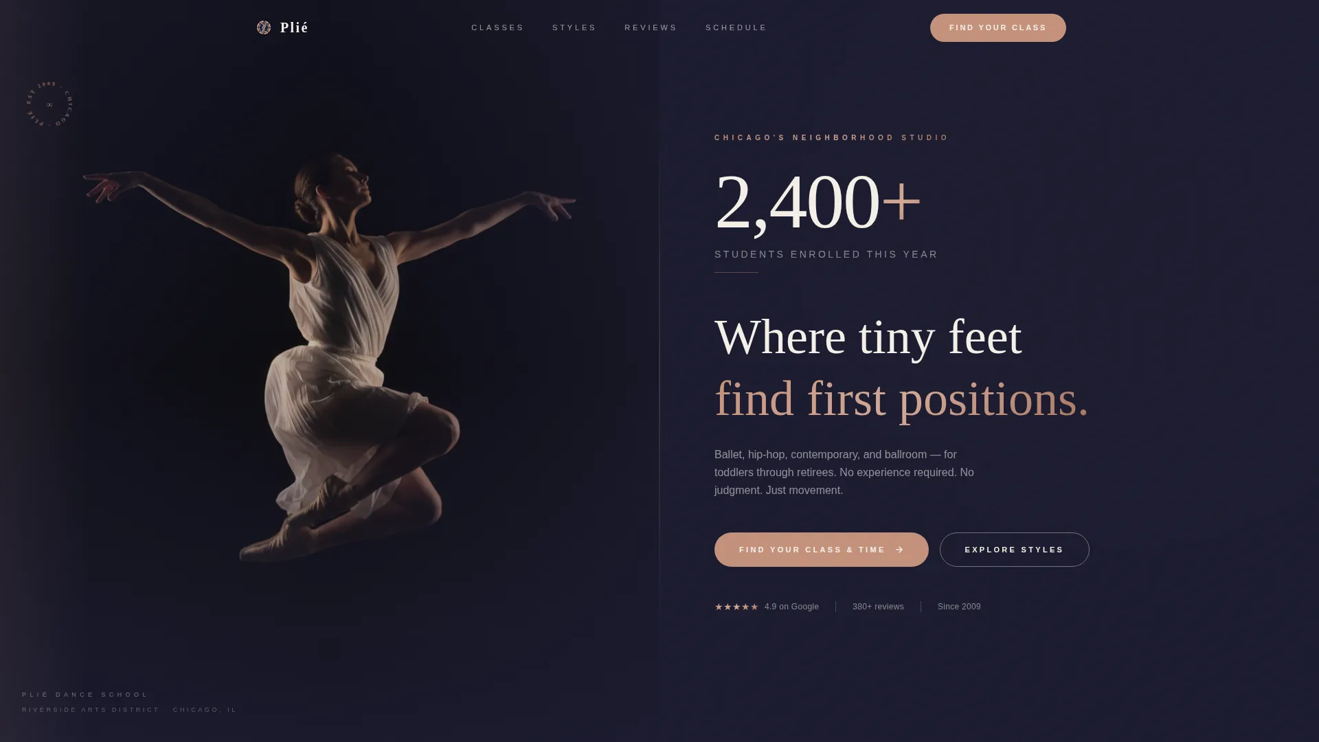
- A cinematic dark full-bleed header with a glow-lit dancer photograph and an oversized enrollment statistic
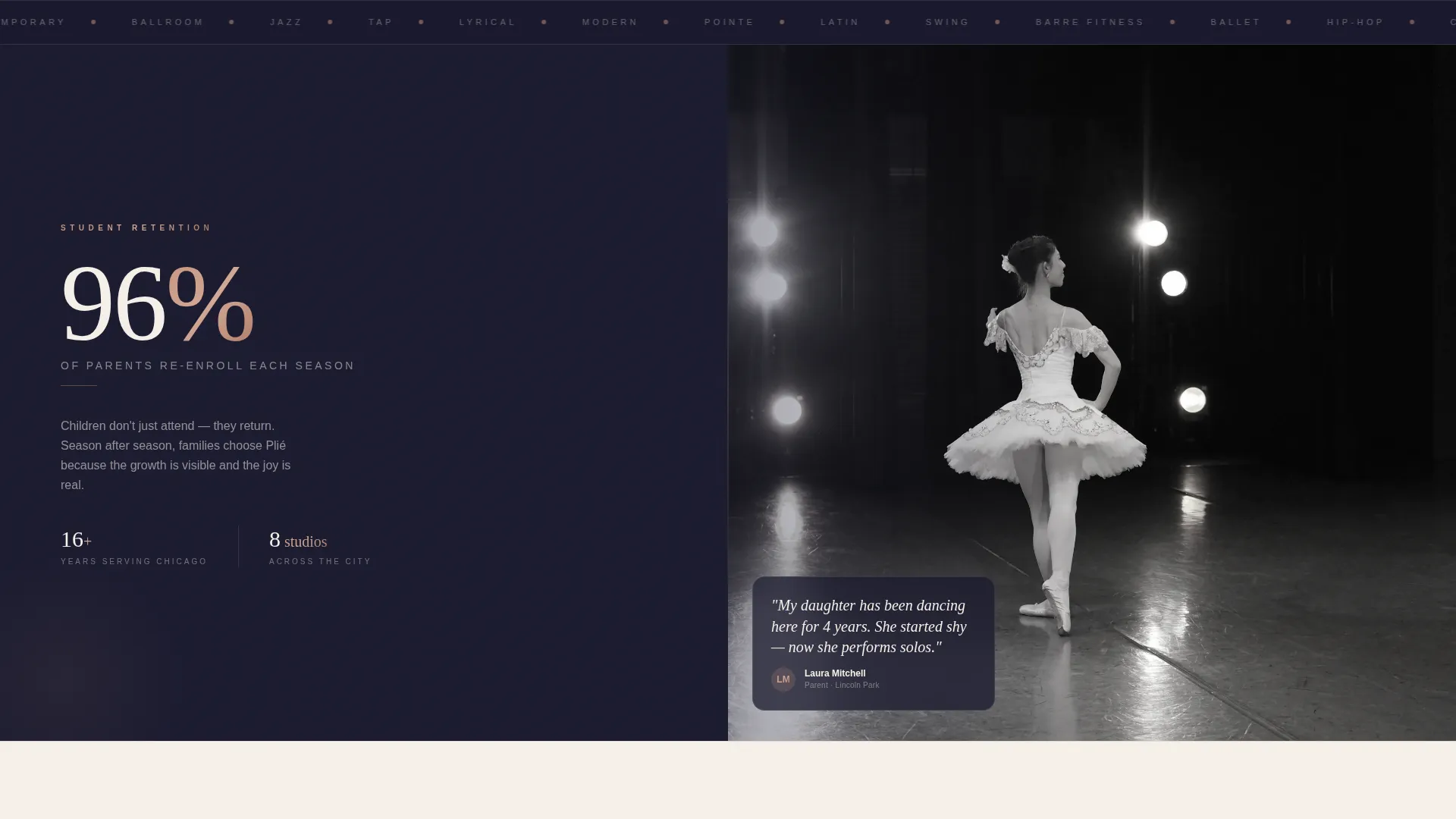
- Alternating split-screen sections that pair stats on one side with supporting imagery on the other
- A primary call-to-action linked to an interactive class schedule filtered by age group, style, and day of the week, plus a secondary lead-capture path for a free beginner's guide download
Feature list
This template is built around a clear set of design and content decisions. Each feature below reflects something explicitly present in the layout.
Stats-First Split Screen Layout
Each section leads with a prominent number before revealing its story. Stats like enrollment counts, review scores, and re-enrollment rates sit on one panel while supporting photography fills the other. The left-right alternation mirrors counted dance beats and keeps the page visually dynamic.
Cinematic Full-Bleed Header
The header uses a single dramatic photograph of a dancer mid-leap against a pure black background. Warm side-lighting traces the body's edges while the center stays in shadow, creating a Caravaggio-style mood. The enrollment statistic fades in at large scale in thin tracked-out parchment type above the school name.
Interactive Class Schedule Block
The primary call-to-action connects to a filterable schedule tool. Visitors can sort classes by age group, dance style, and day of the week. This removes friction for parents and adult beginners who need to find a specific slot before committing.
Lead Capture for Beginner's Guide
A secondary conversion path offers a free downloadable guide to choosing a dance style. It sits behind a simple first-name and email gate. This path targets early-stage visitors who are not yet ready to book but are open to starting a relationship with the school.
Local SEO Content Structure
The page includes schema-marked class listings, repeated neighborhood name references, and an embedded Google Map with the studio pinned. These elements reinforce local search intent and help the page serve visitors who typed queries like "adult dance classes" followed by a city name.
Testimonial Carousel with Review Stats
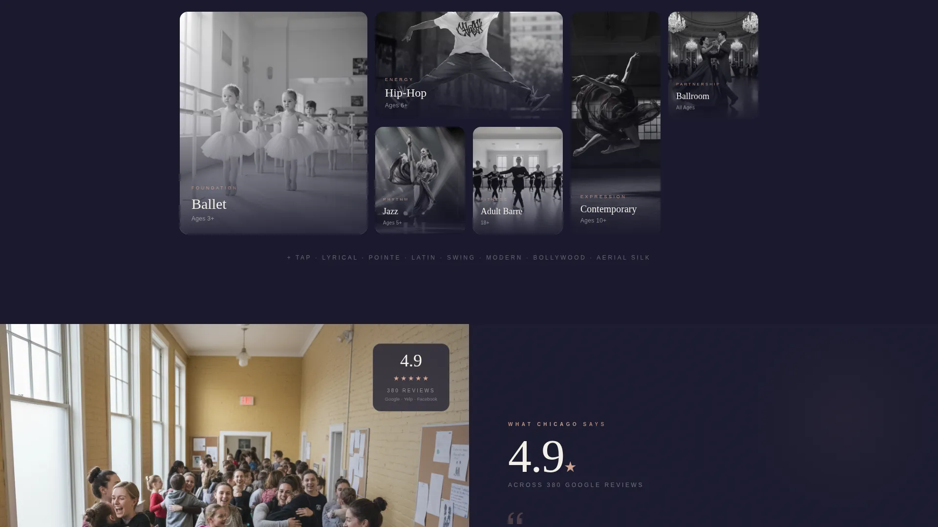
A dedicated section pairs a star-rating count and total review figure with a rotating testimonial carousel. Social proof is quantified before it is illustrated, so skeptical visitors see the numbers first and the human stories second.
Page sections overview
| Section | Purpose |
|---|---|
| Full-Bleed Header | Opens with cinematic dancer photo and oversized enrollment stat |
| Enrollment Stat Panel | Leads with student count before revealing supporting context |
| Re-enrollment Split | Shows parent retention rate alongside a recital photograph |
| Styles Taught Grid | Pairs "14 styles taught" stat with class thumbnail grid |
| Review Score Block | Anchors star rating and review count to testimonial carousel |
| Schedule call to action Section | Drives clicks to age, style, and day-filtered class schedule |
| Beginner's Guide Gate | Captures first name and email in exchange for free download |
| Embedded Map Block | Pins studio location and repeats neighborhood name for local SEO |
Design & branding system
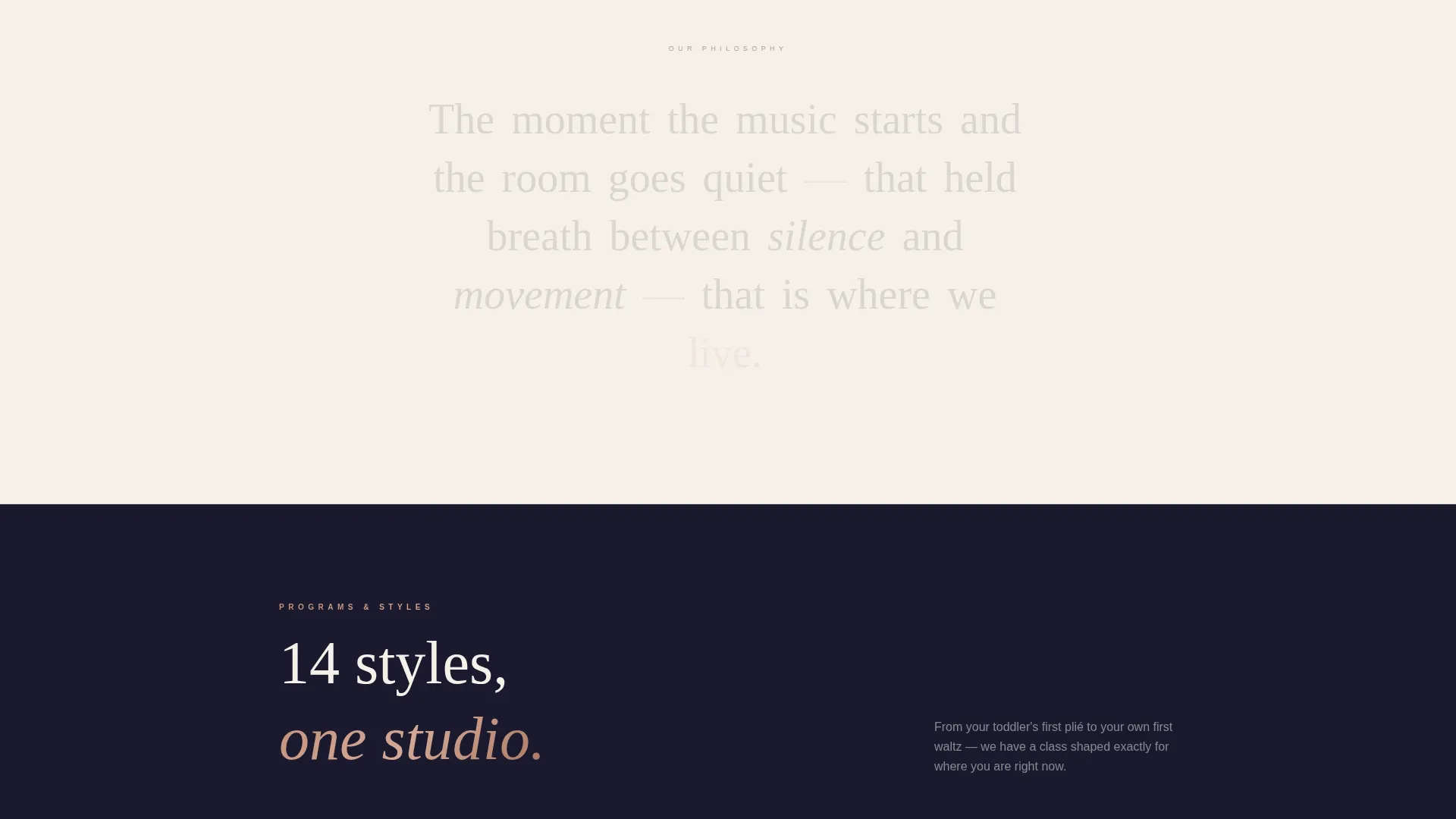
The visual identity follows an Executive Suite theme built on the Ink and Paper color system. Deep editorial black dominates the header and alternating dark sections. Warm parchment breathes between them and carries text-light panels. Graphite handles body copy and secondary labels. Rose-gold appears only for calls-to-action, stat highlights, and hover states, so every instance feels like a spotlight finding a dancer.
- Typography uses thin, tracked-out letterforms in parchment on dark panels, giving the page the feel of an embossed program at a professional ballet performance
- Rose-gold (#C4917B) is reserved strictly for emphasis so its impact is never diluted by overuse
- The alternating black and parchment section rhythm creates a visual cadence that echoes the counted beats of the choreography being sold
Mobile & speed optimization
The split-screen layout is designed to restack cleanly on smaller screens. Each panel transitions from a side-by-side view to a stacked single-column flow, keeping the stat-then-image story intact on any device size.
- The dark full-bleed header photograph is composed to remain impactful even when cropped to a portrait aspect ratio on mobile
- Rose-gold call-to-action buttons remain prominent and tappable at all screen sizes, preserving the conversion path for visitors browsing from a phone at bedtime
How this template helps you convert
The page is structured to move a skeptical local visitor from first impression to schedule click without a single moment of doubt. Every layout decision is intentional.
- The header stat ("2,400+ students enrolled this year") establishes scale and trust before any copy is read, so visitors arrive at the body sections already leaning forward
- The alternating stats-first split screens build a compounding case for the school, with each scroll adding a new proof point until booking feels like the obvious next step
- The dual conversion paths serve two different visitor mindsets: the parent ready to book now goes straight to the schedule tool, while the uncertain adult beginner downloads the free guide and enters a softer relationship with the school
Other information about this template
Pli is well suited for studios in competitive local markets where generic template designs fail to differentiate. The layout is especially effective for schools that already have strong review counts and enrollment numbers and want to lead with those figures rather than bury them in a sidebar.
- The template supports schema-marked class listings, which can help search engines understand the studio's offerings and serve them more accurately to local queries
- The neighborhood name repetition strategy built into the copy structure is designed to reinforce proximity signals throughout the page, not just in a footer address
- This template works equally well for an established school celebrating years in the community and for a newer studio that wants to project the confidence of a long-standing institution from day one
Theme
Executive Suite
Creative direction
Stats-First Impact
Color system
Ink & Paper
Style
Split Screen (50/50)
Direction
Content/Resource
Page Sections
Stats-first Split Screen Layout
Cinematic Full-bleed Header
Interactive Class Schedule Block
Beginner's Guide Lead Capture
Local SEO Content Structure
Testimonial Carousel with Quantified Reviews
Related questions
Can I adapt this template for a studio that teaches only one or two dance styles?
Does this template work for adult-only dance studios?
How does the interactive class schedule section work?
Is the beginner's guide lead capture section easy to customize?
Can I use my own photography in the full-bleed header?


