SaaS Pitch Deck Landing Page Template
Pitch is a single-page SaaS pitch deck landing page template built for founders and growth leads who need to convert cold traffic into app installs. It pairs stark data visualizations with sharp insight copy across a split-screen layout, walking visitors through market evidence before revealing the product as the only logical next step.
by Rocket studio
Quick summary
Pitch is a single-page landing page template that presents a SaaS pitch deck app with the authority of an analyst briefing. It uses a 50/50 split-screen layout, live data callouts, and a scroll-driven narrative to turn skeptical visitors into confident downloaders. The design is built around a void black and phosphor green palette that signals urgency without noise.
Who this template is for
This template speaks directly to builders and growth practitioners who know their product is strong but struggle to communicate it. It is designed for people who need a page that earns trust through data before it asks for anything.
- Seed-stage founders who need a pitch deck app landing page that performs after demo day
- Growth leads at Series B companies hunting sharper positioning frameworks for their SaaS tools
- Solo developers who built something genuinely useful but pitch it like a technical specification sheet
What problem this template solves
Most SaaS landing pages front-load features and skip the evidence. Visitors leave before they feel the problem. This template solves that by manufacturing the problem with real data first, then introducing the product as the obvious answer.
- Founders lose installs because their page explains the app before the visitor cares about the gap it fills
- Generic hero sections and stock illustrations undercut credibility for data-driven, analyst-minded audiences
- No sticky call-to-action means high-intent visitors scroll away without a clear moment to convert
What you get with this template
You get a fully structured single-page layout ready to customize with your own SaaS pitch deck app content. Every section has a defined role in the conversion sequence, and the visual system is pre-built so you spend time on copy, not colors.
- A 50/50 split-screen layout with four escalating data-and-insight sections
- A pinned app download call-to-action bar with platform-detect buttons for iOS and App Store, plus a tertiary browser link
- A secondary conversion path offering a benchmark report download in exchange for an email, timed to appear after the data sections
Feature list
This template is built around a specific set of deliberate design and layout decisions sourced directly from the brief.
Live Counter Header Bar
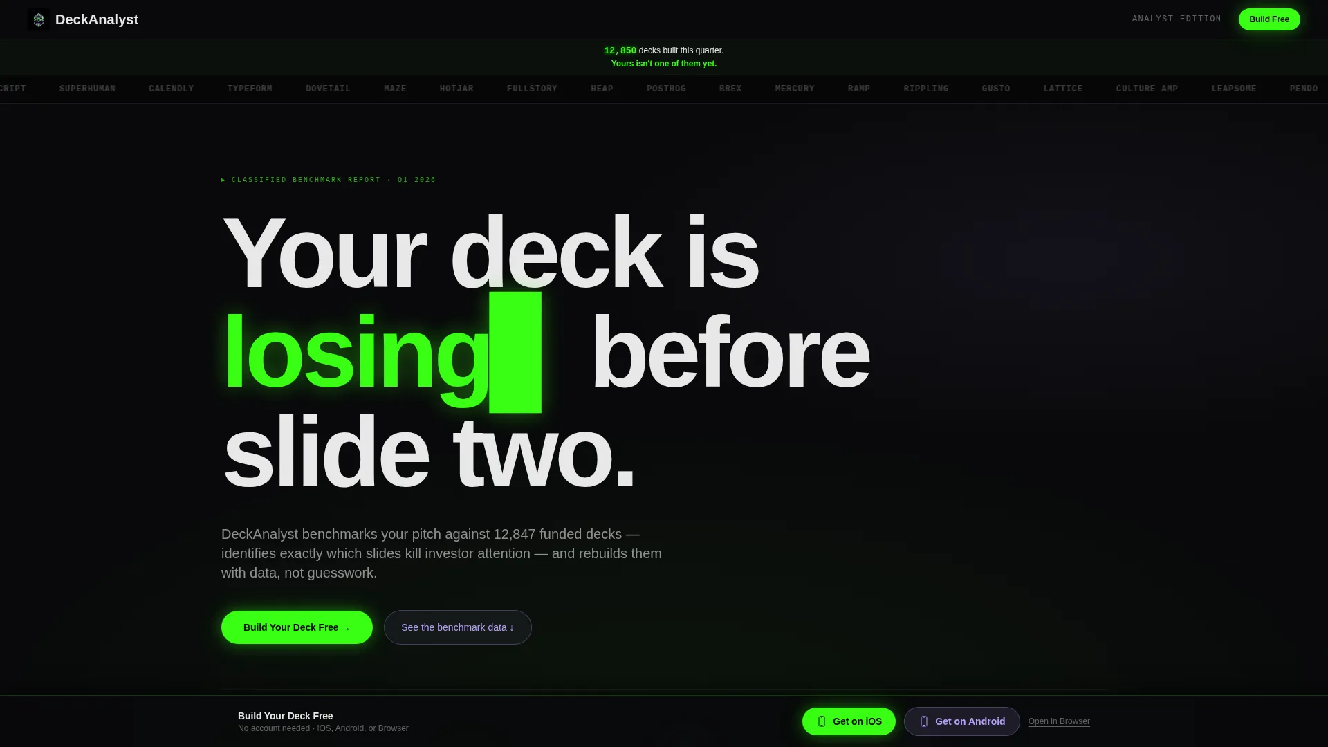
A horizontal logo scroll of fifty or more monochrome SaaS brand logos moves at a slow, hypnotic pace above a live ticking counter. The counter reads "12,847 decks built this quarter" in interface white, with a phosphor green follow-up line below. No hero image competes with it. The social proof is the visual.
Split-Screen Scroll Narrative
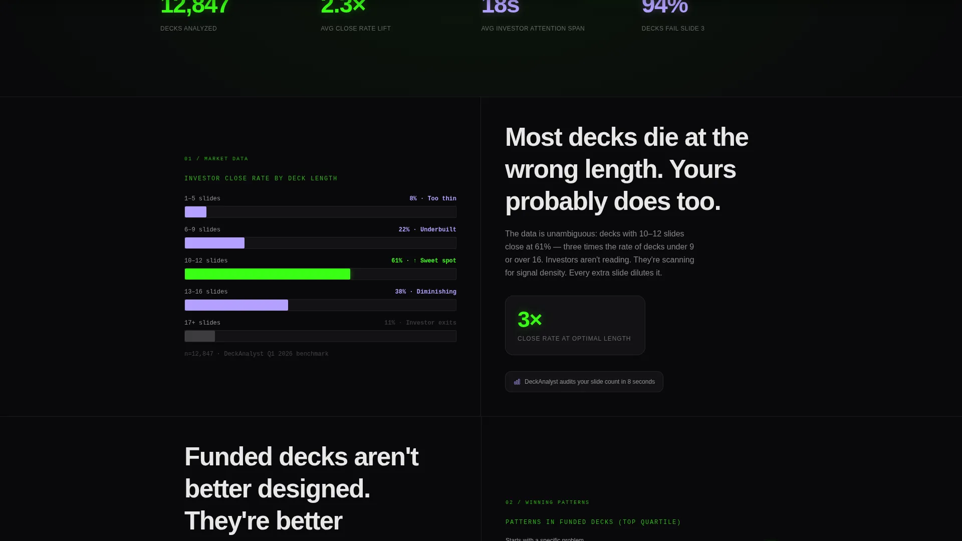
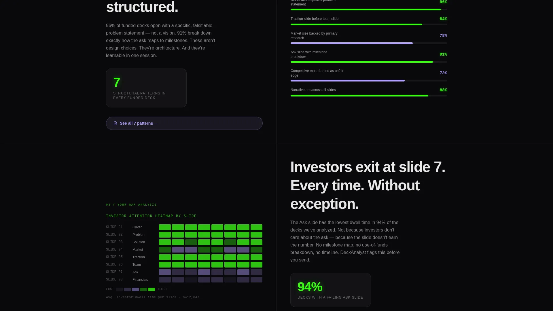
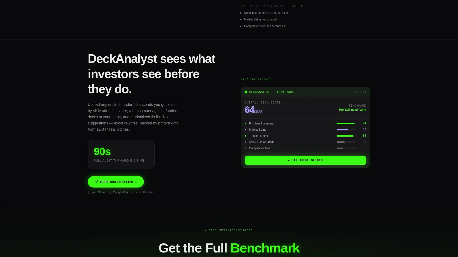
Four distinct 50/50 sections pair a stark data visualization on the left with a single insight sentence and a micro-interaction on the right. Each section escalates stakes: market data, winning deck patterns, what your deck is probably missing, and finally the app interface as the resolution. The scroll builds the case before the pitch begins.
Data Visualization Panels
Each left-side panel presents a specific data story: conversion benchmarks, average deck length versus close rate, and slide-by-slide attention heatmaps. These are not decorative charts. They function as mirrors that make visitors recognize their own gap before any product claim is made.
Pinned App Download call to action
After the first scroll, a call-to-action bar pins itself to the bottom of the viewport. It reads "Build Your Deck Free" in phosphor green on void black. Platform-detect buttons for iOS and App Store keep the tap path frictionless, with an "Open in Browser" tertiary link for desktop visitors.
Secondary Email Capture Path
After the data sections, a secondary conversion prompt offers "Get the Full Benchmark Report" in exchange for an email address. It appears at the moment curiosity peaks, after the visitor has absorbed the market evidence. It gives high-intent but not-yet-ready visitors a lower-commitment way to stay connected.
Acid Digital Color System
The visual identity uses four tightly controlled colors: void black (#09090B), phosphor green (#39FF14), UV lilac (#B4A0FF), and interface white (#E8E8E8). Green fires only on calls to action, live counters, and stat callouts. UV lilac marks secondary interactive states and chart accents. White body text floats cleanly against the dark ground.
Page sections overview
| Section | Purpose |
|---|---|
| Logo Bar Header | Establishes social proof instantly with a live counter and moving logo strip |
| Market Data Panel | Opens the narrative with industry conversion benchmarks to surface the gap |
| Winning Deck Insights | Shows what top-performing decks share to raise the visitor's awareness |
| Deck Gap Reveal | Reflects the visitor's probable weaknesses back at them with heatmap data |
| App Interface Reveal | Introduces the product as the direct solution to each identified gap |
| Pinned Download call to action | Keeps the primary action visible and tappable after the first scroll |
| Benchmark Report Capture | Collects emails from high-intent visitors not yet ready to download |
Design & branding system
The Tech Glass theme is defined by restraint and precision. Every design decision serves signal clarity, not decoration. The result feels like a terminal window reflecting off a glass desk at 2 a.m., electric and focused.
- Void black (#09090B) dominates every background; phosphor green (#39FF14) is reserved for calls to action, counters, and callout numbers
- UV lilac (#B4A0FF) marks secondary interactive states and chart accents; interface white (#E8E8E8) carries all body text on dark grounds
- The monochrome logo bar and absence of hero imagery keep the data visualizations as the primary visual anchors throughout
Mobile & speed optimization
The template is structured to stay functional and readable on smaller screens without sacrificing the impact of the split-screen layout. The pinned call to action is especially important on mobile, where the download moment must always be one tap away.
- The 50/50 split-screen stacks vertically on mobile so data panels and insight copy read in the correct narrative order
- Platform-detect buttons surface the right app store link automatically, reducing friction for mobile visitors arriving from ads or shared links
- The logo bar scroll and live counter are designed to remain legible and performant at all viewport widths
How this template helps you convert
This template does not ask for the tap before it earns it. Every scroll builds belief, and the download moment arrives when the visitor already feels behind.
- The live counter and logo bar create immediate social proof before a single product claim appears, so skeptical visitors stay on the page long enough to engage with the data
- The four-section scroll narrative manufactures the problem using real benchmarks and heatmap evidence, making the app feel like a conclusion the visitor reached themselves rather than a pitch they were sold
Other information about this template
This template is part of the Startup and Launch category, specifically built for the SaaS startup subcategory and the SaaS pitch deck page niche. It is an ideal starting point for any team launching or repositioning a pitch deck tool, fundraising aid, or investor communication app.
- The template is categorized under the SaaS Startup subcategory with a niche focus on SaaS pitch deck pages, making it well-suited for founders in the pre-seed to Series B range
- The Industry Report creative direction means the page reads like proprietary research, which builds trust with analytically minded audiences faster than lifestyle or feature-driven templates
- The App Download landing page direction is built in from the ground up, so the entire scroll sequence supports a single conversion goal rather than splitting attention across multiple outcomes
Theme
Tech Glass
Creative direction
Industry Report
Color system
Acid Digital
Style
Split Screen (50/50)
Direction
App Download
Page Sections
Live Counter Header with Logo Bar
Four-section Split-screen Narrative
Pinned App Download Call-to-action
Secondary Benchmark Report Capture
Data Visualization Panels
Acid Digital Visual Identity System
Related questions
Can I use this template for a SaaS product that is not a pitch deck app?
Does the live counter update automatically?
Is this template suitable for both desktop and mobile visitors?
Does this template include the email capture for the benchmark report?
Can I change the colors to match my own brand?



