Full-Service Marketing Agency Editorial Landing Page Template
The Pitch full service marketing agency editorial landing page template delivers a bold, broadsheet-inspired single page designed to convert mid-market leads. Built with a Stats-First Impact creative direction, Ink and Paper color system, and a Press Mentions header, this agency landing page turns dense proof into pipeline through strategic typography, editorial layout, and a sticky audit form.
by Rocket studio
Quick summary
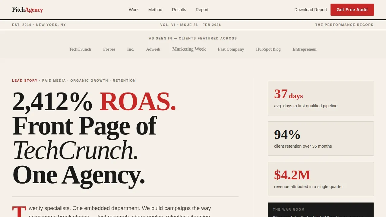
The Pitch template is a full-service marketing agency landing page built entirely around editorial proof. It opens with a publication masthead and a 72pt serif headline, then guides visitors through oversized metrics, bento case studies, and a sticky audit form. Every design decision earns its place on the page, and every scroll stop is engineered to move a reader closer to booking a free audit.
Who this template is for
This agency landing page was designed for a very specific kind of marketing operation. It suits firms that already have results worth showing and need a page that can present those results with the authority they deserve.
- Mid-market digital marketing agencies targeting CMOs, franchise operators scaling from five to fifty locations, and SaaS founders who need embedded team-level services
- Full-service marketing agency owners who rely on hard metrics and editorial credibility to win new business
- Marketers and agency principals who want a high-impact, lead generation landing page without relying on generic web templates
What problem this template solves
Most agency landing page designs bury their best proof. Vague headlines, bloated copy, and weak calls to action mean visitors bounce before they ever reach the case studies. This template flips that pattern completely.
- Visitors land on a page that leads with a publication masthead and a punchy headline, establishing credibility before a single paragraph of body copy appears
- Prospects who are not yet ready to contact sales can still convert via a secondary lead magnet, the benchmark report download, so no traffic source goes to waste
- The sticky audit form activates after the third section scroll, catching leads at the exact moment proof has stacked high enough to motivate action
What you get with this template
This is a complete, single page editorial layout ready to be customized and deployed. It contains every structural and visual element described in the creative brief, assembled into a coherent conversion flow.
- A broadsheet-style hero with a Press Mentions publication masthead, a bold serif headline, and floating stat cards that display oversized metrics on load
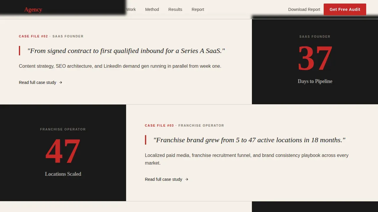
- An asymmetric bento grid for three ideal-client-profile case studies, a two-column editorial methodology breakdown, and a benchmark report call-to-action section with secondary form
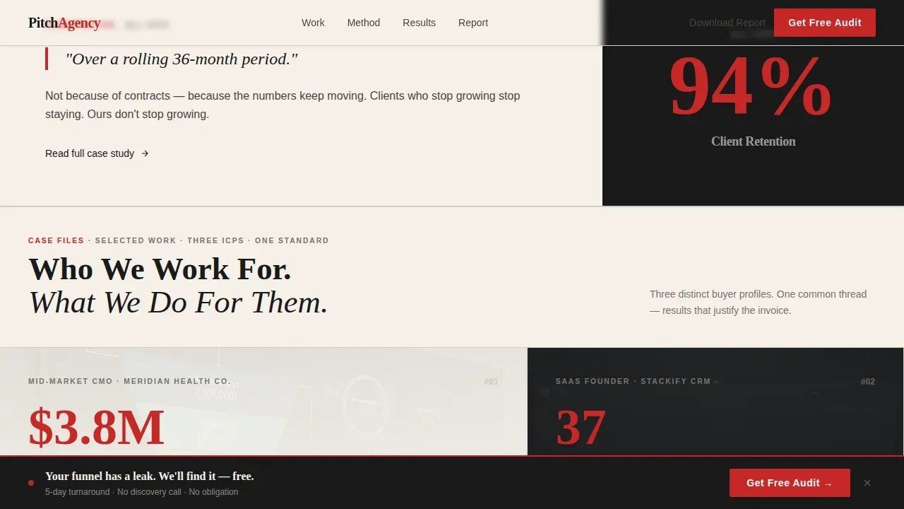
- A sticky bottom bar with a free audit form that activates on scroll, asking for company website first to minimize friction and maximize lead quality
Feature list
This agency landing page packs a precise set of features, each chosen to support the editorial design system and the lead generation objective. The template does not pad with unused sections.
Stats-First Hero with Publication Masthead
The header opens with real publication logos arranged like a broadsheet nameplate, followed by a bold 72-point serif headline set flush left. Floating stat cards appear alongside the headline, giving visitors oversized metrics before any paragraph of explanation. This design approach ensures the unique value proposition is visible without scrolling, matching the visitor's expectations immediately.
Oversized Metric Spotlight Sections
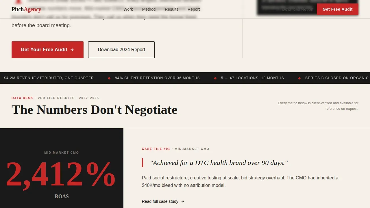
Between editorial columns, the page drops full-width stat callouts in hot-off-the-press red. Each spotlight section leads with a single dominant number, such as "37 days to first qualified pipeline," and follows with a short editorial paragraph. This Stats-First Impact rhythm strategically alternates hook and evidence the way a long-form feature article builds its argument.
Asymmetric Bento Case Studies Grid
Three ideal-client-profile case studies sit in an asymmetric bento grid layout. Each cell can display a client result, a key metric, and a short narrative. Case studies build credibility and trust through data-driven storytelling, and this grid makes them impossible to skip. Displaying client logos alongside quantifiable results serves as a powerful credibility indicator for potential clients.
Sticky Audit Form Bar with Dropdown
A sticky bottom bar activates after the third section scroll and stays anchored as visitors read. The form asks for company website first, then monthly marketing spend range via dropdown, then name and email. Fewer fields mean less friction for the user, and the spend range dropdown helps the agency qualify leads before a single conversation takes place.
Benchmark Report Secondary Conversion Block
A dedicated section above the footer presents the free benchmark report download as a secondary call to action. This block captures earlier-funnel visitors who are not ready to contact the agency directly but will sign up in exchange for useful data. It ensures no visitor leaves the page empty-handed, protecting lead volume from every traffic source.
Editorial Two-Column Methodology Section
The methodology section uses a classic two-column editorial layout to break down the agency's war-room process. Left-column headers anchor each stage, while the right column delivers the explanatory copy. This format lets the page present deep expertise in a format that feels authoritative, skimmable, and true to the broadsheet design language that runs through the rest of the template.
Page sections overview
| Section | Purpose |
|---|---|
| Publication Masthead Header | Establishes editorial credibility with press logos |
| Bold Serif Hero | Delivers headline, stat cards, primary call to action |
| Stats Spotlight Row | Alternates oversized metrics with pull quote columns |
| Bento Case Studies | Displays three client results in asymmetric grid |
| Methodology Columns | Explains war-room process in editorial two-column format |
| Benchmark Report call to action | Captures mid-funnel leads with free report offer |
| Sticky Audit Bar | Anchors primary form after third scroll trigger |
| Horizontal Flow Footer | Closes page with navigation and brand links |
Design & branding system
The design language draws from classic broadsheet print media. Every color, type choice, and spacing decision reflects the Ink and Paper system, giving the page an authoritative feel without visual noise.
- Color palette: editorial black (#1A1A1A) for body type, warm newsprint cream (#F5F0E8) as the page background, column-rule gray (#D1CBC2) for section dividers, and hot-off-the-press red (#C62828) reserved for data callouts, pull quotes, and hover states
- Typography: Fraunces display serif for headlines and pull quotes, DM Sans for body copy and user interface elements; generous white space between sections forces the eye toward key metrics and calls to action
- Visual emphasis sits entirely on the numbers and headlines; there is no hero photo or background illustration, because the typography and statistics are the visual proof
Mobile & speed optimization
The template is built desktop-first to serve CMOs reading on large monitors, and it is fully responsive so the same landing page works across every screen size.
- GSAP ScrollTrigger powers animated stat counters, staggered section reveals, and the sticky audit bar activation, all running as client-side components while static sections use server components for faster initial load
- The layout reflows cleanly for mobile, stacking the bento grid, condensing the two-column editorial sections, and keeping the sticky bar accessible without covering critical page content
- Icons, column rules, and typographic elements scale consistently across breakpoints, so the user friendly experience holds whether the visitor is on a desktop, tablet, or phone
How this template helps you convert
An effective landing page does not ask visitors to trust on faith. It builds a logical argument, section by section, until requesting an audit feels like the rational next step. This template does exactly that.
- The page follows a logical downward flow: hero proof leads to stat spotlights, which lead to named case studies, which lead to methodology, which lead to the benchmark report offer, and finally to the free audit form. Every scroll raises the stakes and adds a new layer of evidence, so visitors convert with confidence rather than hesitation.
- Testimonials, client logos, and specific metrics serve as layered social proof throughout the page. Detailed testimonials can include the names and titles of satisfied clients to reinforce trust. The sticky audit form strategically captures leads at peak engagement, and the secondary benchmark report form means the page converts visitors across a wide range of readiness levels.
Other information about this template
This template is part of a focused library of professional services and digital agency landing page templates designed for B2B lead generation. A few additional details worth knowing before you customize and launch.
- The template is designed to work with a drag and drop interface, so you can tweak layout, swap copy, and adjust brand colors without writing code from scratch
- You can save time by using the pre-built section order as your production checklist, then fill in your own metrics, case study results, and publication logos
- The page is built as a single page experience, meaning all conversion paths live on one focused web document rather than spreading visitors across multiple pages
- For digital agencies and digital marketing firms that run paid campaigns, this template keeps every traffic source landing on a distraction-free environment built to generate leads
- Customization options let you align the design, icons, and color emphasis with your brand identity, and the editorial layout gives you room to present results in a format that stands apart from standard agency website templates
- Google and other search engines can index the static content effectively, while animated elements remain client-rendered to protect page performance
- This template is a strong fit for web professionals who want to stand out in a market full of generic agency landing page examples and need a page that signals expertise from the first pixel
Theme
Service Utility
Creative direction
Stats-First Impact
Color system
Ink & Paper
Direction
Lead Generation
Page Sections
Stats-first Hero with Publication Masthead
Oversized Metric Spotlight Sections
Asymmetric Bento Case Studies Grid
Sticky Audit Form Bar with Dropdown
Benchmark Report Secondary Conversion Block
Editorial Two-column Methodology Section
Related questions
Who is this landing page template best suited for?
Can I customize the colors, fonts, and content sections?
How does the lead capture form work?
Does the page include a secondary conversion option for visitors not ready to book?
Is this template mobile-responsive?



