Thai Dining Professional Website Template
Plaa is an immersive Thai tasting menu landing page built around a masonry gallery and hand-drawn botanical illustration. It tells the story of a twelve-seat chef's counter in rich amber tones, guiding anniversary couples, food editors, and visiting chefs from the first scroll to a single reservation click.
by Rocket studio
Quick summary
Plaa is a single-page, scroll-driven landing page for a twelve-seat Thai tasting menu experience. It pairs a full-viewport custom illustration with a masonry gallery of seven illustrated courses. Every section is built to make the visitor feel the meal before they ever book a seat.
Who this template is for
This template suits any intimate fine dining or tasting menu concept that leads with storytelling over photography. It works equally well for a chef building their first web presence or a hospitality studio designing on a client's behalf.
- Anniversary couples researching a meaningful, memorable dining event
- Food editors and visiting chefs looking for a venue worth featuring or returning to
- Restaurant owners running small-format or chef's-counter concepts who want a click-through reservation page
What problem this template solves
Most restaurant pages feel like menus printed on a screen. They list dishes, show a few photos, and stop there. A Thai tasting menu experience built around a single dawn-sourced ingredient deserves something more considered than a grid of thumbnails and an OpenTable widget.
- It gives an atmospheric, editorial alternative to generic restaurant templates
- It replaces flat photography grids with illustrated, poem-like course cards that carry real emotional weight
- It removes friction from the booking path by sending visitors directly to the reservation platform with no on-page form to complete
What you get with this template
You get a fully structured, single-page layout that moves a visitor through an emotional arc, from curiosity to hunger to a confident reservation click. Every section has a clear role, and the visual language stays consistent from hero to footer.
- A full-viewport illustrated hero, a seven-course masonry gallery, a testimonial section, and a focused reservation call-to-action block
- Scroll-linked background gradient shifts, staggered card reveal animations, a rotating badge, and a fixed bottom call-to-action that appears at scroll depth
- DM Serif Display headings, DM Sans body text, and Reenie Beanie handwritten accents, all paired with a four-color warm artisan palette
Feature list
Full-Viewport Botanical Illustration Header
The hero spans the entire screen with a hand-drawn SVG illustration. It depicts a teak counter seen from above, with each place setting illustrated as a tiny ecosystem. Floating info cards and a rotating badge sit over the artwork, adding context without covering the composition.
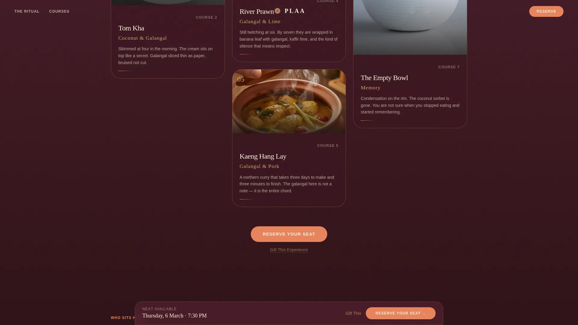
Masonry Gallery Walk
Seven course cards are arranged in a staggered masonry layout. Each card carries a close-up dish illustration, a hand-lettered ingredient name, and a short poetic description of the ingredient's origin. Cards vary in width and height, and the scroll pace slows as the visitor moves through the courses.
Scroll-Linked Gradient Animation
The page background shifts from deep tamarind to smoked papaya as the visitor scrolls. This is handled with CSS animations and Intersection Observer triggers, so the color transition responds to scroll position without heavy scripting.
Fixed Reservation Call-to-Action
A "Reserve Your Seat" button appears first as a gold inline button after the third row of masonry cards. Once the visitor scrolls past the fifth course, the same button locks to the bottom of the viewport. A secondary "Gift This Experience" text link sits beneath it for visitors buying on behalf of someone else.
Testimonial Social Proof Section
The "Who Sits Here" section displays three attributed quotes from a food editor, a visiting chef, and an anniversary guest. This section validates the experience for each of the three primary audience types before they reach the call-to-action.
Warm Artisan Typography System
Headings use DM Serif Display for editorial weight. Body copy runs in DM Sans for clean readability. Accent labels and ingredient names use Reenie Beanie, a handwritten style that echoes the illustration work throughout the page.
Page sections overview
| Section | Purpose |
|---|---|
| Hero illustration | Introduce the counter with a full-viewport botanical illustration, floating info cards, and a rotating badge |
| The Ritual | Present the single-ingredient philosophy using a staggered asymmetric layout |
| Gallery Walk | Guide visitors through seven illustrated course cards in a masonry scroll |
| Who Sits Here | Build trust with three attributed quotes from real audience types |
| Reserve call-to-action | Deliver the primary "Reserve Your Seat" button and the secondary "Gift This Experience" link |
| Minimal footer | Close the page with a centered, minimal footer pattern |
Design & branding system
The palette draws from golden-hour light falling across a teak table. Every color has a clear role, and the overall impression is warm, amber, and handcrafted rather than sleek or clinical.
- Four core colors: smoked papaya (#E8845C), deep tamarind (#5B2333), toasted rice gold (#D4A96A), and palm-shadow black (#1A1412) for body text
- Toasted rice gold borders frame each masonry card, while interactive elements pulse in smoked papaya on hover, mimicking embers breathing
- Illustration style sits between traditional Thai mural painting and modern botanical ink work, with loose line work and watercolor-soft color fills
Mobile & speed optimization
The template is built desktop-first, reflecting the research and reservation habits of a fine dining audience. The layout is designed to read clearly on large screens, where the masonry gallery and illustration details carry the most visual impact.
- CSS animations are preferred throughout, keeping the scroll-linked gradient and stagger reveals lightweight
- Intersection Observer handles card reveal triggers, so animations fire only when elements enter the viewport
- The desktop-first approach prioritizes the experience most visitors will use when making a reservation decision
How this template helps you convert
The page earns the reservation click by building desire across every scroll step. It does not ask for a commitment until the visitor has experienced the full story.
- The masonry gallery slows the visitor's pace deliberately, mimicking the rhythm of a tasting menu and building appetite before any call-to-action appears
- The fixed bottom call-to-action appears only after the visitor has passed the fifth course card, ensuring the button arrives at the moment of highest engagement
- The "Gift This Experience" secondary link targets the anniversary audience directly, capturing a second conversion path without cluttering the primary button
Other information about this template
This template is built for a very specific kind of hospitality brand: one that competes on atmosphere and story rather than price or volume. The design language, copy structure, and animation choices all reflect that positioning.
- Thai ingredient names are used authentically throughout, including galangal, naam phrik, and river prawn references, supporting localization for an English-language audience that appreciates culinary specificity
- The click-through landing page direction means there is no on-page reservation form; the call-to-action button carries the visitor directly to the external booking calendar with the next available evening pre-selected
- The footer uses a minimal centered pattern, keeping the exit clean and avoiding visual noise after the call-to-action


Theme
Warm Artisan
Creative direction
Gallery Walk
Color system
Sunset Gradient
Style
Masonry/Pinterest
Direction
Click-Through
Page Sections
Full-viewport Botanical Illustration Header
Seven-course Masonry Gallery
Scroll-linked Gradient Background
Fixed Depth-triggered Call-to-action
Attributed Testimonial Section
Warm Artisan Typography System
Related questions
Does this template include a built-in reservation form?
Can I replace the illustrated header with a photograph?
How many course cards does the masonry gallery include?
Is the template suitable for a restaurant with more than twelve seats?
What fonts does this template use?


