Education Recruiting | Free Website Template | Rocket
The Placed Startup Velocity Education Recruiting Agency Landing Page is a sidebar companion landing page built for UK education recruiters. It serves headteachers posting vacancies and newly qualified teachers uploading CVs through one punchy, scroll-driven experience. Electric violet, highlighter yellow, and a deep blackboard palette give this landing page bold, classroom-first energy that converts from both sides of the hiring desk.
by Rocket studio
Quick summary
Placed is a sidebar companion landing page template designed for UK education recruiting agencies. It runs on a Startup Velocity energy system with a Dopamine Pop colour palette, electric violet, highlighter yellow, chalk-white, and deep blackboard. The page converts from two sides at once: headteachers posting vacancies and job seekers uploading CVs, all within one focused, high converting page layout.
Who this template is for
This landing page speaks directly to education recruiters who need to close roles fast and build a candidate pipeline at the same time. It is built for agencies operating in the UK market, where September deadlines create real urgency on both sides of the hiring desk. If your company fills classrooms rather than office cubicles, this template is built for you.
This landing page template is ideal for:
- Education recruiting agency owners who need a single landing page that converts both school clients and teacher candidates without splitting budget across two separate pages.
- Academy trust HR leads and headteachers looking for a clear, fast route to post job postings and reach top candidates before the new term begins.
- Newly qualified teachers and experienced educators who are job seekers refreshing their inbox and need a landing page experience that immediately proves the talent pool is real.
What problem this template solves
Most traditional landing pages for recruitment treat both audiences the same way. A traditional landing page built for an education agency often forces visitors to choose their path awkwardly, or worse, sends them to a generic jobs board that kills momentum. The result is lower conversion rates, wasted leads, and a page design that fails the urgency of a September deadline.
This template solves those problems by design:
- Two-sided conversion in one layout. The persistent sidebar companion toggles between a "Post a Vacancy" school path and an "Upload Your CV" teacher path, keeping the main goal clear for every visitor without feeling overwhelmed by competing messages.
- Search-first, register-second flow. The oversized hero section search box teases real results before asking for any data, which earns the click honestly and improves conversion rates by removing the trust barrier upfront.
- Human network storytelling. Every scroll reinforces that this is a living network of placed educators, not a flat database of job postings, which builds trust faster than a list of roles ever could.
What you get with this template
This landing page gives education recruiters all the tools needed to run a two-sided marketplace from a single, well-structured page. The layout is clean and purposeful. Visitors land, search, scroll through social proof, and convert, either by posting a vacancy or uploading a CV. Good design here does not mean decorative. It means every section has a clear goal that moves the visitor forward.
Every element included in this landing page template is listed below:
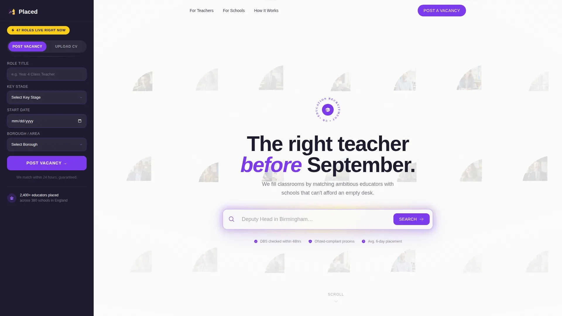
- Hero section with pulsing search box, an oversized, centred search input with cycling ghost text and a mosaic of circular portrait photos behind it in slow parallax drift, acting as both a hero image and an instant conversion tool.
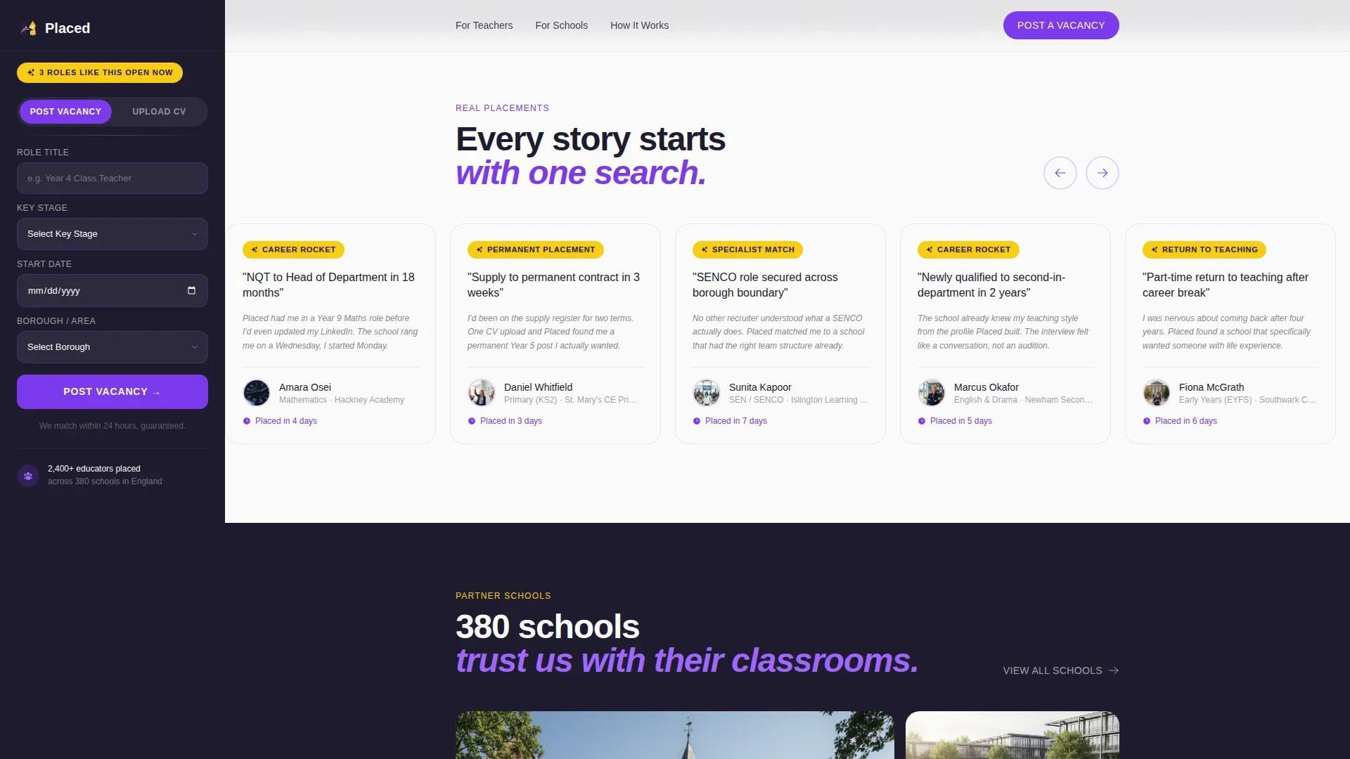
- Candidate stories carousel, a horizontal scroll section with one-line placement stories ("NQT to Head of Department in 18 months") that delivers social proof in a format visitors can absorb in seconds.
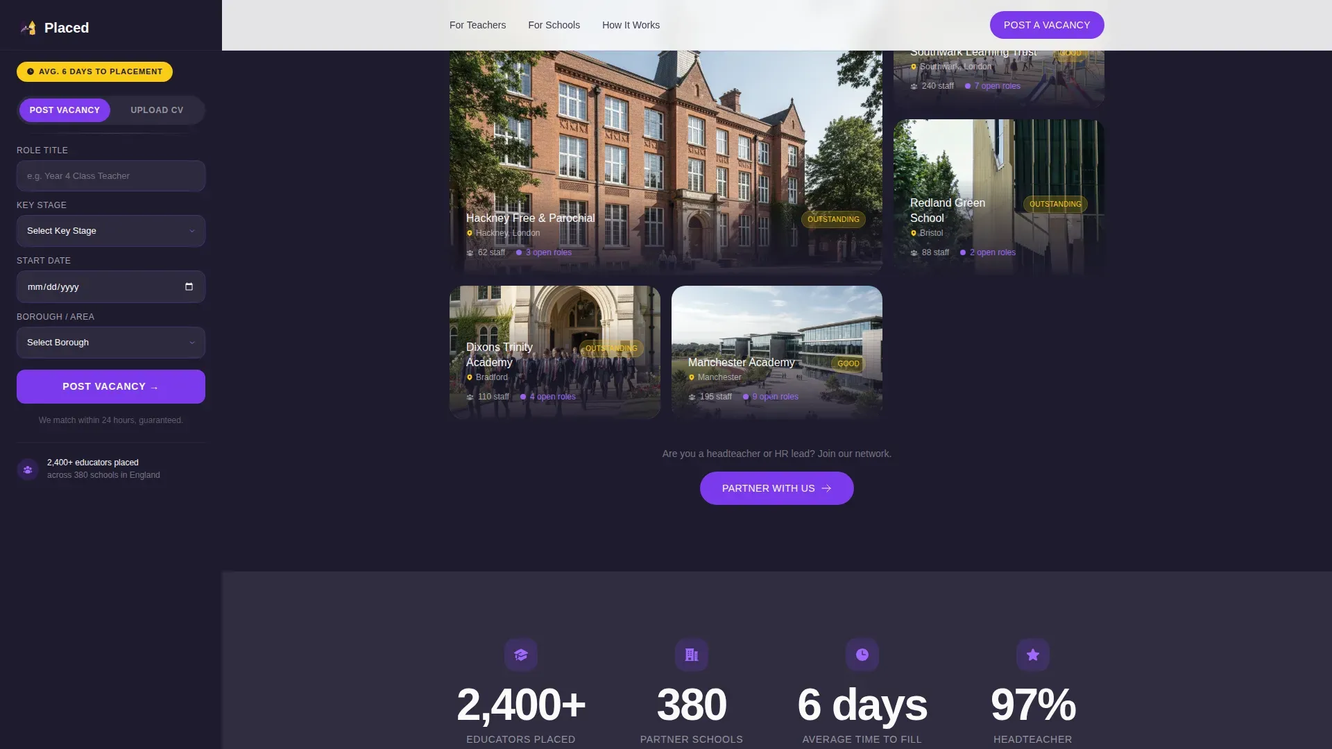
- Partner schools asymmetric grid, building photos with staff count and open roles displayed, showing schools as real places rather than flat logos.
- Stats and social proof section, a blackboard-dark background section with animated counters and a testimonial block that reinforces credibility with hard data.
- How It Works split section, an asymmetric layout showing the school path versus the teacher path side by side, making the unique selling proposition clear for both audiences.
- Persistent sidebar companion, a sticky, context-aware sidebar that updates its call to action based on scroll position, toggling between school and teacher conversion paths.
- Footer in Vercel Horizontal Flow pattern, a clean, structured footer that closes the page without distraction.
Feature list
This landing page packs a focused set of interactive elements and layout tools that work together to convert visitors from both sides of the education hiring market.
Contextual Sticky Sidebar with Dual-Path Toggle
The sidebar companion is the centrepiece of this landing page. It stays fixed as visitors scroll and updates its message contextually, showing a vacancy nudge when a candidate story is on screen, then switching to a schools prompt when the map section hits. The primary call to action reads "Post a Vacancy" for schools, with fields for role title, key stage, start date, and borough. A secondary toggle flips the sidebar to a candidate path with a drag-and-drop CV upload field, subject specialism dropdown, and availability selector. This clever way of managing two audiences on one page is what makes it a genuinely high converting page.
Parallax Mosaic Hero with Cycling Search Input
The hero section leads with high quality images, circular portrait photos of real, lanyard-wearing educators arranged in a slow-moving mosaic behind the search box. The search input pulses with a soft violet glow and cycles through ghost text examples such as "Year 2 Teacher in Bristol" and "Head of Maths in Leeds." Any search query triggers a results teaser gated behind a registration step, proving the talent pool exists before asking for details. This is how a hero image becomes a conversion tool, not just decoration. Visitors need to grab attention within five seconds of landing, and this hero section delivers exactly that.
Candidate Story Carousel with One-Line Placements
The horizontal scroll carousel presents placed educators with a single line of copy per card. A single line like "NQT to Head of Department in 18 months" communicates speed, trust, and outcomes faster than any paragraph. This section functions as strong social proof and gives job seekers the confidence that the agency works. It also reinforces to school clients that the candidate pool is active and proven. The visual appeal here is high, using bold visuals and clean card design that keeps the page moving forward.
Partner Schools Grid with Live Vacancy Data
Schools are shown as building photos, not flat logo tiles. Each card includes a staff count and a number of current openings. This page design choice speaks directly to the unique selling proposition: this is a network of real, active schools, not a name-drop list. The asymmetric grid layout gives the section energy and helps hold the visitor's attention through a section that could otherwise feel dry. Visitors get informative content without feeling overwhelmed.
Animated Stats and Testimonial Block
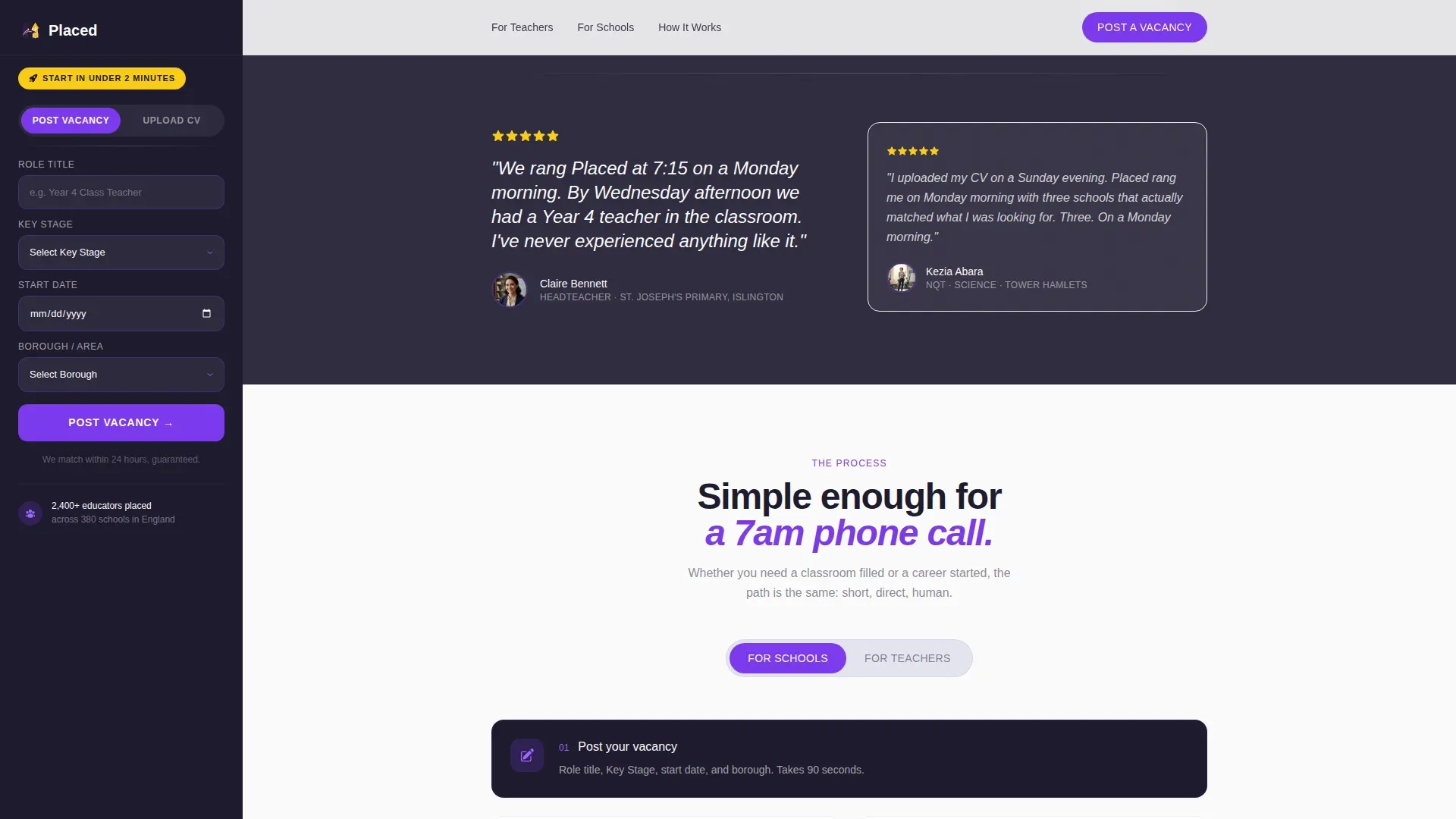
The stats section sits on a deep blackboard background and uses animated counters to bring data to life. Placement speed, total roles filled, and active school count are displayed as numbers that count up on scroll. A testimonial from a placed candidate or partner school sits alongside the counters, combining hard data with human voice. Credibility can be built through testimonials, success stories, and specific data metrics like a placement rate figure, and this section does all three at once. Strong social proof at this point in the scroll journey reinforces the decision to convert.
Asymmetric How It Works Split
The final editorial section before the footer separates the school path and the teacher path into two visual columns. Step-by-step flow is shown for each side, making the process feel simple and approachable. A clear call to action sits at the bottom of each column, one for posting job postings, one for submitting a CV. This section makes the proposition clear to both audiences without doubling the page length. Good design means both users finish this section knowing exactly what to do next.
Page sections overview
| Section | Purpose |
|---|---|
| Hero Search Box | Grabs visitor's attention with pulsing search input and mosaic portrait background |
| Candidate Stories Carousel | Delivers social proof through one-line placement outcomes |
| Partner Schools Grid | Shows active school clients with building photos and open roles |
| Stats and Social Proof | Animated counters and testimonial reinforce credibility with data |
| How It Works Split | Separates school path and teacher path with a clear call to action per column |
| Persistent Sidebar | Toggles between vacancy posting and CV upload, updating by scroll context |
| Footer Flow | Closes the page cleanly with Vercel Horizontal Flow pattern |
Design & branding system
The visual identity runs on Startup Velocity energy with a Dopamine Pop colour system. The palette is built for a landing page that needs to feel optimistic, urgent, and human all at once. Think of cracking open a fresh set of dry-erase markers on a clean whiteboard, punchy, impossible to ignore, and instantly warm. Every colour has a specific role in the page design.
The full design system includes:
- Electric violet (#7C3AED), highlighter yellow (#FACC15), chalk-white (#FAFAFA), and deep blackboard (#1E1B2E), violet leads on the sidebar and call to action buttons, yellow fires on hover states and notification badges, blackboard anchors section backgrounds, and chalk-white gives body text room to breathe with generous white space.
- DM Sans typography at weights 400, 700, and 900, the heavy 900 weight drives hero headlines and stats counters while 400 weight keeps body copy readable, creating a natural hierarchy that guides the eye through the layout without extra effort.
- Playful design with high animation intensity, parallax portrait drift in the hero image, scroll-reveal on section entries, marquee-style motion on the candidate carousel, and counter animation on stats all contribute to a landing page that feels alive rather than static.
Mobile & speed optimization
This landing page is built desktop-first. The sidebar companion requires a wide viewport to function as designed, and the parallax hero image performs best on a larger screen. That said, a mobile fallback is included so that the landing page functions flawlessly on smaller devices too. Optimizing for speed and mobile-friendliness is essential to keep job seekers from bouncing before they explore the vacancies on offer.
The mobile and device strategy includes:
- Desktop-first layout with mobile fallback, the sidebar collapses gracefully on smaller screens and mobile devices, with the dual-path call to action converting into a stacked toggle section that keeps both conversion paths accessible on every device.
- Server Components for static sections, the editorial sections of the landing page use server-rendered components to keep initial load fast, while the sidebar, search input, and animation layers are handled by Client Components to keep interactive elements sharp and responsive.
- Performance-conscious animation, high animation intensity is maintained where it matters most (hero section, stats counters, carousel) while static sections remain lightweight, which helps the overall page speed stay competitive across device types.
How this template helps you convert
A high converting page in education recruitment has one job: prove value fast, then make the next step feel obvious. This landing page is designed around that principle. Visitors do not have to read long paragraphs before they understand what the company does. The layout earns trust through data, human faces, and real placement stories before it ever asks for an email address or a vacancy form submission. That is the big difference between this page and a generic jobs board template.
Here is how the conversion logic works across the page:
- Search first, register second. The hero section search box is a clever way to demonstrate the talent pool before asking for anything in return. Any search query shows a results teaser, which then gates access behind a simple registration step. Potential customers see the proof before they commit, which is a smart move for agencies where trust takes time to earn. This approach consistently drives higher conversion rates than asking users to register on arrival.
- Scroll-triggered sidebar nudges. As visitors move through the page, the sticky bar updates its message to match the section on screen. Seeing a candidate story? The sidebar shows "3 roles like this open now." Reaching the schools grid? It switches to "Schools in your area." This user behavior-aware design keeps the call to action relevant throughout the entire scroll journey, improving the chance that each visitor converts on the message most relevant to them.
- Social proof layered at every scroll depth. Candidate story cards, partner school photos with live vacancy data, and the animated stats block each add a layer of credibility. Using social proof at multiple points in the layout means conversion rates benefit from trust-building at the top, middle, and bottom of the page rather than relying on a single testimonial at the footer.
Other information about this template
This landing page template is part of the Startup Velocity theme family and uses the Dopamine Pop colour system. It is built as a Sidebar Companion template style, which means the interactive sidebar is a core part of the landing page experience rather than an optional add-on. The template is listed in the HR and Hiring category under the Education HR subcategory, targeting the education recruiting agency niche specifically.
Additional details worth noting:
- Landing page templates can be customized to suit various recruitment and marketing needs. You can update borough names, key stage labels, subject specialism dropdowns, and ghost text cycling sequences to match your agency's actual market coverage and candidate pool.
- Rocket.new offers an AI-powered platform that allows users to build production-ready apps and websites from natural-language prompts, making it straightforward to generate a new landing page like this one or to launch different versions of the page for testing purposes.
- The drag-and-drop editor available on the platform lets you customize section order, swap out hero image portraits, update colour tokens, and edit copy without touching code, keeping the process accessible for non-technical users.
- Templates for landing pages come in both free and premium versions, catering to different budgets. Using a well-structured template saves time and money compared to building a landing page from scratch, especially for agencies that need to launch quickly before the September recruitment window opens.
- A/B testing tools let you run different versions of headlines, button colours, and form field counts to improve conversion rates over time. Landing page builders often include features like A/B testing to optimize performance, and continuous testing on elements like button copy and form length is one of the most reliable ways to raise performance beyond the average two to five percent conversion rate seen across recruitment landing pages.
- The best landing page examples in the recruitment space, including some of the best landing page examples from adjacent categories, share a common pattern: they focus on a clear goal, use social proof generously, and make the call to action impossible to miss. This template does all three with a page design that is specific to education hiring rather than generic recruitment.
- Urgency elements such as role count badges and contextual sidebar nudges help replicate the urgency of a September deadline without needing a countdown timer, which can feel out of place on a landing page serving a professional audience.
- The landing page example provided by this template is appropriate for agencies of all sizes, from independent education recruiters placing a handful of teachers per term to multi-campus academy trust suppliers managing dozens of job postings simultaneously.
Theme
Startup Velocity
Creative direction
Team & People
Color system
Dopamine Pop
Style
Sidebar Companion
Direction
Recruitment/Hiring
Page Sections
Contextual Sticky Sidebar with Dual-path Toggle
Parallax Mosaic Hero with Cycling Search Input
Candidate Story Carousel
Partner Schools Asymmetric Grid
Animated Stats and Testimonial Block
Asymmetric How It Works Split
Related questions
Can this landing page convert both schools and teachers at the same time?
Do I need to know how to code to customize this template?
Is this landing page suitable for mobile devices?
How does the search box help with recruitment conversion?
Can I update the location and subject data to match my agency?


