Cameroonian Cuisine Booking Website Template
Plancha is a bold, masonry-style landing page built for a Cameroonian food truck. It leads with an immersive nine-image photo grid, moves visitors through a gallery-walk scroll experience, and closes with a stepped booking form. The design uses a Fire and Earth color palette to capture the mood of a roadside night market from the first pixel.
by Rocket studio
Quick summary
Plancha is a single-page template for a Cameroonian food truck. It opens with a full-viewport photo grid mosaic, guides visitors through masonry dish and event galleries, and ends at a stepped catering booking form. The Neo-Retro visual style and Gallery Walk creative direction make scrolling feel like moving through a live night market.
Who this template is for
This template is built for food truck operators who need to convert two distinct visitor types in one scroll: event bookers and walk-up customers. If your business runs on catering contracts and foot traffic, this structure handles both without compromise.
- Event coordinators, brewery taproom managers, and brides looking to book catering
- Walk-up customers who want to find the truck's location and schedule this week
- Food truck owners ready to lead with atmosphere before asking for a commitment
What problem this template solves
Most food truck pages ask for a booking before the visitor is hungry. Plancha reverses that order. The gallery does the persuasion work first. By the time the booking form appears, the visitor has already experienced the food visually across multiple scroll clusters.
- Visitors bounce when a form appears before trust is built
- Static menus and plain contact pages fail to communicate atmosphere and authenticity
- Event bookers need to feel the energy of the truck at a real event before they commit
What you get with this template
You get a complete, single-page layout with every section your food truck business needs, from the first visual impression to the final booking submission. Each section has a defined job, and the scroll order is designed to build desire progressively.
- A nine-image hero mosaic, three masonry gallery clusters, a stepped booking form, and a weekly stops module
- Hover reveal interactions on dish cards, kraft paper testimonial styling, and a sticky mobile booking button
- A cohesive Neo-Retro visual identity with a Fire and Earth color system applied consistently across every section
Feature list
This template includes the following built-in capabilities based on its design and functional scope.
Nine-Image Photo Grid Hero
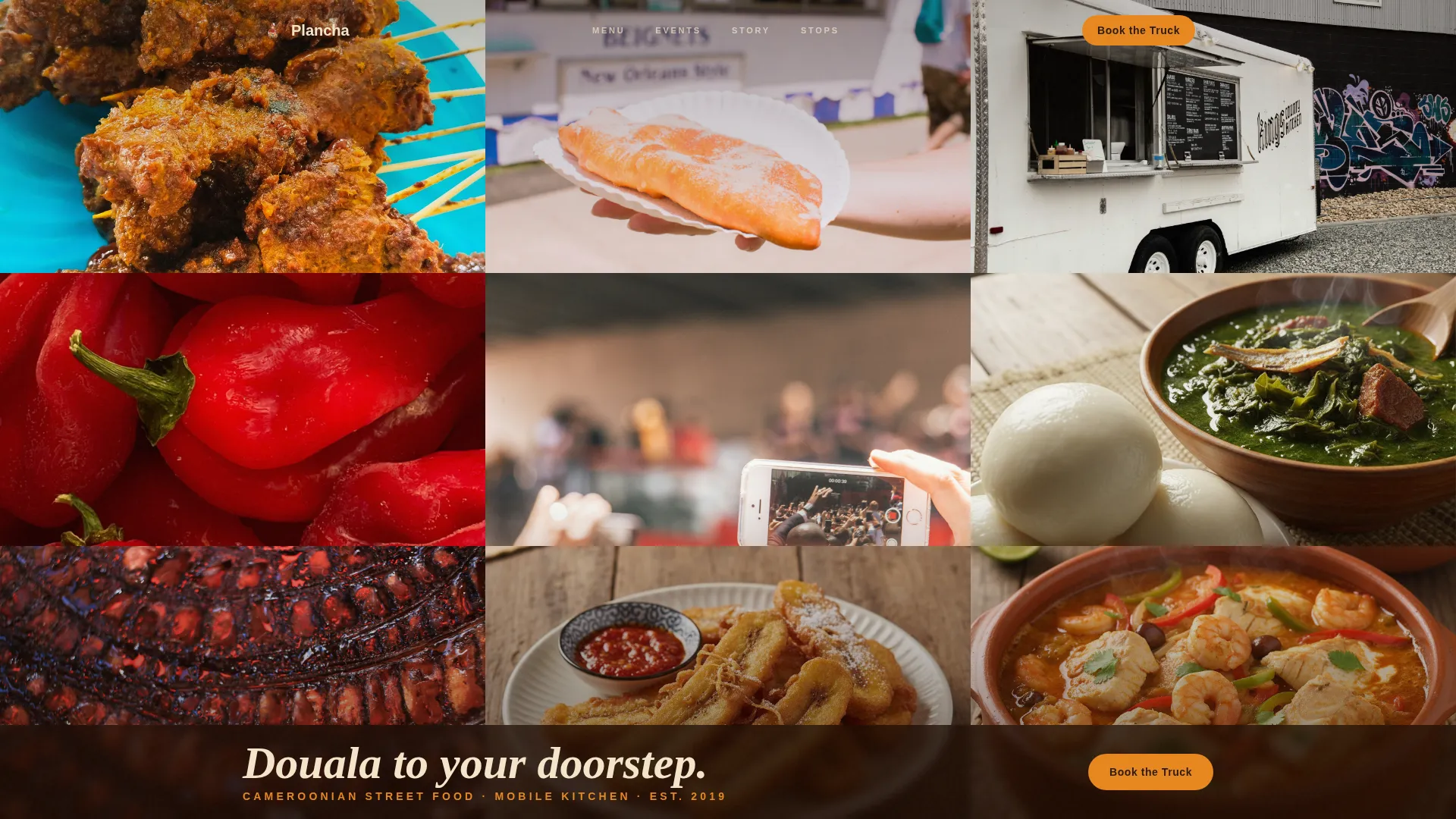
The header fills the full viewport with nine unevenly cropped images and no gutters. A single translucent bar at the bottom carries the tagline. No competing headline dilutes the visual impact on arrival.
Masonry Gallery Walk Layout
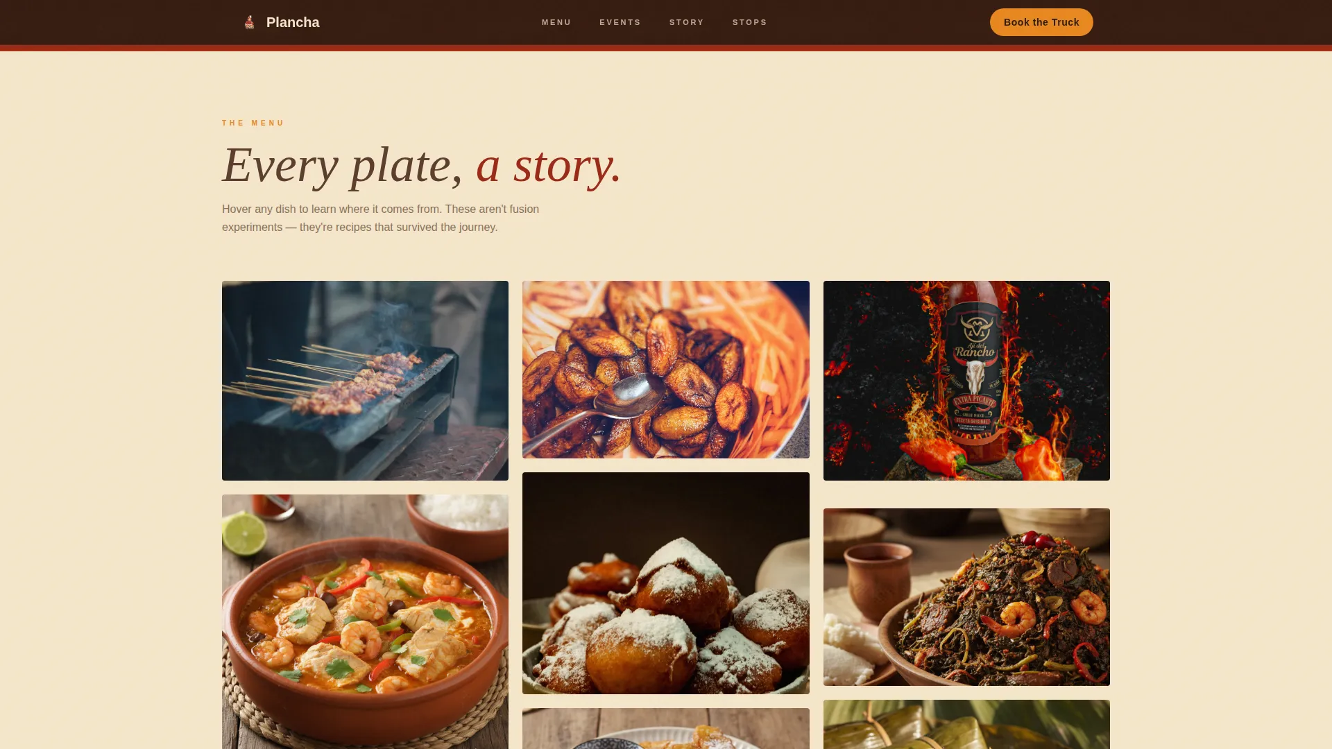
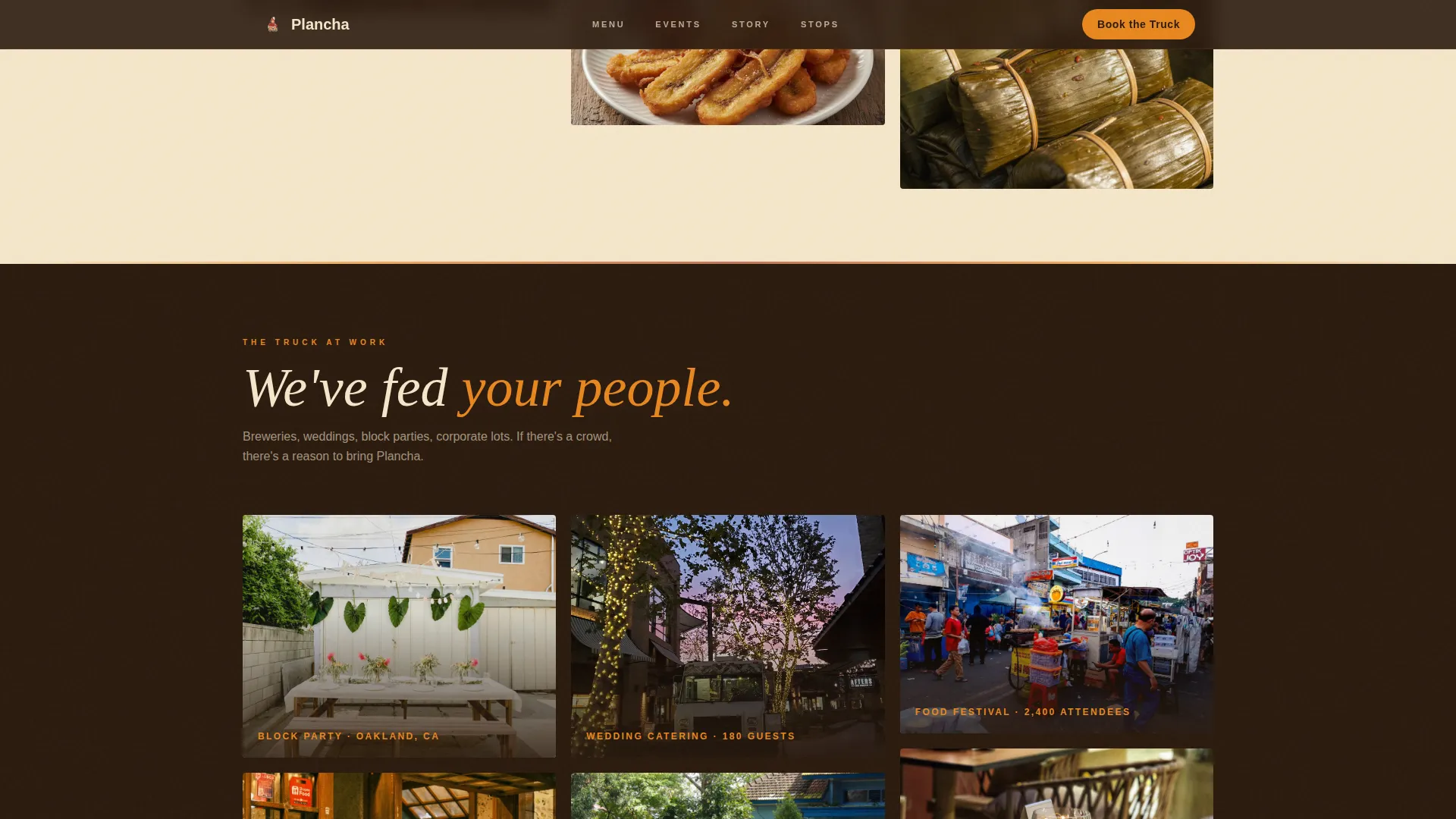
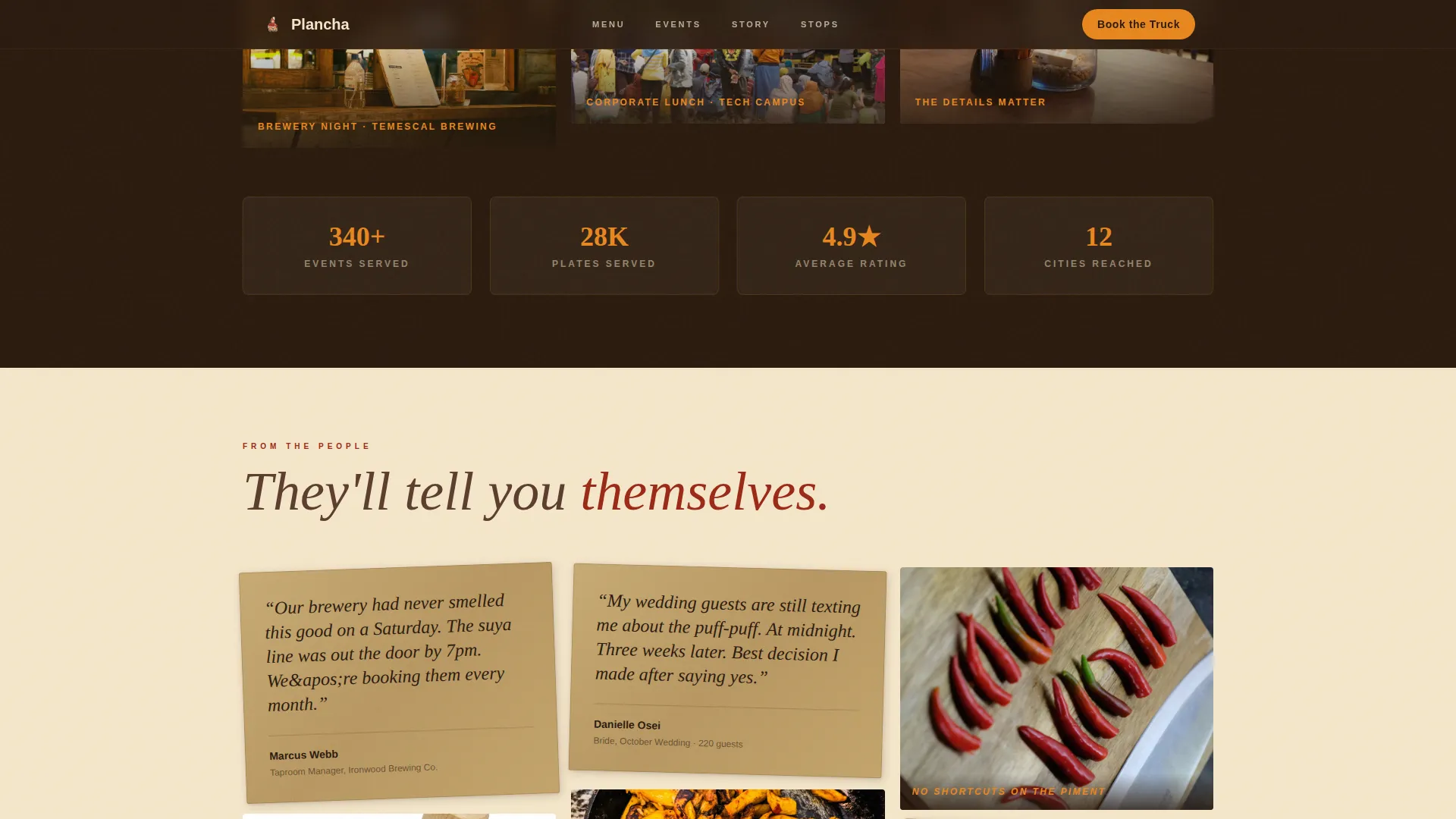
Three distinct card clusters scroll like a night market. Dish cards use tight still-life crops with hover reveals showing the dish name and a one-line origin note. Event cards show wider crowd shots with fairy lights and branded details. Testimonial cards are styled as handwritten notes on kraft paper, mixed with behind-the-scenes prep photography.
Stepped Booking Form
The catering inquiry form moves through four clear steps: event date picker, event type selector (private party, corporate, festival, or wedding), a guest count slider from 25 to 500, and a free-text field for event details. This structure reduces friction by asking one thing at a time.
Sticky Mobile Booking Button
On mobile viewports, the primary "Book the Truck" call to action stays visible as a sticky button throughout the scroll. Visitors never have to hunt for the booking entry point no matter how deep they scroll.
Weekly Stops Module
A secondary section below the third gallery cluster shows a schedule and map view for walk-up customers. This gives non-catering visitors a clear path without cluttering the primary booking flow.
GSAP ScrollTrigger Animations
Cards enter the viewport with staggered entrances. The masonry rhythm tightens as the visitor scrolls deeper, with cards becoming smaller and more numerous to mirror the energy of approaching a market center.
Page sections overview
| Section | Purpose |
|---|---|
| Photo Grid Hero | Sets atmosphere with nine full-bleed images and a tagline bar |
| Dish Gallery Cluster | Showcases individual dishes with hover name and origin reveals |
| Events Gallery Cluster | Shows the truck at live events with crowd energy and branding |
| Testimonials and Prep | Builds trust with kraft paper notes and kitchen behind-the-scenes |
| Booking Call to Action | Anchors the stepped catering inquiry form on desktop |
| Weekly Stops Module | Directs walk-up visitors to current schedule and location |
| Footer | Closes with horizontal flow layout and supporting links |
Design & branding system
The visual identity follows a Neo-Retro direction built around a Fire and Earth color system. Every color has a specific role, and the typeface pairing reinforces the handcrafted, roadside character of the brand.
- Deep laterite red (#9B2915) for section backgrounds and bold typographic moments; smoked cassava brown (#5C3D2E) for body text and card borders; open-flame amber (#E8871E) for buttons, hover states, and price callouts; shea butter cream (#F5E6CA) for negative space and warm background fills
- Fraunces is used for display headings and the retro-serif tagline; DM Sans handles body copy and form labels for clean legibility
- The overall aesthetic reads like a wooden stool pulled up to a roadside braiser at night: embers glowing, everything golden and close
Mobile & speed optimization
This template is built mobile-first because food truck audiences discover vendors on their phones. The layout and interactive elements are designed with smaller screens as the primary context, not an afterthought.
- The sticky "Book the Truck" button remains visible throughout the mobile scroll so the booking entry point is always one tap away
- Images across all gallery clusters are lazy-loaded to reduce initial load weight on mobile connections
- CSS GPU-accelerated transforms power the GSAP animations, keeping scroll performance smooth on mid-range devices
How this template helps you convert
The page is structured so that visual desire peaks before the call to action appears. This sequence is intentional and directly tied to how event bookers make decisions.
- The photo grid hero and two gallery clusters build appetite and atmosphere before any form is shown, so visitors arrive at the booking step already engaged rather than cold
- The stepped booking form reduces abandonment by breaking a multi-field inquiry into four simple, focused screens rather than one overwhelming page
- The secondary weekly stops path captures walk-up visitors who are not ready to book catering, keeping them connected to the truck without losing them to a dead end
Other information about this template
This template is part of a broader set of food and beverage landing page designs built for mobile-first, experience-led businesses. A few additional details worth noting before you get started.
- The template is categorized under Food and Beverage, with a specific focus on Cameroonian cuisine and mobile catering use cases
- Copy flavor throughout the template uses light Franglais touches (a mix of French and English phrasing) to reflect the cultural identity of the truck
- The intersection match score for this template's niche, subcategory, and category alignment is 13, indicating a tightly focused design brief
- The footer uses a horizontal flow layout pattern suited for displaying social links, a brief tagline, and operational contact details
Theme
Neo-Retro
Creative direction
Gallery Walk
Color system
Fire & Earth
Style
Masonry/Pinterest
Direction
Booking/Scheduling
Page Sections
Nine-image Photo Grid Hero
Gallery Walk Masonry Layout
Stepped Four-screen Booking Form
Sticky Mobile Booking Button
Weekly Stops Schedule Module
GSAP Scrolltrigger Card Animations
Related questions
Can I use this template for a different type of food truck?
Does the booking form connect to a backend or calendar system?
Can I remove the weekly stops module if I only offer catering?
Is this template suitable for both desktop and mobile visitors?
How do I replace the placeholder images with my own photos?