Spanish Dining Landing Page Template | Haute Craft
The Plancha landing page template captures the warmth of an authentic Spanish neighborhood tapas bar in a visually rich, masonry-style single-page layout. Built on a Fire & Earth color palette with parallax scroll and a full-screen video header, it guides guests through three clear conversion paths: book a table, order for pickup, or inquire about private dining. Warm, tactile, and built for hospitality.
by Rocket studio
Quick summary
Plancha is a masonry-style landing page template designed for authentic Spanish casual dining restaurants. It opens with a cinematic full-screen video, cascades through a Pinterest-style specials grid, and closes three simultaneous conversion goals: table reservations, pickup orders, and private dining event inquiries. The Haute Craft visual identity makes every screen feel handmade and deeply neighborhood.
Who this template is for
This template is built for Spanish restaurant owners, tapas bar operators, and hospitality teams who want their online presence to feel as genuine as their food. It suits operators who already have a loyal local following and want a landing page that converts new visitors just as reliably.
- Independent tapas restaurants and neighborhood dining bars looking to move beyond basic booking platforms
- Private dining coordinators who need a polished event inquiry pathway built directly into the page
- Restaurateurs targeting young couples, office groups, and food-forward guests who expect more than a chain dining experience
What problem this template solves
Most restaurant landing pages feel disconnected from the actual dining experience. A generic layout with a PDF menu link and a phone number does not communicate the warmth of hand-thrown plates, the smell of garlic crisping in olive oil, or the hum of a busy dining room on a Thursday evening. Guests arrive at the page and leave without booking because nothing pulls them in.
- Visitors can not tell from a flat, static page whether the restaurant has the right atmosphere for a special dinner or a relaxed midweek meal
- There is no clear or friction-free path for guests who want to book a table, order for pickup, or inquire about hosting a private event in the same visit
- Restaurants lose local credibility when their online presence does not reflect the community character and neighborhood life that keeps regulars coming back
What you get with this template
Plancha delivers a complete, single-page hospitality experience built around three conversion goals and one unmistakable visual identity. Every section earns its place by moving the guest one step closer to a booking, an order, or an event inquiry. The layout rewards slow scrolling the same way a great restaurant rewards lingering at the table.
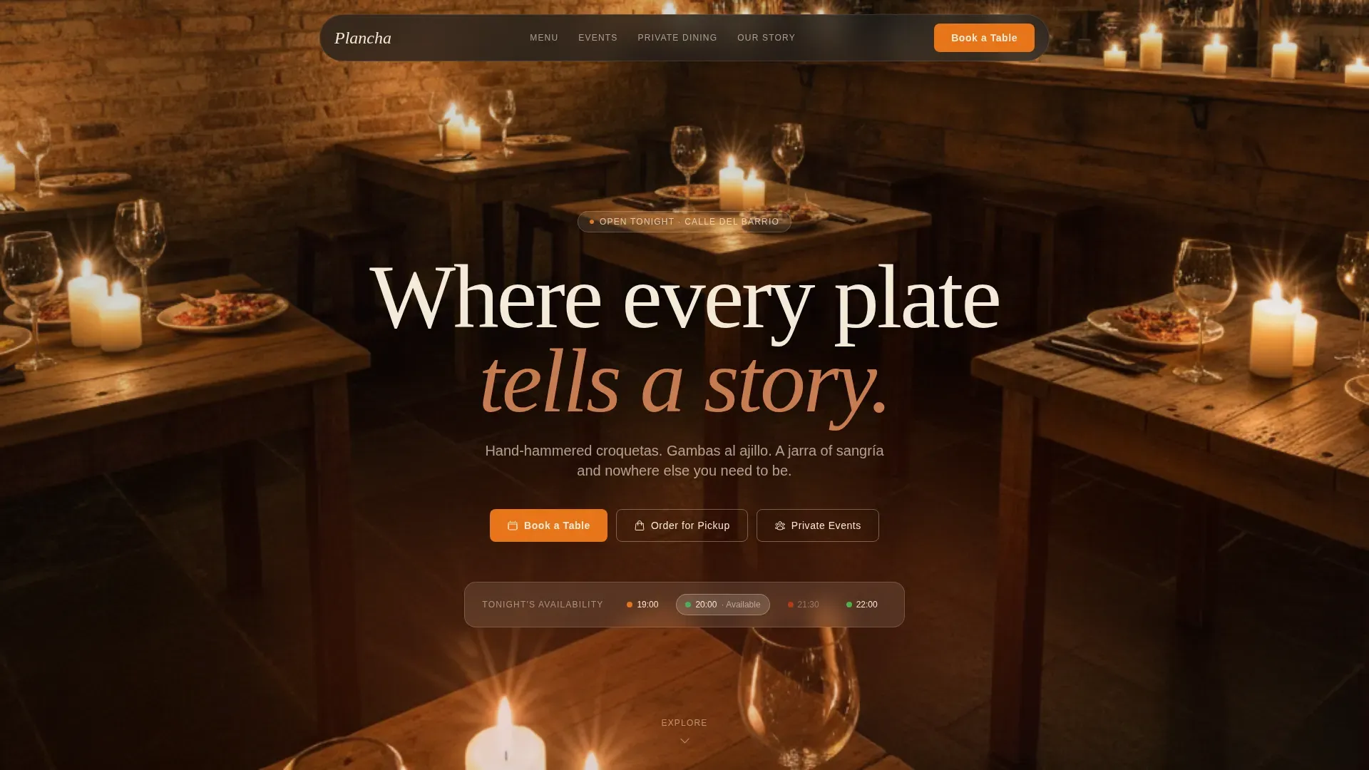
- A full-screen video hero with an ambient 12-second loop, etched cream serif headline, and three distinct calls to action displayed immediately above the fold
- A cascading masonry grid with daily specials tiles, neighborhood event cards, food photography at mixed scales, handwritten-style quote tiles from regulars, and a live-feel reservation widget
- A full-width private event break card with a candlelit back room photograph and a structured inquiry form, a standalone chef's story section, and a minimal warm footer
Feature list
Full-Screen Video Hero with Ambient Overlay
The hero opens on a slow golden-hour video loop shot at waist height inside the restaurant. The camera drifts past a bartender pouring vermut, lingers on hands tearing bread over shared dishes, and rises to catch candlelight on exposed brick. No voiceover plays. Only ambient sound fills the moment: ceramic on wood, the sizzle of the plancha, laughter between tables. The restaurant name appears in a warm cream etched serif over the overlay, immediately setting the tone for every section that follows.
Masonry Specials and Neighborhood Grid
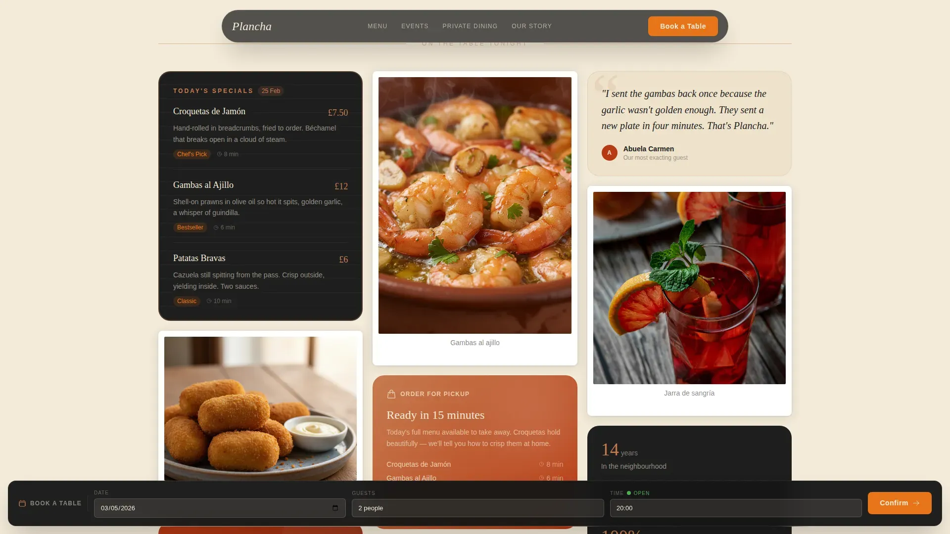
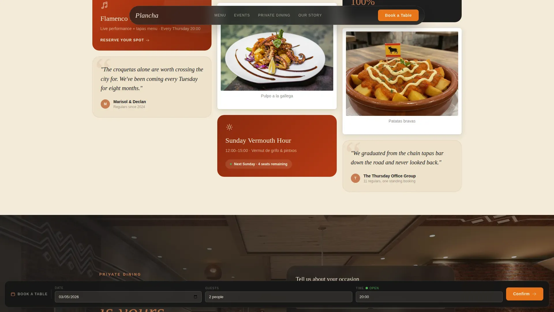
Below the hero, a Pinterest-style masonry grid cascades down the page like Polaroids scattered across a tabletop. Cards appear at varied sizes and angles, mixing the daily specials board, neighborhood event tiles for flamenco Thursdays and Sunday vermouth hour, food photography, and handwritten quote tiles from regulars on aged linen textures. A live-feel reservation widget sits inside the grid and displays tonight's remaining tables, creating a gentle sense of urgency without hard-sell language. This section drives the communal, shareable energy that modern casual dining guests expect.
Three-Path Conversion Architecture
The template handles three distinct guest intentions at the same time without crowding the page. A sticky bottom bar anchors "Book a Table" with date, party size, and time selectors always within reach. A prominent masonry card links to the pickup menu with today's specials and prep-time context to reduce friction. A full-width break card mid-scroll handles private dining inquiries with a form asking for date, guest count, and occasion type. Each path is designed to earn its click through a different emotional trigger: urgency, convenience, and aspiration.
Chef's Story Section
A short, intimate section tells the chef's story in three sentences and one photograph of flour-dusted hands. The section is not a lengthy biography. It is a single, honest paragraph that communicates craft, care, and the cooking philosophy behind every dish. This kind of storytelling builds trust with guests who are choosing between restaurants and want to know who is actually in the kitchen creating the food on the menu.
Neighborhood Social Proof Tiles
Handwritten-style quote tiles from regulars are woven into the masonry grid and the lower social proof section. The quotes appear on aged linen textures, keeping them visually consistent with the overall Fire & Earth palette. This approach reflects the broader trend among casual dining restaurants toward community-rooted branding, where real local voices carry more weight than anonymous star ratings. Guests who read these tiles feel like they are already part of the neighborhood before they walk through the door.
Private Event Inquiry Form
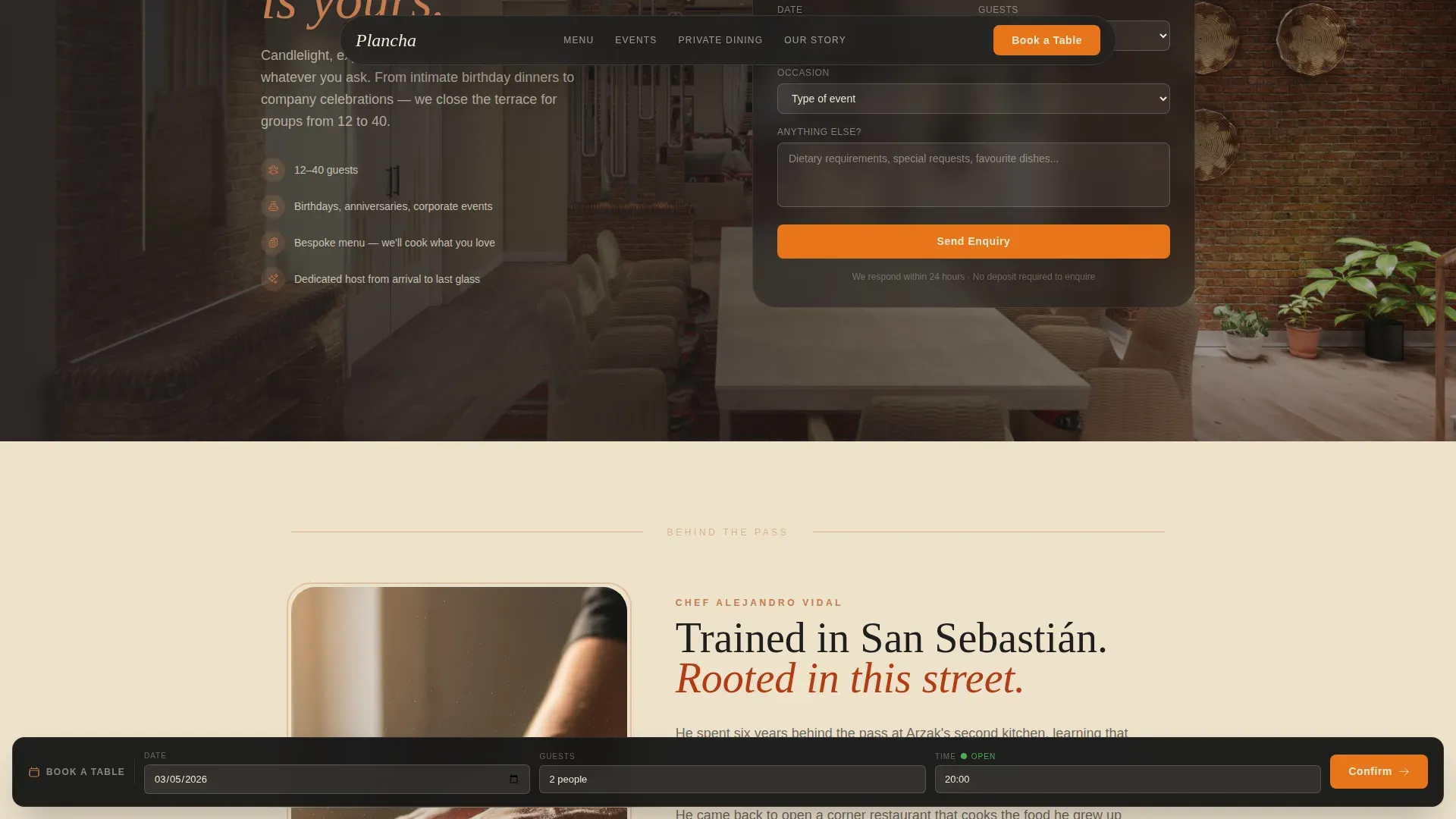
The private event break card is a full-width cinematic section. A single photograph of the candlelit back terrace does all the atmospheric selling before the form asks a single question. Guests fill in date, guest count, and occasion type. The section is structured so that private dining coordinators and event planners can see themselves in the space before committing to an inquiry. It is the quietest and most persuasive section on the page.
Page sections overview
| Section | Purpose |
|---|---|
| Video Hero | Opens with ambient cinematic loop, etched name, three conversion calls to action |
| Masonry Specials Grid | Displays daily specials, event tiles, food Polaroids, and live reservation widget |
| Pickup Menu Card | Links to takeaway menu with today's specials and prep-time context |
| Private Event Break | Full-width cinematic card with back terrace photo and inquiry form |
| Chef's Story | Three-sentence narrative with flour-dusted hands photograph |
| Neighborhood Regulars | Handwritten quote tiles and social proof in masonry continuation |
| Footer | Minimal warm footer in Vercel Horizontal Flow pattern |
Design & branding system
The visual identity follows a Haute Craft direction built around a Fire & Earth color system. Every color choice and typographic decision references the textures of a real working kitchen: charred oak, hand-thrown ceramics, aged linen, and the deep warmth of an open fire. The result is a page that feels tactile, even on screen.
- Color palette: scorched paprika red (#B83A14) and terracotta clay (#C67B4F) for backgrounds and section fills; blackened cast iron (#1E1E1E) for body text and dark sections; aged linen cream (#F4EBD9) for light backgrounds; Seville orange (#E8751A) reserved exclusively for buttons and interactive highlights to create clear contrast and draw the eye to calls to action
- Typography: Fraunces serif headlines give every heading an etched, unhurried quality; DM Sans handles body text with clean legibility; the combination communicates fine craft and neighborhood warmth at the same time
- Animation and texture: parallax scroll, staggered masonry reveal animations, and a GPU-accelerated sticky bottom bar keep the page feeling alive without distracting from the food and the story
Mobile & speed optimization
The template is designed desktop-first with a deliberate and complete mobile adaptation. The sticky bottom bar, which carries the primary booking call to action, is particularly important on mobile where guests often make quick decisions between restaurants while already out for the evening.
- The sticky bottom bar remains accessible on all screen sizes, keeping the reservation path one tap away at all times during the scroll
- Video is lazy-loaded and images are optimized so the page remains responsive even on mobile connections, keeping the dining experience on screen as smooth as the one guests expect in person
- The masonry grid adapts gracefully from a multi-column desktop display to a single-column mobile stack without losing the Polaroid-scattered energy of the original layout
How this template helps you convert
Showcasing a restaurant's atmosphere online through high-quality images and video can significantly enhance guest engagement and encourage first-time visits. This template is built around that principle. Every visual and structural choice is made to move a guest from browsing to booking, from curious to committed.
- The full-screen video hero communicates atmosphere within the first two seconds of a visit, giving guests an immediate emotional reason to stay on the page and explore the menu further rather than clicking away to a competitor
- Three simultaneous conversion paths mean the template serves guests with different intentions at the same moment: the couple planning dinner chooses a date in the sticky bar, the office group checks tonight's pickup specials on the masonry card, and the event planner fills in the private dining inquiry form mid-scroll
- Social proof tiles from neighborhood regulars, combined with the chef's story section, build the local credibility that turns a first-time visitor into a confident guest who tells colleagues and friends which restaurant to visit next
Other information about this template
This section covers additional practical context relevant to hospitality operators who are evaluating the Plancha template for their restaurant. It also addresses menu content guidance, food presentation standards, and kitchen transparency information that guests and operators commonly expect to see reflected online.
- Menu content and kitchen transparency: The template's menu card sections are structured to display fresh, text-based dish descriptions rather than static PDFs, making the menu readable on any device. Restaurants can use this structure to communicate allergen information, note dishes that contain raw or undercooked meats, poultry, seafood, or shellfish, and flag items such as poached eggs or undercooked meats that may present a foodborne illness risk for guests with specific dietary concerns. Transparent menu communication of this kind is increasingly expected by diners and supports responsible food service practice.
- Food photography and dish inspiration: The masonry grid is designed to display photography of signature dishes across the full menu range. A typical Spanish tapas menu might include croquetas, patatas bravas with house tomato sauce, garlic prawns, pork chorizo with caramelised onions, manchego cheese boards with honey and lemon, steak or chicken dishes served alongside seasonal vegetables, fresh salad with greens and cilantro, and a classic paella as a main course centerpiece. The template can equally showcase lighter dishes such as a bacon and egg brunch plate, a fresh avocado and greens side, or mashed potatoes served with rich cooking sauces. Every food card in the masonry grid is an opportunity to display a distinct dish, from squid in garlic and butter to a cinnamon-dusted dessert with cream. The goal is to make every bite look as good on screen as it tastes in person.
- Drink and bar menu display: The template supports a dedicated bar section within the masonry grid. Wine lists, agave-based cocktails, vermut pours, and house coffee service can all be displayed as individual drink cards. This is particularly useful for restaurants that want to communicate the full breadth of their drinks offering, including soft drinks and non-alcoholic options, alongside the food menu.
- Community and event programming: The neighborhood event tiles in the masonry grid are designed for recurring local programming such as flamenco Thursdays, Sunday vermouth hour, and private dining evenings. Engaging with the community through these events strengthens the restaurant's brand identity and builds the kind of loyalty that keeps guests returning week after week. Restaurants that reflect local life in their online presence create a stronger connection with the guests they most want to attract.
- Pineapple and seasonal specials: The template includes a daily specials board tile that rotates to display limited-time offerings. Seasonal dishes such as a grilled pineapple dessert with honey, a half portion of salt-baked sea bass with lemon and cilantro, or a pizza-style flatbread with manchego cheese and chorizo can be promoted here to create urgency and encourage visits on quieter days.
- Additional food safety and menu transparency notes: For full restaurant operation, menus displayed on the site should clearly note when dishes contain raw or undercooked meats, eggs, or shellfish. Foodborne illness risks associated with undercooked meats, poultry, or seafood are a legal and ethical disclosure requirement in most markets. The template's text-based menu structure makes it straightforward to include these disclosures in a readable, accessible format. Manchego cheese, cream-based sauces, and dishes containing raw eggs should be identified clearly where relevant.
- Cafe Ba-Ba-Reeba! is a well-known example in the world of authentic Spanish dining restaurants, recognised for a sharing menu format that includes tapas and paella and celebrated for connecting guests with the flavors of Spain. The Plancha template draws on the same spirit of communal, ingredient-led cooking and can support any restaurant that wants to position itself within this tradition of authentic Spanish hospitality.
- The plancha authentic neighborhood spanish dining landing page template is available as a ready-to-customise starting point for hospitality operators who want a high-quality, visually immersive site without building from scratch.
Theme
Haute Craft
Creative direction
Local & Neighborhood
Color system
Fire & Earth
Style
Masonry/Pinterest
Direction
Marketplace/Multi
Page Sections
Full-screen Cinematic Video Hero
Masonry Specials and Neighborhood Grid
Three-path Conversion Architecture
Private Dining Inquiry Section
Chef's Story and Social Proof
Haute Craft Fire and Earth Design System
Related questions
Can I update the menu content directly in the template?
Does the reservation widget connect to a live booking system?
Is the template suitable for restaurants that also offer brunch or daytime dining?
How does the private dining section handle event inquiries?
Can I change the color palette and typography to match my own branding?



