High-Protein Food & Dining Professional Website Template
Plancha is a modular card-grid landing page built for a flame-kissed, high-protein food truck parked at trailheads, CrossFit lots, and farmers' markets. It features a cinematic hero, a day-in-the-life bento grid, a tappable menu marketplace, a real-time location tracker with SMS opt-in, and a sticky mobile call-to-action, all dressed in a warm Desert Rose palette rooted in agrarian honesty.
by Rocket studio
Quick summary
Plancha is a single-page, card-grid landing page template made for high-protein food trucks that serve real food to active customers. The template follows a day-in-the-life creative arc, sunrise prep through golden-hour sellout, and supports order-ahead cart functionality, SMS-based location alerts, and a mobile-sticky "Build Your Bowl" call-to-action button. Every section is built to convert fast, on a phone, at the curb.
Who this template is for
This template is built for independent food truck operators who want a professional, conversion-ready online presence without starting from scratch. It works especially well when your restaurant is the truck, your dining room is a parking lot, and your regulars are people who read macros before they read anything else.
- Post-WOD athletes, trail runners, and macro-tracking gym members who choose their meals based on protein count
- Meal-prep parents who want clean, seasoned whole-food ingredients their family will actually eat week after week
- Food truck founders ready to replace a basic social media link with a purpose-built, brand-honest landing page
What problem this template solves
Most food truck pages forget that the customer is standing at a trailhead with a phone in one sweaty hand. They are not ready to scroll through a wall of text. They want to know what is on the menu, where the truck is parked this week, and how to order ahead before the line gets long. Generic restaurant website builders forget this entirely.
- Customers cannot quickly find the truck location or read the menu in a clear, scannable format
- There is no quick way to order ahead or get notified when the truck is nearby, which means lost sales every week
- The page feels nothing like the food, no sizzle, no texture, no reason to choose this truck over the restaurant down the block
What you get with this template
You get a fully structured, modular landing page that moves like a day on the truck, from dawn prep to a sold-out sign at golden hour. Every section is purposeful. Every card is a moment. The layout is ready to receive your photography, your menu items, your prices, and your SMS opt-in copy without any structural guesswork.
- A cinematic full-bleed hero with fade-in headline, a clock-driven day-in-the-life bento grid, a tappable menu marketplace with macro overlays, a location tracker with SMS capture, and a customer proof section with tomorrow's menu preview
- A Desert Rose color system using sun-dried clay, bleached barnwood, deep loam, and prickly-pear magenta reserved only for price tags and call-to-action buttons
- Fraunces serif headlines paired with DM Sans body labels, high animation polish including marquee, scroll-reveal stagger, card hover depth, and a mobile-sticky primary call-to-action
Feature list
This template is built around a small number of high-impact components that work together as a complete customer journey. Each feature below is grounded in the prompt brief and delivered as a designed, structured section within the landing page.
Cinematic Full-Bleed Hero
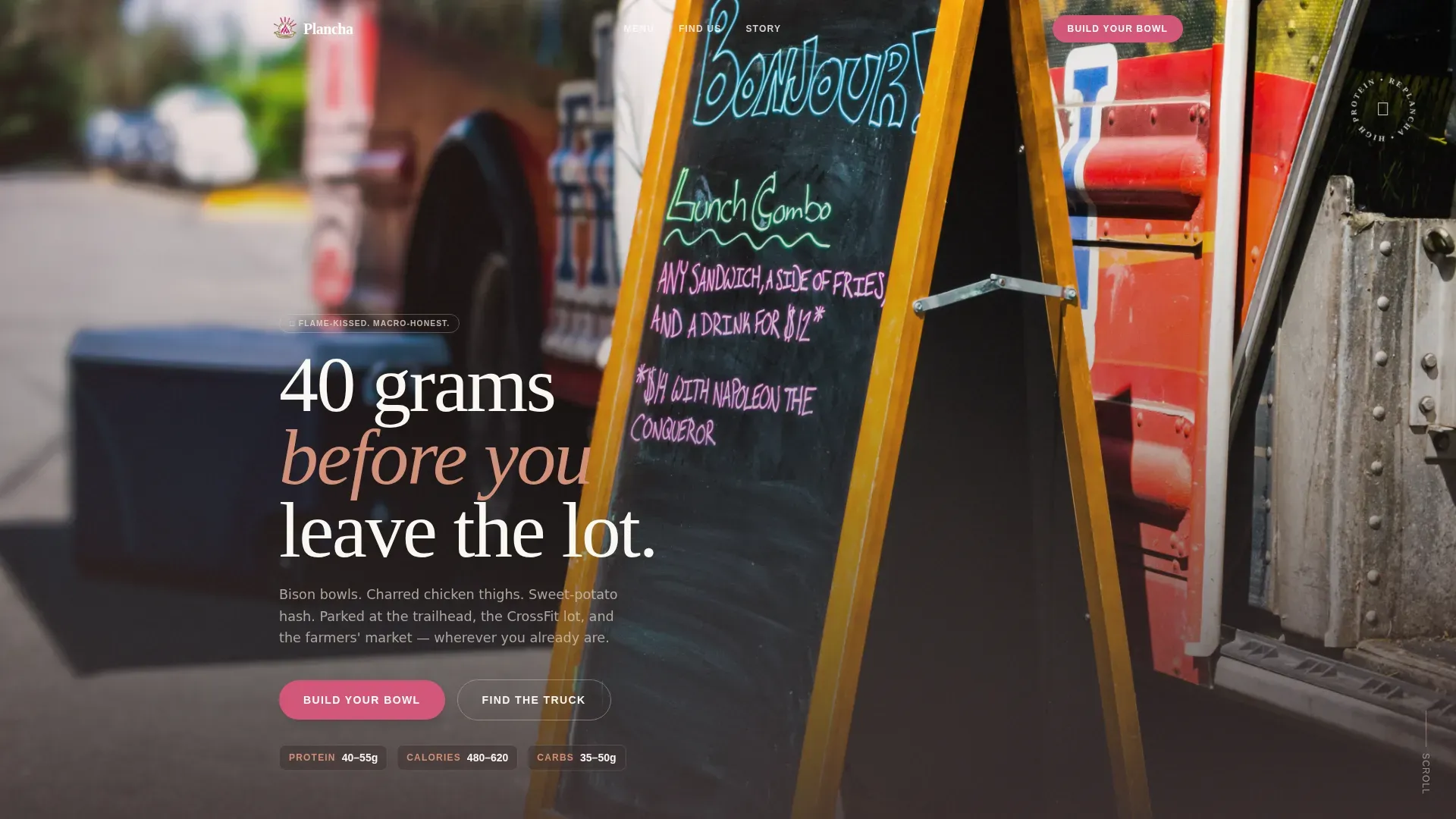
The hero opens with a hip-height photo of two hands extending a kraft bowl through the truck's pass-through window. A single fade-in line reads "40 grams before you leave the lot." The depth of field is shallow, bowl razor-sharp, background a warm bokeh of string lights. A prominent "Build Your Bowl" call-to-action button sits below the headline, ready to anchor the first conversion.
Day-in-the-Life Bento Grid
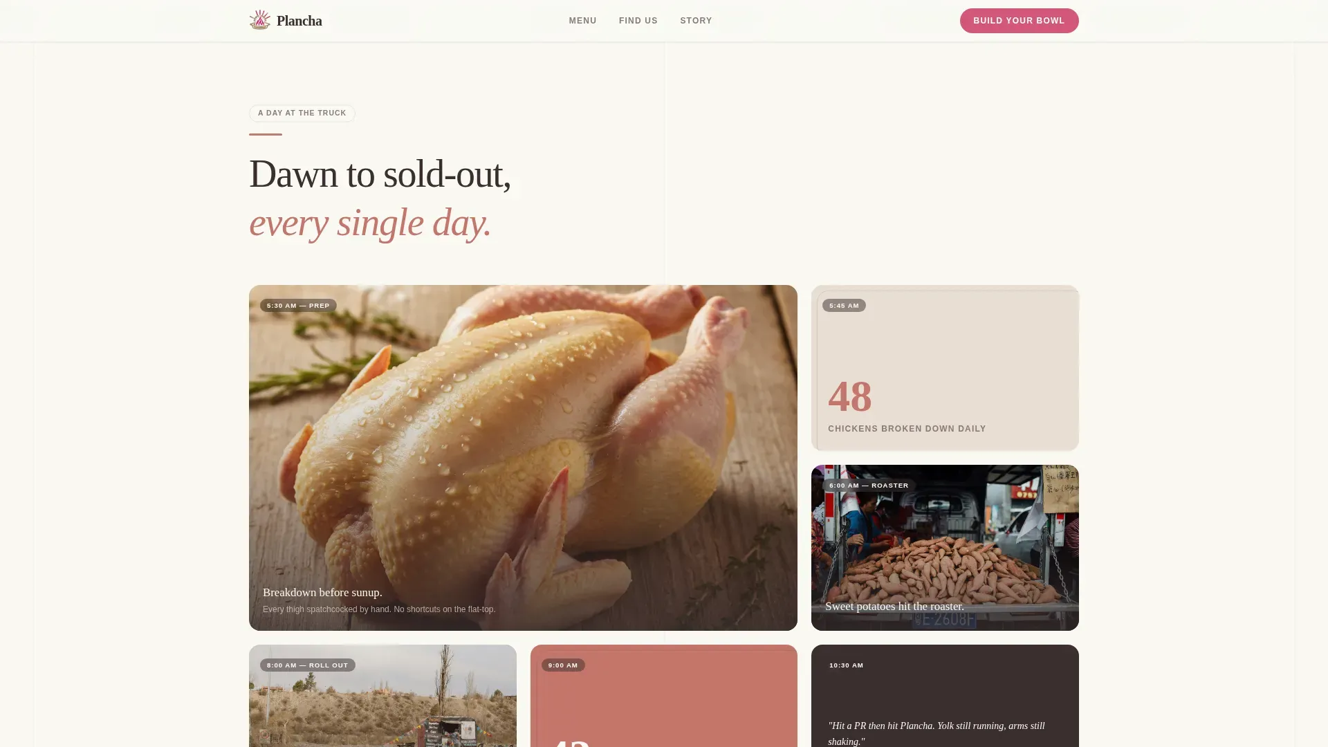
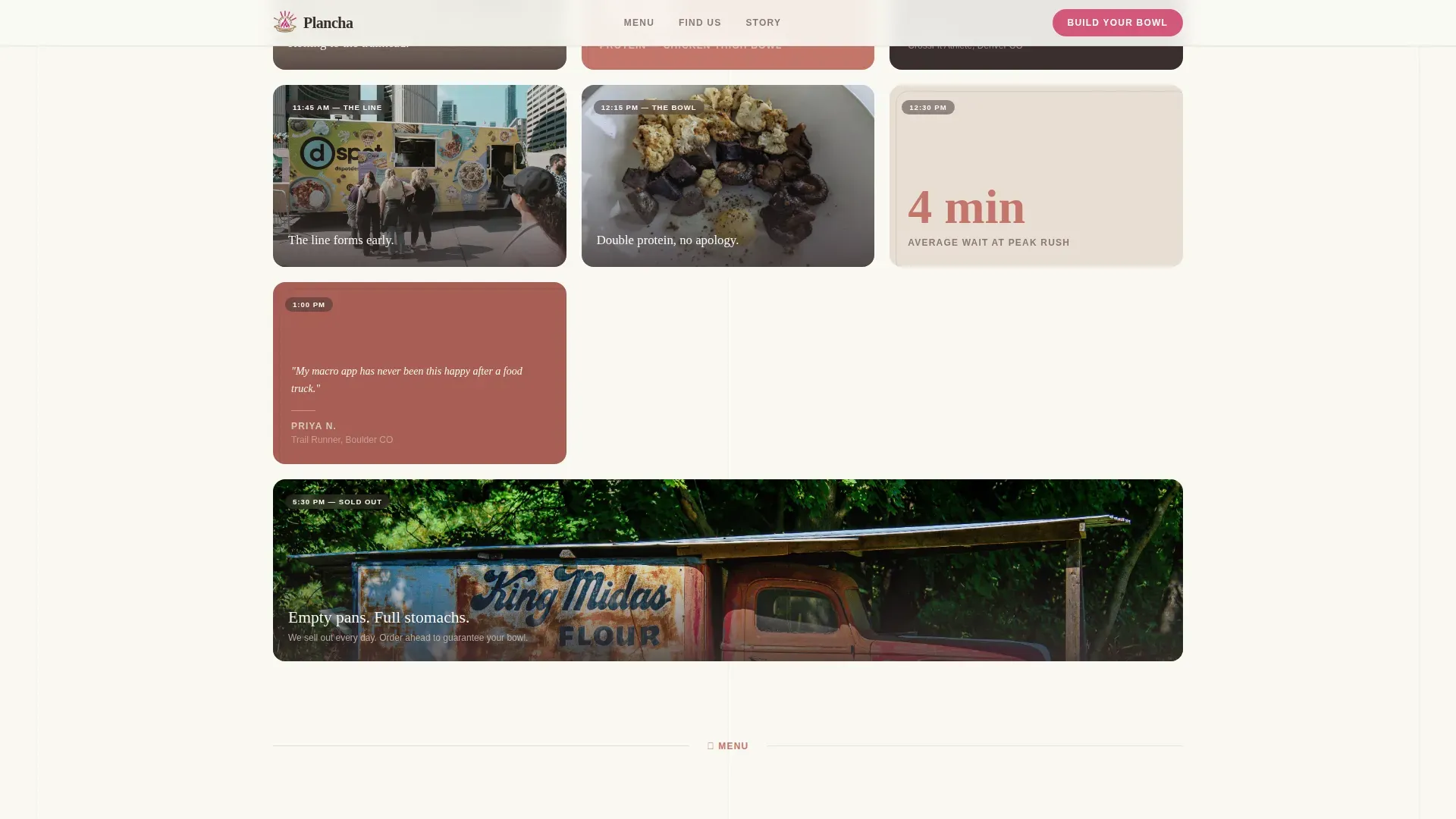
The page scrolls like a clock. Sunrise cards show whole chickens being broken down and sweet potatoes hitting the roaster, seasoned with spices and herbs. Mid-morning cards reveal the truck rolling out with location pins. Lunch-rush cards tighten the grid, more cards, smaller format, to mimic the energy of a real service rush. Golden-hour cards open back up into a single wide card showing the sold-out sign and tomorrow's menu preview.
Tappable Menu Marketplace
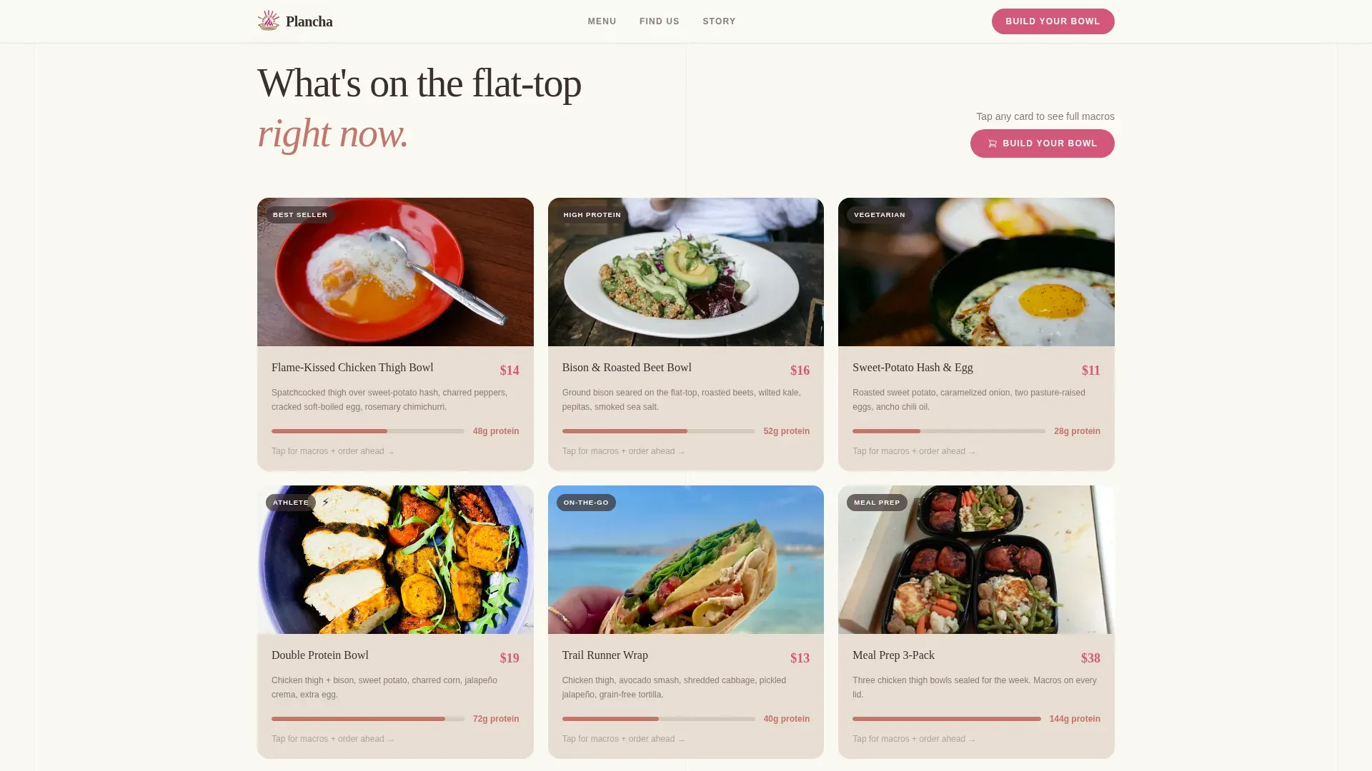
Each menu card is interactive. Tap any item to reveal its protein count, calorie breakdown, and an "Order Ahead" button that adds the item to a pickup cart. Cards highlight nutrient-dense ingredients clearly, whether that is charred vegetables, flame-kissed chicken thighs, bison bowls, or sweet-potato hash. Macro counts double as credibility signals. The layout helps customers choose quickly and confidently.
Location Tracker with SMS Opt-In
A real-time map section shows current and upcoming truck locations, trailheads, CrossFit lots, Saturday farmers' markets. An SMS opt-in asks only for zip code and phone number. The prompt reads "Text me when you're near," making it low-friction and high-value. This is the kind of feature that keeps regulars coming back week after week without requiring a separate app.
Sticky Mobile Call-to-Action
On mobile, the "Build Your Bowl" button stays pinned to the bottom of the viewport at all times. The click should feel as fast as pointing at a chalkboard menu and saying "that one." This is essential for on-the-go customers who are ready to order the moment they find the truck online, and it is one of the clearest conversion levers built into the template.
Customer Proof and Tomorrow's Preview
The final content section holds on-site customer photo quotes and a sold-out card that signals demand and trust. It closes with a single wide card previewing tomorrow's menu, a reason to come back, opt in, and stay connected. This section turns a satisfied customer into a returning one.
Page sections overview
| Section | Purpose |
|---|---|
| Full-Bleed Hero | Opens with cinematic bowl photo and fade-in protein headline |
| Day-in-Life Grid | Clock-driven bento cards from sunrise prep to golden-hour sellout |
| Menu Marketplace | Tappable protein cards with macro overlays and order-ahead cart |
| Location Tracker | Real-time map pin and SMS opt-in for location alerts |
| Customer Proof | On-site photo quotes, sold-out card, and tomorrow's menu preview |
| Page Footer | Horizontal flow footer with brand links and contact details |
Design & branding system
The visual identity follows an Agrarian Root theme. The palette feels like a wooden crate of heirloom produce sitting on cracked desert earth at golden hour, warm, dry, honest, and a little flushed from the heat. Fiery tones imply heat, flavor, and energy without resorting to neon or fast-food red. Every color has a job, and none of them overlap.
- Sun-dried clay (#C4756B) frames section dividers, bleached barnwood (#E8DDD3) washes across card backgrounds, and deep loam (#3B2F2F) anchors all body text for strong contrast
- Prickly-pear magenta (#D4577A) appears only where money or action lives, price tags and call-to-action buttons, keeping it rare enough to demand attention
- Typography pairs Fraunces serif headlines for warmth and character with DM Sans labels for clean, quick readability in menu cards and macro overlays
Mobile & speed optimization
This template is built mobile-first because most customers will load it on a phone while standing in a parking lot, not at a desk. The design prioritizes fast visual communication over decoration. Images are lazy-loaded, and scroll behavior uses CSS smooth scrolling throughout.
- The "Build Your Bowl" call-to-action button stays pinned to the bottom of the viewport on mobile, so the path to ordering is never more than one tap away
- The SMS opt-in form asks only for zip code and phone number, minimal friction, maximum capture rate for customers who want weekly location alerts
How this template helps you convert
A high-converting food truck landing page must blend sensory, high-quality visuals with immediate, actionable information. Plancha is built around that principle. Every section earns its place by moving a visitor one step closer to an order or an opt-in.
- The hero hooks attention with a drool-worthy bowl photo and a protein-count headline, then serves a clear "Build Your Bowl" call-to-action before the visitor has scrolled a single card
- The bento grid builds trust through authentic, moment-driven imagery, prep, rush, sellout, so customers feel like they already know the truck before they ever visit
- The menu marketplace lets visitors tap, read macros, and add items to a pickup cart in seconds, while the SMS opt-in captures repeat customers who want to know where the truck is parked each week
Other information about this template
This template is a strong fit for operators who want to stand out in a competitive street-food market without hiring a full design team. It is built for a specific niche where the restaurant is mobile and the audience is health-conscious, time-pressed, and phone-native. Read through the sections below to understand additional context that may help you decide if this is the right fit.
- The Plancha flame kissed high protein food truck landing page template is purpose-built for the high-protein food truck niche, covering every major conversion surface from menu discovery to location tracking
- Menu cards are designed to highlight a variety of protein-forward dishes, think seasoned chicken thighs, bison bowls, and sweet-potato hash loaded with roasted vegetables and warm spices, alongside any specialty items like bacon-topped bowls or limited weekly features
- The template supports a wide choice of high-protein formats: grilled proteins, macro-counted bowls, vegetarian options built around legumes and roasted vegetables, and rotating weekly specials that give regulars a reason to check back
- Sensory copy slots throughout the template use language like "seared," "caramelized," and "smoke-infused" to communicate the unique character of plancha cooking, a method that sears quickly to seal in juices and deliver a distinct texture and flavor that a standard restaurant grill cannot replicate
- The day-in-the-life creative direction means every photograph slot is intentional: close-up drool-worthy shots of protein on the flat-top, chef-in-action frames, and on-site customer moments, no stock photo substitutes needed
- Because the truck moves, the location tracker section is especially valuable. Customers who forget to check social media will still find the truck if they are subscribed to SMS alerts
- This template works well for operators who want to add a week-by-week specials preview, choose a rotating set of seasonal vegetables and spices, and keep their regulars engaged without building a separate app
- Enjoyed by customers who track macros, meal-prep for the week, and want a quick, trusted choice at lunchtime, Plancha's template design reflects the lifestyle values of its target audience at every scroll depth
Theme
Agrarian Root
Creative direction
Day-in-the-Life
Color system
Desert Rose
Style
Card Grid (Modular)
Direction
Marketplace/Multi
Page Sections
Cinematic Full-bleed Hero Section
Clock-driven Day-in-life Bento Grid
Tappable Menu Marketplace with Macro Overlays
Real-time Location Tracker and SMS Opt-in
Sticky Mobile Call-to-action Button
Customer Proof and Tomorrow's Menu Preview
Related questions
Can I customize the menu cards to show my own dishes and macro counts?
Does the template include the SMS opt-in form and location map section?
Is this template suitable for a food truck that changes locations each week?
How does the sticky Build Your Bowl button work on mobile?
Can I use this template if my menu rotates week to week?



