Regional Indian Cloud Kitchen Landing Page Template
Plancha is a gallery-and-detail landing page for a regional Indian cloud kitchen. It pairs macro food photography with origin stories to build appetite before the order button appears. The Agrarian Root design uses turmeric yellow, lime zest, and black soil tones to set a raw, warm mood that feels like a working kitchen, not a delivery app.
by Rocket studio
Quick summary
Plancha is a single-page template built for a regional Indian cloud kitchen. It opens on a cinematic tawa roti close-up, then guides visitors through three regional kitchen tours, Kumaoni hills, Konkan coast, and Rajasthani desert, using gallery grids that expand into dish origin stories. By the time someone reaches the order button, the craving is already there.
Who this template is for
This template is built for founders and operators who want a landing page that sells through feeling, not just listing. It works for cloud kitchens that lead with craft, region, and story rather than price and speed.
- Cloud kitchen owners serving regional Indian cuisine to urban professionals
- Food entrepreneurs who want gallery-led storytelling over a standard menu grid
- Operators targeting homesick diners who want a specific state's home food delivered
What problem this template solves
Most cloud kitchen pages look the same: a logo, a menu list, and a button. That format does not work when your product is emotional. When someone is craving their grandmother's dal, a bullet list will not move them. They need to smell the salt and steam before they decide.
- Visitors bounce before they connect with the food's story or regional identity
- A flat menu layout cannot communicate the difference between standardized and generational cooking
- Without appetite-building content, the order button appears too early and converts poorly
What you get with this template
You get a fully structured, scroll-driven landing page designed to build craving across five content sections. Every element is built to move a visitor from curiosity to order intent.
- Hero section with a full-viewport tawa roti macro and animated tagline drift
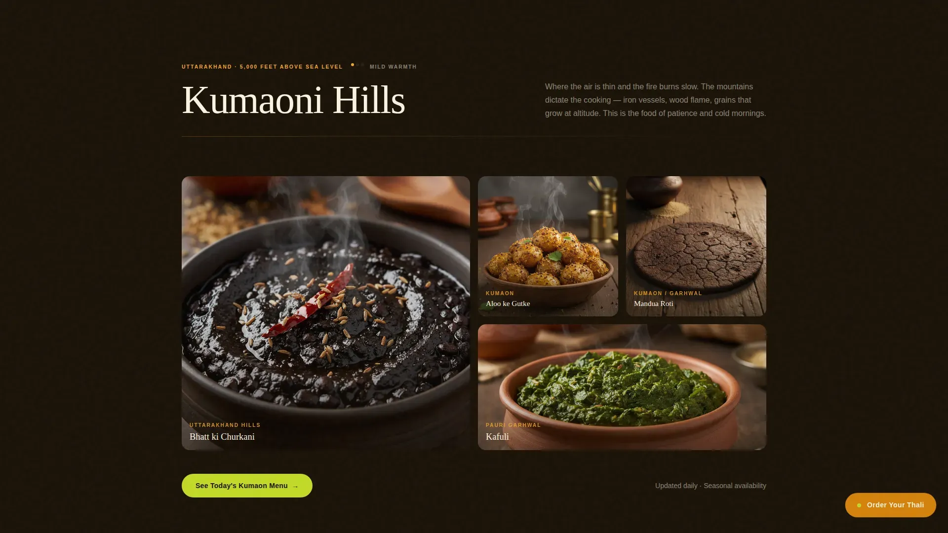
- Three regional gallery grids (Kumaoni, Konkan, Rajasthani), each with tap-to-expand detail panels showing dish origin, household tradition, and spice sequence
- Cook voice section with handwritten quotes over ingredient close-ups, plus a footer set to centered social icons and copyright
Feature list
This section covers the core capabilities built into the template as described in the source brief.
Macro Close-Up Hero with Tagline Animation
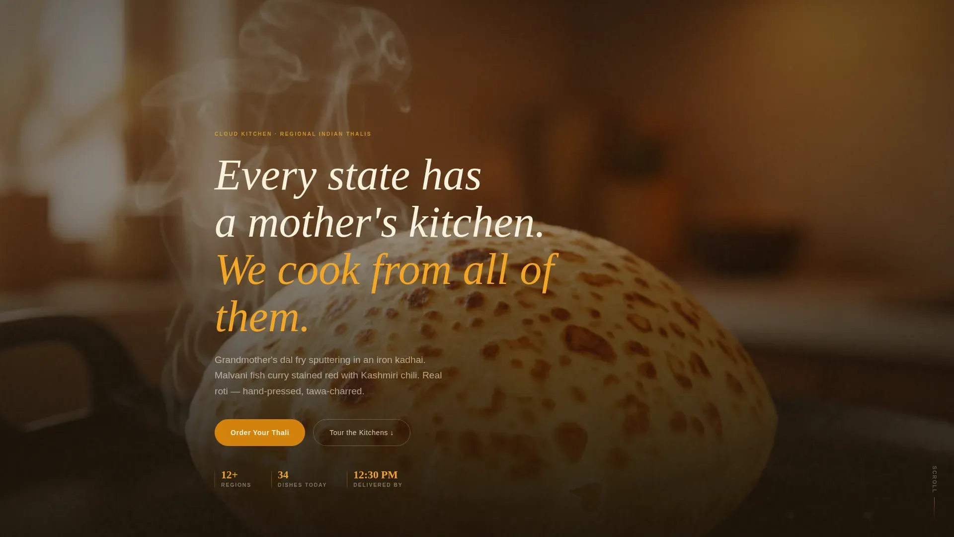
The hero fills the full viewport with a single blistered tawa roti shot. A tagline drifts up in wheat-white type after three seconds of pure visual immersion. No navigation appears until the visitor scrolls, keeping attention on the image and the steam rising from it.
Tap-to-Expand Regional Gallery Panels
Each regional section opens as a macro food photography grid. Tapping any image expands a detail panel that shows the dish's origin region, the household tradition behind it, and the exact spice sequence used. This turns browsing into a kitchen tour.
Floating Order Call-to-Action Button
An "Order Your Thali" button in mustard amber pins itself as a floating element after the first scroll. It stays present without interrupting the gallery experience, so visitors can finally act the moment craving peaks.
Regional Section Secondary Calls to Action
Each of the three regional sections carries its own "See Today's [Region] Menu" button. These route to live menus for that specific kitchen, connecting the story directly to the ordering platform.
Cook Voices Social Proof Section
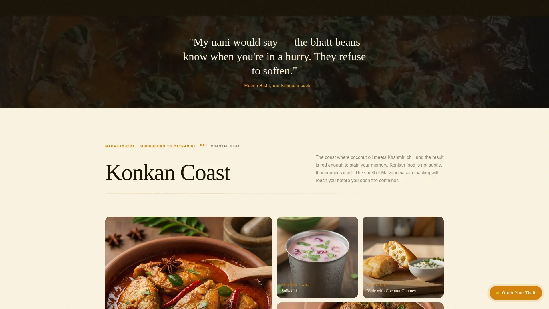
Handwritten-style quotes from the cooks themselves appear over close-up ingredient photography. This section provides the human proof that the food comes from real culinary memory, not a standardized recipe set.
Taste-and-Aroma Scroll Architecture
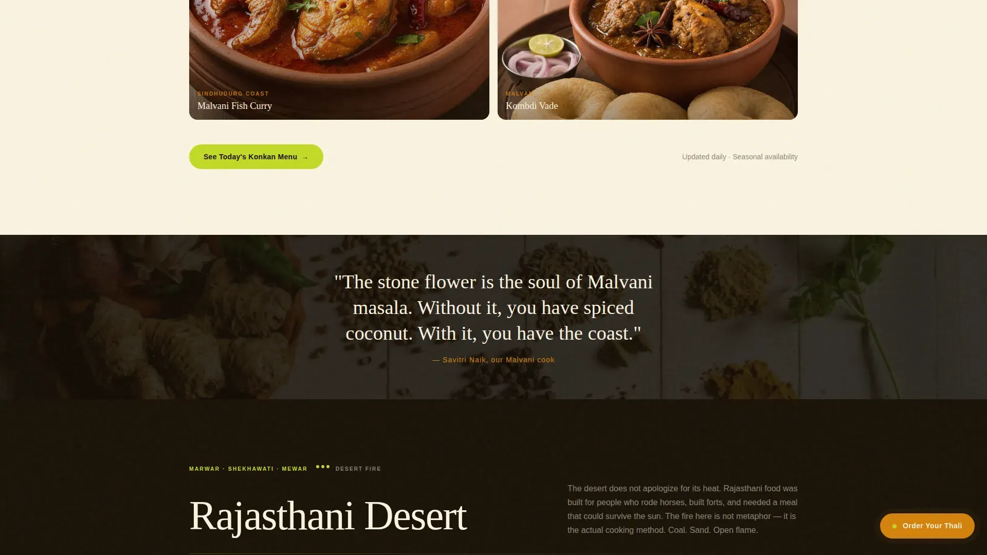
Sections escalate in sensory intensity: mild Kumaoni hills first, then coastal Konkan heat, then Rajasthani desert fire. This progression builds appetite like courses in a meal, so every scroll is a step deeper into the experience.
Page sections overview
| Section | Purpose |
|---|---|
| Hero: Roti Close-Up | Opens on a full-viewport tawa roti macro with animated tagline and steam overlay |
| Kumaoni Hills Gallery | Mild, earthy regional dishes with tap-to-expand origin detail panels |
| Konkan Coast Gallery | Coastal heat dishes with macro photography and spice-sequence detail panels |
| Rajasthani Desert Gallery | Desert fire dishes escalating sensory intensity before the order prompt |
| Cook Voices Section | Handwritten cook quotes over ingredient close-ups for human social proof |
| Footer | Centered social icons and copyright in Pattern 4 Superhuman layout |
Design & branding system
The visual identity follows an Agrarian Root theme. Nothing here is polished. Everything feels alive, warm, and slightly wild, like a wooden crate of just-picked citrus split open at a market.
- Color palette: turmeric yellow (#F4A623), raw lime zest (#C2D927), mustard oil amber (#D4820C), and rich black soil (#1A1208) for text and grounding; pale wheat (#FAF3E0) backgrounds alternate with soil-black
- Typography: Fraunces serif for headlines (warmth, weight) and DM Sans for body copy (clean, readable)
- Accent lime hits buttons and hover states; backgrounds shift between soil-black and unbleached-muslin wheat across sections
Mobile & speed optimization
Most cloud kitchen orders come from smartphones, making mobile-first design essential for this template. The layout is built to deliver the gallery and detail panel experience clearly on small screens.
- Mobile-first layout ensures the gallery grid, detail panels, and floating button all work cleanly on phone screens
- Hero image loads with priority; gallery images use lazy loading to keep the page responsive under a heavy photo set
- Floating call-to-action button is sized and positioned for thumb reach on mobile
How this template helps you convert
The template earns the click before it asks for it. Visitors are not browsing a menu; they are moving through a kitchen tour that builds appetite with every scroll.
- The hero creates an immediate sensory connection through a full-bleed food close-up, lowering the cognitive distance between craving and action
- Regional gallery panels give visitors the specific origin information they need to trust the food is authentic, not generic
- The floating order button appears only after the first scroll, arriving when appetite is already engaged rather than before any connection is formed
Other information about this template
The Plancha Agrarian Root Regional Cuisine Cloud Kitchen Landing Page Template draws on a broader understanding of how agrarian heritage translates to digital food presentation. A plancha, in its original context, is a thick, flat metal cooking plate made of cast iron, stainless steel, or chrome. It is designed for high-heat searing and is considered one of the earliest forms of the flattop grill. The plancha has deep roots in rural Spanish and Latin American traditions, stemming from a need to cook food quickly over open fire or coals. It allows simple seasoning with just olive oil and salt because its high temperatures let the natural flavors of fresh ingredients do the work.
This template borrows that same principle: let the real thing speak, and keep the presentation honest. Integrating agrarian roots into a cloud kitchen's visual identity can enhance the authenticity of regional cuisine offerings. Regional cuisine can serve as a strong differentiator, attracting customers who find generic delivery options unsatisfying. Highlighting traditional cooking methods and ingredients can set a cloud kitchen apart in a competitive market, and this template is built to do exactly that.
- The template is suited to operators who plan to update regional menus seasonally, including shifts from a lighter spring lineup (think March and February harvests) through to richer, warming November and winter dishes
- Cook quote content and gallery images can be refreshed to reflect what is in season, keeping the page honest to what is actually being cooked
- The template's information architecture prioritizes story before transaction, which is appropriate for any kitchen where the "why" behind a dish matters as much as the dish itself
Theme
Agrarian Root
Creative direction
Taste & Aroma
Color system
Citrus Burst
Style
Gallery + Detail
Direction
Click-Through
Page Sections
Macro Close-up Hero with Tagline Drift
Tap-to-expand Regional Gallery Panels
Floating Amber Order Button
Regional Secondary Menu Calls to Action
Cook Voices Social Proof Section
Taste-and-aroma Scroll Architecture
Related questions
Can I add more regional sections beyond the three included?
Does the floating order button link to an external ordering platform?
Is this template suitable for a cloud kitchen that updates its menu seasonally?
How does the tap-to-expand detail panel work?
What image style works best with this template?



