Retail & Commercial Space Design Booking Website Template
Planogram is a storybook landing page template for a grocery store layout consultancy. It guides visitors through an interactive five-zone store walkthrough, proving design expertise before asking for anything. Built for independent grocers, regional chain operators, and retail architects, it leads toward a gated Layout Playbook download and a secondary "Book a Store Walk" inquiry path.
by Rocket studio
Quick summary
Planogram is a full-page, single-scroll landing page template for a grocery store layout consultancy. It turns the visitor's scroll into a guided store walkthrough, using five interactive zones, hotspot pins, and design rationale cards to demonstrate expertise. The primary goal is a gated PDF download. Every visual and copy choice earns trust before making an ask.
Who this template is for
This template is built for retail design professionals and grocery operators who need to convert prospects through demonstrated expertise rather than a simple sales pitch. It speaks directly to decision-makers who evaluate vendors carefully before committing.
- Independent grocers whose profit margins are shrinking against large-format competitors
- Regional chain operations directors managing store redesigns across dozens of locations
- Retail architects who need a consultancy fluent in both sightline psychology and refrigeration clearance
What problem this template solves
Most consultancy landing pages state credentials and ask for a call. They skip the part that actually builds trust: showing the work. Grocery store layout is a specialized discipline, and prospects need to feel the thinking before they believe the pitch.
- There is no way to demonstrate spatial reasoning and store psychology in a static brochure layout
- Independent and regional grocery operators are skeptical of outside consultants without a proof layer
- A generic contact form page cannot earn a high-value "Book a Store Walk" conversation on its own
What you get with this template
You get a deeply structured, content-led landing page built around a fictional store walkthrough narrative. Every section is a zone of the store, and every zone teaches the visitor something real about grocery layout design.
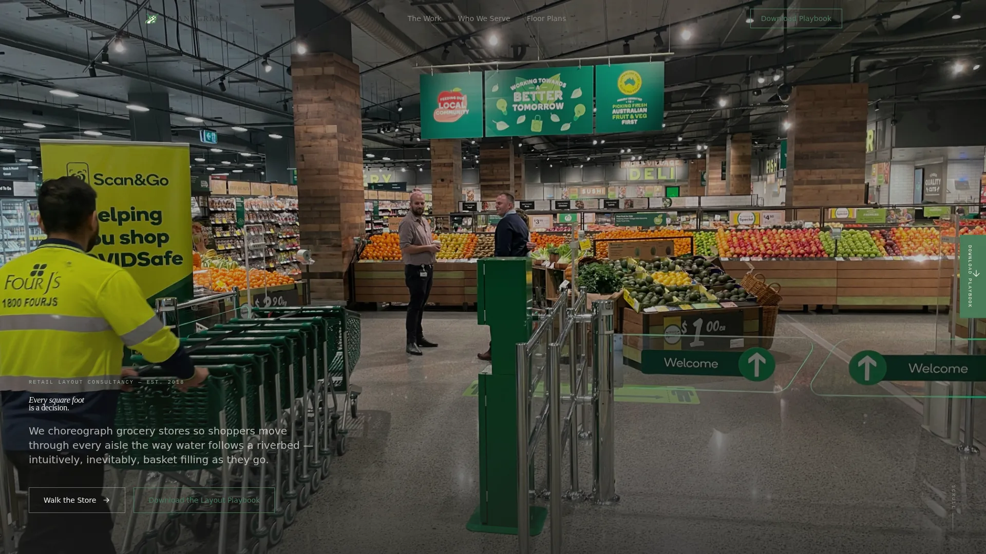
- A full-bleed crane-shot hero section with a serif fade-up headline and no distracting overlay chrome
- Five interactive store zones, each with hoverable or tappable hotspot pins that reveal design rationale cards
- Two lead capture paths: a floating playbook bookmark, a full-width interstitial, and a closing carousel with before-and-after floor plans
Feature list
This template is built around a single, tightly structured content interaction system. Every component below comes from the source brief.
Five-Zone Interactive Store Walkthrough
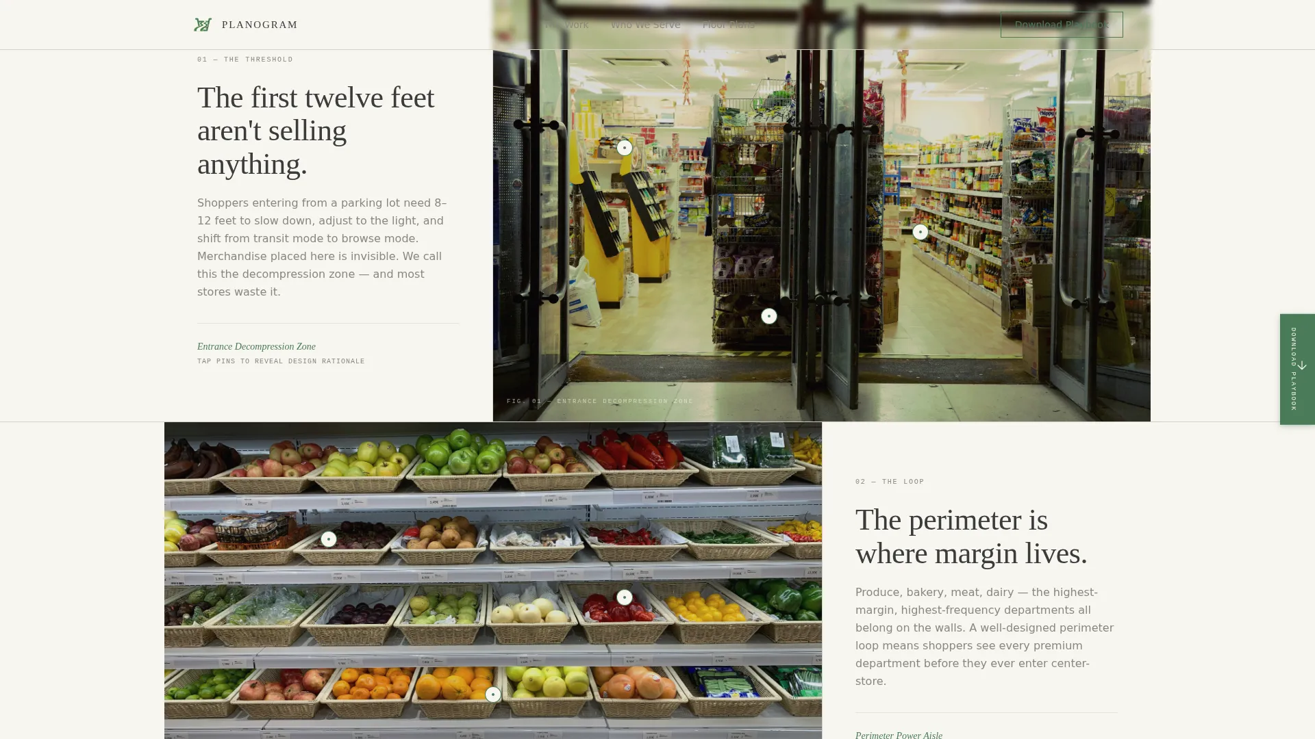
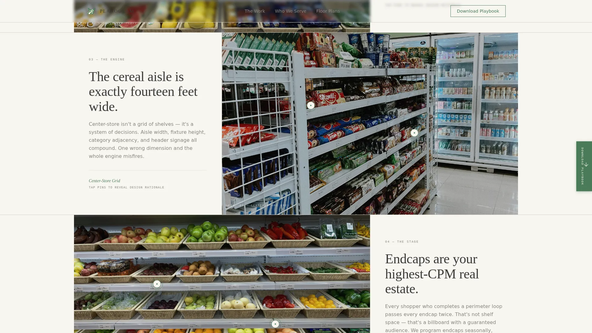
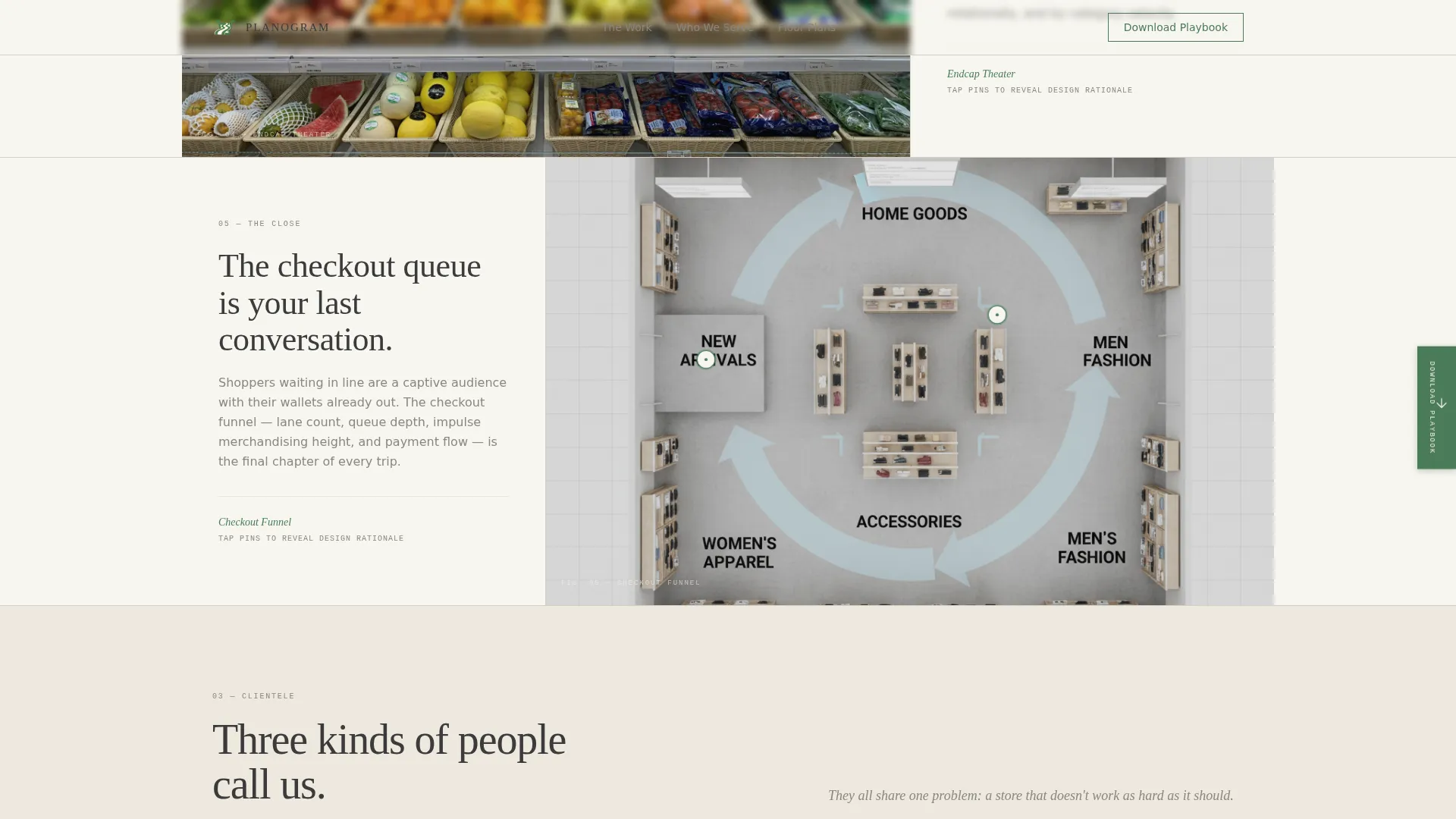
Each full-page scroll section represents one area of a fictional grocery store: entrance decompression, perimeter power aisle, center-store grid, endcap theater, and checkout funnel. Visitors move through the store the way a shopper would, building context as they go.
Hotspot Pin System with Rationale Cards
Within each zone, interactive pins sit on the layout and reveal design rationale cards on hover or tap. Cards explain specific decisions, such as why the bakery vents face the entrance or why the dairy section occupies the back-left corner.
Gated Layout Playbook Download
The primary conversion path gates a forty-page PDF guide behind a two-field form asking for email address and store count. The download offer appears three times: as a floating sidebar bookmark after the third zone, as a full-width interstitial before the final zone, and again in the closing section.
Before-and-After Floor Plan Carousel
The closing section pairs testimonial quotes and store names with a slider showing real before-and-after floor plan comparisons. This gives prospects tangible proof of consulting outcomes without requiring a live conversation.
Secondary "Book a Store Walk" Path
A second call-to-action surfaces only after the visitor has engaged with at least two interactive zones. The ask is earned, not imposed, which fits the consultancy's depth-first positioning and respects a sophisticated buyer's decision pace.
Scroll-Reveal Animation System
The template uses a medium animation layer: a hero headline fade-up, pulsing hotspot pins, and scroll-reveal section entrances. Motion is purposeful and unhurried, matching the Atelier Studio visual identity.
Page sections overview
| Section | Purpose |
|---|---|
| Hero crane shot | Opens with full-bleed produce photo and a thin serif headline fade-up |
| Zone 1: Entrance | Covers entrance decompression logic with hotspot pins |
| Zone 2: Perimeter | Explores perimeter power aisle design and rationale cards |
| Zone 3: Center-Store | Examines center-store grid layout and cereal aisle width data |
| Zone 4: Endcap | Showcases endcap theater design decisions |
| Zone 5: Checkout | Walks through checkout funnel strategy and flow |
| Who We Serve | Three audience cards for indie grocer, regional chain, retail architect |
| Playbook Interstitial | Full-width gated download with email and store count form |
| Floor Plans + Testimonials | Before-and-after slider carousel with client quotes |
| Footer | Arc-split footer with logo, tagline, and navigation links |
Design & branding system
The template follows an Atelier Studio visual identity. The overall feel is matte, tactile, and editorial, like a designer's sketchbook left open on a drafting table. Every decorative choice is restrained so that the grocer's green accent carries full weight when it appears.
- Color palette: gallery white (#F7F5F0) for backgrounds, pencil-sketch graphite (#3B3B3B) for text, tracing-paper cream (#EDE8DF) for surface cards, and grocer's green (#4A7C59) reserved strictly for interactive hotspots and call-to-action elements
- Typography: Fraunces serif for all headlines, DM Sans for body text and interface labels, creating a confident editorial contrast throughout
Mobile & speed optimization
This template is designed desktop-first to serve the operations directors and retail architects who typically review detailed content on large screens. It includes a solid mobile fallback so the experience holds on smaller devices.
- The hero image is set to priority load as a static asset, with remaining sections loading lazily as the visitor scrolls
- Hotspot interactions convert to tap-friendly targets on touch devices, and the before-and-after slider remains functional on mobile viewports
How this template helps you convert
This template builds conversion through demonstrated expertise rather than direct promotion. The layout is structured so every persuasion layer arrives at the right moment in the visitor's journey.
- The five-zone walkthrough positions the consultancy as a knowledgeable guide before any form or call-to-action appears, reducing resistance to the Playbook download request.
- The floating sidebar bookmark and full-width interstitial give the Playbook offer multiple natural touchpoints without feeling repetitive or pushy.
- The "Book a Store Walk" call-to-action is withheld until after the visitor has engaged with at least two interactive zones, so the ask arrives when trust has already been established.
Other information about this template
This template is designed specifically for the grocery store layout and retail space design niche. It suits consultancies that need to demonstrate specialized knowledge to a skeptical B2B audience before presenting a conversion offer.
- The template style is classified as Storybook and Full-Page, using a scroll-driven narrative structure rather than a modular component library
- The header concept is a Full-Bleed Photo using a crane-height, straight-down perspective over a produce department, lit with soft studio lighting
- The creative direction is an Interactive Explorer format, where scroll progression simulates a physical store walkthrough
- The landing page direction is Content and Resource focused, built around a gated forty-page PDF as the primary lead magnet
- The color system is named Cloud Canvas, combining gallery white, tracing-paper cream, graphite, and a single grocer's green accent
- Footer uses an Arc-split pattern with logo and tagline on the left and navigation links on the right
Theme
Atelier Studio
Creative direction
Interactive Explorer
Color system
Cloud Canvas
Style
Storybook/Full-Page
Direction
Content/Resource
Page Sections
Five-zone Interactive Store Walkthrough
Hotspot Pins with Design Rationale Cards
Gated Layout Playbook Download
Before-and-after Floor Plan Slider
Earned Secondary Call-to-action
Scroll-reveal Animation Layer
Related questions
What type of business is this template designed for?
How does the interactive store walkthrough work?
How many lead capture touchpoints does the template include?
Is this template suitable for a consultancy that serves multiple client types?
What animations and interactions does this template include?



