Restaurant Influencer Marketing Agency Landing Page
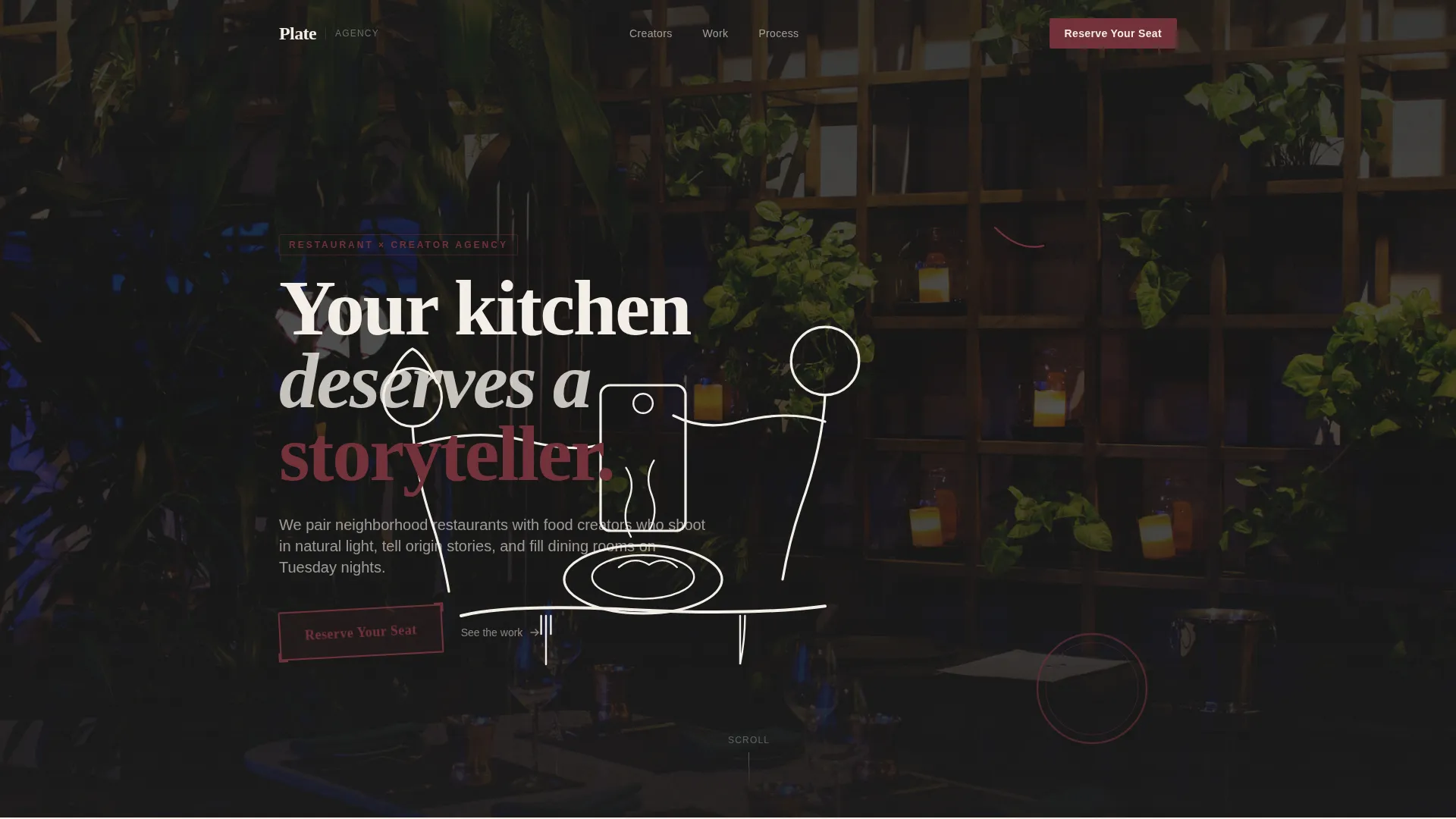
Plate is a restaurant influencer marketing agency landing page template built for agencies that connect independent restaurants with food creators. It uses an Ink & Paper visual identity, layered scroll animations, and a waitlist-focused conversion flow. The design feels like a handwritten reservations book, pairing illustrated headers with real campaign photography to build immediate trust.
by Rocket studio
Quick summary
Plate is a single-page waitlist landing page template designed for a restaurant influencer marketing agency. It pairs hand-drawn ink animations with layered scroll storytelling, guiding restaurant owners and hospitality marketers toward a simple three-field waitlist form. The visual identity feels like a chef's personal notebook, keeping the experience warm, credible, and compelling.
Who this template is for
This template speaks directly to agencies and studios operating at the intersection of food culture and creator marketing. It is built for teams that need to launch quickly and generate early interest before a full product rollout.
- Restaurant influencer marketing agencies ready to build a waitlist before opening their roster
- Independent restaurant owners and hospitality group marketing directors exploring influencer partnerships
- Executive chefs or creative studios that want a high-craft visual presence without a full website build
What problem this template solves
Empty dining rooms and wasted ad budgets are real pain points for independent restaurants. Most agencies pitching to this audience lead with generic decks and stock imagery, which erodes trust before a single conversation begins. This template solves the credibility gap by making the agency feel as considered as the restaurants it represents.
- Independent restaurant owners need proof that a marketing partner understands their world, not just their demographic
- Hospitality marketing directors want to see creative vision before committing budget or a meeting
- The template replaces generic agency presentations with a layered, story-led experience that builds confidence from the first scroll
What you get with this template
You get a fully designed, single-page landing page with a clear waitlist conversion goal and a strong visual narrative. Every section is built to carry the reader from curiosity to commitment, using design as proof of craft.
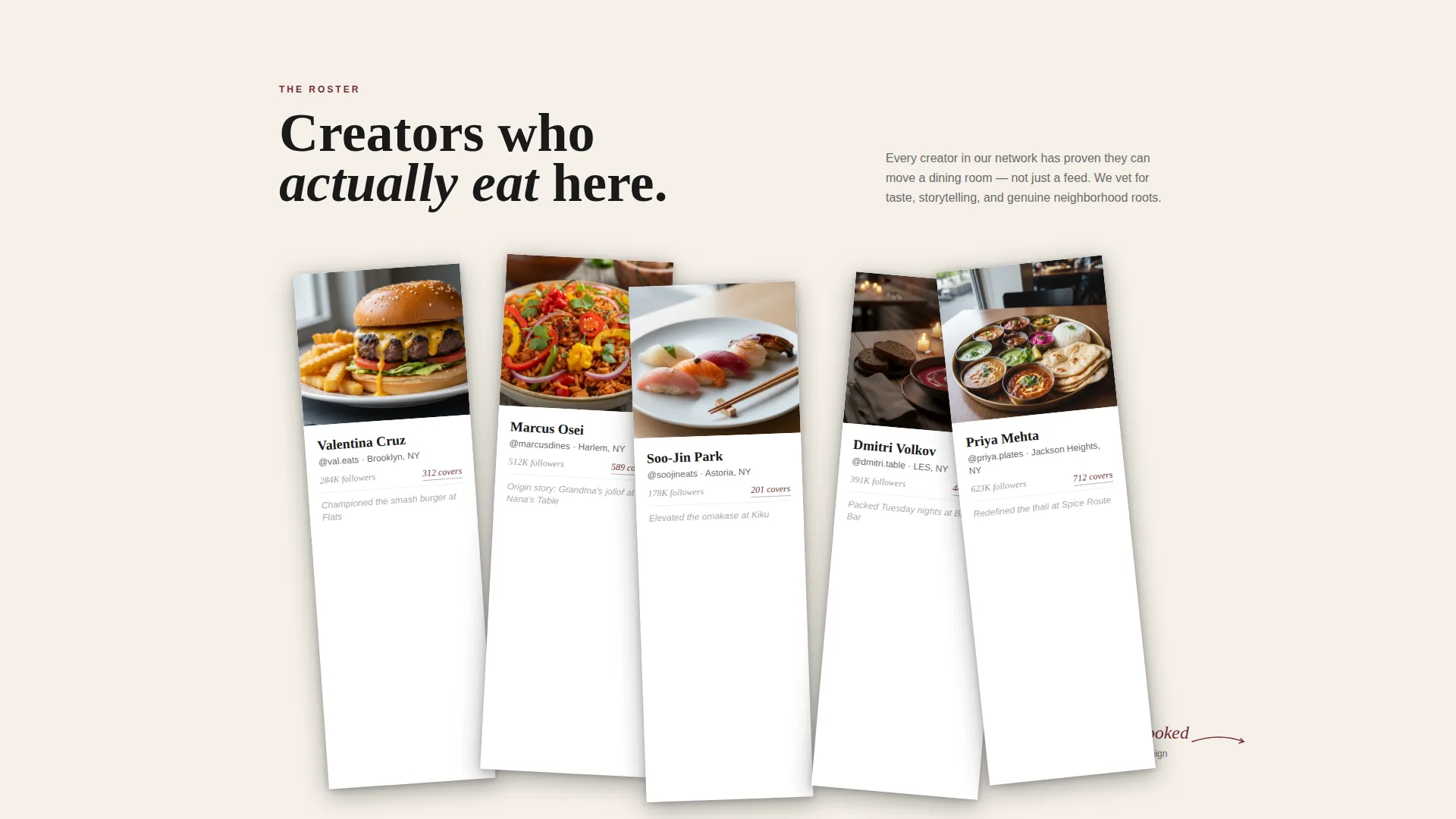
- An animated illustrated header, layered overlap scroll sections, and creator profile cards styled like Polaroids scattered on a table
- A minimal three-field waitlist form on a torn-paper visual, with a live counter showing restaurants already signed up
- A repeating burgundy "Reserve Your Seat" call-to-action that appears in the header, at the portfolio midpoint, and in the final section
Feature list
This template is built around a small set of high-impact features. Each one is grounded in the brief and serves the waitlist conversion goal.
Hand-Drawn Animated Header
Ink lines sketch a bustling restaurant scene in real time across the full viewport. A plate being garnished, a phone hovering mid-shot, steam curling upward, and a creator leaning in. Once the drawing completes, a real photograph bleeds through the illustration like watercolor soaking into paper, and the headline materializes in serif type.
Overlap and Layered Scroll Design
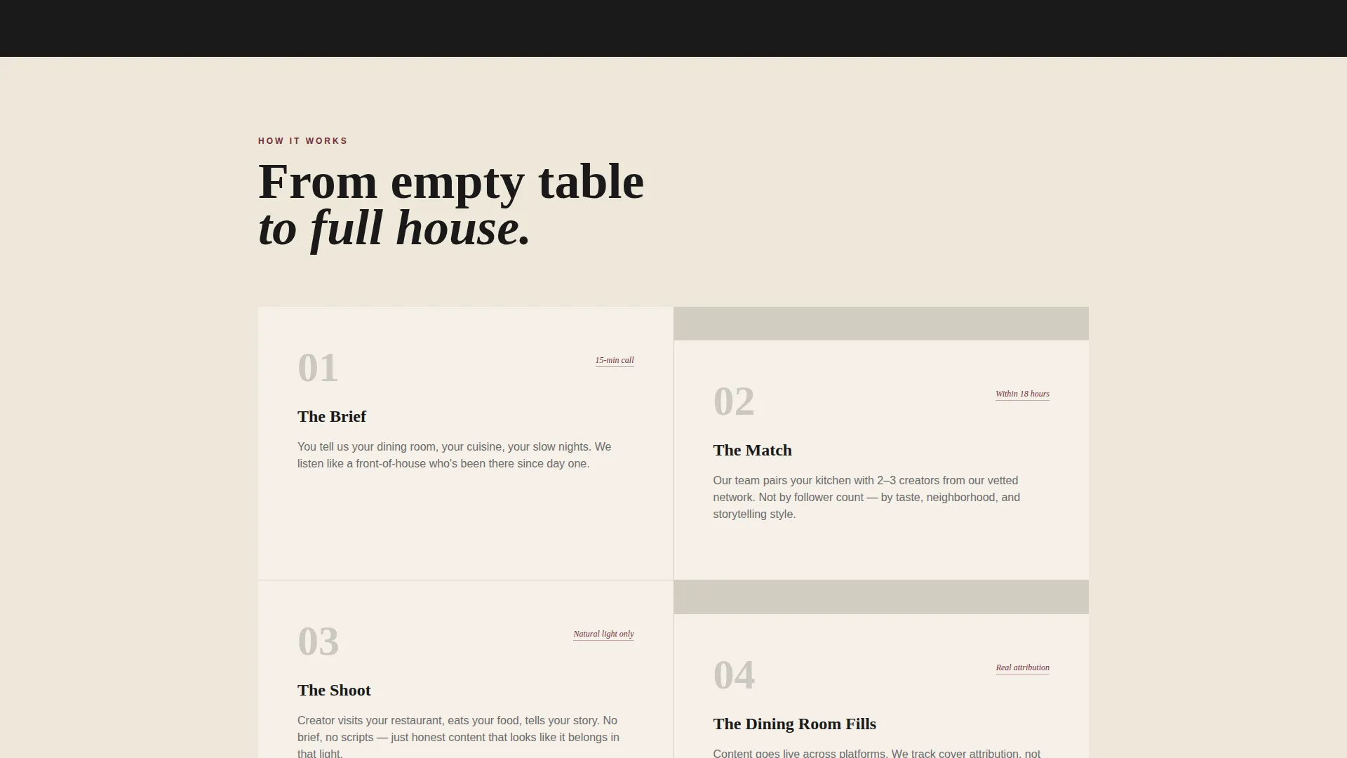
Each section slides over the previous one like pages of a folio being turned. Illustrated restaurant scenes dissolve into real campaign photography as the reader scrolls deeper. The layering accelerates toward the bottom, stacking testimonials, campaign stills, and annotated metrics until the page feels dense with proof.
Creator Profile Card Layout
Creator cards are arranged at angles like Polaroids scattered on a table. Each card shows a face, a follower count, and a signature dish the creator has championed. This layout communicates the depth and personality of the agency's creator network at a glance.
Handwritten Metrics Annotations
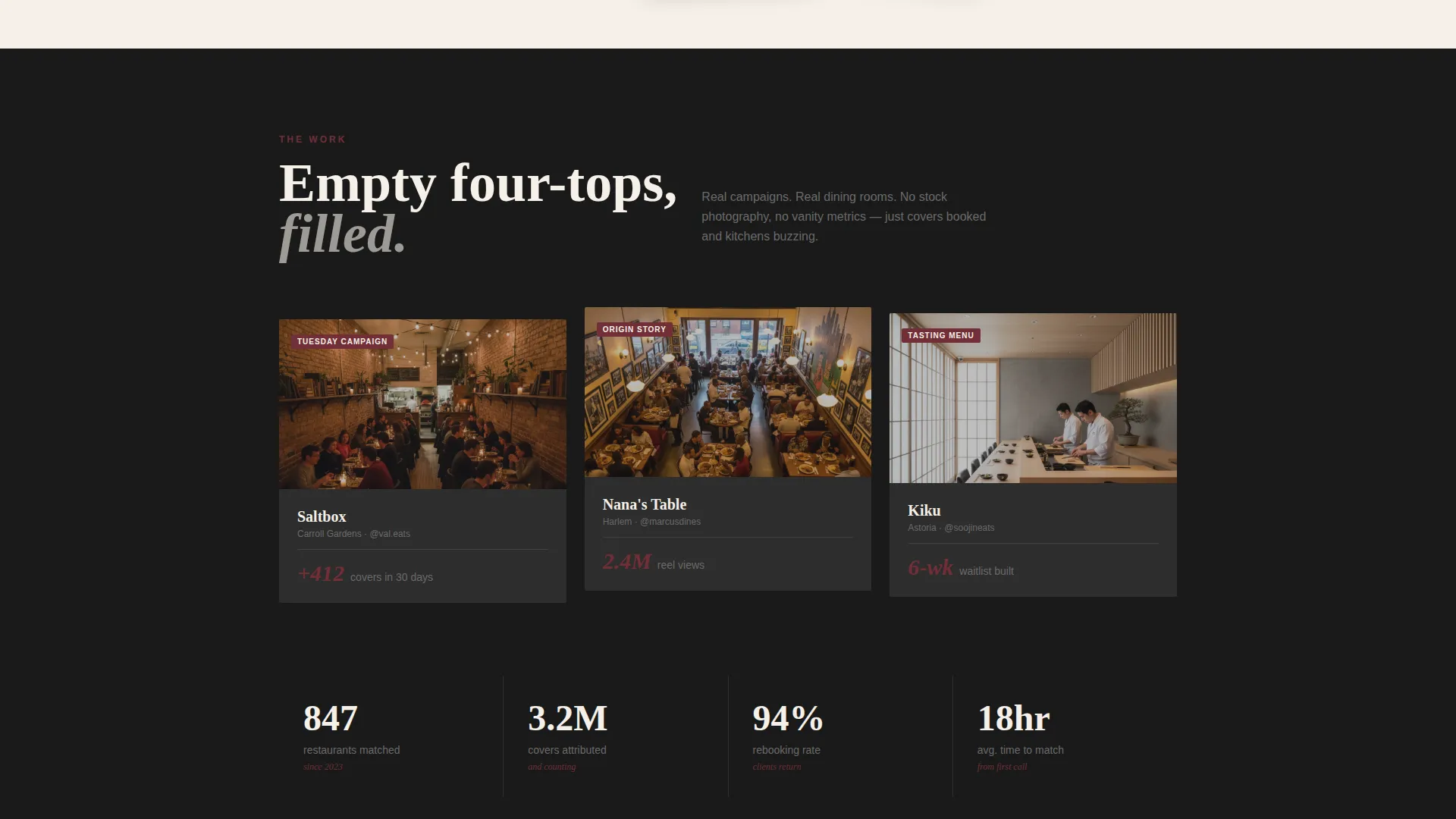
Key performance figures appear as handwritten-style annotations scrawled beside arrows and campaign photography. A note reading "412 covers booked" beside a packed dining room is an example of how data is presented with personality rather than as a dry statistic.
Three-Field Waitlist Form
The form asks only for restaurant name, neighborhood, and email. These three fields sit on a visual that looks like a torn slip of paper, keeping the request low-friction. A live counter below the form shows how many restaurants have already joined, adding social proof in real time.
Repeating Contextual Call-to-Action
The primary call-to-action, styled as a burgundy ink stamp reading "Reserve Your Seat," appears three times across the page. It resurfaces at the header, the portfolio midpoint, and the final section, giving readers multiple natural moments to convert without feeling pressured.
Page sections overview
| Section | Purpose |
|---|---|
| Animated Illustration Header | Opens with hand-drawn ink animation that resolves into real photography and the hero headline |
| Agency Value Statement | Frames the core offer: matching restaurants with food creators who fill dining rooms |
| Illustrated Scene Dissolve | Transitions illustrated restaurant content into real campaign photography as the scroll begins |
| Creator Profile Cards | Showcases creator network using angled Polaroid-style cards with face, follower count, and signature dish |
| Annotated Metrics Section | Presents campaign results as handwritten annotations beside packed-room photography |
| Testimonials and Campaign Stills | Stacks client proof, campaign images, and data in a dense portfolio-style layer |
| Waitlist Form Section | Delivers the three-field sign-up form on a torn-paper visual with a live restaurant counter |
| Closing Call-to-Action | Reinforces the waitlist offer with scarcity copy and the final "Reserve Your Seat" stamp |
Design & branding system
The visual identity is built around an Ink & Paper theme. Every color, texture, and typographic choice is drawn from the world of handwritten notebooks and analog kitchen journals.
- Color palette uses heavy brushstroke black (#1A1A1A), unbleached parchment (#F5F0E8), smudged graphite (#6B6B6B), and a single wine-stain burgundy (#722F37) reserved for interactive elements and hover states
- Backgrounds alternate between deep black and warm parchment, with text living in the opposing tone and layered elements casting subtle paper-curl shadows
- Typography centers on a serif typeface for headlines, reinforcing the handwritten, editorial quality of the overall design
Mobile & speed optimization
The template is designed with mobile visitors in mind. Restaurant owners and creators are often browsing on their phones, so the layout adapts cleanly across screen sizes.
- The overlap and layered scroll sections restack gracefully on smaller viewports without losing the folio-page visual metaphor
- The three-field waitlist form remains thumb-friendly and low-friction on mobile, keeping the path to conversion short
- Animated elements in the header are structured to deliver their narrative without slowing down the initial page experience
How this template helps you convert
Every design decision in this template is made in service of one goal: getting the right restaurant owner to submit their name to the waitlist.
- The animated header creates an immediate emotional connection, making the agency feel like a creative partner rather than a vendor, before a single word is read
- The layered scroll and annotated metrics build proof progressively, so by the time the reader reaches the form, trust has already been established through visual evidence
- The scarcity line below the form, "We match ten new restaurants per month. First seated, first served," gives readers a specific, believable reason to act now rather than later
Other information about this template
This template is part of the Overlap and Layered template style category. It is purpose-built for the Waitlist and Coming Soon landing page direction, making it useful beyond restaurant marketing for any agency that wants to launch a waitlist experience with strong visual identity.
- The Ink & Paper color system and Immersive Visual creative direction make this template a strong reference point for food, hospitality, and artisan brand agencies
- The Animated Illustration header concept is a standalone design asset, adaptable to any agency niche that values craft and human-made aesthetics
- The template sits within the Portfolio and Agency category and the Restaurant Marketing and Agency subcategory, with a focused niche in restaurant influencer marketing
Theme
Ink & Paper
Creative direction
Immersive Visual
Color system
Ink & Paper
Style
Overlap/Layered
Direction
Waitlist/Coming Soon
Page Sections
Hand-drawn Animated Illustration Header
Overlap and Layered Scroll Sections
Polaroid-style Creator Profile Cards
Handwritten Metrics Annotations
Minimal Three-field Waitlist Form
Repeating Contextual Call-to-action
Related questions
Can I use this template if I am not a restaurant influencer agency?
Is the hand-drawn animation included in the template?
How does the three-field waitlist form work?
Can I edit the creator profile cards and handwritten annotations?
What visual style does this template use?



