Restaurant & Dining Advanced Professional Website Template
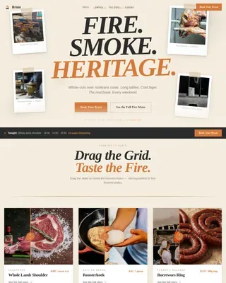
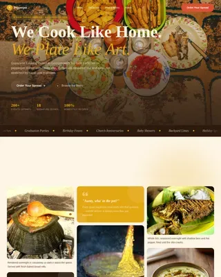
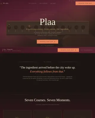
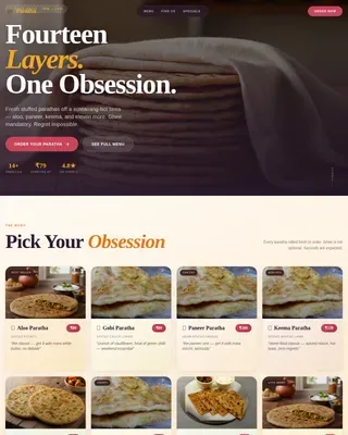
Plate is a luxe minimal fast casual restaurant landing page template built around a modular card grid, golden-hour visuals, and an inline order flow. It showcases rotating menu items by daypart, drives direct pickup and delivery orders, and captures email subscribers through a frictionless weekly menu drop. Perfect for counter-service restaurants, neighborhood kitchens, and quality-first cafes.
by Rocket studio
Quick summary
Plate is a single-page restaurant landing page template designed for fast casual counter-service dining. It blends fine dining aesthetics with everyday counter pricing, using a warm sunset palette, editorial food photography, and a modular card grid. The template drives direct orders through an inline checkout flow and converts browsers into regulars with a low-pressure email capture.
Who this template is for
This template is built for restaurant owners and operators who want a user-friendly website that reflects the quality of their food without a large development budget. No-code platforms let you get started in minutes, not weeks.
- Fast casual restaurants and neighborhood counter-service kitchens
- Quality-focused cafes serving urban professionals and families
- Food operators who want to showcase a rotating menu and drive direct orders
What problem this template solves
Most restaurant website templates force a choice between looking polished and being functional. This landing page solves that by combining fine dining visual craft with immediate, low-friction ordering. A clear call-to-action improves customer engagement from the first scroll.
- Generic templates fail to showcase food ambiance or local sourcing stories
- Customers abandon pages with complicated checkout flows or no sticky order button
- Restaurants lose reservations and repeat visitors without an email capture path
What you get with this template
You get a fully structured restaurant landing page with every section pre-built. Engaging visuals and an inline order form work together so customers can browse and buy without leaving the page.
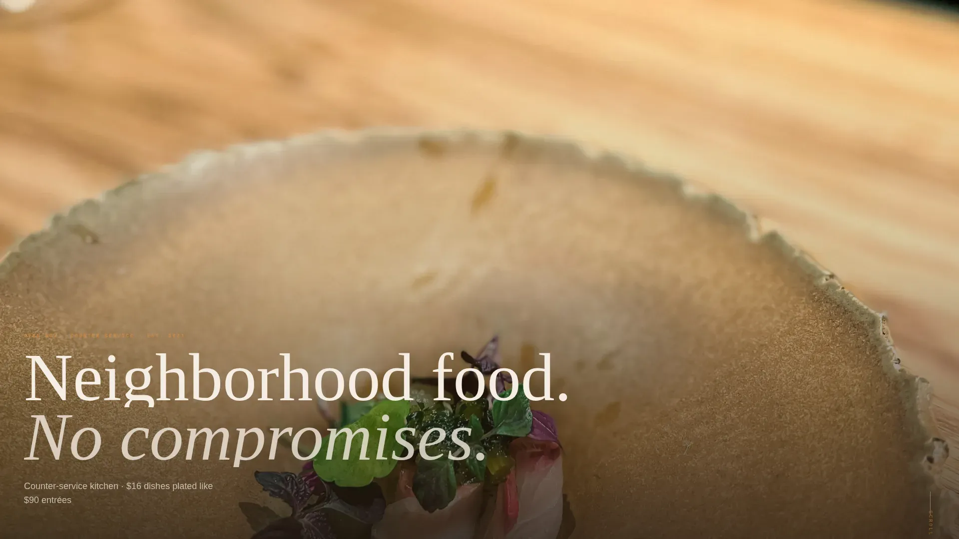
- Full-viewport macro hero image with a bottom-anchored headline
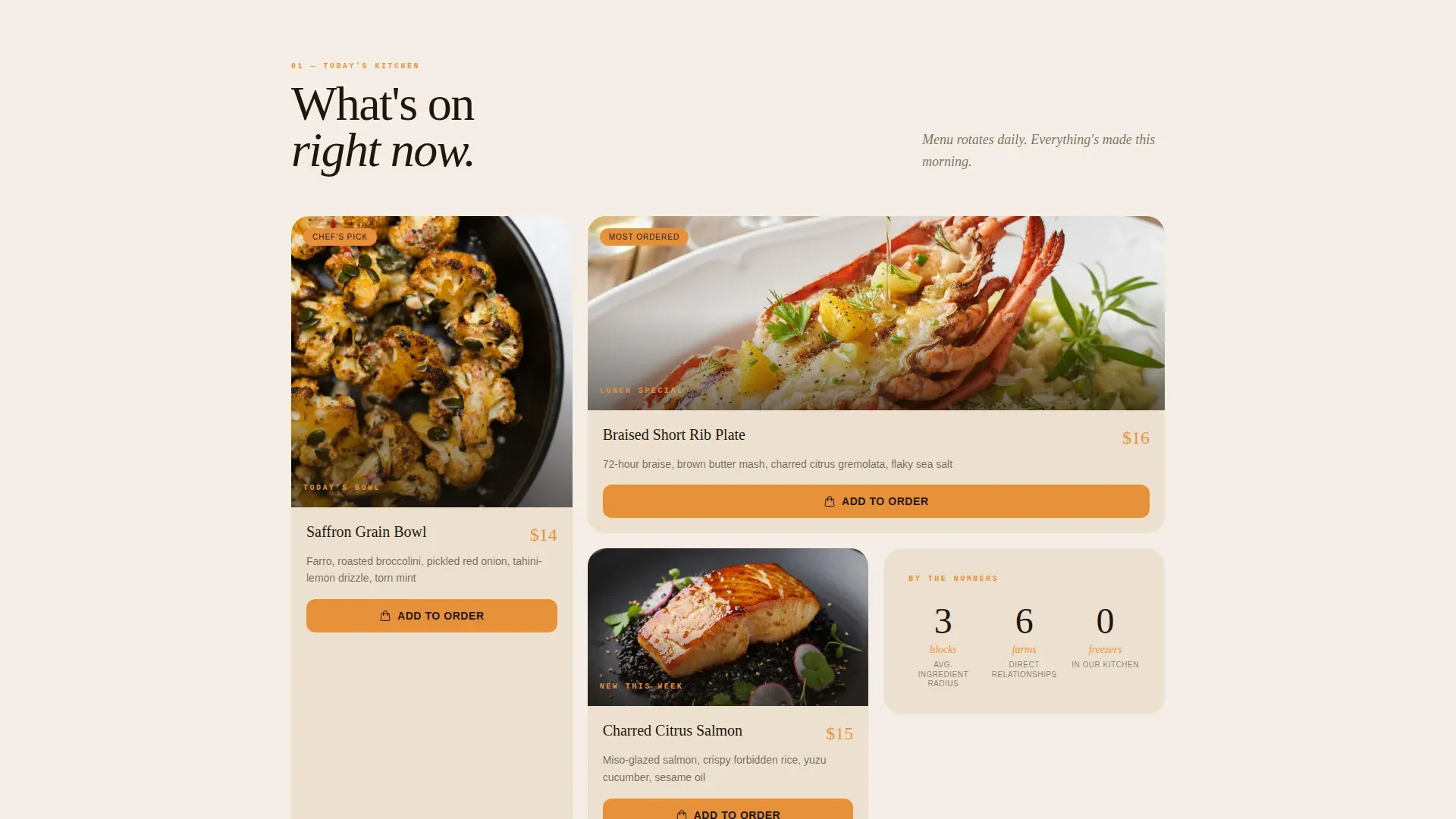
- Modular pinboard card grid for menu items, sourcing stories, and social proof
- Inline daypart order flow with one-tap add-to-bag and a three-field checkout
Feature list
This landing page template includes six purpose-built sections. Each one serves a specific role in moving a visitor from discovery to order.
Full-Viewport Hero Section
A macro close-up food photograph fills the viewport edge to edge. A single warm-toned headline rises from the bottom, establishing a premium tone before the visitor scrolls.
Modular Card Grid Menu Display
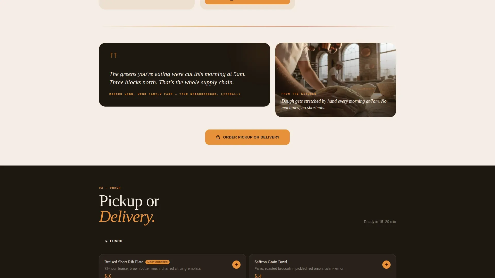
Staggered cards of varied sizes showcase today's rotating dishes, a short kitchen video loop, and a farmer quote. The pinboard layout feels curated and alive, making it easy to showcase seasonal menu offerings.
Inline Daypart Order Flow
An integrated menu tab system organizes food by lunch, dinner, and family packs. One-tap add-to-bag and a three-field checkout reduce friction for mobile customers placing orders.
Sticky Mobile Call-to-Action
An "Order Pickup or Delivery" button is pinned to the bottom of the viewport on mobile. This keeps the primary action visible at all times, directly improving conversion on smartphone screens.
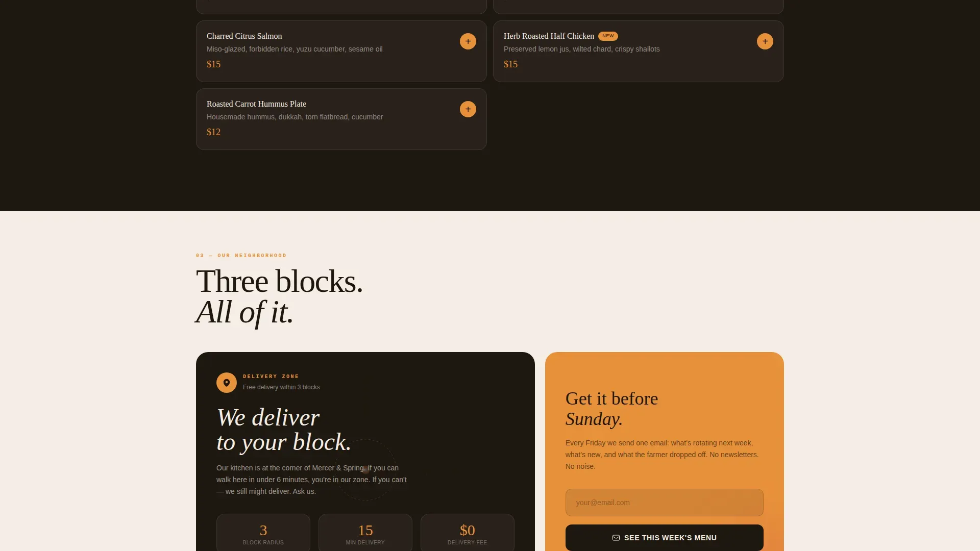
Neighborhood Map and Delivery Zone Card
A dedicated card displays the local delivery radius. This builds trust with nearby customers and reinforces the restaurant's local identity.
Email Capture with Weekly Menu Drop
A secondary conversion path invites visitors to receive a weekly menu PDF. It converts casual browsers into regulars without requiring reservations or a full signup process.
Page sections overview
| Section | Purpose |
|---|---|
| Macro Hero Image | Establish premium food ambiance |
| Today's Menu Cards | Showcase rotating daypart dishes |
| Provenance Story Cards | Build trust through sourcing context |
| Inline Order Flow | Drive direct pickup or delivery |
| Neighborhood Map Card | Define local delivery zone |
| Email Capture Card | Convert browsers into subscribers |
| Minimal Footer | Provide essential restaurant links |
Design & branding system
The design follows a "less is more" principle, using ample negative space to protect focus and guide the eye toward food and calls-to-action. The color palette pairs muted earth tones with a single warm accent.
- Linen (#F5EDE3) dominates backgrounds; espresso (#1E1710) carries all type
- Saffron-to-persimmon gradient lives in section dividers and hover states only
- Fraunces serif handles display headlines; DM Sans handles body and interface text
Mobile & speed optimization
Mobile-first design is central to this template. Fast casual customers frequently browse and order from smartphones, so every interactive element is built for thumb-friendly use.
- Sticky order button stays pinned to the viewport bottom on all mobile screens
- Card grid reflows into a single-column layout on smaller screens
- Images are lazy-loaded and CSS animations are GPU-accelerated for smooth performance
How this template helps you convert
A luxury-minimalist fast casual landing page must blend high-end aesthetics with immediate functionality. This template is structured so the value proposition and primary action are both visible before the visitor scrolls.
- The hero section puts a bold headline and saffron call-to-action above the fold, so customers know how to order within seconds of arriving on the page.
- The sticky mobile button and repeated desktop call-to-action after every third card cluster keep the order path accessible throughout the entire scroll.
- The email capture card saves a secondary conversion opportunity for visitors who are not ready to order, turning them into future regulars.
Other information about this template
This template can suit a wide range of food and beverage operators beyond single-location counter-service spots. It works well for cafes, grain bowl concepts, family-pack takeout brands, and neighborhood bistros. Restaurant website templates like the Plate luxe minimal fast casual restaurant landing page template are designed to create a stunning online presence without requiring technical knowledge. No-code tools mean you can access the full design, update menu items, and go live in minutes. Reservation systems and event calendars are not included in this single-page template by default, but the layout can support links to external reservation systems or event calendar pages. Photo galleries embedded within the card grid let you protect the editorial feel while keeping food imagery current. You can also connect the template to social media platforms to drive traffic back to your landing page.
- The template works equally well for cafes, fast casual concepts, and neighborhood takeout brands
- No-code development means no programming knowledge is needed to get started
- Photo galleries, sourcing cards, and video loop cards can all be updated to reflect seasonal menu changes
Theme
Luxe Minimal
Creative direction
Local & Neighborhood
Color system
Sunset Gradient
Style
Card Grid (Modular)
Direction
Direct Sales
Page Sections
Full-viewport Macro Hero
Modular Pinboard Card Grid
Inline Daypart Order Flow
Sticky Mobile Order Button
Email Capture with Menu Drop
Neighborhood Delivery Zone Card
Related questions
Does this template include an order form?
Can I use this template without technical knowledge?
Does the template include reservation systems or event calendars?
Can I update menu items and food photography easily?
Is this template suitable for cafes and family takeout brands?