Chef Profile Professional Website Template
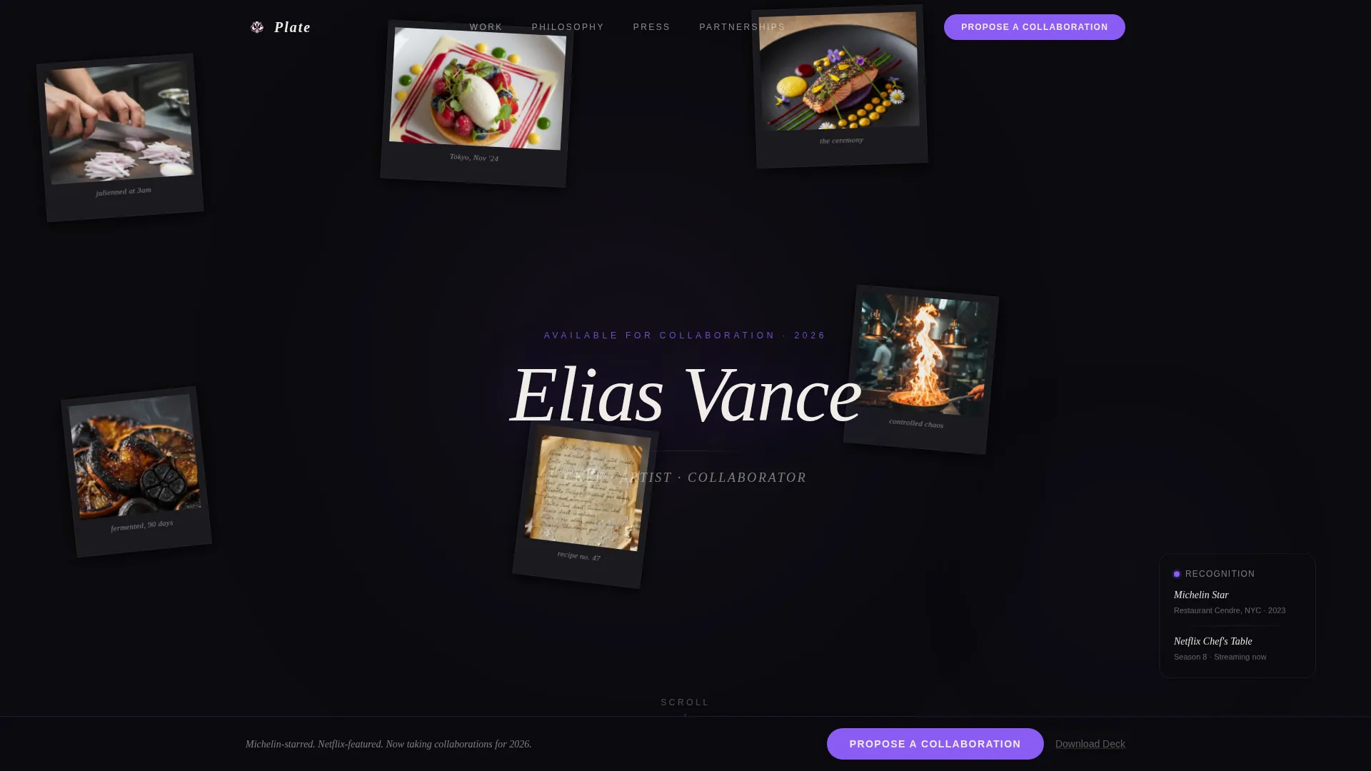
Plate is a dark, immersive chef personal brand landing page built for culinary professionals who work at the highest level. A collage-style header, masonry content grid, and Void & Violet color system create an atmosphere that feels like a private tasting room. The page is designed to attract luxury hotel groups, spirits brands, publishers, and kitchenware partners toward a single goal: a meaningful collaboration.
by Rocket studio
Quick summary
Plate is a single-page chef personal brand landing page that leads with atmosphere before biography. Built on a dark immersive Void & Violet palette and a masonry grid layout, it moves visitors through editorial imagery, press proof, and brand partnerships toward one deliberate action: proposing a collaboration. Every design decision earns trust before it asks for anything.
Who this template is for
This template is built for chefs who operate where food meets culture, media, and commerce. It speaks directly to culinary professionals whose work is already being noticed at an industry level and who need a digital presence that matches that reputation.
- Resident chef candidates being scouted by luxury hotel groups and private dining venues
- Culinary creatives pursuing cookbook deals, editorial commissions, or brand partnership dinners
- Established chefs building a personal brand that attracts premium kitchenware and spirits collaborations
What problem this template solves
Most chef portfolio pages look like restaurant websites. They show a menu, a bio, and a contact form. That approach fails entirely when the audience is a brand director or a hotel development team comparing candidates on a Monday morning. This template solves the gap between fine dining reputation and effective digital presence.
- Generic portfolio layouts undercut a chef's perceived value before a single conversation starts
- Standard contact forms feel misaligned with the ambition of a residency pitch or a six-figure product collaboration
- A visually flat page loses credibility against the richness of the chef's actual work and story
What you get with this template
You get a fully structured, single-page landing page designed specifically for chef personal branding at a partnership level. Every section is laid out with purpose, from the collage header to the sticky collaboration bar at the bottom of the scroll.
- A Collage/Scrapbook header with overlapping Polaroid-style frames and a hand-script signature typography treatment
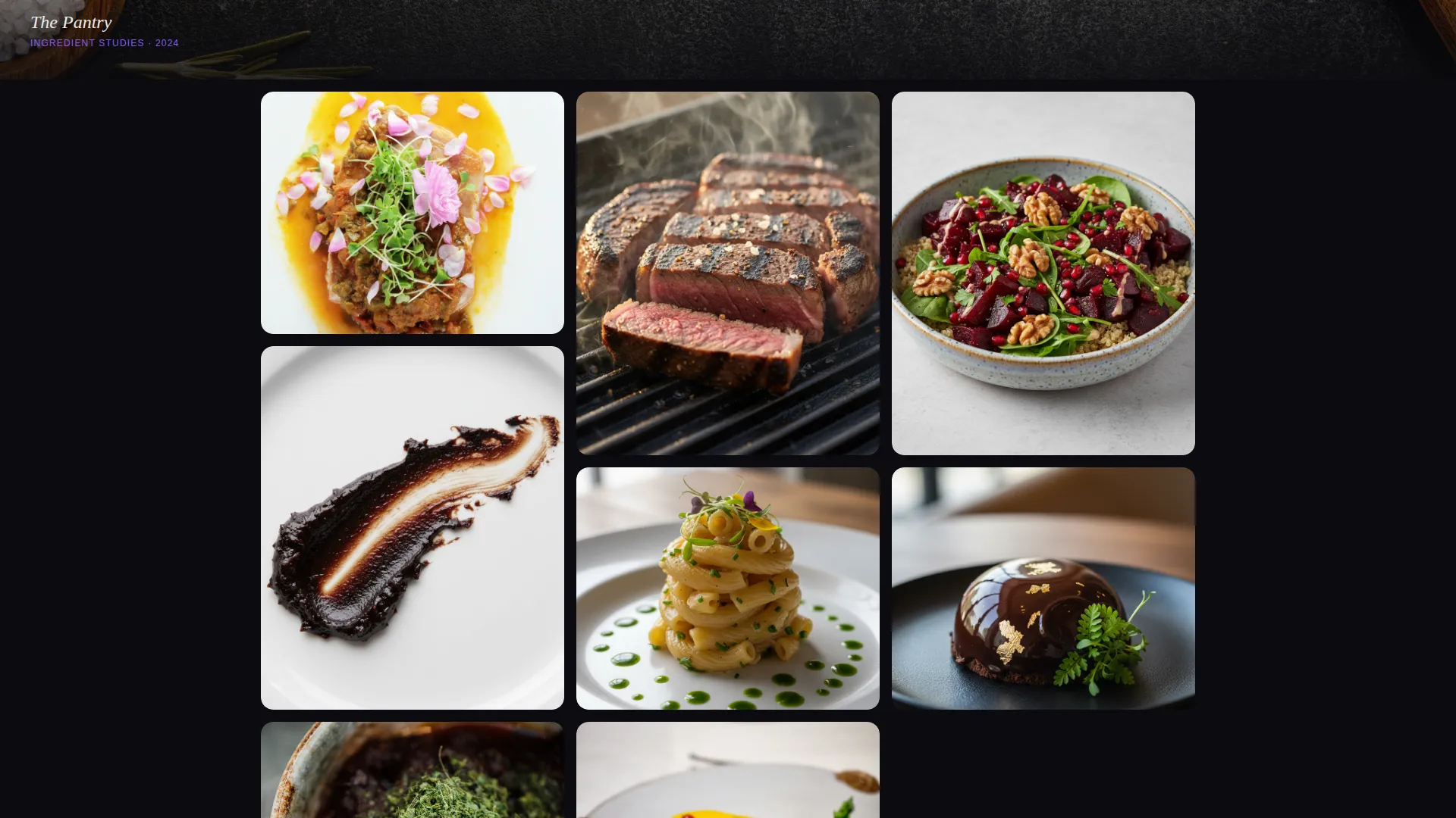
- A masonry content grid that mixes editorial photography, video stills, ingredient close-ups, and press moments
- A sticky bottom bar with a "Propose a Collaboration" primary call to action and a modal form collecting brand name, collaboration type, proposed timeline, and a free-text prompt
- A secondary "Download the Partnership Deck" path gated by a single business email field
Feature list
This section describes the key built-in components and design features included in the Plate template.
Collage Scrapbook Header
The header is composed of overlapping Polaroid-style frames pinned at slight angles across the full viewport. Each frame holds a different fragment of the chef's world: scarred hands at work, a plated dessert shot from above, a handwritten recipe note, a blurred action flame shot, and a torn magazine cover. The chef's name threads through the composition as a hand-script signature rather than a typeset logo.
Masonry Content Grid
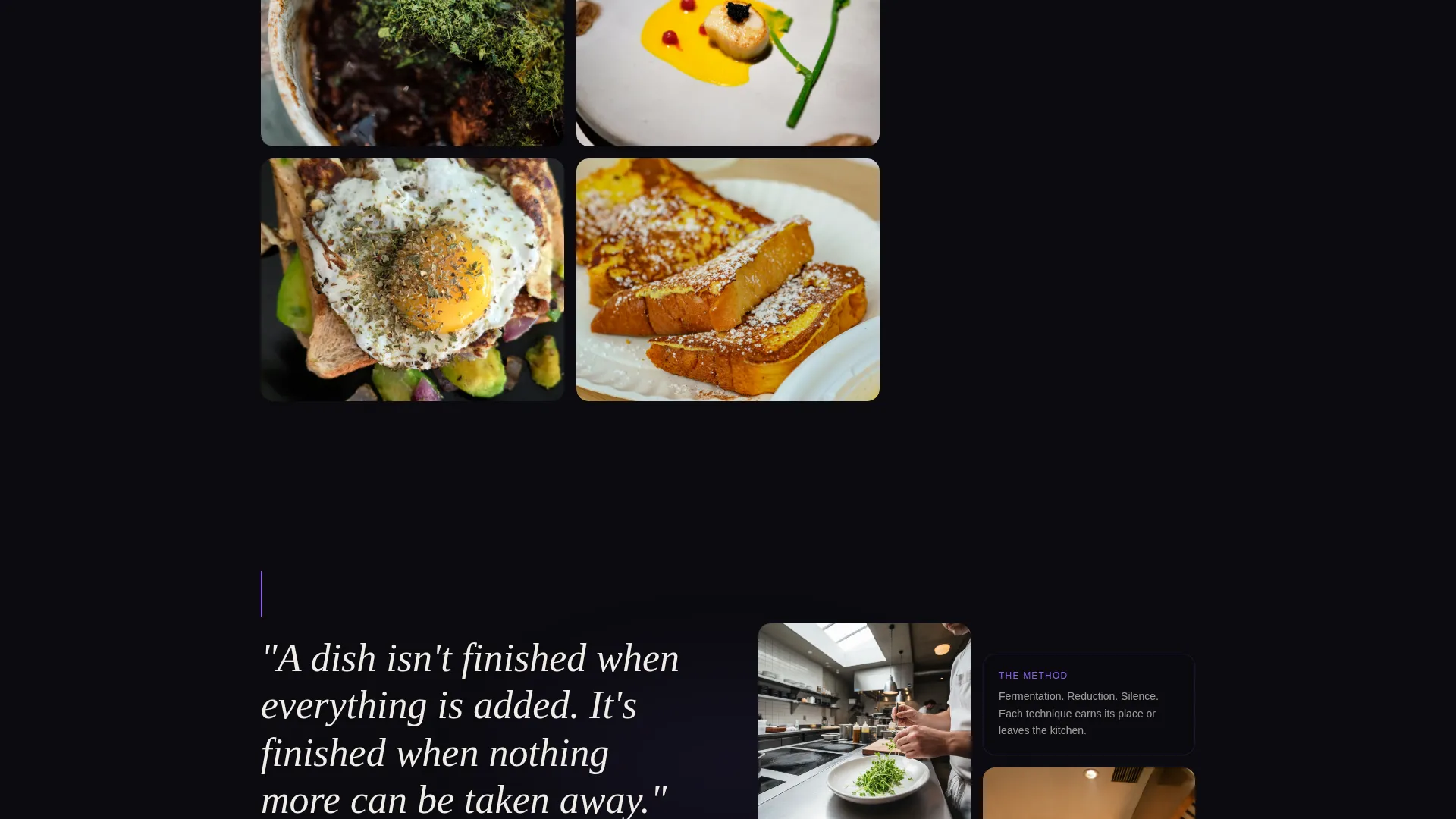
The page body uses an irregular masonry layout that breathes and shifts as the visitor scrolls. Full-width images interrupt the grid every third row, resetting the eye and deepening immersion. The sequence moves deliberately from admiration through process, press coverage, and active brand partnerships.
Sticky Collaboration Bar
After the visitor scrolls past the press section, a sticky bottom bar appears anchored to the viewport. It carries the primary call to action in bone white on electric violet, always visible and never intrusive until the page has already made its case.
Dark Collaboration Modal
The primary call to action opens a dark-themed modal form. It collects the partner's brand name, their preferred collaboration type (residency, product line, event, or content), a proposed timeline, and a free-text field labeled "Tell me what you're imagining." The form is built to feel like the start of a real conversation, not a generic inquiry.
Partnership Deck Download Gate
Below the modal form sits a secondary conversion path. Visitors can download the partnership deck by entering a single business email address. This lower-friction option captures partners who are researching but not yet ready to propose.
Void & Violet Color System
The entire page is built on a four-color palette: absolute black as the dominant canvas, deep aubergine bleeding through section backgrounds, electric violet used for hover states and pull quotes, and bone white reserved for typography and thin divider lines. The result is a visual atmosphere that mirrors a Michelin-starred dining room at night.
Page sections overview
| Section | Purpose |
|---|---|
| Collage Header | Introduce the chef through layered visual fragments and hand-script signature |
| Masonry Editorial Grid | Showcase food photography, video stills, and ingredient close-ups in a breathing layout |
| Full-Width Image Breaks | Reset visual rhythm and deepen immersion every third masonry row |
| Press and Media | Build credibility through visible editorial and screen appearances |
| Brand Partnerships | Show active collaborations already operating at the partner's level |
| Sticky Collaboration Bar | Surface the primary call to action after trust has been established by the scroll |
| Collaboration Modal | Capture partnership intent with a structured yet personal inquiry form |
| Partnership Deck Gate | Offer a lower-friction download path for partners still in research mode |
Design & branding system
The Void & Violet system is not decorative. Every color choice is functional and atmospheric, designed to make the chef's work feel rare and deliberate. The palette creates immediate emotional positioning without a single word of biography.
- Absolute black (#0B0B0F) as the dominant canvas, deep aubergine (#2D1B3D) bleeding through section backgrounds, electric violet (#8B5CF6) on hover states and pull quotes, and bone white (#F0EDE8) exclusively for text and divider lines
- Collage/Scrapbook header composition with Polaroid-style overlapping frames, slight rotations, and imperfect pinned spacing that feels physical rather than digital
- Hand-script signature typography for the chef's name, contrasting with clean bone white body text to separate personality from clarity
Mobile & speed optimization
The template is structured so that the atmospheric design translates cleanly to smaller screens without losing its visual intensity. The masonry grid and sticky bar are both built to adapt to mobile viewports.
- The masonry grid collapses gracefully on mobile, maintaining the irregular rhythm without breaking the visual flow
- The sticky collaboration bar remains anchored and accessible on all screen sizes, keeping the primary call to action within reach throughout the scroll
- The dark modal form is designed to open and close cleanly on touch devices, keeping the partnership inquiry experience smooth from any device
How this template helps you convert
The page is engineered so that every scroll deepens the visitor's investment before a single action is requested. By the time the sticky bar appears, the visitor has already moved through admiration, process, press, and proof of existing partnerships.
- The collage header creates an immediate emotional impression that holds attention from the first second, making the chef's identity feel vivid and specific rather than generic.
- The masonry sequence builds a layered case: editorial quality first, then craft process, then press validation, then active brand partnerships already in motion, positioning the chef as a peer rather than a candidate.
- The sticky collaboration bar and dual conversion paths (direct proposal and partnership deck download) give partners two entry points based on their readiness level, reducing friction without reducing quality.
Other information about this template
This template belongs to the Personal & Resume category under the Chef Profile subcategory. It was designed specifically for the Chef Personal Brand Website niche, where the audience is commercial rather than casual and the stakes of first impression are unusually high.
- The template style is Masonry/Pinterest, meaning the content grid uses variable-height blocks arranged in a multi-column layout that feels editorial and alive rather than structured and static
- The landing page direction is Partnership/B2B, meaning every design and copy decision is oriented toward attracting brand collaborators, not end diners or general audiences
- The creative direction is Immersive Visual, treating each masonry block as a portal into a different dimension of the chef's career rather than a simple image gallery
- The header concept is Collage/Scrapbook, a deliberate departure from the clean hero-image headers typical of chef portfolio pages
- The theme is Dark Immersive, which places the template firmly in a visual category associated with luxury, exclusivity, and high creative intent

Theme
Dark Immersive
Creative direction
Immersive Visual
Color system
Void & Violet
Style
Masonry/Pinterest
Direction
Partnership/B2B
Page Sections
Collage Scrapbook Header with Signature Type
Irregular Masonry Content Grid
Sticky Collaboration Call to Action Bar
Dark Partnership Modal Form
Partnership Deck Download Gate
Void & Violet Four-color Palette
Related questions
Who is the primary audience for this landing page?
Can I customize the collaboration types listed in the modal form?
Do I need to replace all the images before launching?
Is the Partnership Deck download path included in the template?
How does the sticky collaboration bar work?



