Product Launch Event Booking Website Template
Platter is a single-column landing page template built for artisan catering companies that specialize in product launch events. It guides visitors through the full event lifecycle, from tasting consultation to live event spectacle, using a timeline-driven scroll. A warm editorial visual identity and two clear booking paths make it easy for clients to take the next step.
by Rocket studio
Quick summary
Platter is a single-column landing page template for product launch event catering. It uses a Timeline Progression structure to walk visitors through every stage of a catered launch, from the first tasting session to the live event. The design blends editorial illustration with warm, rich color to make the booking decision feel natural and earned.
Who this template is for
This template is built for catering businesses that position food as part of the creative direction, not just the menu. It speaks directly to clients and operators who treat an event as a full production.
- Artisan catering operators who create grazing walls, edible installations, and cocktail pairings for branded launches
- Marketing directors and event producers managing product reveal events in non-traditional venues
- Startup founders and brand teams looking for a caterer that understands visual storytelling
What problem this template solves
Most catering landing pages list services and prices. They do not show the craft, the preparation, or the creative process behind an exceptional event. That gap makes it hard for premium caterers to justify their value to clients who care deeply about experience.
- Visitors leave before they understand what makes the catering operation distinctive
- Without a clear narrative arc, the booking decision feels premature or under-informed
- A generic inquiry form does not capture the context a caterer needs to propose the right menu
What you get with this template
This template delivers a complete, single-page layout structured around the full lifecycle of a catered product launch. Every section earns the one that follows it.
- A hand-drawn editorial illustration header that sets tone and brand identity immediately
- A timeline-driven scroll from six weeks out through the live event, anchored by real photography and ink accent sketches
- Two distinct conversion paths: a booking form for ready clients and a lookbook download for those still scoping
Feature list
This template is built around a clear set of purposeful components. Each one reflects a specific decision from the creative brief.
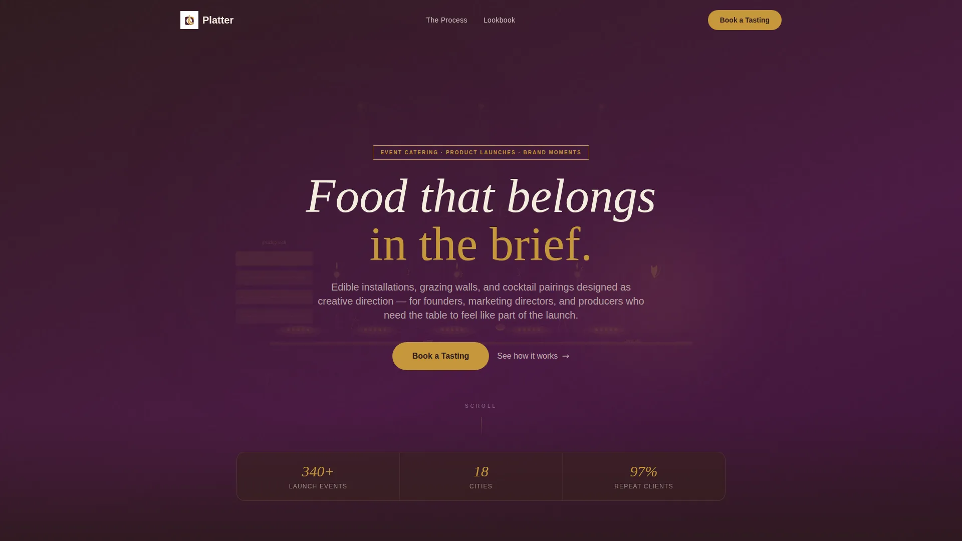
Custom Illustration Header
A wide, hand-drawn header scene depicts a launch event in full swing. Rendered in ink and watercolor using plum and gold tones, it shows guests, a grazing installation, and a bartender in action. The company name is letterpressed directly into the illustration, making the header feel like a branded artifact rather than a generic banner.
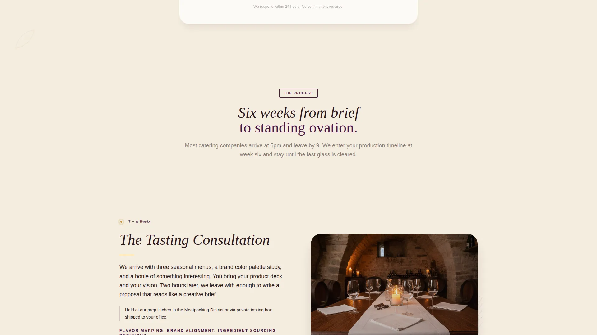
Timeline Progression Scroll
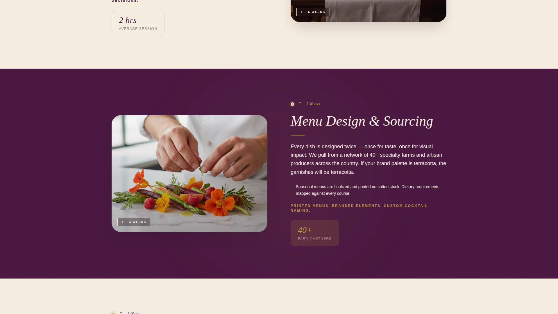
The page walks visitors through the full event lifecycle, hour by hour and week by week. Starting at T-minus 6 weeks, each time marker anchors a new section covering tasting consultation, menu design, prep kitchen, day-of load-in, and the live event climax. The structure builds trust by showing how much craft happens before the first guest arrives.
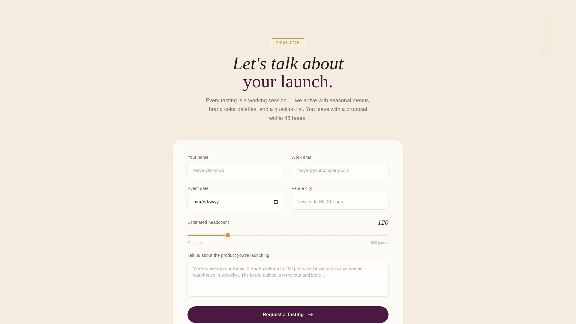
Primary Booking Form
The "Book a Tasting" call to action appears first after the header and again after the event climax section. The form collects event date, estimated headcount via a slider from 30 to 500 guests, venue city, and an open field asking about the product being launched. This gives the catering team the context they need to respond meaningfully.
Lookbook Download Path
A secondary conversion path offers a downloadable launch menu lookbook for visitors who are still in the research phase. It captures email address and company name, providing a lower-commitment entry point that still qualifies the lead.
Editorial Illustration Accents
The hand-drawn style from the header carries through the rest of the page as ink accent sketches placed beside real photography. This blends the handmade with the documentary throughout the scroll, reinforcing the artisan identity at every section.
Plum Executive Color System
The template uses a four-color palette: deep plum for section backgrounds, burnished gold for interactive elements and pricing highlights, warm linen for breathing space between content blocks, and charred fig for body text. The system is cohesive and immediately signals a premium, editorial brand.
Page sections overview
| Section | Purpose |
|---|---|
| Illustration Header | Sets brand tone and introduces the catering identity |
| Book a Tasting | Primary booking call to action placed above the fold scroll |
| T-minus 6 Weeks | Opens the timeline with the tasting consultation stage |
| Menu Design Stage | Shows the creative process behind custom menu development |
| Prep Kitchen Section | Documents behind-the-scenes preparation and craft |
| Day-of Load-in | Captures the setup and installation process on event day |
| Live Event Climax | Showcases the full spectacle of the launch event in action |
| Second Booking call to action | Reinforces the "Book a Tasting" prompt after the timeline |
| Lookbook Download | Secondary path for visitors still in the scoping phase |
Design & branding system
The visual identity follows a Warm Artisan theme expressed through the Plum Executive color system. The palette feels considered and editorial, like a tasting menu printed on cotton stock.
- Deep plum (#4A1942) anchors section backgrounds, burnished gold (#C5973B) highlights interactive elements, warm linen (#F5EDE0) adds breathing room, and charred fig (#2E1A1E) grounds body text
- The header illustration is rendered in ink and watercolor, blending editorial drawing with documentary photography throughout the scroll
- Gold accents carry through to pricing tiers and interactive elements, keeping the visual hierarchy clear and intentional
Mobile & speed optimization
The single-column flow is well-suited to mobile viewing. The layout was designed with a vertical scroll experience in mind from the start.
- Single-column structure means content stacks cleanly without complex reflow across screen sizes
- The timeline progression format works naturally on a phone screen, where vertical scrolling mirrors the narrative pace
- Image and illustration placement is organized to maintain visual rhythm on smaller viewports
How this template helps you convert
The template is designed around a progressive trust-building structure. By the time a visitor reaches the booking form the second time, they have already watched an entire event come together.
- The timeline scroll earns attention by showing real craft and process, not just finished platters, so visitors understand the full scope of the service before they are asked to commit.
- Two conversion paths meet visitors where they are: the "Book a Tasting" form for clients with a live brief, and the lookbook download for those still comparing options, both capturing useful lead information.
Other information about this template
This template is part of the Wedding and Events category under the Product Launch Event subcategory, with a specific focus on the product launch event catering niche. It is a strong fit for operators who want their landing page to reflect the same creative standard they bring to the events themselves.
- The Single Column Flow template style keeps the user experience focused and distraction-free throughout the scroll
- The Timeline Progression creative direction is specifically suited to service businesses that want to demonstrate process and build confidence before asking for a booking
- The Booking and Scheduling landing page direction means every layout decision supports a single outcome: getting the visitor to request a tasting or download the lookbook
- The intersection of Warm Artisan theme and Plum Executive color system produces a visual identity that stands apart from generic event catering templates
Theme
Warm Artisan
Creative direction
Timeline Progression
Color system
Plum Executive
Style
Single Column Flow
Direction
Booking/Scheduling
Page Sections
Custom Illustration Header
Timeline Progression Scroll
Primary Booking Form
Lookbook Download Path
Plum Executive Color System
Editorial Illustration Accents
Related questions
Who is this template designed for?
What conversion paths does the template include?
How does the illustration concept work across the page?
Does the headcount slider support a specific range?
Can this template work for event types beyond product launches?


