Advanced Videography & Film Portfolio Portfolio & Case Study Website Template
Playback is a cinematic landing page template built for music video directors. It uses an asymmetric 60/40 grid, a raw Ink and Paper visual identity, and a scroll experience designed like a film in motion. A scrapbook-style header, scene-by-scene layout, and a gated treatment download make this template both a portfolio and a lead generation tool.
by Rocket studio
Quick summary
Playback is a single-page portfolio template for music video directors. It combines a collage-style header, a cinematic scroll structure, and a dual call-to-action system. The 60/40 asymmetric grid gives featured work room to breathe while credits, laurels, and context stack neatly in the narrower column. Every section feels like a page torn from a working director's notebook.
Who this template is for
This template was built for working directors who need a page that communicates craft before a single word is read. It suits professionals whose clients judge them on visual instinct and proof of process.
- Music video directors pitching indie labels and established artists
- Directors who want to share mood boards, storyboards, and behind-the-scenes process alongside finished work
- Freelance creatives who need a gated resource to capture leads from labels, managers, and producers
What problem this template solves
Most portfolio pages show the finished work and nothing else. For a music video director, the pitch happens before the camera rolls. Clients want to see the thinking, the references, the treatment structure, and the proof that this person has done it before at this level.
- Directors lose commissions because their online presence looks like a showreel dump with no editorial voice
- There is no obvious path for a label or manager to take action, request a treatment, or download a resource
- The page fails to build tension or tell a story, so visitors skim and leave without a strong impression
What you get with this template
You get a fully designed, single-page layout structured like a film from first frame to final cut. Every section serves a specific role in the director's narrative, and the two calls to action work together to capture both browsers and buyers.
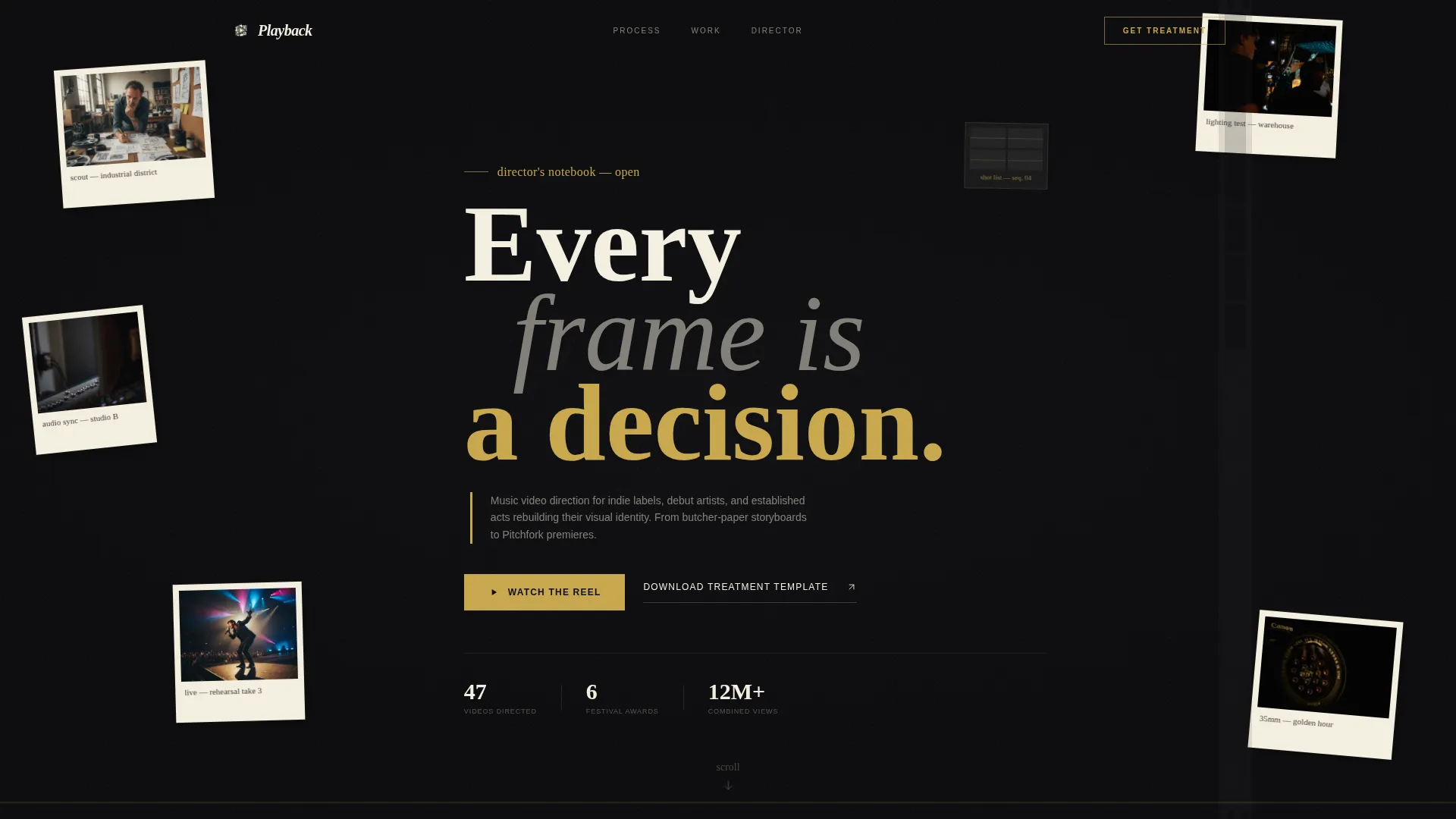
- A collage and scrapbook header with overlapping Polaroids, torn storyboard panels, handwritten shot notes, and a looping muted video inside a ripped-paper mask
- Four scene-based content sections that walk visitors through references, storyboard-to-footage comparisons, behind-the-scenes reels, and finished videos with credits
- A gated treatment download form with an email field and role selector, plus a secondary anchor link to the full director's reel
Feature list
This section covers what the template is built to do, based on the layout and design brief it was designed around.
Asymmetric 60/40 Grid Layout
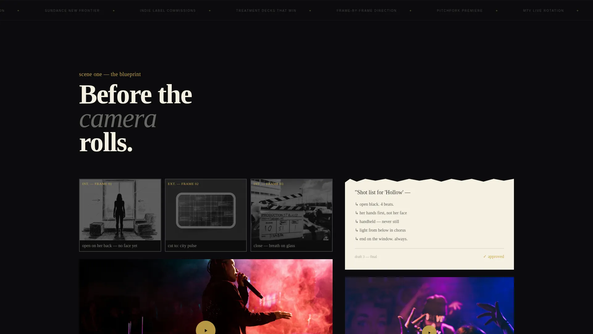
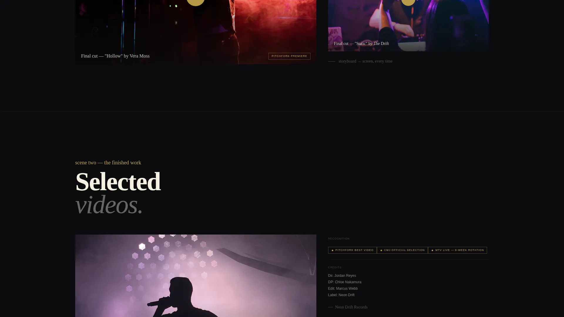
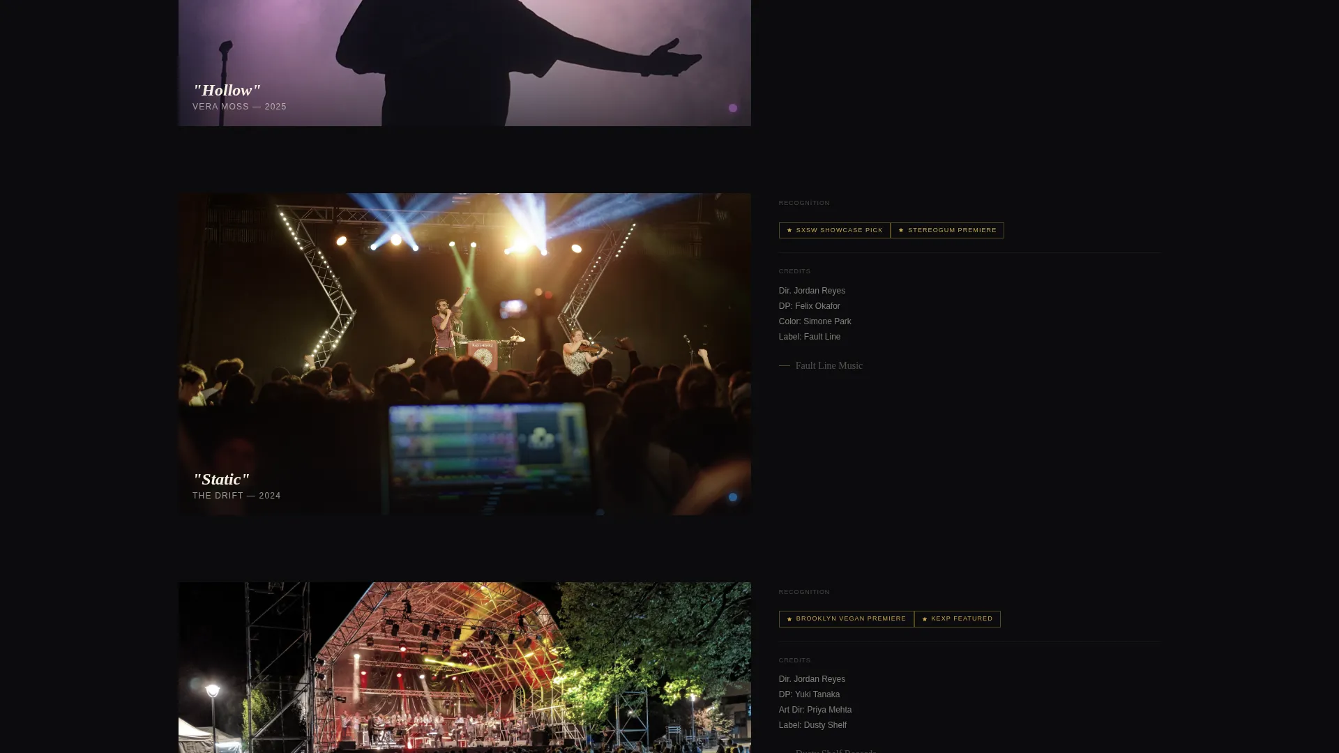
The page uses a 60/40 column split throughout. Featured video embeds, storyboard panels, and mood boards occupy the wider column. Credits, festival laurels, director's commentary, and supporting text stack cleanly in the narrower column. This ratio gives the work visual dominance without losing context.
Collage and Scrapbook Header
The header is composed of overlapping Polaroids, torn storyboard panels, handwritten shot notes, and film-strip frames layered at slight rotations. A looping, muted video plays inside a ripped-paper mask shape. Typography is hand-scrawled and imperfect, positioned off-center to reinforce the notebook aesthetic.
Cinematic Scene-by-Scene Scroll Structure
Each scroll section is framed as a distinct scene in the director's process. The first scene presents raw references and mood boards. The second pairs storyboard panels with final footage side by side. The third features behind-the-scenes reels with handwriting-font commentary overlaid. The fourth showcases finished videos with credits and festival laurels.
Gated Treatment Download with Role Selector
The primary call to action offers a free downloadable treatment deck, gated behind an email field and a role selector. Visitors identify as an artist, label, manager, or producer before downloading. This captures qualified leads and frames the resource as exclusive, practical craft, not generic marketing material.
Obsidian and Gold Color System
The palette uses deep matte black, torn-stock cream, graphite smudge gray, and metallic gold. Gold is reserved for hover states, play buttons, and pull quotes. The result feels tactile and intentional, like a well-used Moleskine notebook rather than a polished agency website.
Dual Call-to-Action Path
Two conversion paths run in parallel. The primary path drives the treatment download. The secondary path is a "Watch the Reel" anchor link that scrolls to the full director's reel mid-page. Together they serve visitors at different stages of decision-making without competing for attention.
Page sections overview
| Section | Purpose |
|---|---|
| Collage Header | Establishes director's aesthetic and plays looping video inside ripped-paper mask |
| References and Mood Boards | Shows raw creative process and visual references for current and past projects |
| Storyboard to Footage | Compares inked storyboard panels with final filmed footage side by side |
| Behind-the-Scenes Reels | Presents production footage with handwriting-font director commentary overlaid |
| Finished Video Showcase | Embeds final music videos large in the 60-column with credits and laurels in the 40 |
| Treatment Download call to action | Gated email form with role selector to capture qualified leads via free PDF offer |
| Director's Reel Anchor | Full-length director's reel embedded mid-page as the secondary conversion destination |
Design & branding system
The visual identity is built on an Ink and Paper theme using the Obsidian and Gold color system. Every design decision reinforces the feeling of a working director's physical notebook.
- Colors: deep matte black (#0B0B0D) as the base, torn-stock cream (#F5F0E1) for text areas, graphite smudge gray (#3A3A3C) for supporting elements, and metallic gold (#C9A84C) reserved for hover states, play buttons, and pull quotes
- Typography uses hand-scrawled, imperfect letterforms that feel authored rather than typeset, with nothing centered and no symmetrical alignment
- Layout elements include slight rotations, overlapping layers, torn-paper masks, and film-strip frame motifs that give every section a tactile, physical quality
Mobile & speed optimization
The template is designed to maintain its editorial character at every screen size. The asymmetric grid and collage-style elements adapt without losing the raw, notebook feel that defines the layout.
- The 60/40 grid reflows gracefully on smaller screens, keeping video embeds and storyboard panels readable
- The looping header video uses a muted autoplay format to reduce load friction on mobile devices
- Rotated and layered elements are controlled within the layout structure so they do not break or overflow on narrow viewports
How this template helps you convert
The page is built around a content and resource conversion model. Visitors are drawn in by the craft, then given a reason to leave their contact details before they go.
- The gated treatment download creates genuine perceived value. Visitors feel they are getting backstage access to real commission-winning documents, which lowers resistance to sharing an email address and selecting a role.
- The "Watch the Reel" secondary path keeps visitors who are not ready to download from bouncing. It anchors them deeper into the page and builds credibility through the finished work before they reconsider the primary offer.
Other information about this template
This template is part of a broader set of portfolio and agency landing page templates designed for creative professionals in the videography and film space. A few additional points worth noting:
- The treatment download is positioned as a real craft resource, using the same document format described as having supported six-figure commission pitches, which gives the lead magnet a specific and believable value proposition
- The Cinematic Sequence creative direction means the scroll itself tells a story, building tension as the work grows in scale and the artists become more recognizable
- The template fits within the Portfolio and Agency category and is specifically matched to the Music Video Director niche, making it relevant for directors pitching to both independent and established label clients
- The role selector on the download form produces segmented lead data, allowing directors to follow up differently with artists, labels, managers, and producers
Theme
Ink & Paper
Creative direction
Cinematic Sequence
Color system
Obsidian & Gold
Style
Asymmetric Grid (60/40)
Direction
Content/Resource
Page Sections
Asymmetric 60/40 Grid Layout
Collage and Scrapbook Header
Scene-by-scene Scroll Structure
Gated Treatment Download Form
Obsidian and Gold Color System
Dual Conversion Path Design
Related questions
Who is this template designed for?
What are the two calls to action on this landing page?
What does the role selector on the download form do?
Can I use this template without a downloadable resource?
How does the scroll structure work on this landing page?



