Pillows & Cushions Store Professional Website Template
Plush is a playful geometric landing page built for print-on-demand cushion and pillow stores. It pairs a curated collection grid with a bold search-first header, candy-toned Lavender Dream palette, and melon-accented call-to-action buttons. Every section is designed to nudge browsers toward a single product click before any purchase commitment is required.
by Rocket studio
Quick summary
Plush is a modular card-grid landing page for playful cushion and pillow print-on-demand stores. It opens with an oversized geometric search header, flows into themed collection capsules, and drives visitors toward individual product pages. The Lavender Dream color system keeps the mood soft but craveable, while warm melon buttons keep the clicks coming.
Who this template is for
This template suits sellers who want their storefront to feel like a design-forward boutique, not a warehouse catalog. It works best for creative product lines where personality and visual style matter as much as price.
- Print-on-demand pillow and cushion store owners launching their first storefront
- Gift-focused sellers targeting buyers who want something more distinctive than mainstream home decor
- Independent creatives selling geometry-led textile designs to style-conscious shoppers
What problem this template solves
Most e-commerce landing pages dump every product onto one scrolling wall. Visitors get overwhelmed, bounce early, and never reach a single product page. Plush solves this by organizing inventory into themed capsules that guide attention one collection at a time.
- Removes decision fatigue by grouping products into mood-led capsules like "Sunday Geometry" and "Bold Mono"
- Replaces the cold catalog experience with a lookbook-style flow that feels personal and curated
- Keeps the click path tight by sending every card directly to a product detail page before asking for any commitment
What you get with this template
You get a fully structured single-page layout designed around discovery and click-through. Every visual and copy element works together to move a visitor from browsing to product interest in one focused scroll.
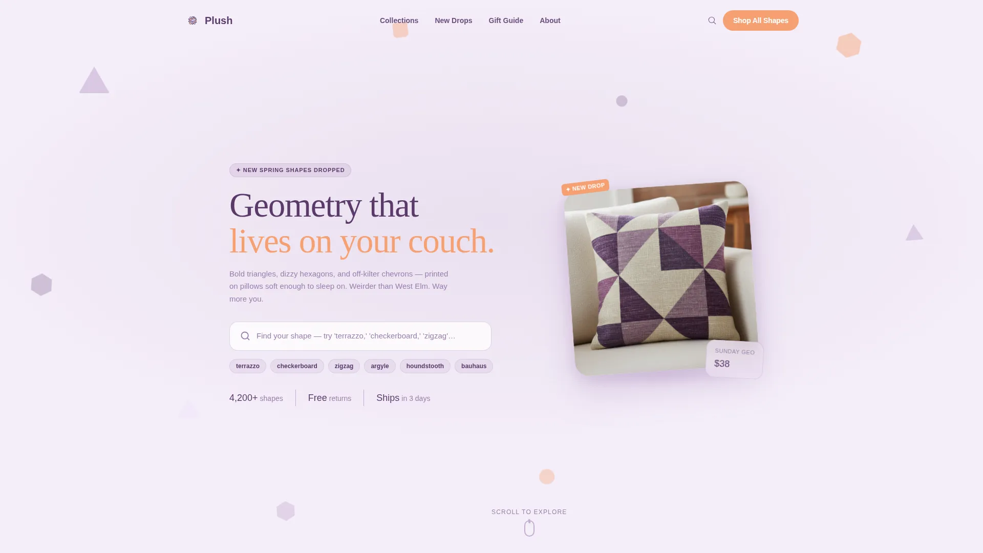
- An oversized search header with a frosted-glass geometric backdrop and a pillow mockup positioned to draw the eye
- A modular card grid organized into named collection capsules, each introduced by an editorial mood card
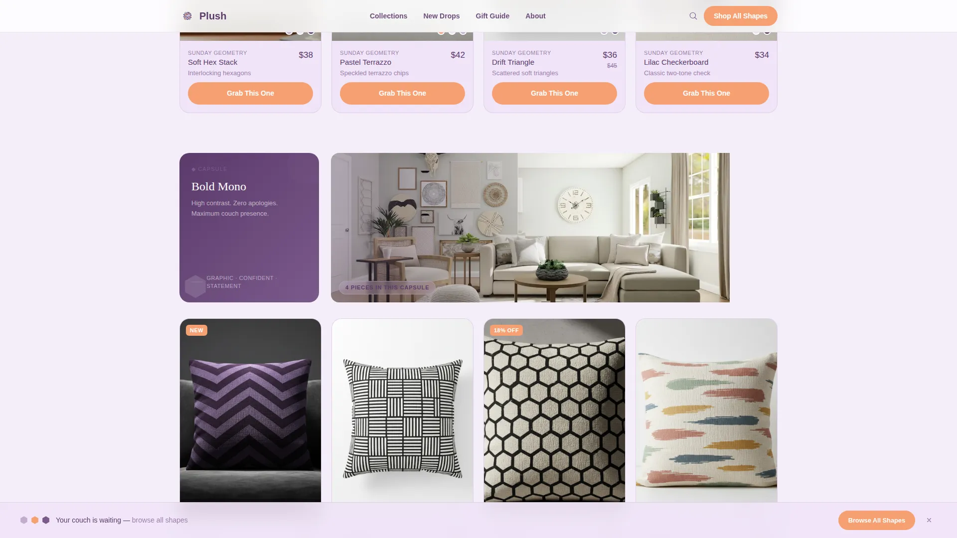
- A sticky bottom bar that appears after the second scroll with a secondary call-to-action phrase
Feature list
This template packs purposeful design decisions into every section. Each feature below comes directly from the brief and serves a specific role in the visitor experience.
Geometric Search Header
The header centers an oversized search box over a field of softly rotating triangles and hexagons rendered behind frosted glass. A suggested pillow mockup sits beside the search field, casting a soft lavender shadow. The placeholder text guides visitors toward specific pattern searches like "terrazzo," "checkerboard," or "zigzag."
Themed Collection Capsules
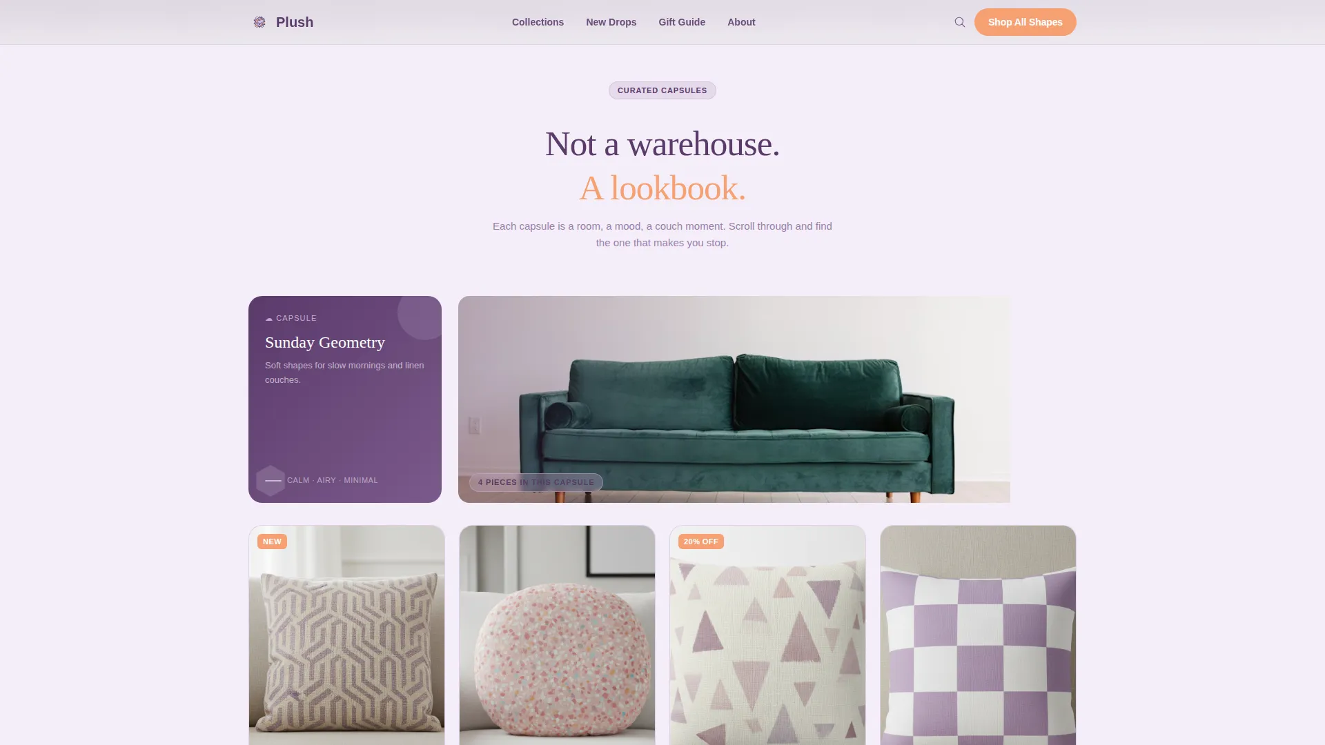
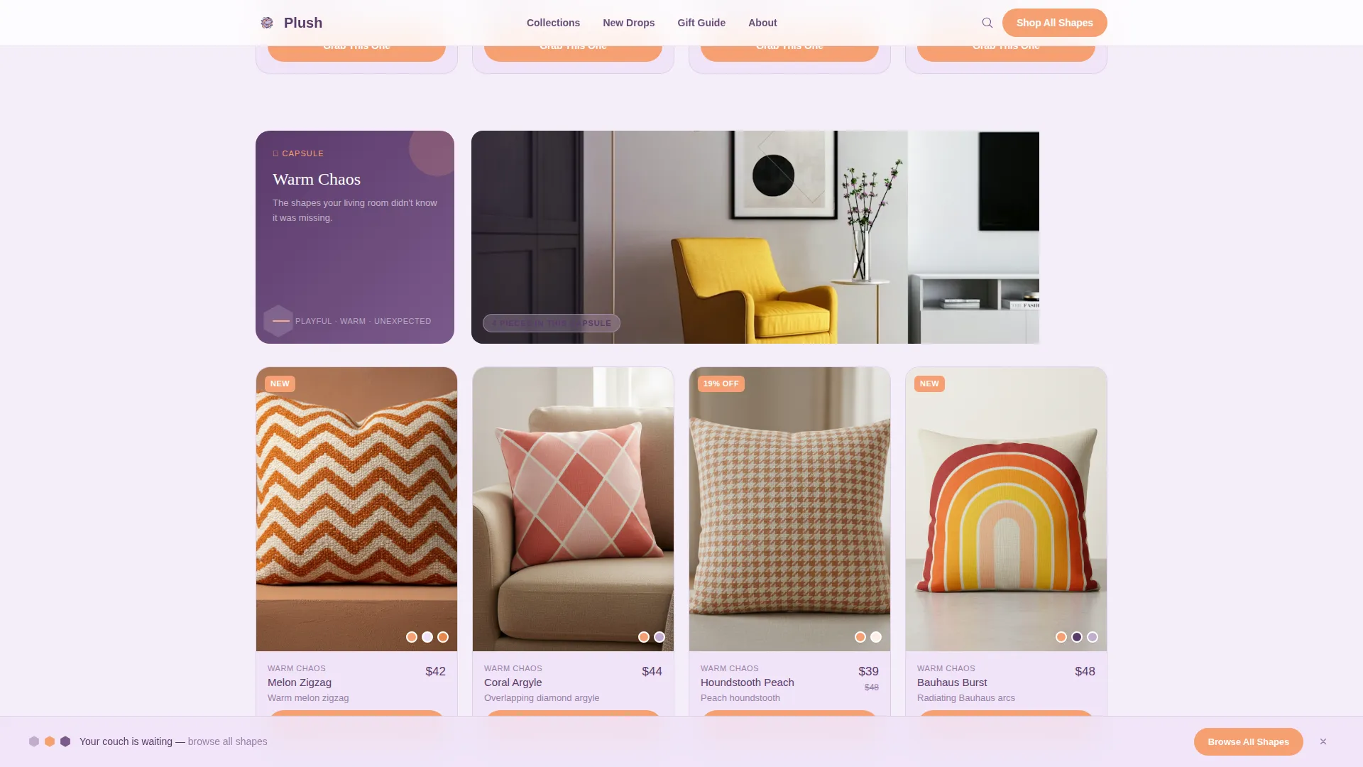
Products are grouped into named capsules such as "Sunday Geometry," "Bold Mono," and "Warm Chaos." Each capsule opens with a small editorial card containing a one-line mood sentence and a lifestyle thumbnail. This gives every collection a distinct personality and keeps the scroll feeling like a lookbook rather than a product list.
Modular Card Grid Layout
The card grid uses a staggered, breathing layout so cards do not line up in rigid rows. The eye bounces playfully across the page rather than scanning a flat shelf. Each card holds a product image, name, and a melon-colored "Grab This One" call-to-action button.
Melon-Accented Call-to-Action Buttons
Every primary interactive element uses warm melon (#F7A072) to stand out against the soft lavender and lilac surfaces. This single accent color is reserved exclusively for buttons, sale tags, and interactive highlights. The contrast draws attention without disrupting the overall pastel mood.
Sticky Secondary Call-to-Action Bar
After the visitor scrolls past the second section, a sticky bottom bar slides into view. It carries the line "Your couch is waiting, browse all shapes" alongside a secondary call-to-action. This persistent nudge keeps the browsing invitation visible throughout the entire page experience.
Click-Through Page Direction
There is no cart on this landing page. The entire layout is engineered to produce one action: a click to a product detail page. This reduces friction and focuses the visitor on an emotional yes before any purchase decision is required.
Page sections overview
| Section | Purpose |
|---|---|
| Geometric Search Header | Invites pattern-led discovery with a visually playful entry point |
| Frosted Glass Backdrop | Sets the Playful Geometric mood with rotating shape animations |
| Pillow Mockup Spotlight | Creates tactile desire beside the search field |
| Editorial Capsule Cards | Introduces each themed collection with mood context |
| Sunday Geometry Capsule | Groups soft, structured pattern pillows into one browsable set |
| Bold Mono Capsule | Showcases high-contrast single-color geometric designs |
| Warm Chaos Capsule | Highlights energetic, mixed-pattern pillow options |
| Product Card Grid | Displays individual pillows with melon call-to-action buttons |
| Sticky Bottom Bar | Maintains a persistent browse prompt after the second scroll |
Design & branding system
The Lavender Dream palette gives the page a distinctly soft, boutique feel. Every color has a specific role, and the system avoids clutter by limiting the warm accent to interactive elements only.
- Soft digital lavender (#C3ACD0) as the primary background, marshmallow lilac (#F0E4F7) for card surfaces, and deep violet-grape (#5B3A6B) for headlines and hover states
- Warm melon (#F7A072) used exclusively for buttons, sale tags, and interactive accents to create a single strong visual pull
- Playful Geometric theme expressed through soft-cornered triangles, hexagons, and chevrons that appear as both decorative backdrops and printed pillow motifs
Mobile & speed optimization
The modular card grid is structured to reflow cleanly across screen sizes. The staggered layout adapts so smaller screens still feel curated rather than compressed.
- Card capsules stack vertically on narrow screens while maintaining their editorial mood-card introduction
- The sticky bottom bar remains visible and accessible on mobile without covering primary product content
- The frosted-glass header scales proportionally so the search field stays centered and usable on smaller viewports
How this template helps you convert
Plush is built around one conversion goal: get a visitor to click a product card. Every design and copy decision feeds that single outcome without rushing the visitor into a cart.
- The curated capsule structure reduces decision paralysis by presenting products in small, mood-matched groups rather than one overwhelming grid, making each click feel like a personal choice.
- The melon call-to-action button on every card creates a clear, repeating visual cue that tells visitors exactly what to do next, linking directly to the product detail page.
- The sticky bottom bar keeps the browse invitation alive as visitors scroll, catching hesitant users before they drift away without clicking anything.
Other information about this template
This template is part of a broader family of print-on-demand storefront layouts built for creative product sellers. It is designed to be customized with your own product photography, collection names, and brand copy.
- The template style is Card Grid (Modular), suited for stores with multiple distinct product lines or design themes
- The header concept is Search Box, which works well for stores with searchable pattern libraries or varied SKU ranges
- The creative direction is Curated Collection, meaning the layout prioritizes editorial grouping over raw catalog display
- The landing page direction is Click-Through, so the page intentionally excludes a cart in favor of driving product page visits
Theme
Playful Geometric
Creative direction
Curated Collection
Color system
Lavender Dream
Style
Card Grid (Modular)
Direction
Click-Through
Page Sections
Geometric Search Header with Mockup
Themed Capsule Collection Grid
Melon Call-to-action Buttons
Sticky Browse Bar
Staggered Modular Card Layout
Click-through Page Direction
Related questions
Can I rename the collection capsules to match my own product themes?
Does this template include a shopping cart or checkout section?
How many product cards can the grid hold?
Is this template suitable for stores selling other home decor products alongside pillows?
What do I need to get started with this template?



