Bold Wellness Group Buying Landing Page Template
Pooled is a bold wellness landing page template built for group buying platforms in the health and wellness space. It combines a Neo-Retro visual identity with a Before/After Reveal gallery, device mockup header, and a click-through conversion flow. Real savings data, animated progress indicators, and tiered product galleries guide visitors from curiosity to confident action.
by Rocket studio
Quick summary
Pooled is a single-page wellness landing page template designed for group buying platforms. It layers a Neo-Retro Dopamine Pop color system over a Before/After Reveal gallery structure. The header opens with a live-deal device mockup. The page builds trust through visible savings math before presenting any call to action.
Who this template is for
This template is built for founders, organizers, and wellness entrepreneurs who need to show proof before asking for commitment. It speaks directly to the people running group buys and the communities they serve.
- Group chat organizers coordinating bulk supplement or pantry orders among coworkers or friend groups
- Yoga studio owners and wellness retailers sourcing inventory at wholesale through pooled demand
- New parents and health-conscious households building a clean-label pantry without overspending
What problem this template solves
Most wellness e-commerce pages ask for trust before they earn it. Visitors see a price, a product image, and a button, with no context for why this deal is real or how much they actually save. Pooled flips that sequence entirely.
- Shoppers need to see real savings math and real member counts before they believe a group deal is worth joining
- Organizers need a clear secondary conversion path to start a group, separate from the browse-and-buy flow
- Brands need a page that escalates urgency naturally across product categories without feeling pushy or cluttered
What you get with this template
You get a fully structured landing page layout with every major section pre-built and ready to populate with your real deals, product imagery, and savings data. The layout guides visitors through a deliberate rhythm of browsing and social proof.
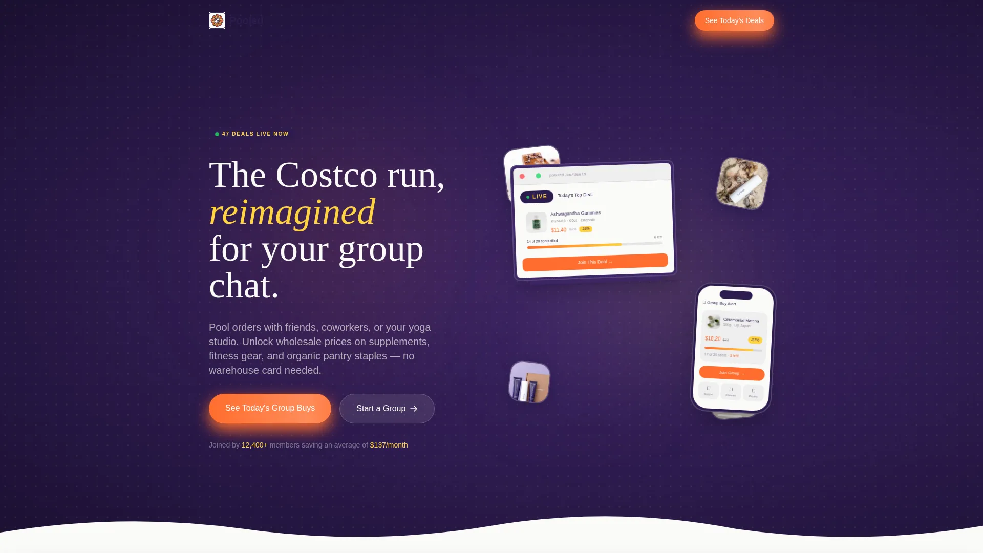
- A device mockup header showing a live group-buy in progress with an animated progress bar
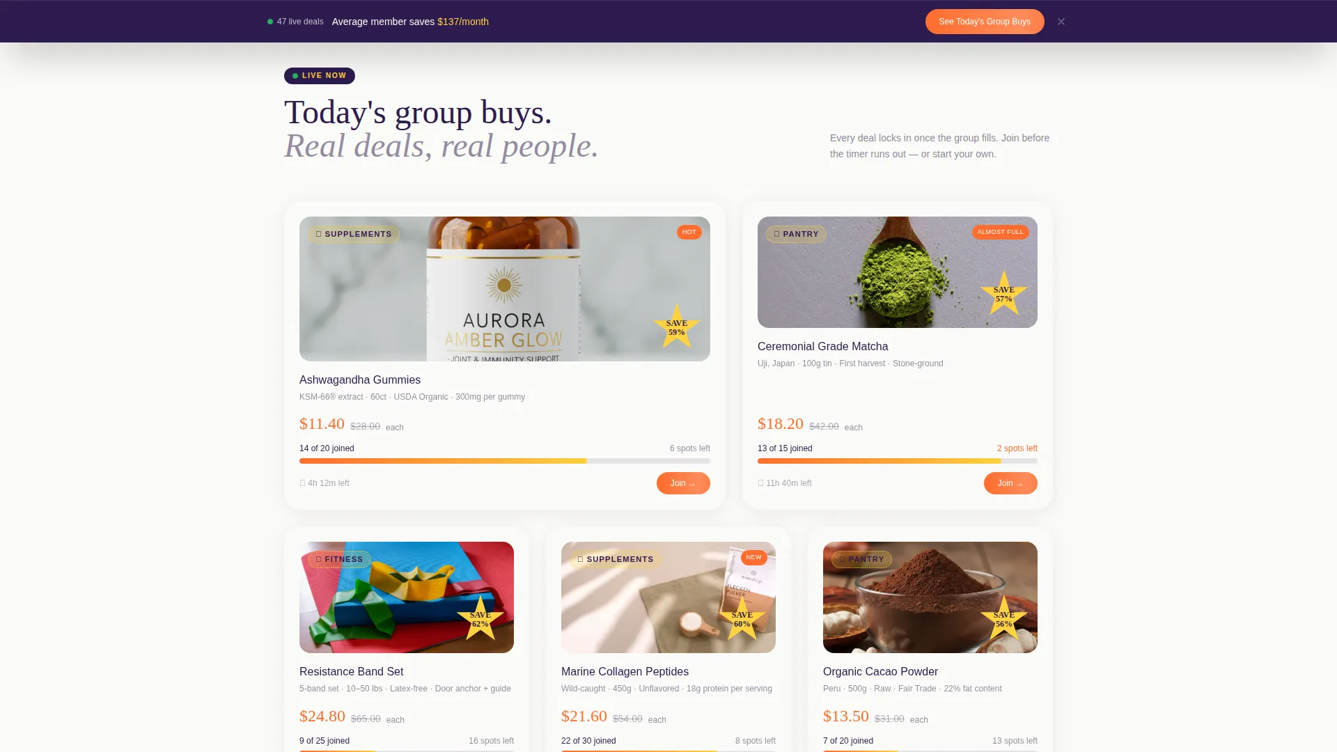
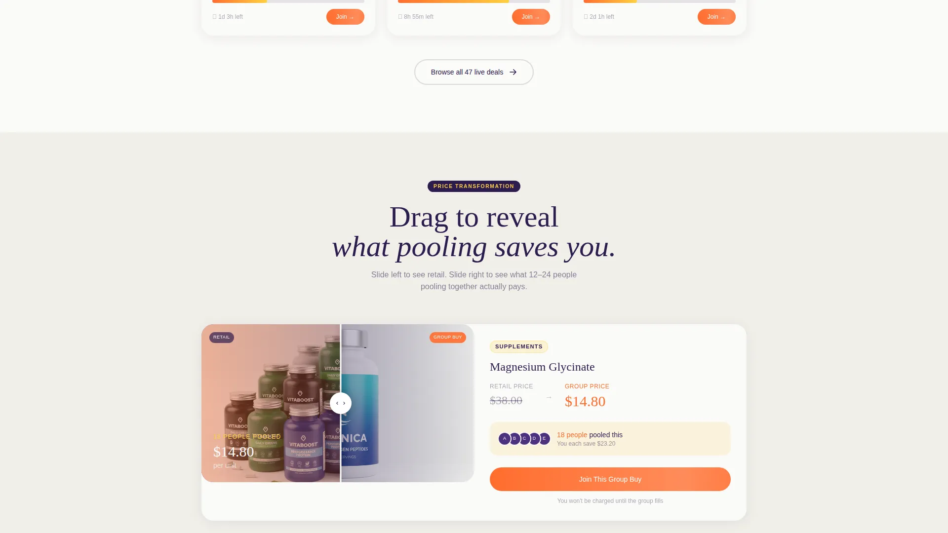
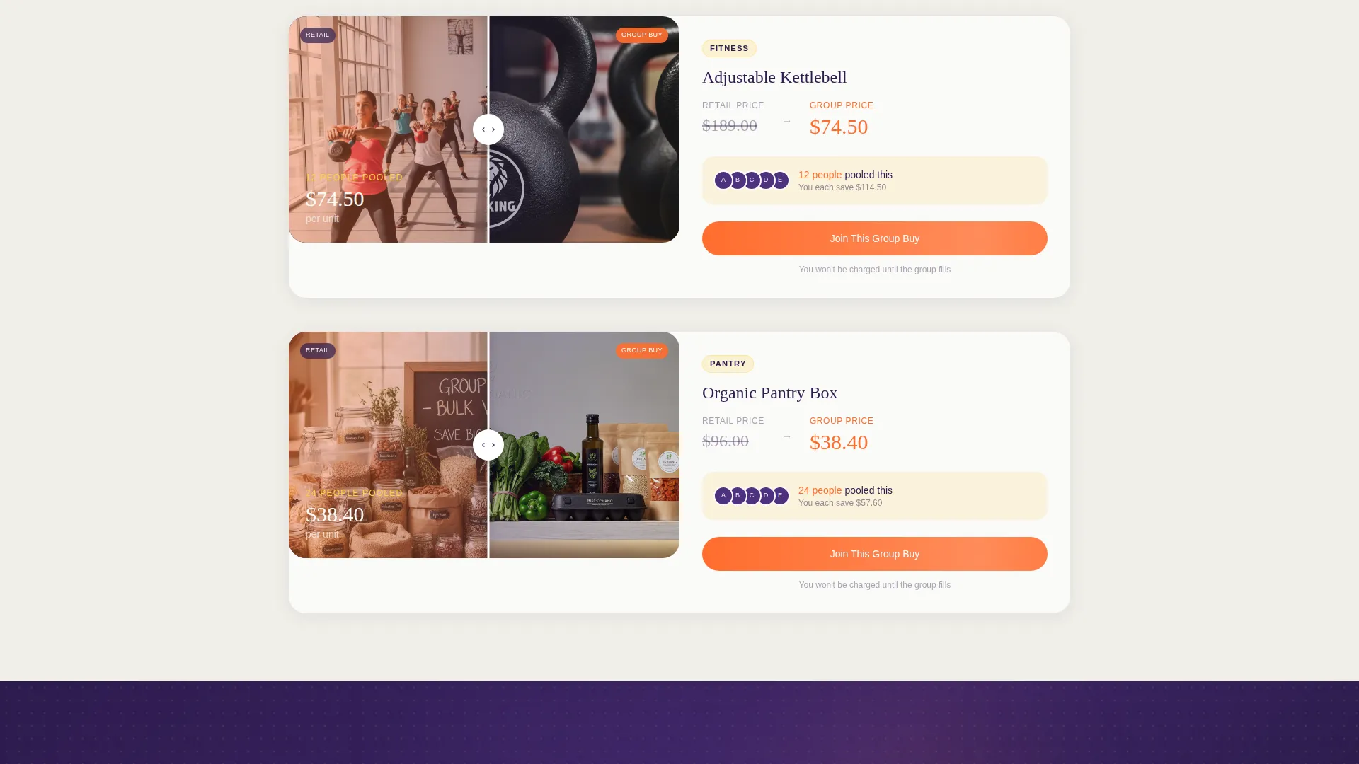
- A multi-category Before/After Reveal gallery covering supplements, fitness equipment, and pantry boxes
- Two distinct conversion paths: a primary click-through call to action and a secondary email capture for group starters
Feature list
This template includes a focused set of purpose-built components. Each one is drawn directly from the platform's core promise: show the math, build the crowd, earn the click.
Device Mockup Header with Live Deal Display
An iPhone and laptop float at a slight angle against a soft acai gradient background. The screens show a group-buy in progress, complete with product name, spots filled, group price, and retail comparison. A small animated progress bar moves as if a new buyer just joined, making the deal feel live and time-sensitive.
Before/After Reveal Gallery
Each gallery card presents a product at its retail price on the left side. As the visitor drags a slider or scrolls the card into view, the right side reveals the group price, the number of members pooled, and a percentage-saved burst badge. The reveal is the core scroll mechanic of the page.
Tiered Category Escalation
The gallery sections are organized by product category in a deliberate order: supplements first, then fitness equipment, then monthly pantry boxes. Each tier shows a wider savings gap than the last, building cumulative proof that the platform delivers real value across the wellness shopping spectrum.
Single-Stat Interstitial Blocks
Between gallery sections, bold full-width callouts surface one number at a time. These interstitials interrupt the browse flow with a simple, memorable fact such as average monthly member savings. They reset attention and reinforce the platform's central value claim without adding visual clutter.
Dual Conversion Path Layout
The primary call to action, "See Today's Group Buys," appears inside the header mockup as a mirrored button and then repeats as a sticky bottom bar after the second gallery section. A secondary path, "Start a Group," targets studio owners and office organizers with a single-field email capture form.
Neo-Retro Product Photography Style
Scattered around the device mockup and within gallery cards, product photography follows a styled visual language: amber supplement jars, matcha tins, and wellness accessories are composed with rounded neo-retro shapes and halftone dot textures that reference vintage health food co-op aesthetics updated for a modern audience.
Page sections overview
| Section | Purpose |
|---|---|
| Device Mockup Header | Opens with a live deal in progress to hook attention immediately |
| Supplements Gallery | Before/After Reveal cards showing group savings on supplement products |
| Stat Interstitial Block | Full-width callout reinforcing average monthly member savings |
| Fitness Equipment Gallery | Escalated savings reveal for fitness gear category |
| Pantry Boxes Gallery | Final reveal tier showing the widest savings gap across monthly boxes |
| Sticky call to action Bar | Persistent bottom bar repeating the primary click-through action |
| Start a Group Section | Secondary conversion path with single-field email capture for organizers |
Design & branding system
The visual identity runs on a Dopamine Pop color system with four core values working in deliberate roles. The palette feels like a vintage pharmacy sign updated by a contemporary graphic designer: warm enough to feel trustworthy, bold enough to prompt action.
- Electric tangerine (#FF6D2E) activates buttons and price callouts; serotonin yellow (#FFD23F) highlights savings badges and member counts; deep acai (#2D1B4E) anchors backgrounds and typographic weight; pill-white (#FAFAF7) breathes space between product cards
- Rounded neo-retro shapes and halftone dot textures reference 1970s health food co-op poster design throughout product photography and decorative elements
- The overlap and layered template style allows product cards, device mockups, and stat blocks to stack with deliberate visual depth rather than flat grid alignment
Mobile & speed optimization
The landing page layout is structured to scale cleanly from desktop to mobile without losing the impact of the Before/After Reveal mechanic or the device mockup header. Overlapping and layered elements are sized to remain readable and tappable at smaller screen widths.
- Sticky bottom call to action bar is designed to remain accessible on mobile without obscuring product gallery content
- Single-field email capture in the "Start a Group" section keeps friction minimal on touchscreen devices
- Card-based gallery layout adapts to single-column stacking on narrow viewports so savings data remains clearly readable
How this template helps you convert
The page is engineered as a trust-first click-through flow. Every structural decision delays the ask until the visitor has already absorbed five real deals with visible savings math and real member counts.
- The header mockup places visitors inside a live transaction immediately, showing a deal in progress rather than a marketing headline, which builds product credibility before any copy makes a claim
- The Before/After Reveal gallery mechanics and single-stat interstitials stack social proof in a browse-gasp-browse-gasp rhythm, so by the time the sticky call to action bar appears the visitor already believes the savings are real
- The dual conversion path separates casual browsers from active organizers, letting each visitor self-select their next step without friction or confusion
Other information about this template
This template is categorized under Retail and E-Commerce with a Health and Wellness E-Commerce subcategory. It is built specifically for the group buying and pooled purchasing niche within wellness retail. The creative direction is a Before/After Reveal, the header concept is a Bundle Deal display, and the landing-page direction is designed for upsell and upgrade flows. The template theme is Neo-Retro and the template style is Overlap/Layered.
- Ideal for wellness platforms, supplement co-ops, and group purchasing communities looking to launch or refresh a conversion-focused landing page
- The color system and photography style are pre-coordinated so brand consistency requires minimal adjustment when swapping in real product images
- The page works as a standalone click-through landing page and does not require backend integrations or a multi-page site structure to deliver its full conversion flow
Theme
Neo-Retro
Creative direction
Before/After Reveal
Color system
Cloud Canvas
Style
Overlap/Layered
Direction
Upsell/Upgrade
Page Sections
Device Mockup Header with Live Deal
Before/after Reveal Gallery Mechanic
Tiered Category Gallery Sections
Single-stat Interstitial Blocks
Dual Conversion Path Layout
Neo-retro Dopamine Pop Visual System
Related questions
Who is this landing page template designed for?
Can I display real product deals and savings data with this template?
Does this template support two different visitor types?
What visual style does this template use?
Is this a single page or a multi-page template?



