Sedation Dentist Booking Website Template
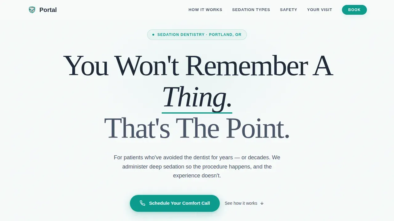
Portal is a calm sedation dentistry landing page built for dental practices that serve highly anxious patients. It uses a hub and spoke anchor navigation structure to walk visitors through what sedation feels like, the three sedation tiers, safety protocols, and the full appointment journey, then moves them directly into booking a consultation without friction.
by Rocket studio
Quick summary
Portal is a single-page, anchor-nav landing page template built specifically for sedation dentistry practices. It guides dental-anxious visitors through four focused spoke sections, each one systematically reducing fear before the next question arises. The design pairs clinical precision with genuine warmth, and the page's primary objective is to move potential patients from research into a booked sedation consultation call.
Who this template is for
This landing page is built for dental practices whose patients arrive already scared. It speaks directly to the adults who have avoided the dental chair for a decade, the parents researching sedation options for children with sensory processing challenges, and the patients preparing for full-mouth reconstructions that require hours of work they cannot endure while awake.
- Sedation dentistry practices seeking a dedicated landing page to convert visitors who are not yet ready to call
- Dental clinics wanting a structured, patient-centered page that handles every anxious question before the phone rings
- Modern dental teams who need a visually appealing, mobile-first presence that works as hard at 2 a.m. as it does at 2 p.m.
What problem this template solves
Dental care avoidance is one of the most common barriers to patient acquisition in sedation dentistry. Potential patients spend weeks researching before they feel safe enough to book. A generic dental landing page cannot carry that emotional weight. Portal is designed to close exactly that gap, giving a dental clinic a structured, calming path from first visit to first appointment.
- Standard dental websites dump clinical information on anxious visitors without first dismantling their fear, causing high bounce rates and lost patient bookings
- Most dentist landing pages ask visitors to book before answering the questions that are keeping them awake at night
- Practices without a dedicated sedation landing page lose potential patients to competitors whose dental landing page speaks directly to the fear, not just the procedure
What you get with this template
Portal delivers a fully structured, hub and spoke landing page with five distinct content sections connected by a sticky anchor navigation ribbon. Every section is a spoke that answers one anxious question in sequence, moving the visitor closer to booking without pressure. The landing page design is grounded in a Medical Clarity visual identity, and the call to action is integrated at two points so it never feels aggressive.
- A hero section with an enormous centered headline, a sticky anchor nav ribbon with five destinations, and a primary teal call-to-action button
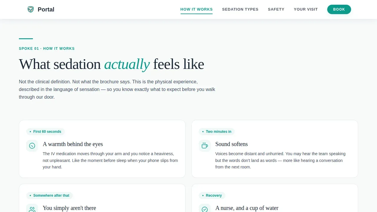
- Four spoke sections covering sedation sensations in plain language, three sedation tiers with a consciousness-depth meter, a safety and credentials checklist, and a minute-by-minute arrival-to-discharge walkthrough
- A floating persistent booking button that appears after the second spoke, plus a secondary PDF capture field for visitors who need more time before committing
Feature list
This section covers the core built-in capabilities that make Portal a high-converting landing page for sedation dentistry practices.
Hub and Spoke Anchor Navigation
The sticky anchor nav ribbon locks to the top of the viewport on scroll and links directly to each spoke section: How It Works, Sedation Types, Safety, Your Visit, and Book. This user friendly navigation means visitors can jump to the answer they need without losing their place in the page. It keeps users engaged by eliminating the frustration of endless scrolling.
Consciousness-Depth Sedation Tier Display
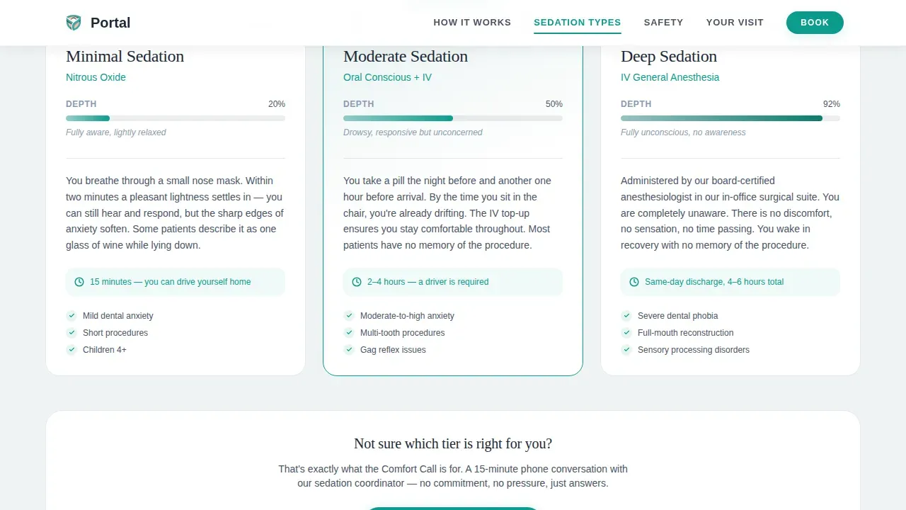
The Sedation Types spoke presents three sedation tiers with a visual depth meter that shows the approximate consciousness level at each tier. This is designed to clearly explain types of sedation in non-technical language, so potential patients can self-identify which option may suit their situation. Displaying this information visually reduces the number of patient concerns that need to be handled by phone.
Safety and Credentials Checklist Section
The Safety spoke presents monitoring equipment and staff credentials as a mental checklist the visitor ticks off while reading. Trust indicators like displayed credentials, safety certifications, and monitoring protocols are laid out in bullet points so the visitor's eye moves through them quickly and confidently. This approach helps establish credibility without requiring the patient to dig through dense paragraphs.
Minute-by-Minute Visit Walkthrough
The Your Visit spoke provides a sequential, step-by-step guide covering the patient journey from arrival through recovery and discharge. Offering a step-by-step guide to the patient journey is one of the most effective ways to reduce fear of the unknown in dental care avoidance cases. The walkthrough gives the patient a mental script so nothing on the day feels like a surprise.
Dual-call to action Conversion Architecture
The page uses a two-point call to action structure. The primary call to action is a teal "Schedule Your Comfort Call" button placed beneath the hero headline and again as a floating element in the bottom-right corner after the second spoke. A secondary text link with a single email capture field offers a downloadable sedation guide, giving not-yet-ready visitors an educational resource to take away. Together, these two touchpoints convert visitors at different stages of readiness.
Warm Blush Testimonial and Reassurance Blocks
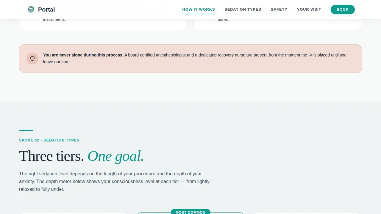
Patient testimonials and safety callouts are rendered on a warm blush background, visually separating social proof elements from the clinical white of the main sections. Highlighting patient testimonials that focus on pain-free experiences builds patient trust in a way that credentials alone cannot. Authentic social proof reassures visitors that they are making the right choice by showing real experiences from satisfied patients.
Page sections overview
| Section | Purpose |
|---|---|
| Hero Headline | Anchors the value proposition with an enormous centered headline and a sticky five-link nav ribbon |
| How It Works | Describes sedation sensations in plain, physical language before the patient asks |
| Sedation Types | Presents three tiers with a visual depth meter showing consciousness level at each stage |
| Safety Checklist | Lists monitoring equipment and staff credentials as a reassurance checklist |
| Your Visit Walkthrough | Guides the patient minute by minute from arrival to discharge |
| Footer Linear Row | Displays practice contact details and a single-row footer link pattern |
Design & branding system
Portal uses a Medical Clarity visual identity that pairs clinical precision with human warmth. The Teal Catalyst color system was chosen because soothing colors like teals and greens promote a sense of calm and safety, which is exactly what anxious visitors need before they can trust a dental clinic enough to book. The typographic pairing reinforces this balance: display headlines feel authoritative, body text stays legible and approachable.
- Clinical teal (#0D9B8C) for primary action elements including buttons and underline accents; deep charcoal (#1E2A38) for body text and navigation; sterile soft white (#F7FAFA) for section backgrounds; warm blush (#E8C4B8) reserved for patient testimonials and safety callout blocks
- Fraunces display typeface for the hero headline and section titles, creating a tone that is confident without being cold; DM Sans for all body copy, keeping the reading experience clean and clear
- No hero image and no video background by design; the landing page deliberately avoids stock photography of smiling patients, replacing imagery with typography-led trust-building and high quality visuals only where they serve the content
Mobile & speed optimization
Anxious patients frequently research dental care late at night on mobile devices. A mobile-optimized landing page enhances the patient experience, reduces bounce rates, and increases conversions by making it easy for mobile users to navigate and take action even on a small screen. Mobile responsiveness is a non-negotiable requirement for any modern dental landing page, and Portal is built with a mobile-first layout throughout.
- The sticky anchor nav ribbon collapses cleanly for mobile users, keeping user friendly navigation intact without cluttering the small-screen viewport
- Scroll-reveal animations and staggered entrance effects are set to medium intensity, keeping the page visually appealing without creating performance drag on mobile devices
- The floating booking button is positioned for thumb-reach on mobile screens, making appointment booking reachable without requiring the visitor to scroll back to the top
How this template helps you convert
A well designed landing page for a sedation dental clinic does more than present information. It systematically removes the emotional barriers that prevent potential patients from booking. Portal is engineered to convert visitors by sequencing the content so each spoke section answers the next anxious question before the visitor consciously forms it. The result is a page where booking feels like the natural, rational conclusion to the scroll.
- The hero section delivers the value proposition immediately, with an enormous headline that speaks directly to the patient's core fear and a visible call to action that invites them to take a low-pressure next step. This structure keeps the primary objective clear from the first second on the page.
- The four spoke sections build trust incrementally, each one reducing a specific layer of fear through plain-language descriptions, visual sedation tier comparisons, a credential checklist, and a full visit walkthrough. By the time the visitor reaches the booking section, encouraging visitors to act feels effortless because every objection has already been addressed.
Other information about this template
Portal is a professional landing page template in the Health and Medical category, listed under the Sedation Dentist Patient Portal niche. It belongs to the Hub and Spoke (Anchor Nav) template style, which means every section is intentionally sequenced. It is designed to be a high converting dental landing page for practices where patient anxiety is the primary conversion barrier.
- This template is a strong fit for dental websites that need a dedicated sedation page separate from the main dental practice website, since mixing sedation content with general dental services pages can dilute the focused, calming message that converts anxious visitors
- The portal calm sedation dentistry landing page template does not include multi step forms or complex contact forms on the page itself; the booking interaction is a click-through to a scheduling portal pre-filtered to sedation consultations, keeping the on-page experience clean and free of minimal distractions
- Landing page design choices here avoid before and after images deliberately, since clinical transformation imagery can heighten anxiety rather than reduce it for the specific target audience this template serves
- The page supports authentic social proof through warm blush testimonial blocks; dental website templates that incorporate patient stories and patient testimonials see stronger trust signals than those relying on credentials alone
- Practices that want to maintain consistency across their broader marketing can adapt the Teal Catalyst color system and Medical Clarity typography to other campaign pages, since the palette and type choices are not proprietary to this template
- Search engine rankings improve when dental landing pages are mobile-friendly, since search engines favor mobile-optimized pages; this landing page design accounts for that with its mobile-first build approach
- The average conversion rate for health-related landing pages including dental services is 7.4%; a dedicated, well designed landing page for sedation dentistry can approach or exceed that benchmark when the content speaks directly to the anxiety driving the search
- Transparent financial information about insurance partners and financing options can be added to the footer or a secondary callout block, helping address remaining patient concerns about cost after the emotional barriers have been cleared
- Practices offering cosmetic dentistry or cosmetic procedures alongside sedation services can reference those dental treatments in the Sedation Types or Your Visit sections without disrupting the page's primary focus
- The dental practice deserves a landing page that does not look like every other dental clinic template; Portal's deliberate choice to use no hero image and no stock photography makes it visually distinct among dental websites and dental landing page designs in its category
- Professional photography of the actual office environment and dental team can be inserted into the testimonial and safety sections if the practice wants to add authentic imagery beyond the typographic-led default
- Customer testimonials and video testimonials can be embedded within the warm blush testimonial blocks; the blocks are styled to accommodate short text quotes by default, but the section structure can support video testimonials as well
- High quality images of the practice environment, high resolution images of monitoring equipment, and high quality visuals of the recovery area can all be placed within the spoke sections to reinforce the safety narrative
- Contact details for the dental clinic are housed in the linear single-row footer pattern at the base of the page
- This dentist landing page is well-suited for practices running paid search campaigns targeting dental care avoidance keywords, since a focused landing page with minimal distractions consistently outperforms a general dental practice homepage for patient acquisition from paid traffic
- Educational resources such as the downloadable sedation guide can be expanded over time; the email capture field built into the secondary call to action creates a foundation for follow-up communications with potential patients who are not yet ready to book
- Successful dental websites that convert browsers into loyal patients share the same principles this template embeds: a clear value proposition, social proof, a transparent patient experience walkthrough, and a frictionless path to scheduling appointments
Theme
Medical Clarity
Creative direction
Step-by-Step Guide
Color system
Teal Catalyst
Style
Hub & Spoke (Anchor Nav)
Direction
Click-Through
Page Sections
Hub and Spoke Anchor Navigation
Sedation Tier Depth Meter
Safety and Credentials Checklist
Minute-by-minute Visit Walkthrough
Dual-cta Conversion Structure
Warm Blush Social Proof Blocks
Related questions
Does this template include a booking form on the page?
Can I add patient testimonials to this landing page?
Is the anchor navigation usable on mobile devices?
Can this template work for a dental clinic that also offers cosmetic dentistry?
What makes this a high converting landing page for sedation patients specifically?



