Internist Booking Website Template
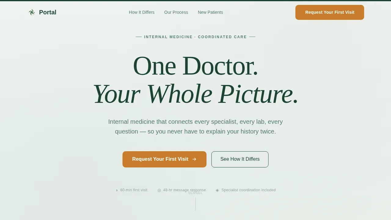
The Portal One Doctor Complete Health landing page template is a focused, single-page lead generation tool built for internal medicine practices. It presents a clear comparison between fragmented specialist care and coordinated internist services, walks visitors through a transparent care process, and guides them toward booking a first appointment using a dual-path intake form.
by Rocket studio
Quick summary
This medical landing page template is designed for internists who manage patients with two or more overlapping chronic conditions. It uses a comparison table, accordion process cards, and a qualifying lead form to convert curious visitors into scheduled patients. The design is calm, authoritative, and built around clarity rather than clutter.
Who this template is for
This landing page serves internal medicine doctors who want a focused, professional web presence without building from scratch. It is especially well-suited for solo practitioners and small clinics that coordinate care across multiple specialists.
- Internists managing adult patients with complex, overlapping health conditions
- Small clinics and solo practices that need a modern, conversion-focused website
- Designers and developers creating healthcare landing pages for medical clients
What problem this template solves
Adults managing multiple chronic conditions often see several specialists who do not communicate with each other. Medication conflicts go unnoticed, lab results get siloed, and patients repeat their health history at every visit. This template gives a doctor's website a clear voice in that fragmented landscape.
- Patients cannot easily find a doctor who holds the full picture of their health care
- Generic medical website pages fail to communicate the real value of coordinated internal medicine services
- Most healthcare landing pages do not qualify leads before the first appointment, wasting time for both doctor and patient
What you get with this template
You get a fully customizable, single-page landing page that communicates a specific and compelling value proposition. Every section flows logically from introduction to appointment request, reducing distractions and keeping the user focused.
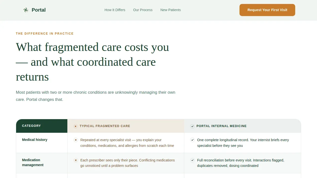
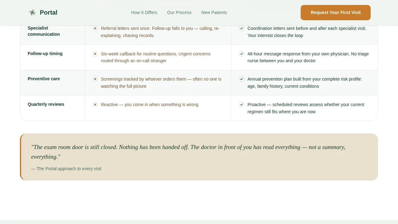
- A side-by-side comparison table showing fragmented care versus coordinated internist services
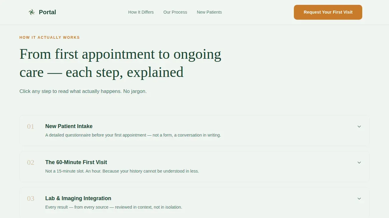
- Numbered accordion process cards covering intake through quarterly review
- A dual-path lead form: one to request a first visit, one to download a new patient guide
Feature list
This template offers a structured set of features designed for the medical field. Each one is built to help clinics communicate services clearly and earn patient trust before the first appointment.
Side-by-Side Comparison Table
The comparison table is the persuasion engine of this landing page. It sets typical fragmented care against the portal-supported internist experience row by row, covering record sharing, medication reconciliation, and appointment response times. Subtle scroll-triggered highlights draw the eye to the most important differences.
Accordion Process Cards
Five numbered cards walk visitors through the full care journey: intake questionnaire, initial 60-minute visit, lab integration, specialist coordination letters, and quarterly review. Each card reveals a short paragraph only when clicked, keeping the page clean while rewarding visitors who want more information.
Dual-Path Lead Form
The qualifying intake form asks three targeted questions: primary health concern, number of current specialists, and insurance carrier. A secondary path lets visitors who are not yet ready to schedule download a new patient guide by entering their name and email. Both paths are easy to complete on any device.
Forest Trust Color System
The design uses a deliberate four-color palette: deep evergreen for headers and navigation, warm birch for card backgrounds and pull-quotes, soft fern for section dividers, and creek white for open reading space. Amber is reserved strictly for call-to-action buttons and interactive highlights, so the user's eye always knows where to go next.
Fraunces and DM Sans Typography
Headlines are set in Fraunces, an unhurried serif that carries authority without coldness. Body copy and user interface elements use DM Sans for clean readability. Together they communicate the tone of a knowledgeable doctor who speaks plainly.
Scroll-Triggered Animations
Sections reveal on scroll, accordion cards expand and collapse smoothly, and table rows highlight subtly as they enter view. The animation level is moderate, adding life to the page without distracting from key information.
Page sections overview
| Section | Purpose |
|---|---|
| Hero headline area | Sets tone with a single centered serif headline and one subtext line |
| Comparison table | Contrasts fragmented care with coordinated internist services |
| Process accordion cards | Walks visitors through care steps from intake to quarterly review |
| Lead generation form | Qualifies and captures patient inquiries through two distinct paths |
| Footer horizontal flow | Provides practice links and secondary navigation |
Design & branding system
The visual identity follows an Educational Guide theme, grounded in a Forest Trust color system. The overall feeling is like a well-kept trail through old-growth woods: quiet, earned, and breathing with authority.
- Evergreen (#1B4332), birch (#D4C5A9), fern (#52796F), creek white (#F0F4F1), and amber (#C97C2B) form the full palette
- Logos, headings, and navigation sit in deep evergreen; amber appears only on buttons and interactive elements
- Fraunces serif handles all display headings; DM Sans handles body copy and form labels for clear user readability
Mobile & speed optimization
This landing page is built desktop-first to serve an older demographic reading dense health information. Full mobile support is included so visitors on mobile devices can complete the lead form and read the comparison table without friction.
- Responsive layout adapts cleanly across every device type, from desktop monitors to smartphones
- Server components handle static sections; client components power the interactive form and accordion for efficient page rendering
- Content flows logically from top to bottom on smaller screens, keeping the schedule of information intact on any device
How this template helps you convert
The page is structured so that by the time a visitor reaches the lead form, the comparison table has already made the case. Every design and content decision supports one job: turning a curious visitor into a qualified patient inquiry.
- The comparison table does the persuasion work early, showing visitors the concrete gap between fragmented care and what this practice offers before any call to action appears
- The accordion process cards build trust through transparency, letting visitors research the care journey step by step at their own pace
- The dual-path form gives visitors two ways to engage, so those not ready to schedule an appointment still have a convenient, low-commitment option that captures their contact information
Other information about this template
This template belongs to a broader collection of medical landing page templates designed for healthcare website use cases. Doctor website templates are pre-made layouts built for medical practitioners including physicians, specialists, and doctors. The majority of these templates have editable components that let practices add their own branding, such as logos and practice-specific color schemes.
- Each medical landing page template in this collection has in-built benefits that suit various needs, and many require minimal coding skills for customization
- The Portal One Doctor Complete Health landing page template is fully customizable, so practices can update content, colors, and services to match their specific credentials and patient focus
- Real-world examples of strong medical landing pages, such as HCA Healthcare's oncologist pages and Cedars Sinai's physical therapist pages, show that clear process descriptions and prominent appointment calls to action drive conversions; this template follows the same proven approach
- The London Wellness Centre's chiropractor landing page includes a video above the fold alongside two calls to action, showing how visual content and dual paths can work together; this template applies the same dual-path logic through its lead form
- Practices can store and update the page using a content management system (CMS) of their choice, and the layout is set up to make future changes straightforward for designers and developers alike
- Secure messaging and communication between patients and the health care team is a recognized best practice in the medical field; this template's lead form and guide download are designed to start that relationship on clear, structured terms
- The template is a strong starting point for building a healthcare landing page or for drawing inspiration when creating a new internist website from scratch
Theme
Educational Guide
Creative direction
Transparent Process
Color system
Forest Trust
Style
Comparison Table
Direction
Lead Generation
Page Sections
Side-by-side Comparison Table
Accordion Process Cards
Dual-path Lead Form
Forest Trust Color System
Fraunces and DM Sans Typography Pairing
Scroll-triggered Reveal Animations
Related questions
Can I update the services and credentials listed on this landing page?
Is this template suitable for small clinics or solo practices?
How does the dual-path lead form work?
Can this landing page template be connected to a CMS?
What makes this template different from a generic medical website template?



