Oncologist Booking Website Template
A hub-and-spoke landing page built for oncologist patient portals. It guides cancer patients, family caregivers, and care coordinators through lab results, appointment booking, treatment timelines, and secure messaging, all within a calm, portrait-centered layout that feels reassuring rather than clinical. The anchor navigation and three-step booking form keep the next action always within reach.
by Rocket studio
Quick summary
This landing page template is purpose-built for oncology patient portal access. It uses a hub-and-spoke anchor navigation structure so visitors can jump directly to Results, Appointments, Treatment Timeline, or Messaging. The design is warm and organized, built around a portrait-centered hero and patient testimonial tiles that guide the scroll with empathy and clarity.
Who this template is for
This template is designed for oncologists, cancer care practices, and healthcare teams that need a patient-facing digital portal entry point. It serves practices where patients manage complex, ongoing treatment alongside demanding personal lives.
- Mid-treatment adults balancing chemotherapy cycles with daily responsibilities like work and school pickups
- Adult children coordinating care for aging parents from a distance, often across time zones
- Retired patients navigating second opinions across multiple hospital systems
What problem this template solves
Managing cancer treatment creates an overwhelming amount of information. Patients check lab results at odd hours, caregivers book appointments from out of state, and care teams need a single trusted entry point that reduces friction and anxiety. This template addresses those real-world access gaps.
- Lab results, appointments, and treatment timelines are scattered across phone calls and paper printouts
- Booking a visit from a mobile phone in a waiting room should not require navigating a confusing hospital IT interface
- Family members acting as care coordinators need the same clear access as the patient themselves
What you get with this template
You get a fully structured single-page portal entry point organized around five core sections, each anchored in the navigation bar for instant access. The layout is driven by patient testimony, not feature copy, so every section earns the visitor's trust before asking for action.
- A portrait-centered hero section with a sage-green primary call to action pinned to the anchor nav on scroll
- Five spoke sections: Results, Appointments, Treatment Timeline, Messaging, and a linear single-row footer
- A three-step progressive booking form with visit type selection, a visual calendar, and a unified contact and insurance field group
Feature list
This template includes the following built-in design and interaction capabilities drawn directly from the source brief.
Portrait-Centered Hero with Anchor Navigation
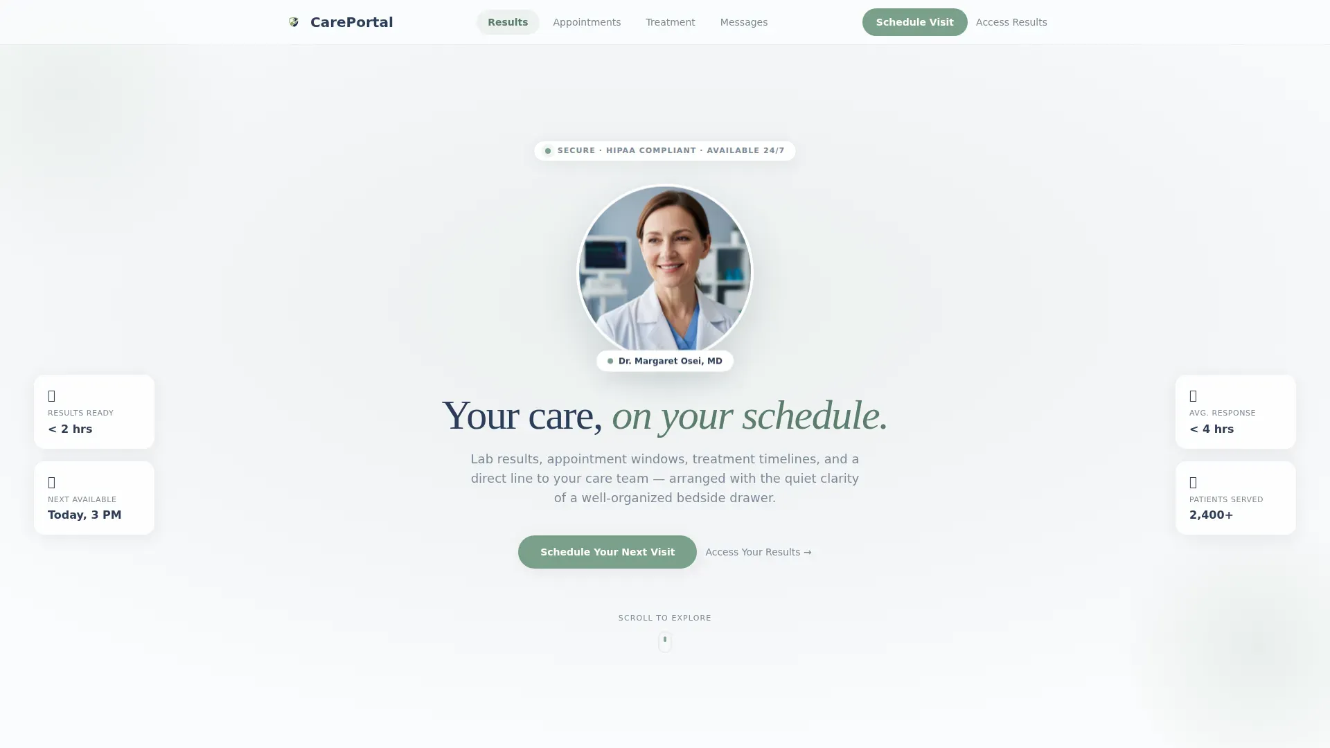
The hero places the oncologist's softly lit portrait at center, two-thirds scale, with generous breathing space and the headline "Your care, on your schedule" in lightweight serif beneath. The anchor navigation bar pins to the top of the viewport on scroll and carries the sage-green "Schedule Your Next Visit" button throughout the entire page visit.
Testimonial Mosaic Section Introductions
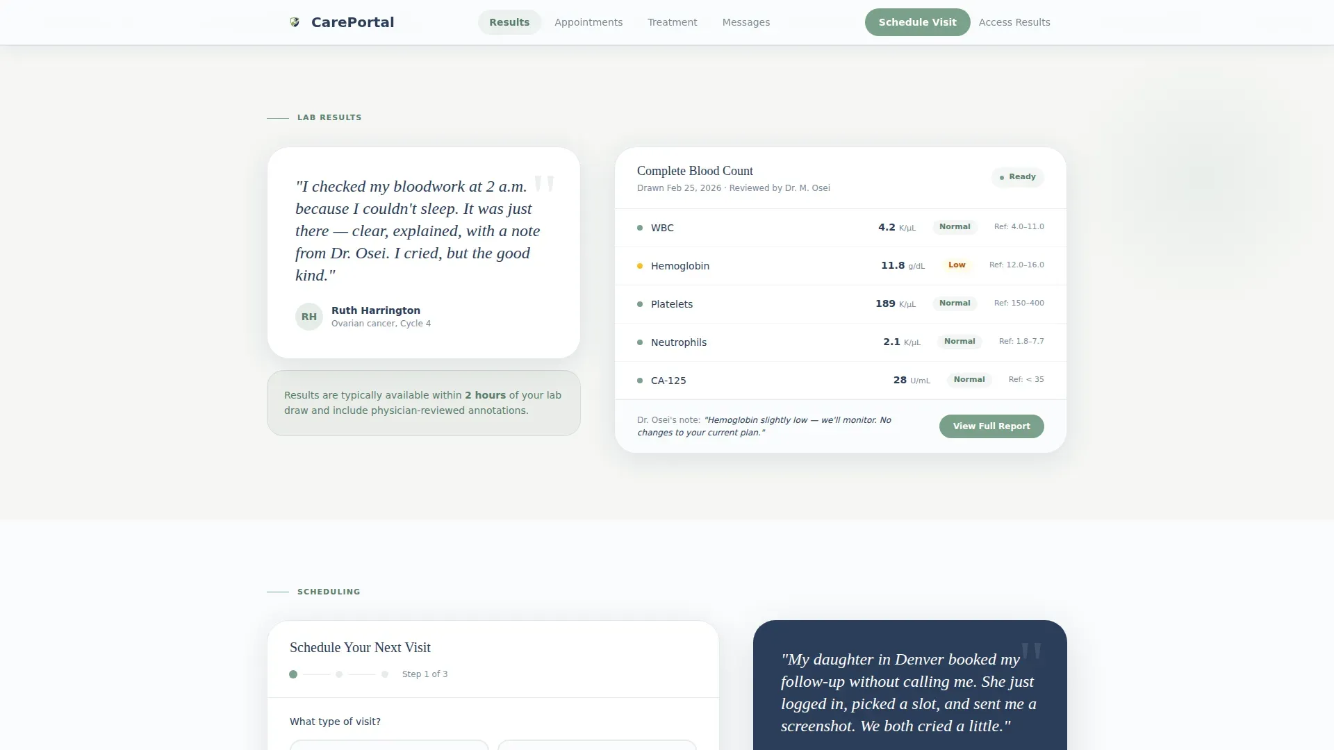
Every spoke section opens with a real patient quote rendered as a mosaic tile. Tiles shift in size and visual emphasis as the visitor scrolls, creating an asymmetric, human rhythm. Each quote anchors the section emotionally before the functional content appears.
Three-Step Progressive Booking Form
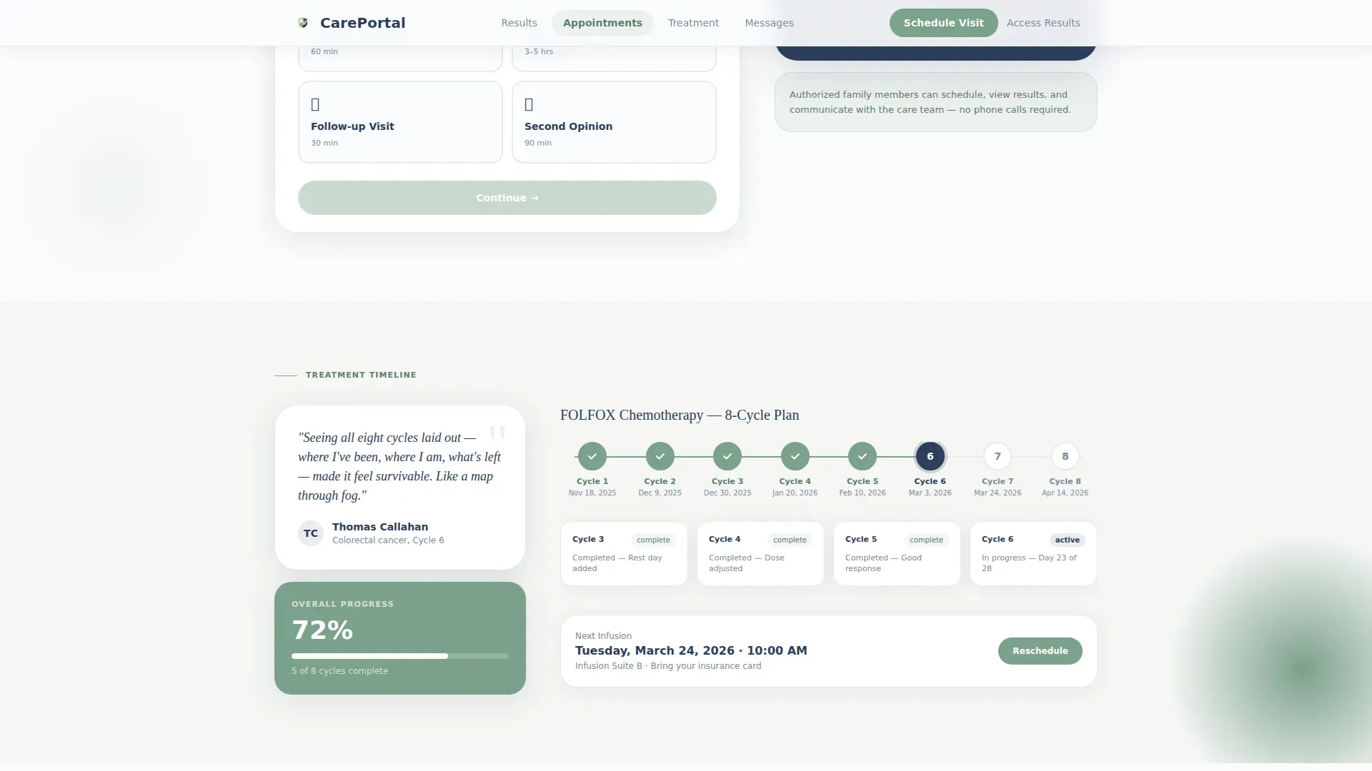
The Appointments section contains a progressive disclosure form with three clear steps. Step one selects visit type (consultation, infusion, follow-up, or second opinion). Step two displays a visual calendar with next available slots highlighted in sage. Step three confirms contact details and insurance in a single unified field group.
Visual Treatment Cycle Tracker
The Treatment Timeline section includes a visual tracker that maps the patient's chemotherapy or treatment cycle. It gives patients and caregivers a clear at-a-glance view of where they are in the plan, reducing the need to call the office for status updates.
Secure Messaging Thread Interface
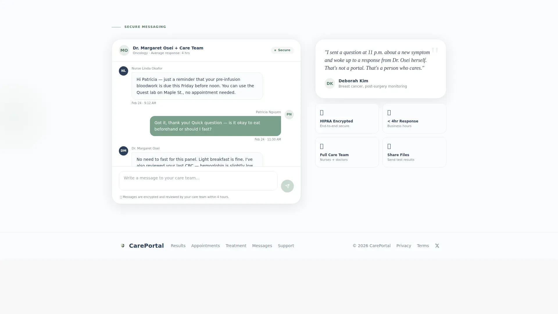
The Messaging section presents a clean, secure message thread interface that mirrors familiar mobile messaging patterns. It reduces the intimidation of contacting a care team and gives patients a private, recorded channel for non-urgent questions.
Dual Call-to-Action Path
The primary call to action, "Schedule Your Next Visit," is always visible in the pinned navigation. A secondary text link, "Access Your Results," sits beneath the primary button to serve returning patients who need direct portal access without rebooking.
Page sections overview
| Section | Purpose |
|---|---|
| Hero portrait section | Establish trust and introduce the primary booking call to action |
| Results mosaic tile | Open the lab results section with a patient testimony and dashboard preview |
| Appointments booking form | Guide visitors through the three-step progressive scheduling flow |
| Treatment timeline tracker | Show the visual chemotherapy cycle tracker with patient quote context |
| Messaging thread interface | Present secure care team communication with a familiar thread layout |
| Footer linear row | Deliver essential practice links in a clean single-row pattern |
Design & branding system
The visual identity follows an Organic Flow theme built on an Arctic White color system. The palette is intentionally restrained, clean enough to signal clinical trustworthiness, warm enough to lower a patient's anxiety before they even read a word.
- Color palette: clinical snow (#FAFBFC) for the background, soft marrow gray (#E8EAED) for surface contrast, living sage (#7BA08A) for all interactive elements and navigation anchors, and quiet navy (#2C3E5A) for body text and trust signals
- Typography: Fraunces serif for headlines and the hero tagline, DM Sans for all body copy and form labels
- Scroll animation: medium-intensity scroll-linked mosaic tile scaling, gentle parallax on the hero portrait, and staggered section reveals for a composed, unhurried page feel
Mobile & speed optimization
This template is designed with a mobile-first approach. Patients check lab results at 2 a.m. from their phones. Caregivers book appointments from airport lounges. The layout and interaction patterns are built to serve those real moments without friction.
- The anchor navigation collapses gracefully on small screens, keeping the sage call-to-action button always reachable
- The three-step booking form uses progressive disclosure so mobile users see only one focused step at a time
- Static content uses server-side rendering with minimal JavaScript, and scroll animations rely on native CSS rather than heavy script libraries
How this template helps you convert
The layout is structured to move a visitor from emotional recognition to completed action without a single unnecessary step. Every design decision reduces hesitation and shortens the path to booking.
- The pinned "Schedule Your Next Visit" button travels the full page length in the anchor nav, so the booking action is never more than one tap away regardless of where the visitor is reading
- Patient testimonials open every section before feature copy appears, creating a mirror moment where visitors recognize their own situation and feel understood before they are asked to do anything
- The secondary "Access Your Results" link gives returning patients a direct path without forcing them back through the booking flow, reducing drop-off from users who already trust the portal
Other information about this template
This template covers the full patient journey from first visit to ongoing care coordination. It is especially well-suited for oncology practices that want their digital presence to reflect the same attentive, human-centered care their clinical team delivers in person.
- The hub-and-spoke anchor navigation structure means patients with specific needs (such as checking results or messaging their team) can reach the right section immediately without scrolling through unrelated content
- The template is built for English (United States) localization, using USD and MM/DD/YYYY date formatting throughout the booking form
- The footer follows a linear single-row pattern, keeping the design clean and uncluttered while surfacing essential practice links
Theme
Organic Flow
Creative direction
Testimonial Mosaic
Color system
Arctic White
Style
Hub & Spoke (Anchor Nav)
Direction
Booking/Scheduling
Page Sections
Portrait-centered Hero with Pinned Anchor Nav
Scroll-driven Testimonial Mosaic
Three-step Progressive Booking Form
Visual Treatment Cycle Tracker
Secure Messaging Thread Interface
Dual Call-to-action Path
Related questions
Can I customize the oncologist portrait and patient testimonials?
Does the three-step booking form work well on mobile devices?
Can a family caregiver book an appointment on behalf of a patient?
What visit types does the booking form include?
Is the anchor navigation visible throughout the full page?



