Family Doctor Advanced Booking Website Template
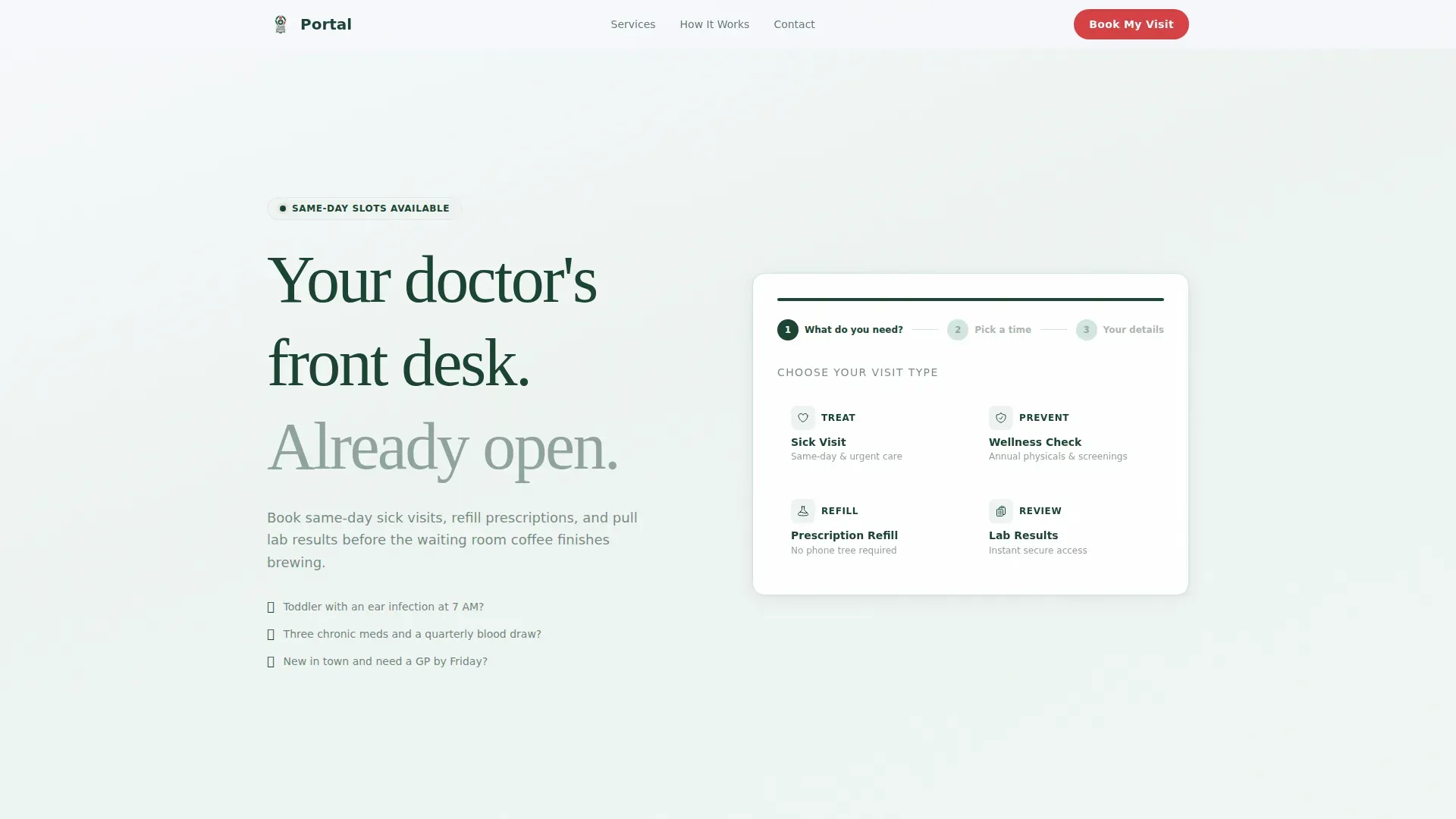
This family doctor patient portal landing page gives practices a polished digital front desk that works around the clock. Patients can book same-day sick visits, request prescription refills, and check lab results through a guided three-step form. The zigzag layout turns each scroll into a personal health audit, building quiet urgency that leads naturally to a completed booking.
by Rocket studio
Quick summary
This single-page patient portal template is built for family medicine practices that want to replace phone trees with a fast, self-guided booking experience. A three-step header form gets visitors halfway through scheduling before they have consciously committed. Alternating audit sections then build just enough urgency to make booking feel like the obvious next step.
Who this template is for
This template is designed for family medicine practices and primary care clinics that need a conversion-focused digital front desk. It speaks directly to three real patient groups and removes the friction that usually stops them from booking.
- Working parents who need same-day sick visits for children and have no time to wait on hold
- Retirees managing chronic medications and quarterly lab appointments who need a clear, simple scheduling path
- Young professionals new to an area who need to register with a GP quickly and without paperwork delays
What problem this template solves
Most practice websites make patients work too hard. They bury booking links, force phone calls during office hours, and offer no clear path for urgent or routine needs. This template removes every one of those roadblocks.
- Patients arrive at an active, step-by-step form rather than a static homepage, so the booking process starts immediately
- Each zigzag section poses a quiet health-audit question that keeps readers engaged and surfaces unmet care needs
- A secondary email-capture path catches visitors who are not ready to book, turning curiosity into a follow-up opportunity
What you get with this template
The template delivers a complete, ready-to-customise landing page built around a high-intent booking flow. Every section has a defined purpose, and the layout guides visitors from first impression to confirmed appointment.
- A three-step multi-step form in the header with four tappable visit-type tiles, a date and time grid, and a patient details step
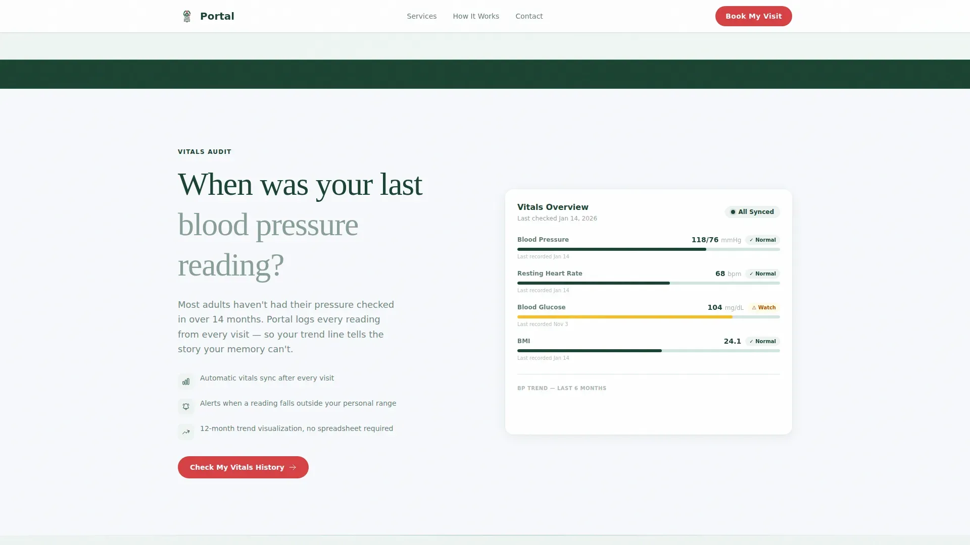
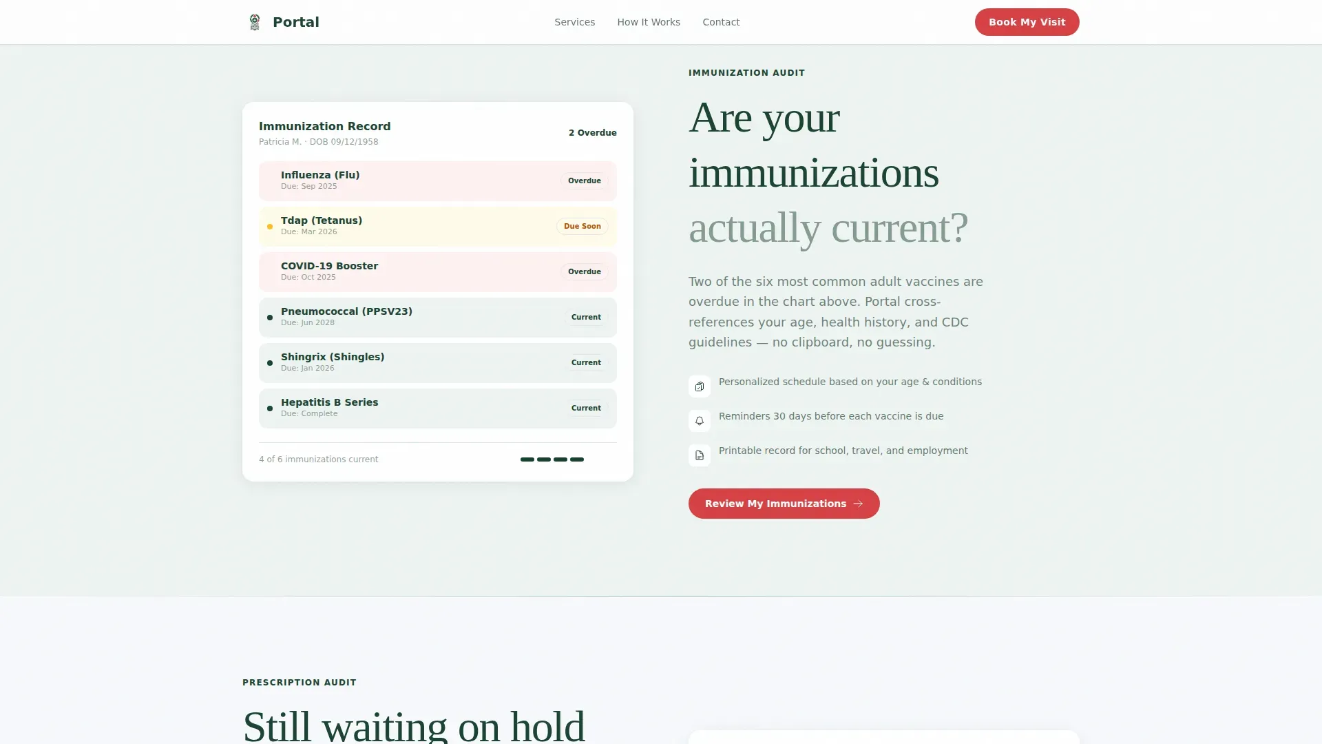
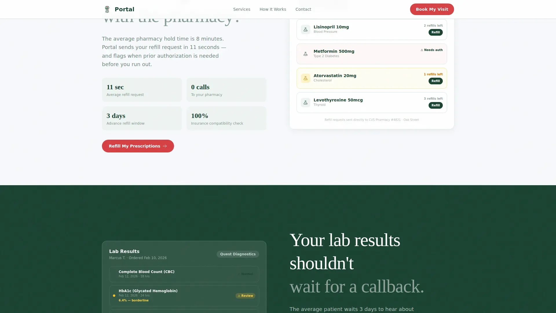
- Six alternating zigzag content sections covering vitals, immunisations, prescriptions, and lab results, each paired with a matching portal visual
- Three strategically placed "Book My Visit" calls to action, including a sticky mobile bar that follows the user down the page
Feature list
This template is built around specific, prompt-defined components. Each feature below reflects something directly present in the page layout and interaction design.
Three-Step Booking Form
The header loads a compact progress bar already set to Step 1. Four tappable tiles let patients choose Sick Visit, Wellness Check, Prescription Refill, or Lab Results. Selecting a tile slides automatically to a date and time grid, then to a patient details step capturing name, date of birth, and insurance carrier.
Zigzag Health-Audit Layout
Six alternating left-right sections each pose a personal health question paired with a relevant portal visual. The sequence moves through blood pressure, immunisation status, prescription wait times, and lab result delays, creating a self-guided chart review that builds low-grade urgency naturally.
Sticky Mobile Call-to-Action Bar
After the second zigzag section, a persistent "Book My Visit" bar appears at the bottom of the screen on mobile devices. It stays visible as the user scrolls, keeping the primary conversion action one tap away at all times.
Dual Conversion Paths
The page supports two outcomes. Visitors ready to book complete the three-step form. Visitors still exploring can download a New Patient Checklist by submitting their email address. Both paths are built into the page layout without competing for attention.
Social Proof Metrics Block
The template includes dedicated space for patient count figures, average booking time, satisfaction scores, and named patient testimonials. These elements appear as scannable metrics rather than long narrative copy, reinforcing trust quickly.
Scroll-Triggered Section Reveals
Content sections animate into view as the user scrolls, using reveal text effects and tile slide transitions. This pacing keeps the experience feeling intentional rather than overwhelming, and it matches the clinical warmth tone of the overall design.
Page sections overview
| Section | Purpose |
|---|---|
| Header Booking Form | Starts three-step scheduling flow immediately above the fold |
| Vitals Audit Row | Prompts reflection on blood pressure with portal dashboard visual |
| Immunisation Audit Row | Surfaces immunisation gaps with a colour-coded compliance checklist |
| Prescription Audit Row | Addresses pharmacy hold-time frustration with refill portal view |
| Lab Results Audit Row | Removes callback anxiety by showing in-portal lab result access |
| Final Call-to-Action Block | Repeats booking form and adds secondary email-capture download path |
| Footer | Single-row linear footer with practice links and contact details |
Design & branding system
The visual identity follows a Corporate Precision theme that pairs clinical reliability with genuine warmth. No hero image or stock photography appears on the page; the interactive form is the primary visual element above the fold.
- Summit white (#F7F9FC) covers open backgrounds, keeping the layout feeling clean and spacious like a well-lit clinic reception area
- Evergreen (#1B4332) anchors primary headings and navigation, while glacier mist (#A7C4BC) provides calm secondary panel backgrounds and divider accents
- Alpine berry (#D64045) is reserved exclusively for calls to action and urgent-status indicators, making every booking prompt immediately visible without visual noise
Mobile & speed optimization
The template is built mobile-first, reflecting the reality that working parents and on-the-go patients will arrive on a phone. The layout scales cleanly to desktop without losing its clinical precision feel.
- The three-step form tiles are sized for thumb tapping, and the date grid picker is designed for small-screen usability
- The sticky mobile call-to-action bar activates after the second zigzag section, keeping the booking action reachable during the full scroll journey
- Static content sections use server-rendered components while the interactive multi-step form loads as a client component, keeping the initial page render fast
How this template helps you convert
Every design decision in this template is oriented toward one outcome: a patient who completes the booking form. The audit-style layout makes that outcome feel like a personal health responsibility rather than a sales action.
- The header form puts visitors inside a booking flow before they have finished reading the page title, reducing the cognitive gap between "I should book" and "I am booking"
- Each zigzag audit section adds a layer of health-maintenance context that makes scrolling past without booking feel like leaving something unresolved, turning passive browsing into motivated action
- The dual conversion path ensures that even undecided visitors leave something behind, capturing an email address through the New Patient Checklist download so the practice can follow up
Other information about this template
This template was designed specifically for the family doctor patient portal use case within the Health and Medical category. It reflects real scheduling behaviour and the friction points that prevent patients from booking through a practice website.
- Typography uses Fraunces for serif headings and DM Sans for body text and interface elements, balancing warmth with clinical legibility
- The page uses United States date formatting (MM/DD/YYYY), United States dollar currency references, and English-language copy throughout
- Animation intensity is set to medium-high, with scroll-triggered reveals, tile slide transitions, and a sticky call-to-action bar all included in the template build
- The footer follows a linear single-row pattern, keeping the page exit clean and focused
Theme
Corporate Precision
Creative direction
Checklist & Audit
Color system
Alpine Fresh
Style
Zigzag/Alternating
Direction
Booking/Scheduling
Page Sections
Three-step Header Booking Form
Zigzag Health-audit Sections
Sticky Mobile Booking Bar
Dual Conversion Path Design
Social Proof Metrics Block
Scroll-triggered Reveal Animations
Related questions
Can I customise the visit-type tiles in the booking form?
Does the template support both mobile and desktop layouts?
What happens when a visitor is not ready to book?
How many calls to action does the page include?
Can I add my practice's patient testimonials and metrics?



