Refined Foyer Organization Landing Page Template
Threshold is a single-column landing page template built for mudroom and entry interior designers. It follows a Problem-to-Solution scroll arc, guiding visitors from frustrating entryway chaos to three clearly priced design packages. With a warm stone color palette, architectural typography, and a built-in lead capture path, it turns browsers into booked clients.
by Rocket studio
Quick summary
Threshold is a precision-built landing page template for mudroom and entry interior designers. It opens with visceral chaos photography, shifts to polished project results, and closes with three tiered packages at fixed prices. The design feels warm but controlled, every section doing exactly the job it was built for.
Who this template is for
This template speaks directly to design professionals and real estate specialists who work with entryways every day. It is built around a specific niche with a specific sales goal, not a generic service portfolio.
- Mudroom and entry interior designers ready to sell fixed-scope packages directly from their website
- Real estate agents who stage entryways and need a polished, focused page to communicate value fast
- Architects who offer mudroom redesigns as a defined service and want to stop losing clients to scope confusion
What problem this template solves
Most interior designers lose potential clients because their websites bury pricing, show too much, and ask visitors to work too hard. Entry and mudroom specialists face a compounded problem: the niche feels narrow, so the pitch has to be precise.
- Clients arrive overwhelmed by clutter and leave without booking because there is no clear next step
- Pricing ambiguity kills momentum at exactly the moment a visitor is ready to commit
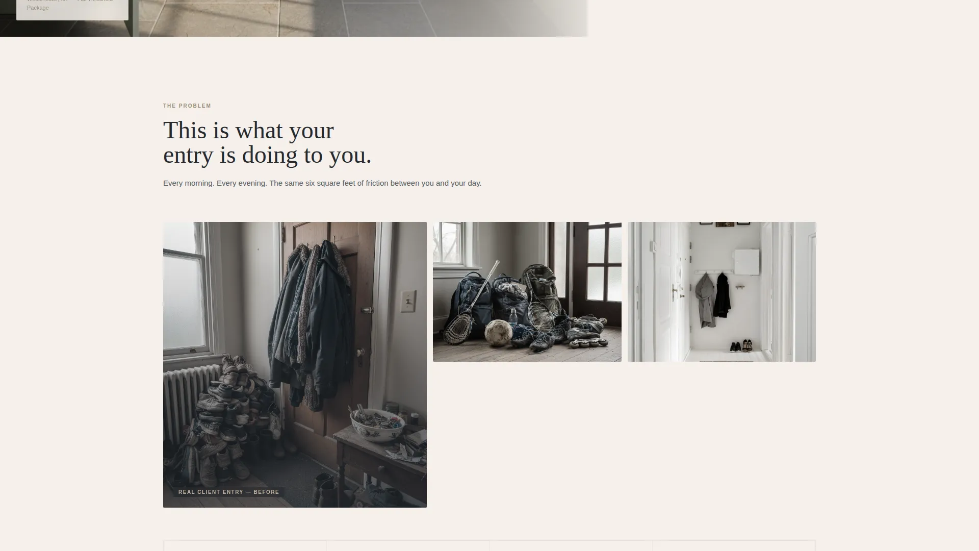
- Generic portfolio pages do not communicate the transformation from chaos to system that mudroom clients actually need to see
What you get with this template
You get a complete, single-column landing page structured around a Problem-to-Solution arc that builds trust and drives direct sales. Every section is sequenced deliberately, from chaos photography through to a checkout flow.
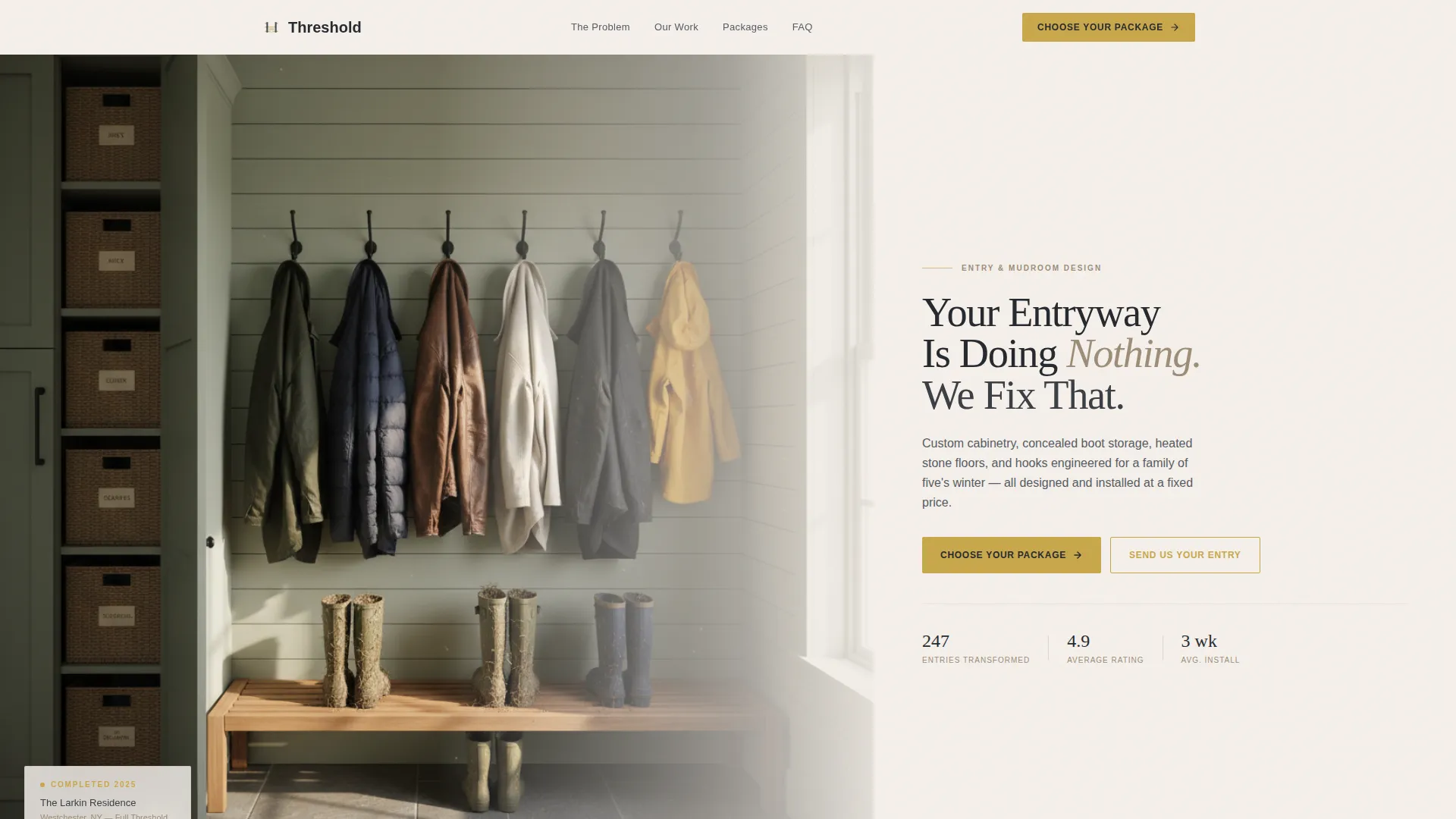
- A half-page photo and text header with a headline, supporting copy line, and a brass-toned call-to-action button
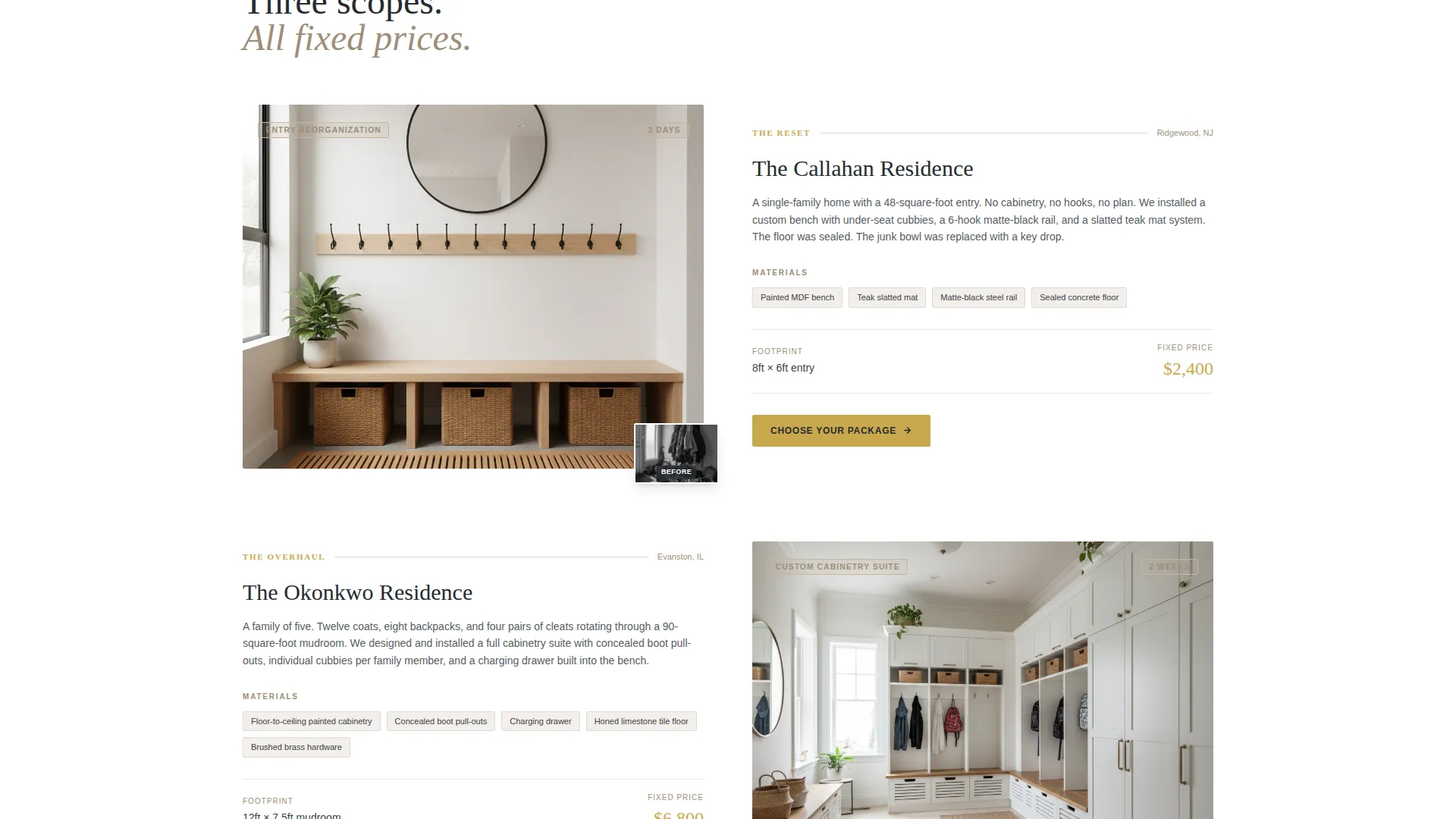
- Three tiered pricing cards for "The Reset" at $2,400, "The Overhaul" at $6,800, and "The Threshold" at $14,500, each with brass-bordered pricing
- A dual-path conversion system: a primary checkout flow for ready buyers and a secondary lead capture path for visitors who want a free entry assessment first
Feature list
This section covers the core capabilities built into the Threshold template as described in the source brief.
Problem-to-Solution Scroll Arc
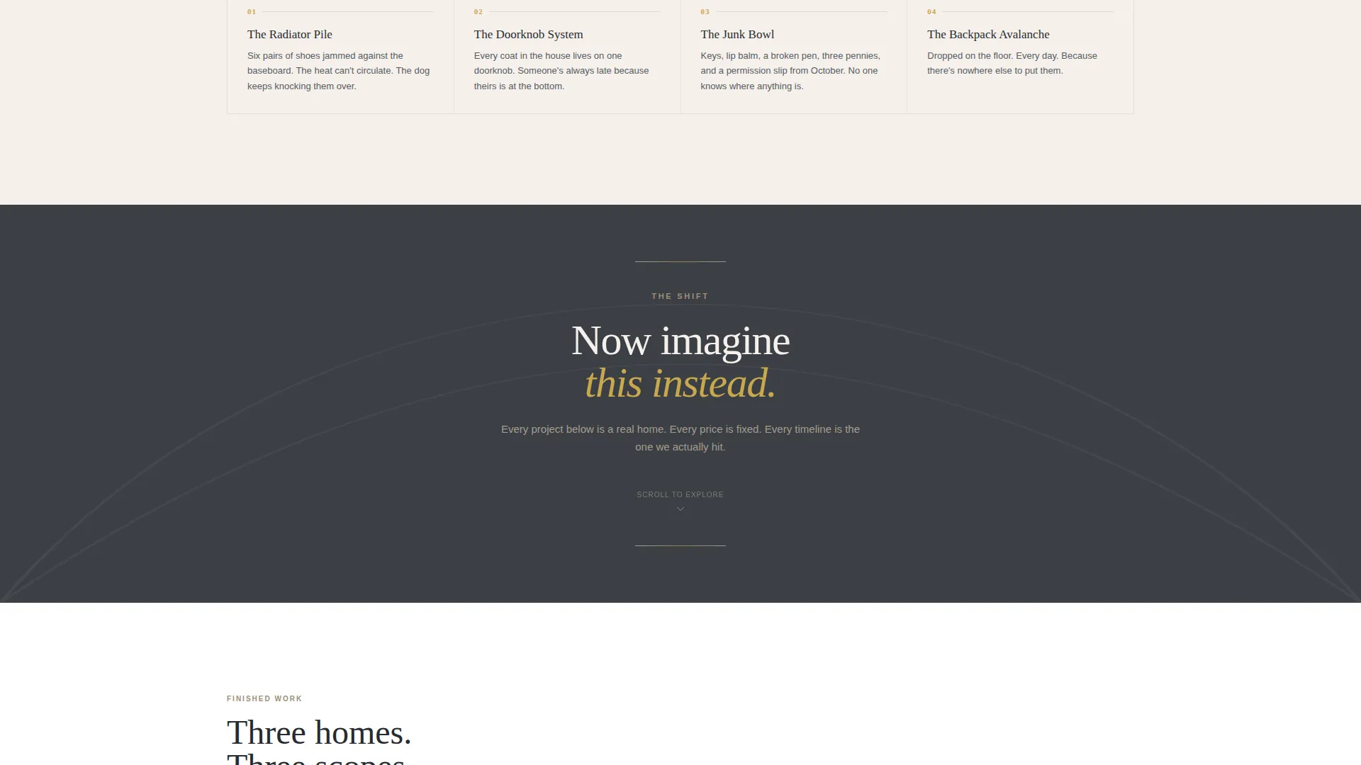
The page opens with a real photo gallery of mudroom chaos, paired with short blunt copy. A single transitional line shifts the mood. Then finished project photography takes over, each section representing one design package at increasing scope. The emotional tension is intentional and deliberate.
Three-Tier Pricing Card System
Each package card displays materials, dimensions, a timeline badge, and a fixed price. Brass-bordered pricing separates each tier visually. The "Choose Your Package" call-to-action repeats after every card to keep the decision moment present throughout the scroll.
Built-In Checkout Flow
Clicking any package card opens a short, focused checkout sequence. The visitor selects a package, uploads a photo of their current entry, and picks a consultation date. The flow removes friction without removing intent.
Secondary Lead Capture Path
A "Not Sure? Send Us Your Entry" option sits alongside the primary purchase path. Visitors upload a photo for a free assessment. This keeps the funnel warm for visitors who are interested but not yet ready to commit.
Pinned Mobile Call-to-Action Bar
On mobile, a slim bar pins the primary call-to-action to the bottom of the screen throughout the scroll. Visitors never have to scroll back up to find the next step.
Half-Page Photo and Text Header
The header splits the screen: a left-weighted hallway photograph in morning sidelight, and right-side architectural headline copy. The composition is designed to communicate calm order before a single word is read.
Page sections overview
| Section | Purpose |
|---|---|
| Header Split Panel | Establish visual tone and primary headline |
| Chaos Photo Gallery | Surface the problem with real imagery |
| Transitional Copy Line | Shift emotional register from problem to solution |
| Reset Package Card | Present entry-level scope and fixed price |
| Overhaul Package Card | Present mid-tier cabinetry scope and price |
| Threshold Package Card | Present full architectural redesign and price |
| Free Assessment Path | Capture warm leads not ready to purchase |
| Pinned Mobile Bar | Keep call-to-action visible on small screens |
Design & branding system
The visual identity follows a Corporate Precision theme built on a Warm Stone color system. Every color choice is intentional, pulling from architectural material references rather than digital trend palettes.
- Honed limestone (#C4B6A1), wet slate (#3B3F45), and plaster white (#F5F0EB) form the base palette for backgrounds, body text, and surface areas
- Brushed brass (#C9A84C) is reserved for buttons, price tags, and interactive accents to draw the eye only where action is needed
- Typography uses a tight architectural sans-serif that echoes the precision of the mudroom systems being sold
Mobile & speed optimization
The template is designed with mobile visitors in mind. The single-column flow translates directly to small screens without requiring layout restructuring.
- The pinned bottom call-to-action bar keeps the primary conversion action reachable at all times on mobile devices
- The single-column layout eliminates horizontal scroll and keeps vertical reading momentum intact across screen sizes
How this template helps you convert
The conversion logic is embedded in the page structure itself, not bolted on at the end. Every scroll decision is made with a specific buyer action in mind.
- The Problem-to-Solution arc earns trust before asking for money. Visitors see their real situation reflected, then see a credible resolution, which makes the pricing feel earned rather than arbitrary.
- Repeating the "Choose Your Package" call-to-action after each tier means the decision prompt appears at the exact moment a visitor finishes evaluating each option, reducing the need to scroll back.
- The dual-path funnel captures both ready buyers and warm leads in one page, so no visitor leaves without a next step matched to their current level of commitment.
Other information about this template
This template is built specifically for the mudroom and entry renovation niche within the broader Construction and Home category. It is not a general interior design portfolio template.
- The page style is a single-column flow, which keeps the scroll linear and the conversion path unambiguous
- The creative direction is a Problem-to-Solution Arc, a structure proven to work when the product solves a daily frustration the client already feels acutely
- The header concept is a Half-Page Photo and Text split, giving equal visual weight to photography and written communication from the very first screen
- The direct sales landing page direction means all roads on this page lead to a purchase or a warm lead capture, not to a general contact form
- This template suits designers who have standardized their service into defined packages and are ready to sell those packages without a lengthy discovery call first
Theme
Corporate Precision
Creative direction
Problem→Solution Arc
Color system
Warm Stone
Style
Single Column Flow
Direction
Direct Sales
Page Sections
Problem-to-solution Scroll Arc
Three-tier Pricing Card Layout
Built-in Checkout Flow
Dual-path Lead Funnel
Pinned Mobile Call-to-action Bar
Half-page Photo and Text Header
Related questions
Can I change the package names and prices shown in the template?
Do I need a separate booking tool for the consultation date picker?
Is this template suitable if I only offer one service package?
What kind of photography works best with this template?
Can the free assessment path work independently of the checkout flow?



