High-Net-Worth Financial Advisor Team Profile Website Template
A hub-and-spoke landing page built for financial advisor teams who serve high-net-worth individuals and institutional clients. Each advisor gets a full dossier section with philosophy, specializations, and credential timeline. A sticky comparison panel lets visitors evaluate up to three advisors side by side before reaching out for a confidential introduction.
by Rocket studio
Quick summary
This is a single-page financial advisor team landing page built around a hub-and-spoke anchor navigation layout. It presents each advisor as a complete dossier, philosophy, specializations, credentials, and key metrics, so high-value visitors can self-sort, compare, and arrive at the introduction form already confident in their choice.
Who this template is for
Wealth management firms and independent advisory practices need more than a generic "meet the team" page. This template is built for firms whose clients demand evidence before they commit. It suits teams where each advisor brings a distinct specialty and where the comparison between advisors matters to the decision.
- Wealth management firms targeting high-net-worth individuals comparing shortlisted firms
- Institutional advisory practices serving corporate clients or pension oversight mandates
- Advisory teams where individual specializations, credentials, and track records drive client selection
What problem this template solves
Most financial advisor team pages bury the detail that actually converts serious clients. A high-net-worth individual or a corporate CFO vetting fiduciary partners will not fill in a contact form after reading three sentences and a headshot. They need the full picture before they trust anyone with their capital.
- Visitors cannot easily compare advisors side by side, so they leave to research elsewhere
- Credential depth and specialization clarity are hidden inside PDFs or long unstructured bios
- The contact form appears too early, before the visitor has built enough conviction to engage
What you get with this template
The template delivers a complete, scroll-driven team presentation built around four advisor dossier sections, each connected to a sticky anchor navigation bar. Firm-level statistics sit between advisor sections as charcoal data cards, reinforcing trust with aggregate evidence before each individual profile deepens it.
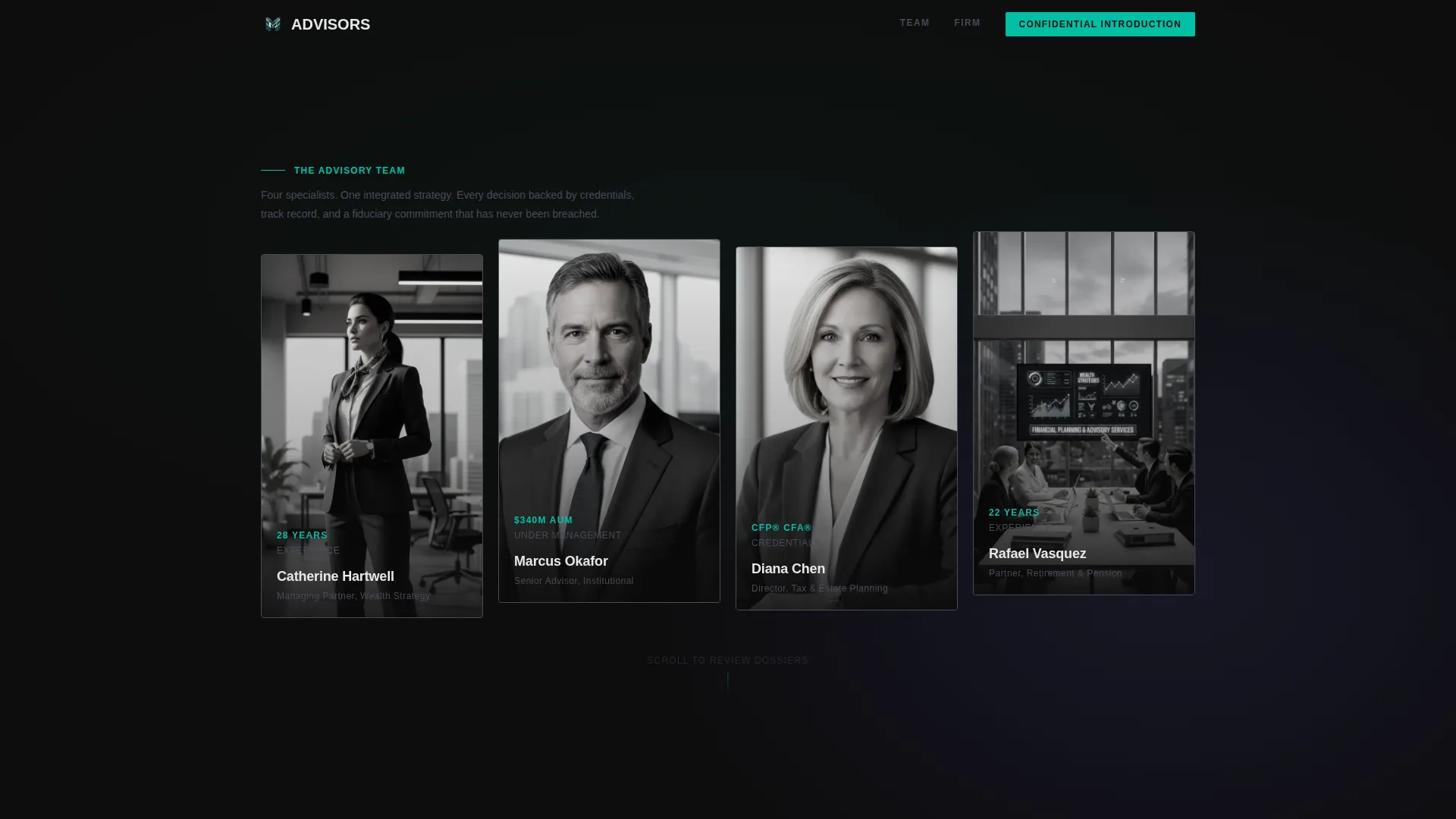
- Hero section with four Dark Glass Panel advisor portrait cards and parallax mouse-drift animation
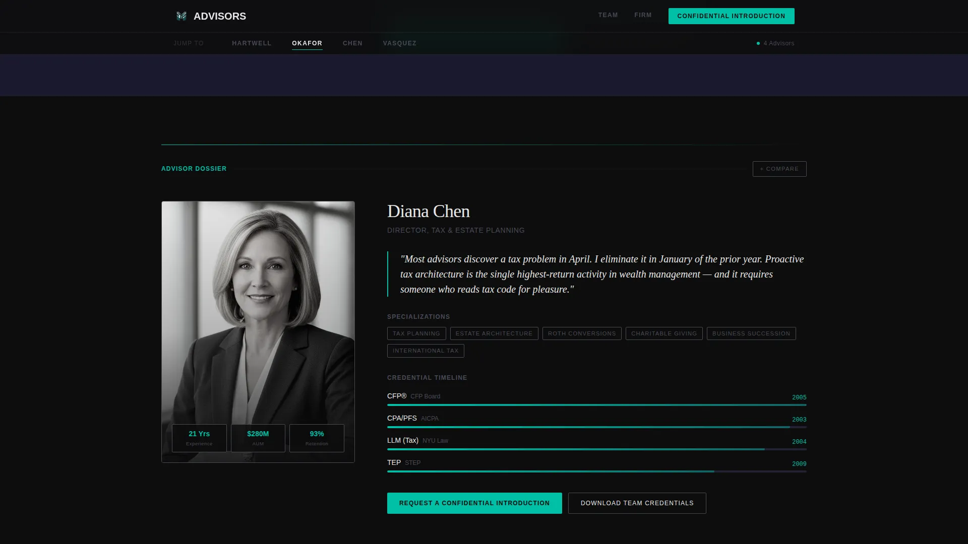
- Four full advisor dossier sections, each with philosophy pull quote, specialization grid, and credential timeline
- Sticky bottom comparison drawer that docks up to three advisor cards side by side with aligned credential, specialization, and fee structure columns
Feature list
Each capability below is built directly into the template layout and interaction design.
Anchor Navigation with Active Indicator
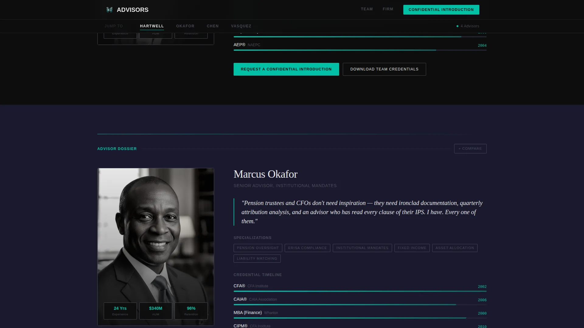
A sticky spoke navigation bar pins to the top of the page. Each spoke carries an advisor's last name. Clicking any spoke smooth-scrolls to that advisor's full section. The active spoke highlights with an electric teal underline, so visitors always know where they are in the page.
Dark Glass Panel Hero
Four advisor portrait cards are displayed in the hero as frosted Dark Glass Panels against the deep black background. Each card shows a desaturated high-contrast portrait, the advisor's name, title, and a single key metric such as years of experience, assets under management, or credentials. The panels respond to mouse movement with a subtle parallax drift.
Full Advisor Dossier Sections
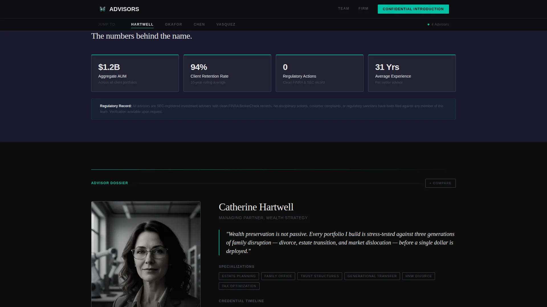
Each advisor section is a complete profile unit. It opens with a philosophy statement typeset as a serif pull quote, followed by a specialization grid covering areas such as retirement, estate, tax, and institutional planning. A horizontal bar-style credential timeline presents career milestones and qualification history in a visual, scannable format.
Advisor Comparison Panel
A sticky bottom drawer activates when visitors toggle "Compare Advisors." Up to three advisor cards dock side by side inside the panel, with credentials, specializations, and fee structures aligned in matching columns. This lets visitors make a direct, structured comparison without leaving the page or opening a separate document.
Firm-Wide Data Cards
Between individual advisor sections, the template inserts charcoal data cards carrying firm-level statistics: aggregate assets under management, average client retention rate, and regulatory record. These cards use teal accent lines and are styled to read like entries in a proprietary research report, reinforcing institutional credibility at the firm level.
Gated Credentials Download
A secondary call-to-action offers visitors the option to download a team credentials document as a gated PDF. The gate requires only a name and email address. This path captures visitors who prefer to review materials offline before committing to a direct introduction.
Page sections overview
| Section | Purpose |
|---|---|
| Hero Panel Cards | Display four advisor portrait cards with key metrics and parallax drift |
| Sticky Anchor Nav | Pin spoke navigation with teal active indicator for each advisor |
| Firm Stats Cards | Show aggregate AUM, retention rate, and regulatory record as data cards |
| Advisor Dossier 1 | Present first advisor's philosophy, specialization grid, and credential timeline |
| Advisor Dossier 2 | Present second advisor's philosophy, specialization grid, and credential timeline |
| Advisor Dossier 3 | Present third advisor's philosophy, specialization grid, and credential timeline |
| Advisor Dossier 4 | Present fourth advisor's philosophy, specialization grid, and credential timeline |
| Compare Drawer | Dock up to three advisor cards side by side in a sticky bottom panel |
| Footer Row | Single-row linear footer with firm links and secondary navigation |
Design & branding system
The visual identity follows a Carbon Fiber color system that feels like the interior of a precision instrument, every surface engineered to absorb light, nothing reflective unless interacted with. Typography pairs DM Sans for body text with Fraunces serif for philosophy pull quotes, creating a contrast between clinical data presentation and authoritative voice.
- Color palette: deep cockpit black (#0D0D0D) and woven graphite (#1A1A2E) alternate as section backgrounds; card surfaces sit at #222233 with 1-pixel titanium borders (#4A4A5A); signal white (#E8E8E8) is used for all primary text
- Accent usage: electric teal (#00BFA6) appears exclusively on active states, hover underlines, anchor nav indicators, and data card accent lines, never as a background fill
- Animation system: parallax mouse drift on hero cards, scroll-reveal entrances on dossier sections, staggered card entrance sequences, and teal underline transitions on interactive elements
Mobile & speed optimization
The template is designed desktop-first, reflecting the reality that high-net-worth individuals and institutional reviewers typically evaluate wealth management firms on large screens. The layout prioritizes information density and side-by-side comparison at wide viewport widths, where the comparison drawer and dossier sections deliver the most impact.
- Static content sections use server-rendered components, while interactive elements such as the comparison toggle, anchor nav indicator, and sticky panel are handled client-side
- Scroll reveals and staggered entrance animations are scoped to sections as they enter the viewport, keeping the initial load unblocked
- The footer follows a single-row linear pattern to keep the page closure clean and fast to render
How this template helps you convert
The page is structured so that conviction builds gradually before any form is presented. Visitors move from recognition to evidence to comparison, and the introduction request feels like a natural conclusion rather than a cold prompt.
- The hero introduces each advisor immediately with a key metric, so visitors can identify relevant expertise within seconds of landing on the page
- Dossier sections escalate from personal philosophy to hard credential evidence, building the case section by section before any call-to-action appears
- The comparison drawer and gated PDF download offer two self-directed paths to conversion, so visitors can choose the commitment level that feels right for them before reaching the "Request a Confidential Introduction" form
Other information about this template
This template sits within the Financial Advisor Website Templates subcategory and is built specifically for the Financial Advisor Team Page niche. It is localized for English-language, USD-denominated, USA-market advisory practices. The Hub and Spoke anchor navigation structure makes it straightforward to customize spoke labels and dossier sections to match any team size or composition.
- The template style is classified as Hub and Spoke with Anchor Navigation, making it reusable for any team with two or more advisors who need distinct individual profiles within a single page
- The Directory and Discovery theme means the page functions as both a team introduction and a self-service research tool for serious prospects
- The Industry Report creative direction gives every section the visual weight of a formal research document, which aligns with how institutional and high-net-worth clients expect to receive information about fiduciary partners
Theme
Directory & Discovery
Creative direction
Industry Report
Color system
Carbon Fiber
Style
Hub & Spoke (Anchor Nav)
Direction
Comparison/Versus
Page Sections
Anchor Navigation with Teal Active Indicator
Dark Glass Panel Hero with Parallax Drift
Full Advisor Dossier Layout
Sticky Advisor Comparison Drawer
Firm-wide Charcoal Data Cards
Gated Team Credentials Download
Related questions
Can I add more than four advisor dossier sections to this template?
What information does the advisor comparison drawer display?
Is this template suited to a solo financial advisor?
What call-to-action language does the template use on each advisor card?
What kind of clients is this financial advisor team page designed to attract?



