Portfolio — Influential Product Executive Landing Page Template
Folio is a masonry-style product manager personal brand landing page built on an Ink and Paper visual identity. It uses a scroll-locked hero, a Pinterest-style artifact gallery, and a waitlist conversion section to help senior product managers showcase their thinking, attract hiring managers and collaborators, and build a compelling portfolio that earns the signup before the full case studies drop.
by Rocket studio
Quick summary
Folio is a single-page product manager portfolio landing page designed to make product thinking visible. It combines a scroll-locked animated hero, a staggered masonry gallery of case study artifacts, and a focused waitlist form. The Ink and Paper visual system grounds every section in deep indigo, warm cotton, and electric violet, creating a site that feels like reading a brilliantly annotated notebook.
Who this template is for
This template is built for senior product managers who want their portfolio website to do more than list job titles. It speaks directly to the people who review PM work every day and need to see evidence of real thinking, not just polished summaries. The site is equally useful for fractional product leads, independent consultants, and experienced product designers looking to position themselves with a strong personal brand.
- Product managers seeking roles at growth-stage companies or enterprise teams
- Fractional leads and consultants building a professional portfolio to attract potential clients
- Conference speakers and product thinkers who want a site that showcases process alongside credentials
What problem this template solves
Most product manager portfolio websites look like resumes in disguise. They list skills, name projects, and say very little about how the PM actually thinks or solves a user problem. Hiring managers scan dozens of these sites and remember almost none of them. Folio solves this by making the thinking the centerpiece, not the biography.
- Generic portfolio design fails to demonstrate product sense or problem solving abilities to reviewers
- Text-heavy layouts bury measurable impact inside walls of vague language that potential employers skip
- Static, one-size-fits-all templates make it impossible to showcase the PM's ability to approach problems with structured creativity
What you get with this template
Folio delivers a fully designed, high-interactivity landing page ready to be customized with your own case studies, metrics, and artifact images. Every section is purpose-built to communicate PM credibility without requiring you to write a novel. The template gives you full control over content placement and visual emphasis, so you choose projects and artifacts that represent your strongest work samples.
- A scroll-locked animated hero section that draws a product question word by word as the visitor scrolls
- A staggered masonry gallery designed to showcase case study fragments, metric cards, wireframes, and other visual samples
- A waitlist conversion section with a counter, scarcity copy, and a radio-select form asking just two pieces of information
Feature list
This section covers the key components built into Folio and what each one delivers for your product manager portfolio.
Scroll-Locked Hero with Handwritten Animation
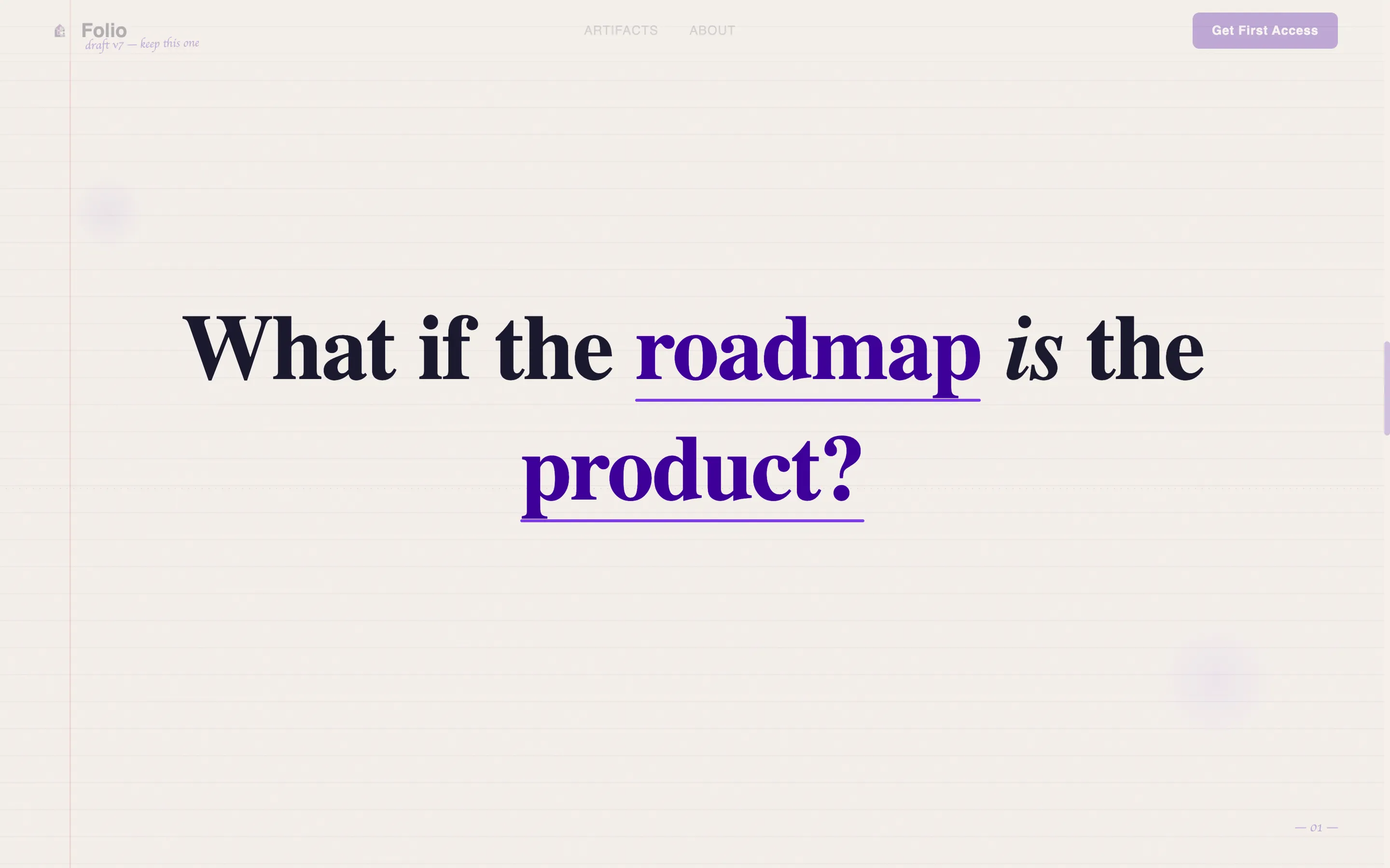
The hero section hijacks the viewport on entry. As the visitor scrolls, handwritten-style type animates stroke by stroke, spelling out a provocative product question. Each scroll tick draws another word, with an ink-bleed effect against the paper-textured background. The animation releases only after the full sentence lands, giving the visitor an experience they do not forget. This is the kind of interactive element that turns a passive page visit into an active moment of engagement.
Masonry Gallery Artifact Wall
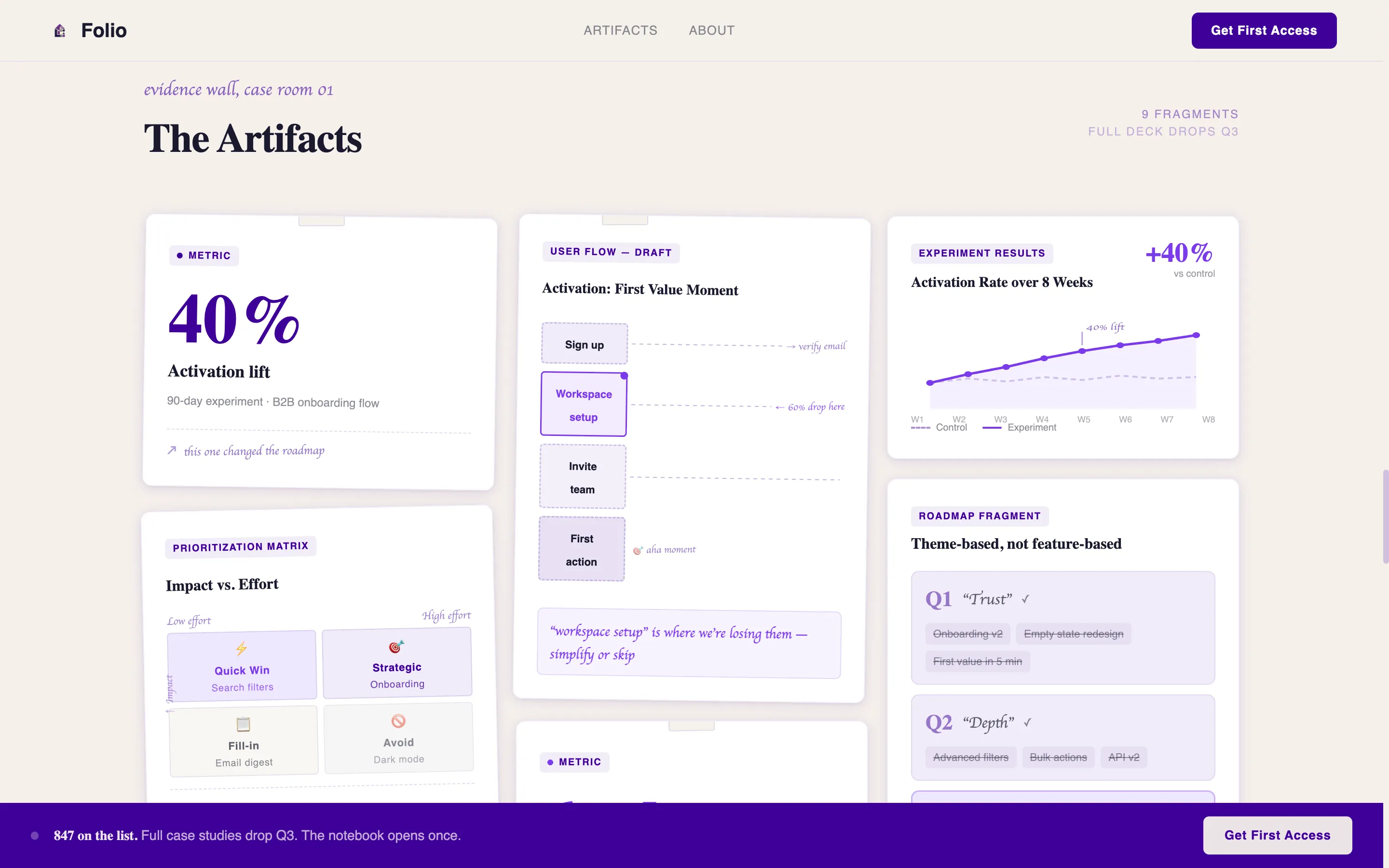
The masonry gallery is the heart of the portfolio. It is a Pinterest-style grid where each tile is a different case study fragment: a prioritization matrix, a hand-drawn user flow, a metric card with a real number like a 40% activation lift, or a screenshot that captures a decisive product moment. Cards fade and lift into position as the visitor scrolls, using staggered reveal timing so the grid feels like walking through a curated exhibition. Scale shifts between tiles keep the eye moving and the viewer engaged. This is how you demonstrate product thinking without writing a dissertation.
Signal Section with Credibility Stats
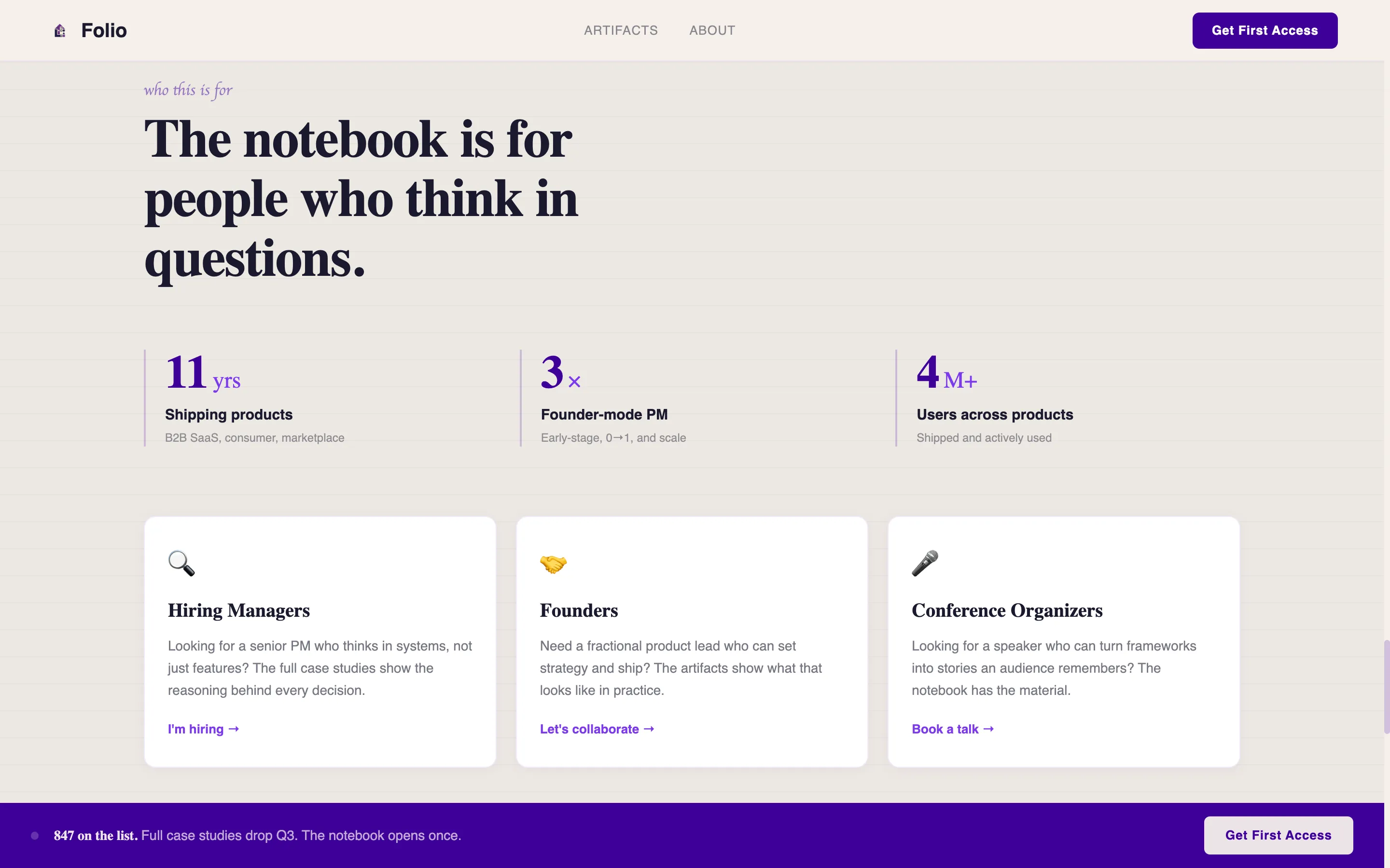
Between the gallery and the waitlist form sits an asymmetric layout section that states clearly who this portfolio is for and anchors three credibility stats. This section helps hiring managers quickly confirm they are in the right place. It works as a compact about section that does not overstay its welcome. The layout is intentionally off-grid to reinforce the editorial, notebook-style aesthetic.
Waitlist Conversion Section
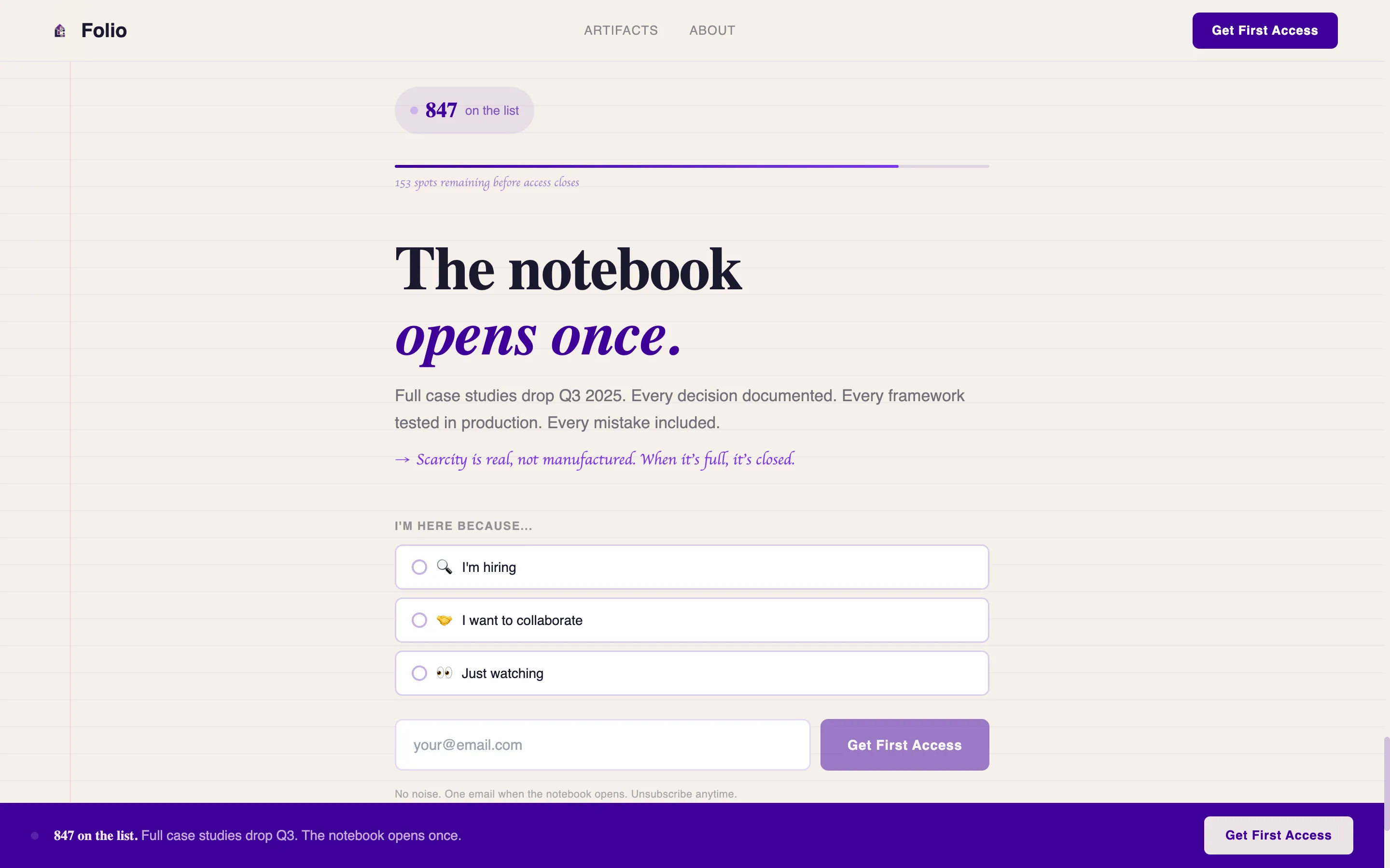
The waitlist call to action appears twice: as a persistent bottom bar and as a final full-width section after the last masonry row. The form asks only for an email address and one radio-select question with three options. Above the form, a live waitlist counter and a single line of scarcity copy set the stakes. This structure keeps the conversion flow tight and removes friction while still communicating that the full case studies are worth waiting for.
Ink and Paper Visual System
The entire site is built around a consistent design language. Deep inkwell indigo anchors body text and structural elements. Electric violet activates on hover states and links. Warm cotton stock forms all backgrounds. Cards float on subtle shadows that suggest index cards lifted off a desk. This is not decoration; it is a portfolio design choice that reinforces the PM's brand as someone who thinks in systems and communicates with precision.
Minimal Footer with Social Links
The footer follows a Superhuman-style extreme minimal pattern. It is centered, light, and contains only social links and a copyright line. It does not add visual noise. The page earns its ending by letting the waitlist form be the last real statement.
Page sections overview
| Section | Purpose |
|---|---|
| Scroll-Locked Hero | Animate a product question word by word as visitor scrolls |
| Masonry Artifact Gallery | Showcase case study fragments, metrics, and wireframes in a staggered grid |
| Signal and Stats | Establish who the portfolio is for with three credibility statistics |
| Waitlist Form Section | Capture email and intent via a minimal form with scarcity counter |
| Persistent Bottom Bar | Keep the call to action visible throughout the scroll experience |
| Minimal Site Footer | Anchor the page with centered social links and copyright |
Design & branding system
Folio's visual identity is built on an Electric Indigo color system that treats every design decision like a pen stroke on heavyweight paper. The palette is intentional and restrained, making each color do real work. Typography is layered across three typefaces to create hierarchy without clutter. Backgrounds stay warm and textured, cards carry subtle shadow, and ample white space keeps the reading experience clean and focused.
- Colors: deep inkwell indigo (#3D0099) for body text, electric violet (#7C3AED) for hover states and active links, warm cotton stock (#F5F0EB) for all backgrounds, and ballpoint blue-black (#1A1A2E) for structural contrast
- Typography: Fraunces serif display for headlines, DM Sans for body copy, and Caveat for handwritten accent labels and annotations throughout the gallery
Mobile & speed optimization
The template is designed desktop-first to match how hiring managers and founders review product manager portfolio work. The layout is fully responsive and adapts cleanly to mobile viewports, ensuring the site remains mobile friendly for any visitor who arrives from a link shared via social media platforms or email.
- The masonry grid uses IntersectionObserver to trigger staggered card reveals only as tiles enter the viewport, keeping the experience smooth without loading everything at once
- CSS scroll-driven animations power the hero word-draw effect, reducing reliance on heavy JavaScript libraries and keeping the site lean on mobile devices
How this template helps you convert
Folio is engineered to move visitors from curious to committed. Every section earns the next one, and the conversion path is direct. The template removes vague language and replaces it with specific artifacts and numbers that make the case for your work.
- The scroll-locked hero creates immediate intrigue by turning the visitor's scroll into a creative act, making them feel invested before a single case study loads
- The masonry gallery builds evidence tile by tile, so reviewers experience your product thinking the way you actually work: in fragments, in context, and with measurable impact attached to real moments
Other information about this template
Folio is a single landing page, not a multi-page site. This makes it faster to launch and easier to maintain. The online portfolio format is intentional: one focused URL that you can link from social media profiles, email signatures, or a resume. Custom domains can be connected to give the portfolio website a professional address. If you want to add new projects over time, the masonry grid is built to accommodate additional tiles without restructuring the page.
The template does not require coding experience to customize. You can swap images, update copy, adjust colors, and add contact info using the design tool it is built for. The layout supports graphic design elements like annotated wireframes and hand-drawn diagrams as part of the gallery tiles, so product designers and user experience designers can use it just as effectively as pure PMs.
A product manager portfolio is ultimately a collection of work samples and achievements that demonstrate your background, competencies, and value as a candidate. Portfolios serve potential employers and potential clients equally: they communicate that you understand how to approach problems, lead cross functional teams, and deliver results that matter. Folio's structure reflects exactly this. It shows past work in a way that feels alive, not archived.
If you are building an online portfolio for the first time, this template gives you the right tools and the right structure to start strong. If you are rebuilding a portfolio that stopped working, Folio gives you a framework that is sharp enough to earn a reply. Regularly updating your portfolio with new case studies and metrics keeps the site relevant and reflects your current pm skills and professional goals.
- The about section can be adapted to include a professional photo, a short career narrative, and contact options for inbound inquiries
- Personal projects and side project work can be added to the masonry grid alongside formal case studies, giving the portfolio breadth without clutter
- Product analyses and product roadmaps can be embedded as gallery tiles or linked to deeper write-ups using the contact info and link structure in the footer
There are a few ways to think about what makes this template different from a standard resume site. It is built around the idea that portfolios serve a curatorial purpose: they do not show everything, they show the right things. Each portfolio piece in the masonry grid is chosen to reveal one sharp detail. The template rewards product managers who choose projects strategically and write about them with precision. It also supports product analyses and product sense demonstration through visual samples that do not need walls of text to land.
The template works well for product managers who also have a user experience designer background or who collaborate closely with a product designer. Cross functional teams often produce the most interesting case study material, and the masonry format is built to showcase that kind of multi-layered work. Technical skills and technical abilities can be referenced inside gallery tiles without making the portfolio feel like a technical resume.
Search engines can index the landing page effectively when the page title, meta description, and on-page copy are customized with relevant terms. Using SEO best practices when filling in page-level copy improves discoverability on search engines over time, making it easier for potential employers to find the portfolio without paid marketing. Custom domains also strengthen the signal that search engines use to associate the site with a specific professional identity.
Theme
Ink & Paper
Creative direction
Gallery Walk
Color system
Electric Indigo
Style
Masonry/Pinterest
Direction
Waitlist/Coming Soon
Page Sections
Scroll-locked Animated Hero
Staggered Masonry Artifact Gallery
Signal Section with Credibility Stats
Waitlist Form with Scarcity Counter
Electric Indigo Color System
Three-tier Typography Hierarchy
Related questions
Who is this template best suited for?
Do I need coding experience to use this template?
Can I add more case studies after the site launches?
How does the waitlist conversion section work?
Is this landing page mobile friendly?



