Post-Frame Builder Comparison Landing Page Template
Posthole is a single-page landing page template built for post-frame construction businesses. It leads with bold structural metrics, walks visitors through comparison tables on cost, clear-span capability, and build timelines, and closes with a guide download form. The design feels like a well-organized jobsite, authoritative, data-driven, and built to earn trust before asking for anything.
by Rocket studio
Quick summary
Posthole is a comparison-table landing page for post-frame builders and pole barn contractors. It opens with three billboard-scale stats, guides visitors through side-by-side building method comparisons, and converts them with a downloadable buyer's guide form. Every scroll rewards curiosity with data, real project photos, and clear calls to action.
Who this template is for
This template is made for post-frame construction businesses that need to educate prospects before earning the call. It suits contractors who build machine sheds, horse arenas, commercial cold storage, and hobby garages on laminated columns and engineered trusses.
- Pole barn builders targeting hobby farmers pricing a first 40×60 structure
- Agricultural operators expanding grain storage before harvest season
- Contractors selling clear-span post-frame solutions to clients who assume steel-frame is their only option
What problem this template solves
Most post-frame builders lose leads because their website does not explain why post-frame wins. Prospects arrive skeptical, compare costs in their head, and leave without contacting anyone. This template fixes that by making the engineering argument for you, before a visitor ever fills out a form.
- No way to present cost-per-square-foot comparisons in a visual, scannable format
- No structured path from "just browsing" to "ready to request a site visit"
- No lead magnet flow that delivers real value and captures contact details in return
What you get with this template
You get a fully structured single-page layout that teaches, shows, and converts. The page includes a stats-led header, multiple comparison table sections, an auto-scrolling gallery, a guide download form, and a footer call to action.
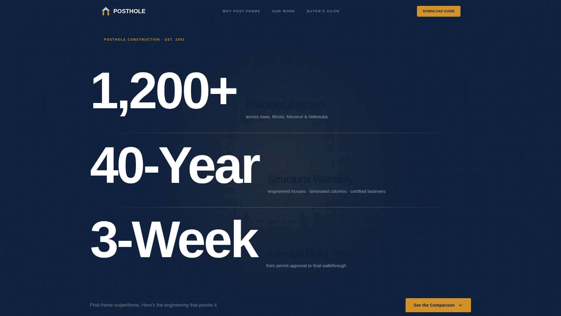
- A header block showing three key structural metrics in heavy condensed type against deep navy
- Alternating comparison-table-and-photo sections covering cost, clear span, insulation, timeline, and foundation
- A primary lead capture form with name, email, and a "What are you building?" dropdown, plus a footer "Request a Site Visit" anchor
Feature list
This section highlights the core built-in components that make Posthole ready to deploy for a post-frame builder's marketing needs.
Billboard Stats Header
Three massive performance numbers fill the viewport on load: buildings erected, warranty length, and average build time. Each stat is set in heavy condensed type against deep command navy, separated by thin amber divider lines. A single supporting line in galvanized gray sets the engineering tone immediately.
Side-by-Side Comparison Tables
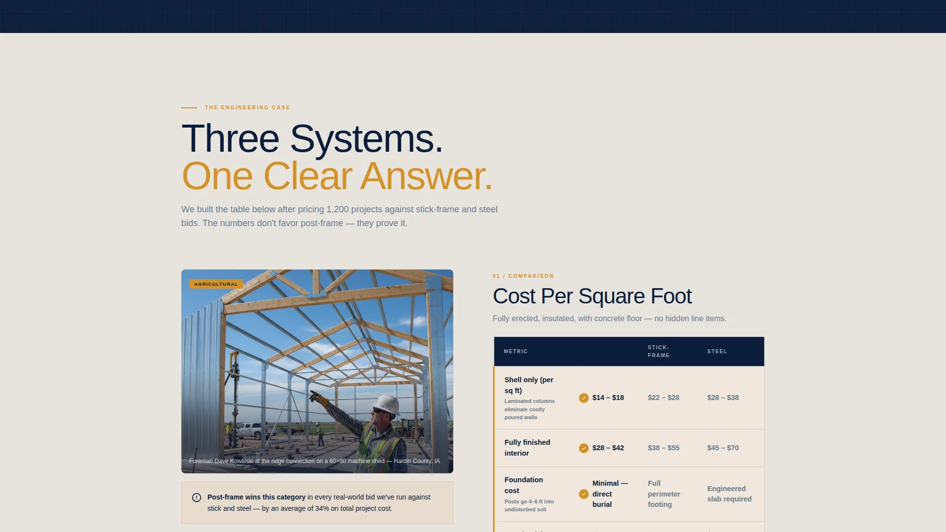
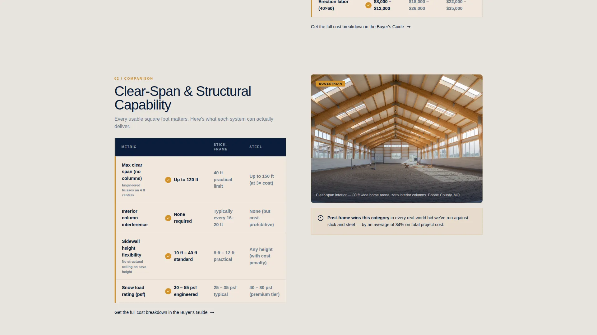
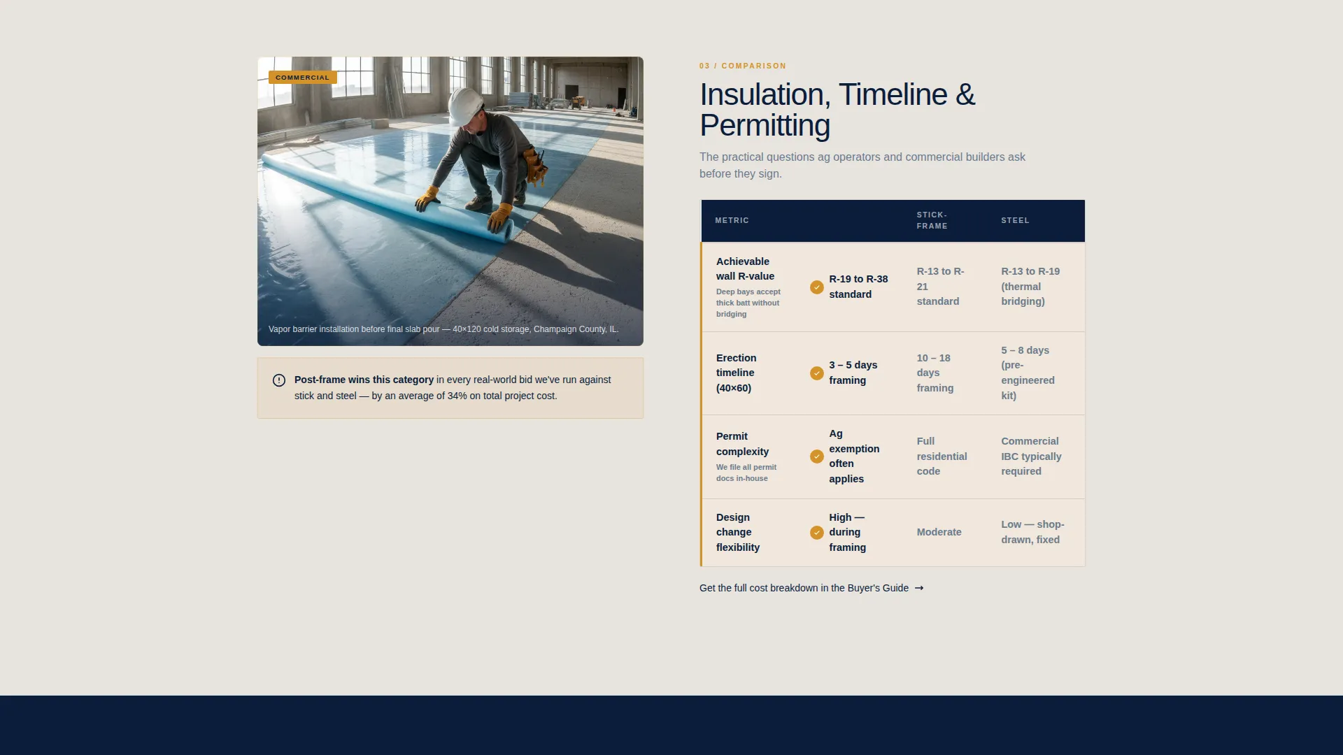
Each scroll section pairs a structured comparison table against a specific decision point. Post-frame is shown against stick-frame and steel across cost per square foot, clear-span capability, insulation R-value, erection timeline, and foundation requirements. The tables make the case without a single sales claim.
Crew-Visible Project Photography
Every comparison section includes a real project photo with crew members visible in frame. A foreman pointing at a truss connection or a finisher rolling out vapor barrier keeps the data grounded in actual field work. The people make the numbers feel real.
Auto-Scrolling Gallery Strips
Full-width gallery strips sit between comparison sections and auto-scroll completed builds tagged by use case. Categories include equestrian, agricultural, commercial, and residential. The rhythm alternates between learning and seeing, keeping visitors engaged through the full scroll.
Buyer's Guide Download Form
The primary conversion point is a lead capture form offering a 12-page post-frame buyer's guide PDF. The form collects first name, email, and a single dropdown asking "What are you building?" Options cover farm and ag, commercial, residential, hobby and shop, and not sure yet.
Footer Site Visit call to action
A secondary call to action anchored in the footer reads "Request a Site Visit." It targets visitors who have moved past the research phase and are ready to act. It gives the page two conversion paths without cluttering the main scroll flow.
Page sections overview
| Section | Purpose |
|---|---|
| Stats metrics header | Establish authority with three bold structural performance numbers |
| Cost comparison table | Show post-frame cost-per-square-foot advantage over alternatives |
| Clear-span table | Demonstrate open interior capability versus stick-frame and steel |
| Insulation R-value table | Compare thermal performance across all three building methods |
| Timeline comparison table | Show erection speed advantage for post-frame construction |
| Foundation requirements table | Address soil and foundation differences for each building type |
| Gallery strip (equestrian) | Show completed horse arenas and equestrian builds |
| Gallery strip (agricultural) | Show machine sheds and grain storage completed projects |
| Gallery strip (commercial/residential) | Show cold storage and hobby garage finished builds |
| Buyer's guide form | Capture leads with name, email, and project type dropdown |
| Footer site visit call to action | Convert research-phase visitors into site visit requests |
Design & branding system
The visual identity follows an Educational Guide theme built on the Navy Authority color system. The palette is organized like a well-run jobsite: structured, purposeful, and immediately readable.
- Deep command navy (#0B1D3A) anchors the header and footer, giving the page its authority at a glance
- Galvanized steel gray (#6B7B8D) handles body text and secondary surfaces, keeping reading comfortable throughout
- Fresh-pour concrete (#E8E4DF) breathes through the middle sections as a section background, breaking the scroll without losing momentum
- Caution-stripe amber (#D4922A) appears only on calls to action, data callouts, and divider lines, pulling the eye exactly where it needs to land
Mobile & speed optimization
The layout is designed to stay readable and functional at any screen width. The heavy condensed header type, wide comparison tables, and auto-scrolling gallery each adapt to smaller viewports without breaking the educational flow.
- Comparison tables reflow cleanly so mobile visitors can still scan the three-column data without horizontal scrolling
- Gallery strips and project photography scale to fill mobile screens while keeping crew-visible framing intact
How this template helps you convert
The page earns its leads by giving away half the knowledge for free. Visitors arrive skeptical and leave convinced, because the scroll makes the engineering argument before the form ever appears.
- The stats header builds instant authority, so visitors know within seconds they are dealing with an experienced post-frame contractor rather than a generic builder website.
- The comparison tables remove the biggest objection in post-frame sales by showing cost, span, and timeline data side by side, eliminating the need for a visitor to "do their own research" elsewhere.
- The buyer's guide form converts informed curiosity into a captured lead, because visitors who have scrolled through five comparison sections already trust the content and want the full PDF.
Other information about this template
Posthole is built specifically for the post-frame and pole barn construction market, where education drives conversion more than flashy visuals do. A few additional details worth knowing before you deploy it:
- The 12-page buyer's guide concept covers soil requirements, permit timelines, and cost-per-square-foot calculators, giving your lead magnet immediate credibility
- The "What are you building?" dropdown segments your incoming leads by project type from the first interaction, making follow-up conversations more focused
- The two-call to action structure serves two distinct visitor stages: researchers who want information first, and ready buyers who want a site visit now
- The template's learn-then-see scroll rhythm is designed for prospects who have been told steel-frame is their only option, giving them a structured reason to reconsider post-frame before they leave the page
Theme
Corporate Precision
Creative direction
Expert Panel
Color system
Navy Authority
Style
Sidebar Companion
Direction
Partnership/B2B
Page Sections
Billboard Stats Header Block
Multi-point Comparison Tables
Crew-visible Project Photography
Auto-scrolling Use Case Galleries
Segmented Buyer's Guide Form
Related questions
Who is this landing page template designed for?
What decision points do the comparison tables cover?
What does the lead capture form collect from visitors?
Does the template include gallery sections for different building types?
Can the template serve visitors who are already ready to hire a contractor?



