Certified Ergonomic Assessment | Free Website Template | Rocket
The Posture certified ergonomic assessment landing page template is a single-page, zigzag layout built for certified ergonomists who serve HR directors, operations managers, and professionals dealing with desk-related pain. It stacks escalating case study proof in alternating rows, opens with a real testimonial card, and drives visitors toward a booking click with no form on the page.
by Rocket studio
Quick summary
This template gives ergonomic assessment services a credible, conversion-focused landing page. It opens with a floating testimonial card, then walks visitors through three escalating case studies in a zigzag layout. Each before-and-after block builds trust before the page asks for a click. No form lives here, the goal is a single, confident click to a booking page.
Who this template is for
HR directors and workplace safety leads are the primary audience. This template is equally well suited to operations managers coordinating remote-team evaluations and individual professionals who have tried every chair adjustment on their own and still hurt by mid-afternoon.
- HR directors managing rising workers' compensation claims and needing documented safety improvements
- Operations managers onboarding distributed teams who need home office workstation setup evaluated remotely
- Individual professionals ready to stop accepting neck pain and lower-back discomfort as a normal part of their job role
What problem this template solves
Ergonomic assessment services are often invisible online. A generic service page cannot communicate the depth of a certified evaluation process or the real outcomes that follow. Potential clients, especially those responsible for employee comfort and workplace safety, need proof before they book.
- Poor workstation setup causes chronic posture strain, and visitors need to see that identified before they trust the service
- Without structured social proof, HR buyers cannot justify the cost of bringing in ergonomics personnel to their leadership team
- The page needs to support both corporate buyers evaluating teams and individuals seeking relief from daily discomfort and ergonomic risks
What you get with this template
You get a complete, ready-to-customize single-page layout designed specifically for certified ergonomic assessment services. The page is structured to document real outcomes, reduce friction, and move visitors toward a booking click.
- A floating testimonial card header with a teal left-border accent and coral highlight on the key outcome metric
- Three zigzag case study rows that alternate before-and-after content at individual, department, and campus scale
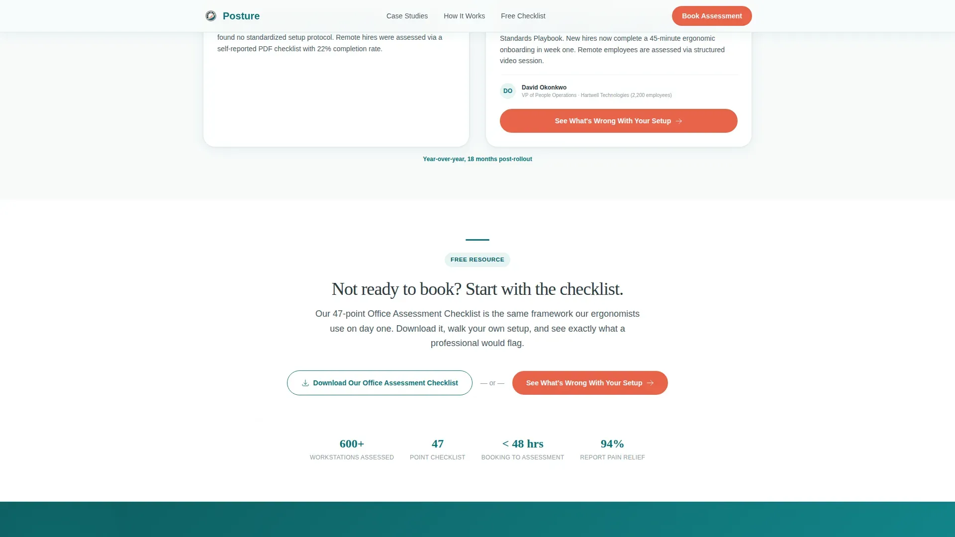
- Two call-to-action placements: a primary booking button and a mid-scroll checklist link for visitors not yet ready to commit
Feature list
This template includes a focused set of sections and visual tools matched to the specific needs of an ergonomic assessment service landing page.
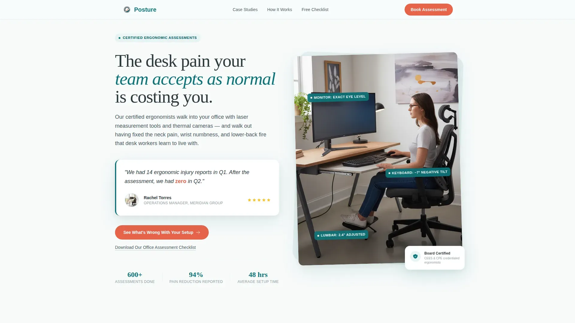
Testimonial Card Header
The header is a single oversized testimonial card floating on a clinical white background. It features a real quote from an office manager, a photo of the redesigned workstation, and a coral accent on the key outcome number. The card immediately establishes credibility before the visitor scrolls.
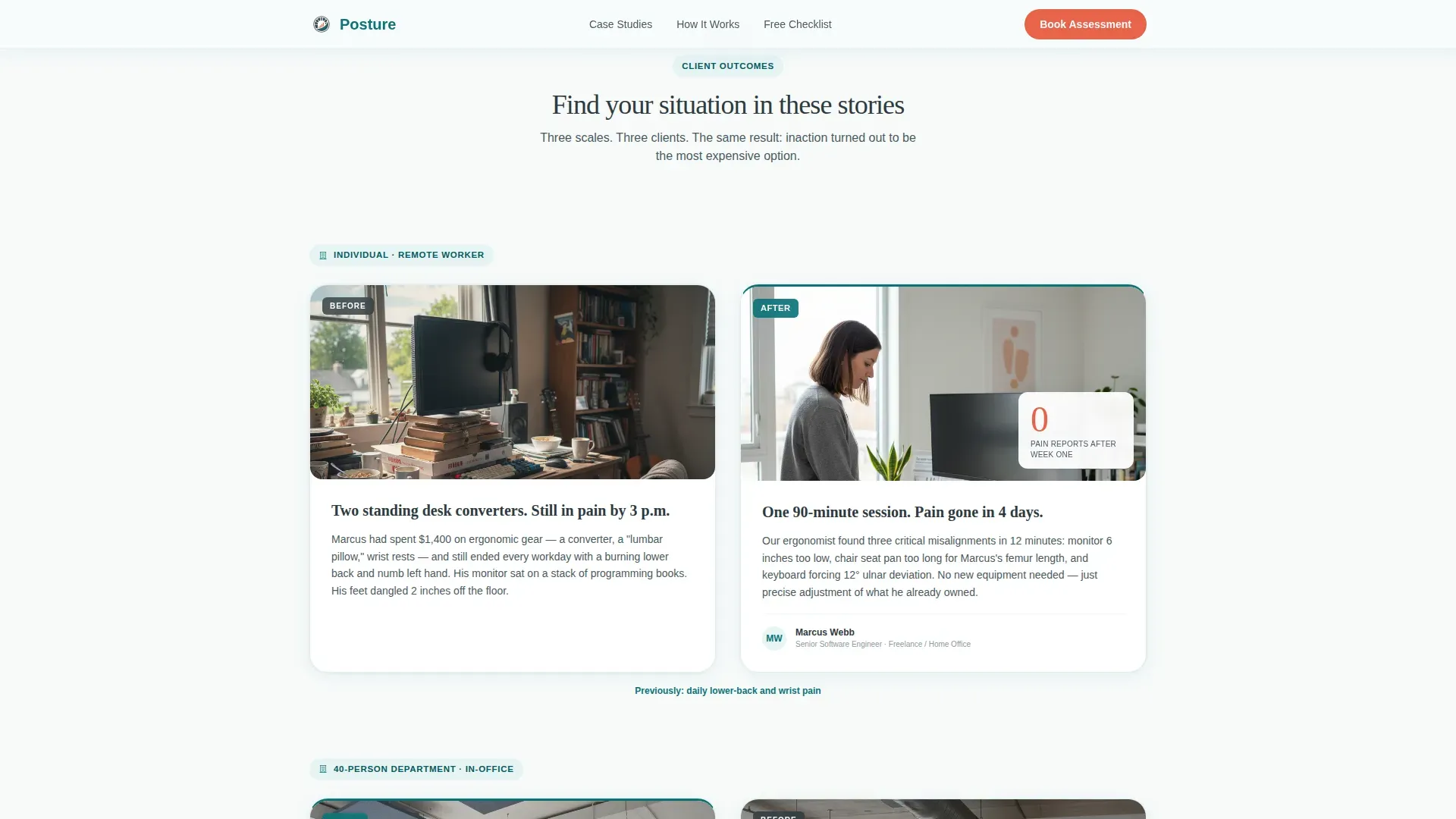
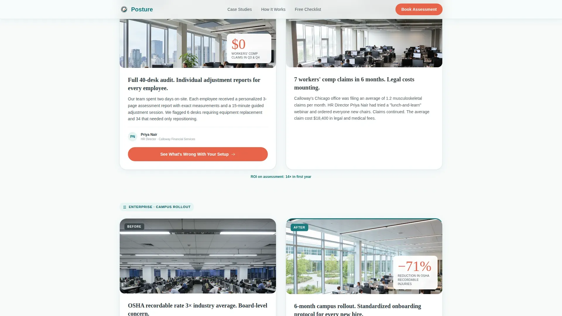
Zigzag Case Study Rows
Three alternating rows each pair a "before" scenario with an "after" result. Each block includes a description of the complaint, an annotated workstation setup photo with measurement overlays, and a single outcome metric in large coral type. The cases escalate in scale to help different visitors see their own situation reflected.
Dual Call-to-Action Structure
The primary call-to-action button, styled in catalyst coral, repeats at every third zigzag row. A secondary text link mid-scroll offers a downloadable office assessment checklist for visitors who need more time. Neither option requires a form on this page, both lead to a dedicated next step.
Teal and Coral Visual System
Deep assessment teal anchors headers and section dividers. Catalyst coral is reserved exclusively for call-to-action buttons and data callouts, training the eye to move exactly where the page needs it. This palette supports the visual hierarchy without competing with the content.
Scroll-Linked Reveal Animations
The template includes medium-intensity scroll reveals, stagger effects, and hover states. These animations give the page a polished, clinical feel without slowing the reader down. Each case study block enters smoothly as the visitor scrolls, reinforcing the sense of a building argument.
DM Sans and Fraunces Typography
Body copy uses DM Sans for clean, readable legibility across all screen sizes. Display headlines use Fraunces serif to signal authority and warmth simultaneously. Together they create a tone that feels like a trusted report rather than a sales page.
Page sections overview
| Section | Purpose |
|---|---|
| Testimonial Card Header | Opens with real outcome proof and primary call-to-action |
| Case Study One | Individual remote worker before-and-after workstation block |
| Case Study Two | 40-person department assessment with department-scale metrics |
| Case Study Three | Full campus rollout with annotated photos and outcome data |
| Mid-Page Call-to-Action | Checklist capture link plus repeated primary booking button |
| Footer | Horizontal flow pattern with supporting navigation elements |
Design & branding system
The visual identity follows a Directory and Discovery theme built on the Teal Catalyst color system. The palette feels like a well-organized wellness clinic, cool and competent, with one warm accent directing every important decision.
- Deep teal (#0D7377) for headers, section dividers, and the testimonial card left-border accent
- Clinical white (#F7FAFA) as the dominant background, giving every row space to breathe
- Catalyst coral (#E8634A) exclusively for call-to-action elements and outcome data callouts; warm charcoal (#2E3A3F) for all body text
Mobile & speed optimization
The template is built desktop-first to match the HR director audience who typically reviews materials at a workstation. It also delivers a solid mobile experience so individual professionals evaluating the service from a phone are not left behind.
- Server Components handle all static content, keeping JavaScript minimal and page load lean
- Scroll-linked reveal animations are designed to perform smoothly without blocking the main thread
- The zigzag layout adapts responsively, stacking case study blocks vertically on smaller screens without losing the before-and-after visual contrast
How this template helps you convert
Every layout decision on this page is oriented toward a single action: getting the visitor to click through to a booking page. The page earns that click by making inaction feel more costly than a single assessment appointment.
- The testimonial card opens with a concrete, undeniable outcome metric, making the value of the service clear before any scrolling happens
- Each case study escalates in scale, ensuring HR directors, operations managers, and individual professionals each find a scenario that mirrors their own situation and motivates action
- The dual call-to-action structure captures both ready-to-book visitors and those who need a lower-commitment entry point, reducing drop-off without adding form friction to the page
Other information about this template
This template is designed for ergonomic assessment businesses that need to communicate professional credibility alongside real human outcomes. Several additional details are worth noting for teams evaluating whether this layout fits their service.
- Assessments should be conducted annually for all employees, with additional evaluations triggered by workplace injuries or changes in job role, this template supports messaging for both scheduled and triggered evaluations
- The ergonomics assessment form used during real-world evaluations typically covers workstation layout, posture position, chair height, monitor height, keyboard distance, elbows angle, feet placement, and spine alignment, the template can support case study content drawn from these measurement categories
- Photographic documentation tools, risk scoring matrices, and annotated workstation photos are all referenced in the template's case study design, reflecting how effective assessment services document and present their findings
- Common ergonomic risks addressed in evaluations include repetitive strain, neck discomfort, Carpal Tunnel Syndrome, and lower-back hazards from prolonged static positions, the template's case study structure is built to present these findings clearly
- Regulatory compliance and legal protection are valid reasons many HR teams initiate assessments, this template gives space to reference those motivators through case study outcome language
- Employee feedback is a foundation of good ergonomic practices; teams can add comments drawn from real client responses to enhance the authenticity of each case study block
- The posture certified ergonomic assessment landing page template is fully customizable, businesses can update every case study block, swap outcome metrics, and tailor the follow up actions section to match their own service delivery model
- Template.net offers an ergonomics assessment form that is fully editable, making it a useful companion tool when building out the data-collection side of an assessment program
Theme
Directory & Discovery
Creative direction
Case Study Narrative
Color system
Teal Catalyst
Style
Zigzag/Alternating
Direction
Click-Through
Page Sections
Testimonial Card Header with Outcome Proof
Zigzag Before-and-after Case Studies
Dual Call-to-action Structure
Teal Catalyst Color System
Scroll-linked Reveal Animations
DM Sans and Fraunces Type Pairing
Related questions
Who is this landing page template designed for?
Does this template include a contact form or booking form?
Can I customize the case study content to match my own clients?
What types of ergonomic risks can the case study blocks address?
Is this template suitable for both in-office and remote worker assessments?


