Vibrant Black-Owned Café Landing Page Template
Pour is a scroll-reveal landing page template built for a vibrant, Black-owned neighborhood café. It blends a Before/After Slider header, progressive Comparison Journey sections, and an illustrated "Find Your Perfect Order" quiz into one warm, sensory-rich page. The dopamine pop color palette and gradient-washed layout make the café's personality unmistakable from the first scroll.
by Rocket studio
Quick summary
Pour is a single-page, scroll-reveal landing page template designed for a Black-owned, community-rooted café. It opens with a dramatic Before/After Slider, builds desire through progressive Comparison Journey sections, and drives action through a personalized drink-and-pastry quiz. The result is a page that feels as warm and unhurried as the café itself.
Who this template is for
This template is made for independent café owners who want a web presence that actually reflects their space and story. It works especially well for businesses where atmosphere, craft, and community are the product just as much as the coffee.
- Black-owned café and coffee-bar owners who want to lead with identity and culture
- Neighborhood roasters and specialty coffee shops with a distinctive visual personality
- Creative food-and-beverage businesses that rely on sensory storytelling to attract loyal regulars
What problem this template solves
Most café landing pages look the same: a hero image, a menu link, and a map embed. They do not communicate the feel of a place, and they give a first-time visitor no reason to choose you over the chain down the street.
- Generic layouts that erase what makes an independent café worth walking to
- No conversion hook to turn a curious browser into someone who actually shows up
- A flat, static presentation that cannot convey atmosphere, sound, or craft
What you get with this template
Pour delivers a complete, scroll-driven landing page with interactive components baked in. Every section is purposeful and sequenced to build desire before asking for anything from the visitor.
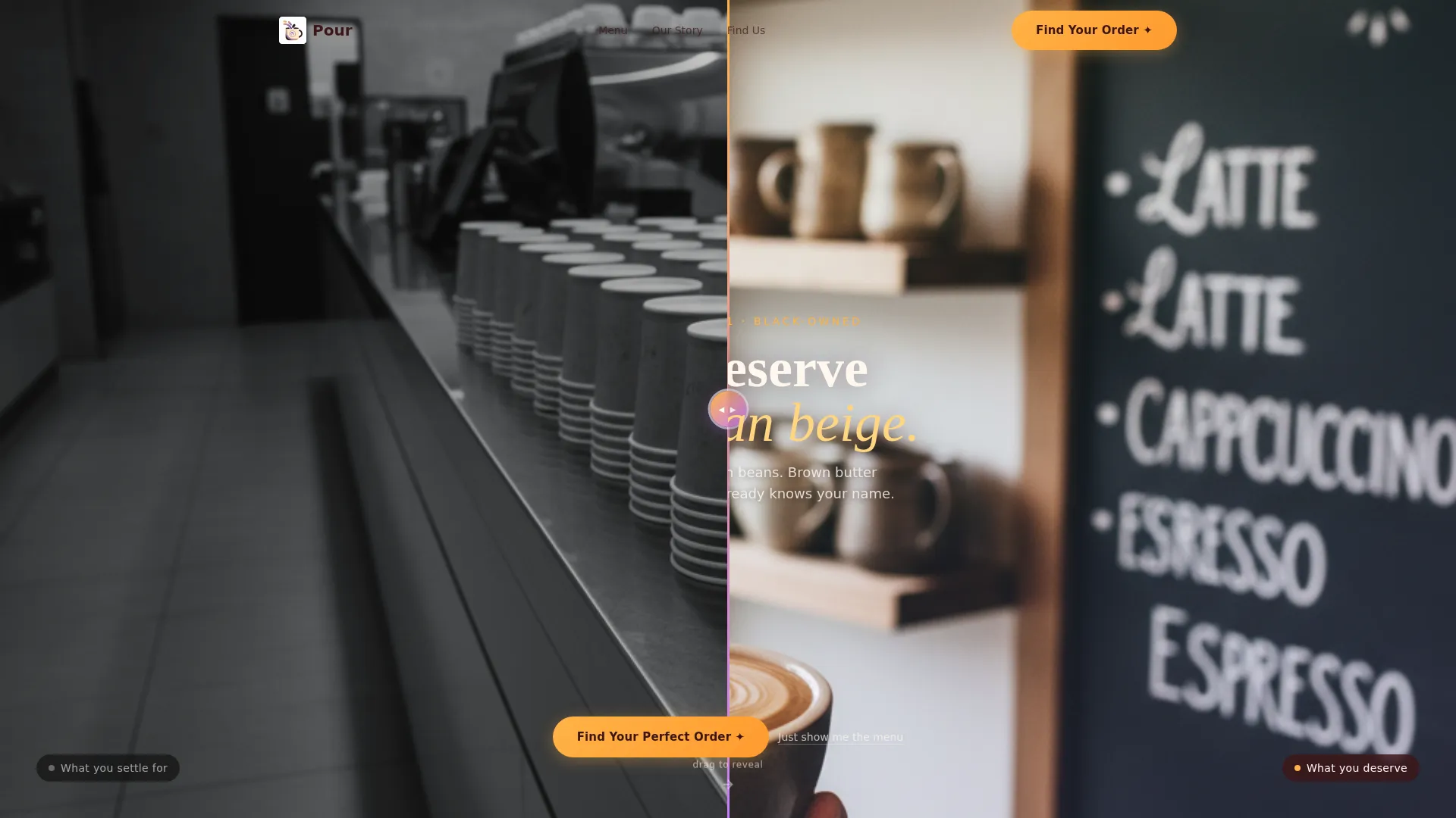
- A Before/After Slider header that physically contrasts commodity coffee with craft and community
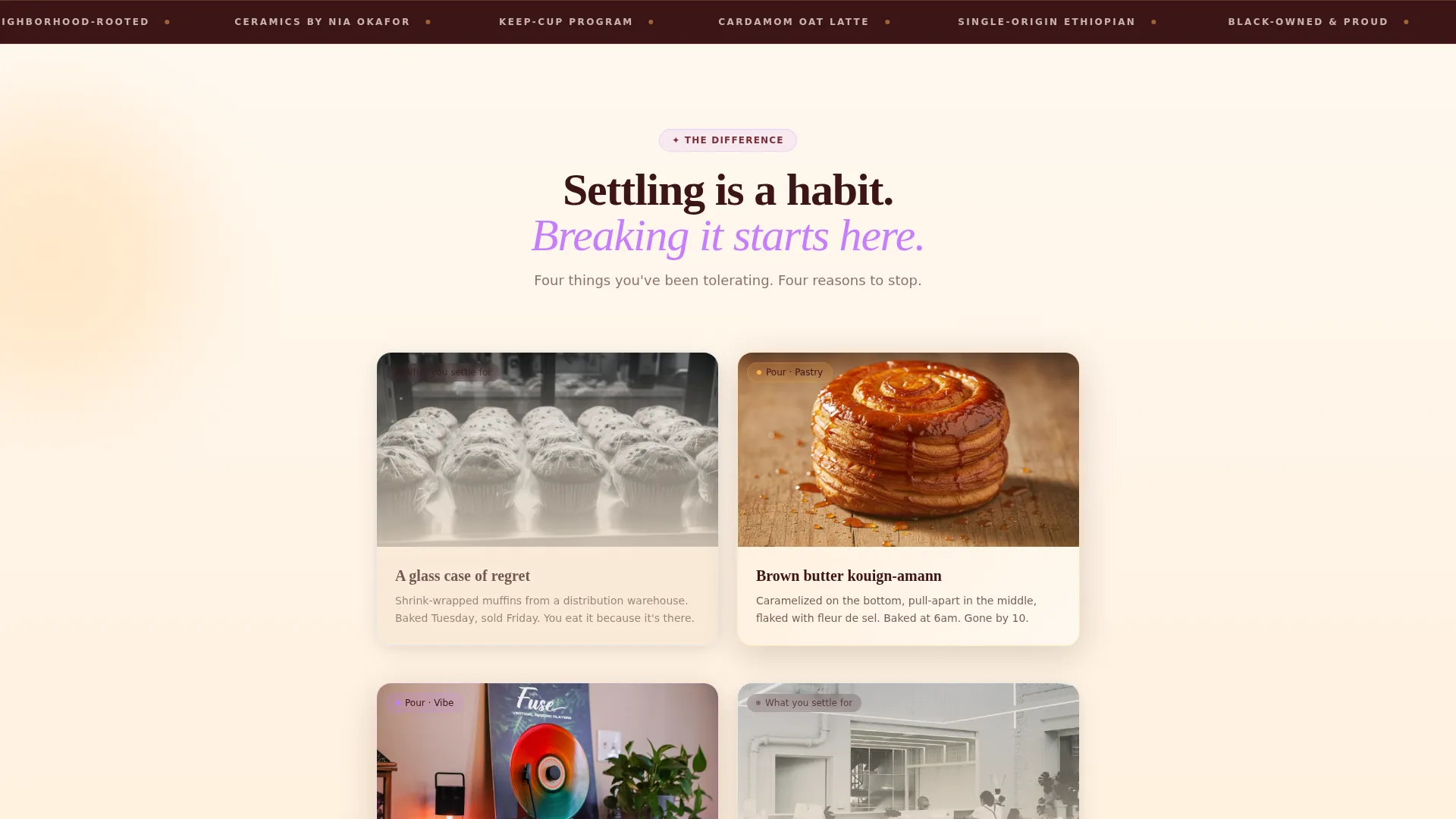
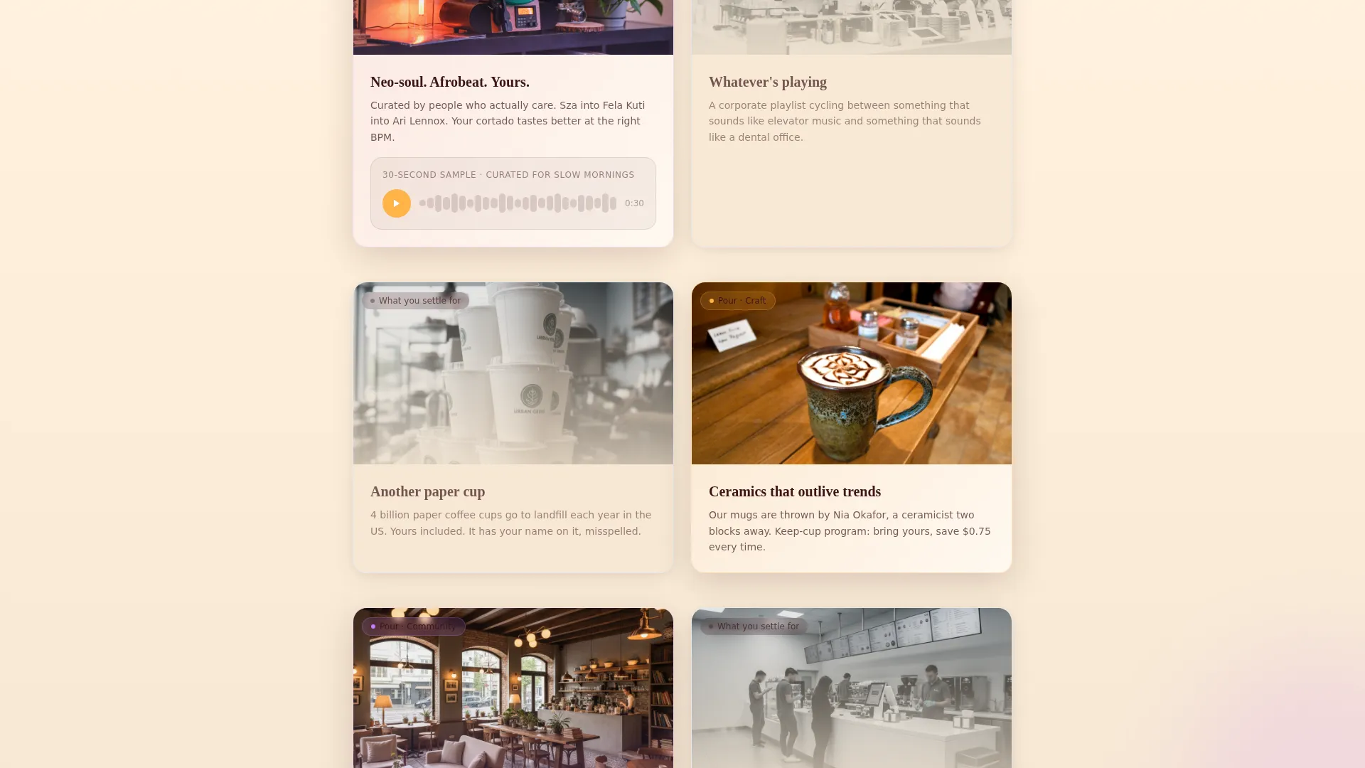
- Four progressive Comparison Journey sections covering pastries, playlists, cups, and sourcing
- A five-question illustrated quiz that generates a personalized drink-and-pastry pairing with a shareable gradient card and an in-store QR code claim
Feature list
This template is built around a small number of high-impact interactive components. Each one earns its place on the page.
Before/After Slider Header
The header opens with a draggable slider. The left side shows a gray, fluorescent-lit chain coffee counter. The right side reveals the café interior in full color with a barista mid-pour and ceramic mugs from local potters. A headline fades in over the right panel: "You deserve better than beige."
Progressive Scroll Reveal
Every section appears as the visitor scrolls down the page. This pacing keeps the experience feeling considered and unhurried, matching the tone of the café itself. Each reveal adds one more sensory layer before the quiz call to action arrives.
Comparison Journey Sections
Four reveal sections pair what a visitor settles for against what the café offers. Subjects include pastries, curated playlists with an embedded audio snippet, reusable cup programs, and single-origin sourcing. Each pairing builds a cumulative, sensory argument for choosing craft over convenience.
Personalized Quiz and Pairing
The primary call to action launches a five-question illustrated quiz covering morning pace, flavor preference, pastry choice, dairy preference, and vibe. Results deliver a custom drink-and-pastry pairing on a branded gradient card that visitors can share. A one-time QR code lets them claim a free first drink in store.
Secondary Navigation Path
A plain text link reading "Just Show Me the Menu" sits beneath the quiz entry point. It gives returning visitors or decided customers a direct path without forcing them through the quiz flow.
Dopamine Pop Color System
The palette uses warm mango, deep espresso brown, electric lilac, and whipped cream white as a base canvas. Gradients wash from mango to lilac across section backgrounds. Interactive elements pulse in lilac with mango hover states. Espresso brown anchors all body text and navigation.
Page sections overview
| Section | Purpose |
|---|---|
| Before/After Slider | Opens the page; contrasts generic coffee with the café's craft and community |
| Headline Fade-In | Delivers the core emotional promise over the right slider panel |
| Comparison Reveal 1 | Contrasts generic pastry cases with brown butter kouign-amann and hibiscus scones |
| Comparison Reveal 2 | Contrasts playlist silence with the café's curated neo-soul and Afrobeat sets |
| Comparison Reveal 3 | Contrasts disposable cups with the keep-cup program and local ceramicist collaboration |
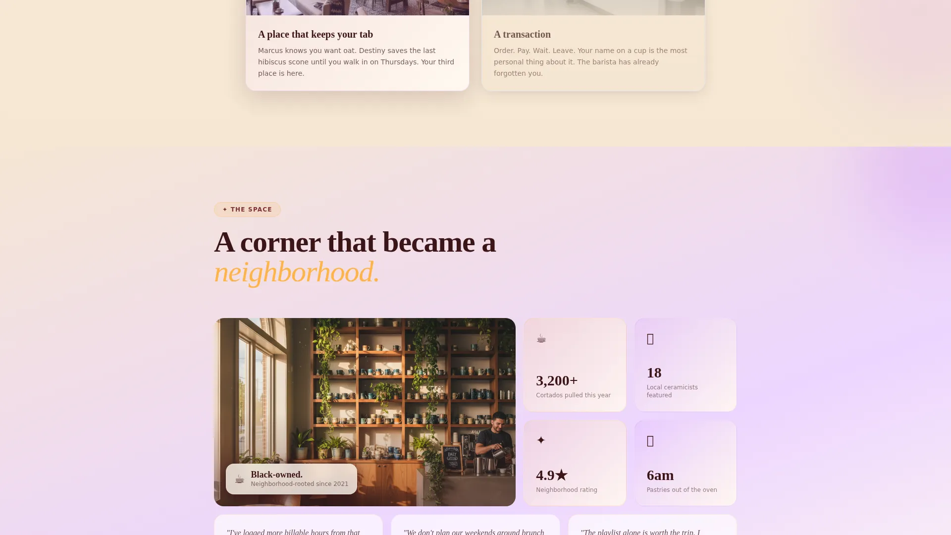
| Comparison Reveal 4 | Delivers the final sensory accumulation before the quiz call to action |
| Quiz Entry Point | Launches the five-question "Find Your Perfect Order" illustrated quiz |
| Quiz Results Card | Shows personalized pairing with a shareable gradient card and QR code |
| Secondary Menu Link | Offers a direct "Just Show Me the Menu" path for decided visitors |
Design & branding system
The visual identity follows a Soft Gradient theme built on a dopamine pop color system. The palette is warm and grounded, designed to feel expressive without overwhelming the content.
- Colors: warm mango (#FFB347), deep espresso brown (#3C1518), electric lilac (#C77DFF), and whipped cream white (#FFF8F0) as the base canvas
- Gradients wash softly from mango to lilac across section backgrounds; espresso brown anchors text and navigation throughout
- Interactive elements pulse in lilac with mango hover states; generous white space lets color breathe rather than shout
Mobile & speed optimization
The scroll-reveal structure and component-led layout are designed to deliver a consistent experience across screen sizes. The page is built as a single-page flow, which keeps navigation simple on smaller devices.
- The Before/After Slider is touch-compatible, so mobile visitors can drag the comparison just as desktop users do
- The quiz flow is designed as a step-by-step illustrated sequence, keeping each question readable and tappable at any screen width
- Generous white space and large tap targets keep the mobile experience clean and easy to move through
How this template helps you convert
Pour uses a sequenced, sensory approach to move visitors from curiosity to commitment. The conversion path is built into the page structure itself, not added as an afterthought.
- The Before/After Slider creates an immediate emotional contrast. Visitors feel the difference before they read a single line of body copy.
- The Comparison Journey sections accumulate sensory proof across four reveals. By the time the quiz appears, choosing the café over a generic alternative feels obvious.
- The quiz generates a personalized result and a free-drink QR code. This gives visitors a concrete, low-risk reason to walk through the door for the first time.
Other information about this template
Pour sits at the intersection of retail and community storytelling. It is designed for a specific kind of business: one where the space, the sourcing, and the people behind the counter are all part of the offer.
- The template is categorized under Retail and E-Commerce with a Black-Owned Business subcategory focus
- The Comparison Journey creative direction is a deliberate structural choice, not a decorative one; it drives every scroll beat with purpose
- The shareable gradient card from the quiz results is designed to extend the café's visual identity onto social media organically
- The one-time QR code tied to quiz results creates a measurable in-store conversion moment from a digital interaction
- This template suits cafés, coffee bars, and neighborhood food-and-beverage spaces that want a landing page with genuine personality rather than a placeholder web presence
Theme
Soft Gradient
Creative direction
Comparison Journey
Color system
Cloud Canvas
Style
Masonry/Pinterest
Direction
Direct Sales
Page Sections
Before/after Slider Header
Progressive Scroll Reveal Layout
Four-part Comparison Journey
Illustrated Five-question Quiz
In-store QR Code Claim
Dopamine Pop Color System
Related questions
Can I change the quiz questions to match my own menu?
Do I need a developer to set up the Before/After Slider?
Can the quiz results card be customized with my café's branding?
Is this template suitable for a café that is not Black-owned?
What happens to the free-drink QR code when a visitor claims it?



