Cloud Kitchen & Delivery Professional Website Template
The Prep landing page template is built for healthy meal prep delivery services that want to feel personal, not corporate. A warm artisan scrapbook aesthetic, hero-dominant layout, rotating meal cards with macro data, and a frictionless meal picker make it easy for busy parents, remote workers, and fitness enthusiasts to pick their meals and place an order fast.
by Rocket studio
Quick summary
Prep is a hero-dominant landing page template designed for healthy meal prep delivery services. It pairs a Warm Artisan visual identity with a direct-sales layout built to convert exhausted, time-poor visitors into weekly meal customers. The collage-style hero, rotating menu section, neighborhood delivery map, and streamlined meal picker all work together to create a landing page that feels as honest and inviting as a neighbor's kitchen.
Who this template is for
This template is built for food delivery operators who want their landing page to feel genuinely local and handcrafted. It suits services that prep meals in small batches, source ingredients from named farms, and deliver within a defined neighborhood radius. The landing page design speaks directly to people who care about what they eat but do not have time to cook.
- Healthy meal prep delivery services looking to drive direct weekly orders
- Cloud kitchen and restaurant operators launching a neighborhood food delivery brand
- Food bloggers and culinary entrepreneurs ready to promote a curated weekly meal service
What problem this template solves
Most meal prep landing pages feel cold and clinical. They list ingredients without evoking any taste or warmth. Visitors land on them and feel nothing. This template solves the emotional gap between a food delivery service and the people it wants to reach.
- Busy parents and remote workers need convenience, not a catalog. This page gives them a clear meal pick flow in seconds.
- Health conscious individuals and fitness enthusiasts want nutrition tracking data and dietary labels without hunting for them.
- Food businesses without design teams need a landing page that captures attention and builds trust from the first scroll.
What you get with this template
You get a fully realized, single-page layout with every section a healthy meal prep delivery service needs to turn visitors into customers. The design is warm, editorial, and immediately recognizable as handcrafted. Nothing feels templated in the generic sense because every detail is rooted in a specific visual brief.
- A collage hero filling ninety percent of the viewport, a rotating weekly menu with farm sourcing callouts, a neighborhood delivery map, customer Polaroid testimonials, a behind-the-scenes kitchen strip, and a minimal warm footer
- A visual meal picker modal with per-dish calorie counts, dietary flags, and a live-updating order total for frictionless ordering
- A sticky call to action bar that follows users after the menu section, prompting them to pick their meals without losing scroll position
Feature list
The template ships with a focused set of built-in components. Each one serves the conversion goal of turning a browsing visitor into a confirmed weekly meal customer.
Collage Scrapbook Hero Section
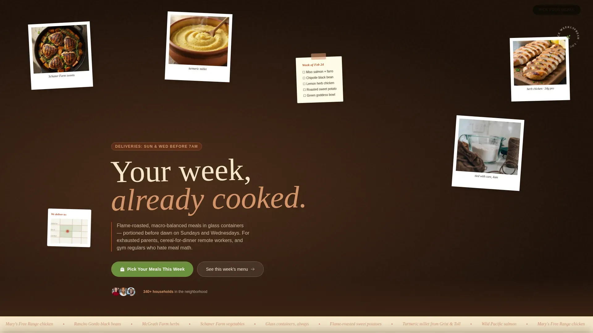
The hero fills ninety percent of the viewport with overlapping Polaroid-style food photos, a torn kraft-paper visual texture, a handwritten weekly menu pinned at an angle, a delivery neighborhood map, and a warm serif headline sitting slightly crooked across the composition. A prominent call to action button in herb green sits above the fold so visitors can act immediately. High quality images and engaging visuals make this section the emotional anchor of the entire landing page.
Rotating Weekly Menu Cards
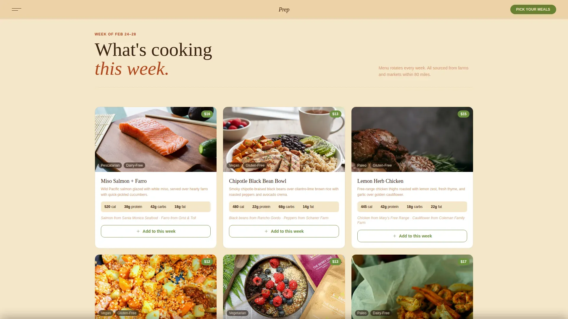
The menu section displays rotating meal cards, each featuring a close-up food photo, calorie count, macronutrient breakdown, and farm sourcing callout. Dietary labels for options like Paleo, Keto, Vegan, and Gluten-Free help health conscious individuals navigate quickly. The description on each card uses sensory language to convey taste and freshness rather than a dry ingredient list. This section supports nutrition tracking needs for fitness enthusiasts tracking their weekly food intake.
Visual Meal Picker Modal
Clicking the primary call to action opens a visual meal picker. Each dish appears as a card with a close-up photo, calorie count, and a one-tap add button. The checkout flow collects delivery address first to confirm zone coverage, then meal count, then dietary preferences, then payment. The total updates live so users always know what they are spending. This frictionless ordering interface removes cognitive load at the most critical step.
Neighborhood Delivery Map
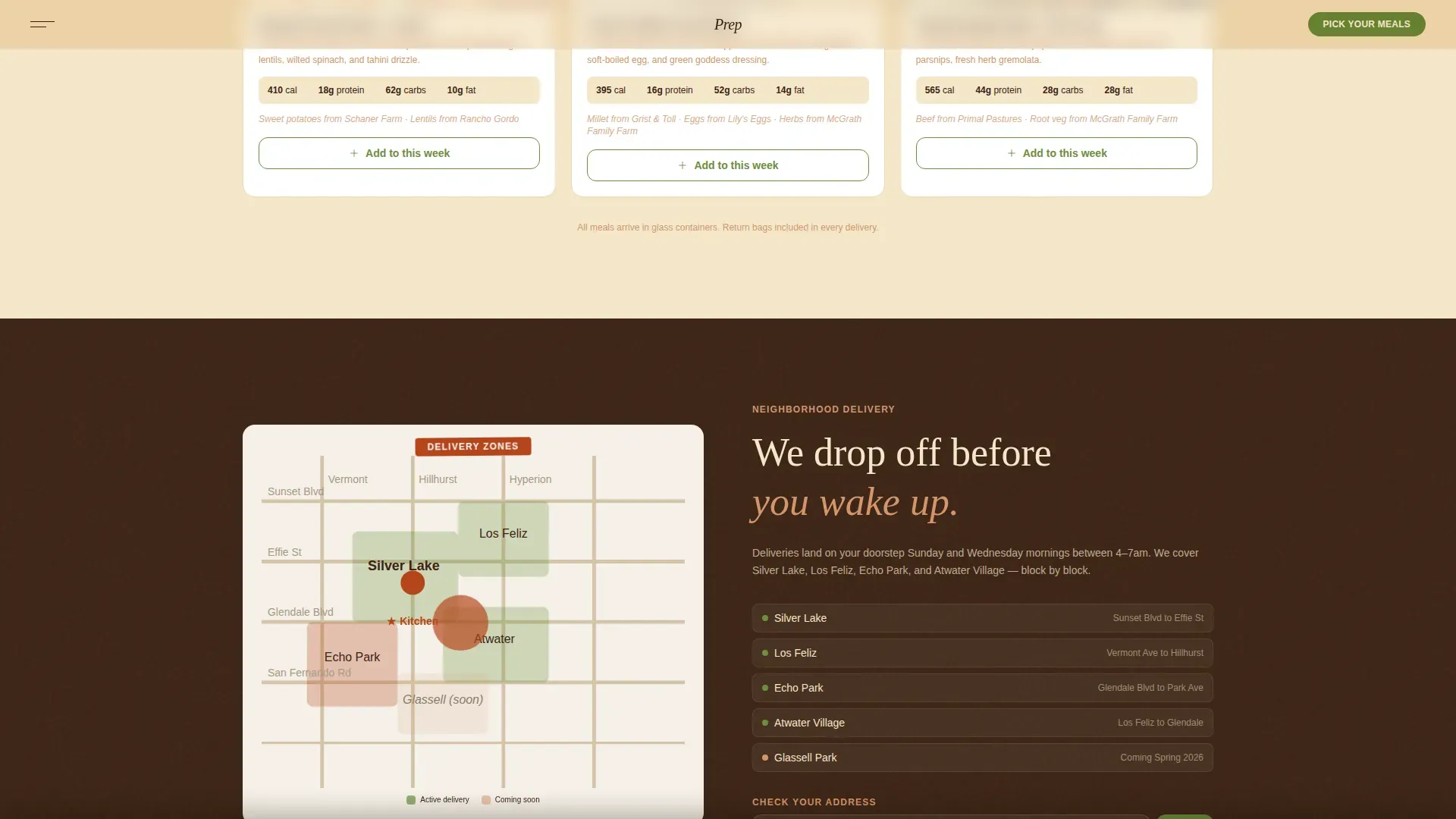
An illustrated map section shows delivery zones block by block with streets actually named. Visitors can check their address directly on the page to confirm coverage. Transparent logistics like this build immediate trust and reduce the number of people who abandon ordering because they are unsure whether delivery reaches them.
Customer Polaroid Testimonials
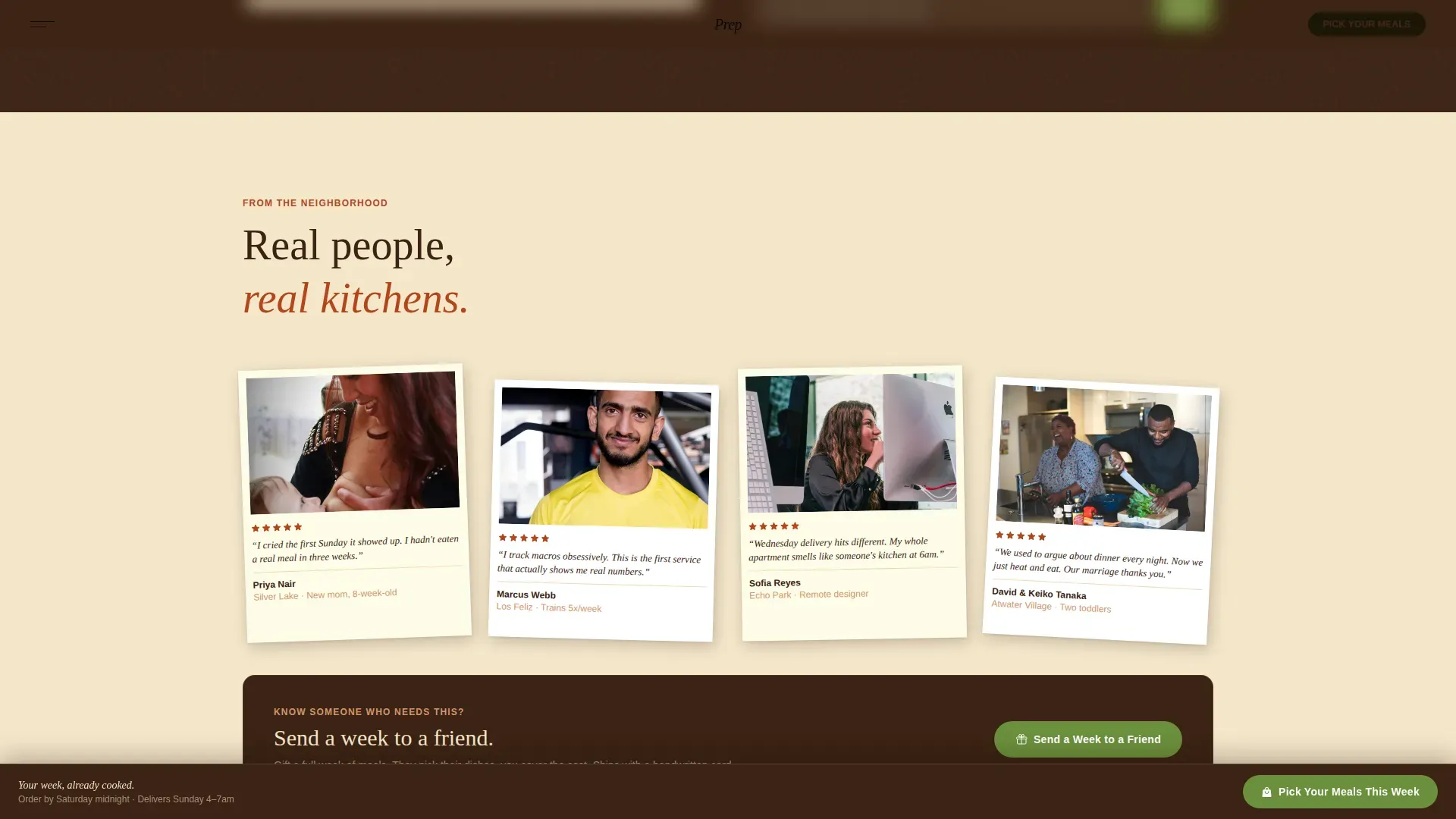
The testimonials section displays customer photos in a Polaroid treatment with handwritten-style captions below each one. Feedback emphasizes taste, healthy eating results, and the time savings that come from skipping weekly cooking. A secondary call to action beneath this section offers a gift option: visitors can send a week of meals to a friend. Testimonials from satisfied customers serve as powerful social proof for potential customers considering their first purchase.
Sticky Bottom Call to Action Bar
After the menu section, a sticky bottom bar follows the user through every remaining section of the page. It displays the primary call to action so visitors never miss the prompt to order, no matter how deep into the page they scroll.
Page sections overview
| Section | Purpose |
|---|---|
| Collage Hero | Capture attention, deliver headline and primary call to action |
| Weekly Menu Cards | Showcase rotating meals with macro data and farm sourcing |
| Neighborhood Delivery Map | Display delivery zones and address checker |
| Customer Polaroid Testimonials | Build trust with social proof and surface gift option |
| Behind-the-Scenes Kitchen Strip | Deepen brand story with 4 a.m. kitchen photography |
| Sticky Call to Action Bar | Keep ordering prompt visible after menu section |
| Minimal Warm Footer | Provide navigation links and brand close |
Design & branding system
The visual identity follows a Fire and Earth color system that makes the landing page feel like food photography from a trusted cookbook rather than a generic restaurant website. Typography pairs a warm serif for headlines with a clean sans-serif for body copy, keeping the page readable at every scroll depth.
- Color palette: scorched clay (#B5451B), deep loam brown (#3B2314), roasted sesame cream (#F5E6CA), and living herb green (#6B8F3C) reserved for buttons and pricing callouts
- Typography: Fraunces for warm serif headings and DM Sans for body text, producing a modern design that still feels handcrafted
- Visuals use warm natural lighting, rustic backgrounds, and close-up food photography to enhance the artisan feel across every section
Mobile & speed optimization
This landing page is built mobile-first because the primary users are people reheating meals between diaper changes or ordering from a couch, not sitting at a desk. The fully responsive layout adapts cleanly from large screens down to small phone viewports without losing the collage aesthetic.
- Images are lazy-loaded to keep the page feeling fast even on slower connections
- CSS animations are GPU-accelerated, covering the marquee, rotating badge, Polaroid hover lifts, parallax collage layers, and scroll-linked kitchen strip
- The meal picker modal and sticky call to action bar are optimized for thumb-friendly tap targets on mobile devices
How this template helps you convert
A landing page only earns revenue when it moves visitors from curiosity to confirmed order. Every section of this template is sequenced to deepen trust before asking for commitment.
- The hero section delivers a benefit-driven headline and a visible call to action above the fold, so visitors who are ready to order can act within seconds of landing on the page.
- The rotating menu with nutrition tracking data, dietary labels, and farm sourcing callouts builds credibility with health conscious individuals and fitness enthusiasts who need to trust the food before they buy it.
- The Polaroid testimonials section reinforces quality and taste through real customer feedback, and the gift call to action opens a second conversion path for visitors who want to share the service with their families.
Other information about this template
This template is a strong fit for food businesses of any size that want a landing page design rooted in a specific place and story rather than a generic food delivery aesthetic. It can also support food bloggers who are launching a meal prep side service and want a professional landing page without a full web development project.
- No-code tools and visual builder platforms let users customize this template and publish their landing page in just a few hours, with no coding knowledge required
- Free templates on platforms like Weblium and Figma offer starting points, but this template is purpose-built for healthy meal prep delivery with the section structure and visuals already in place
- The template supports meal scheduling flows, seasonal menu updates, and discounts for new customers, all within the existing page layout
- Users can customize colors, swap photos, update recipes, and edit copy directly in a visual editor to match their brand identity
- The landing page design includes links to delivery zone details, a gift ordering path, and pricing tiers, giving potential customers every piece of information they need to sign up and place their first order
- The Prep warm artisan healthy meal prep delivery landing page template is designed to promote local food delivery services with warmth, specificity, and a conversion-first structure
Theme
Warm Artisan
Creative direction
Local & Neighborhood
Color system
Fire & Earth
Style
Hero-Dominant (90/10)
Direction
Direct Sales
Page Sections
Collage Scrapbook Hero Section
Rotating Weekly Meal Cards
Visual Meal Picker Modal
Neighborhood Delivery Map
Polaroid Testimonials with Gift Path
Sticky Call to Action Bar
Related questions
Can I update the weekly menu content myself?
Does this template work for a small neighborhood meal prep service?
Is the visual meal picker included in the template?
Can I add a discount for new customers?
Who is this landing page template designed for?



