Gen Z Finance Careers Website Template
Prequalify is a Gen Z mortgage landing page template built around a 50/50 split-screen layout. It breaks down thirty-year fixed rates, debt-to-income ratios, and escrow into plain language through a Jargon Decoder, an interactive rent-versus-own calculator, and a confidence-building call to action that earns the email capture before asking for it.
by Rocket studio
Quick summary
Prequalify is a single-page mortgage template designed for first-time buyers who learned about money on the internet, not in a classroom. It pairs a Corporate Precision visual style with a Comparison Journey structure, guiding visitors from vocabulary confusion to confident decision-making through clean typography, interactive calculators, and zero financial jargon.
Who this template is for
This template is built for mortgage platforms and fintech brands that serve buyers who feel excluded by traditional lending language. It speaks directly to people entering homeownership without a roadmap.
- First-gen homebuyers whose parents rented and cannot walk them through the process
- Young software engineers, freelancers, and mixed-income couples who have been ignored by conventional lenders
- Any first-time buyer product that needs to build trust before asking for a sign-up
What problem this template solves
Most mortgage pages are written for people who already understand mortgages. That leaves a huge audience reading terms like "PMI threshold" and "debt-to-income ratio" without context, and quietly clicking away.
- Visitors arrive confused and leave before they ever reach a call to action
- Traditional lender pages use dense copy that intimidates rather than educates
- First-gen and Gen Z buyers have no trusted reference point, so they stall or disengage entirely
What you get with this template
You get a fully structured, section-led landing page that builds buyer confidence through education before conversion. Every section is designed to move the visitor one step closer to understanding and one step closer to acting.
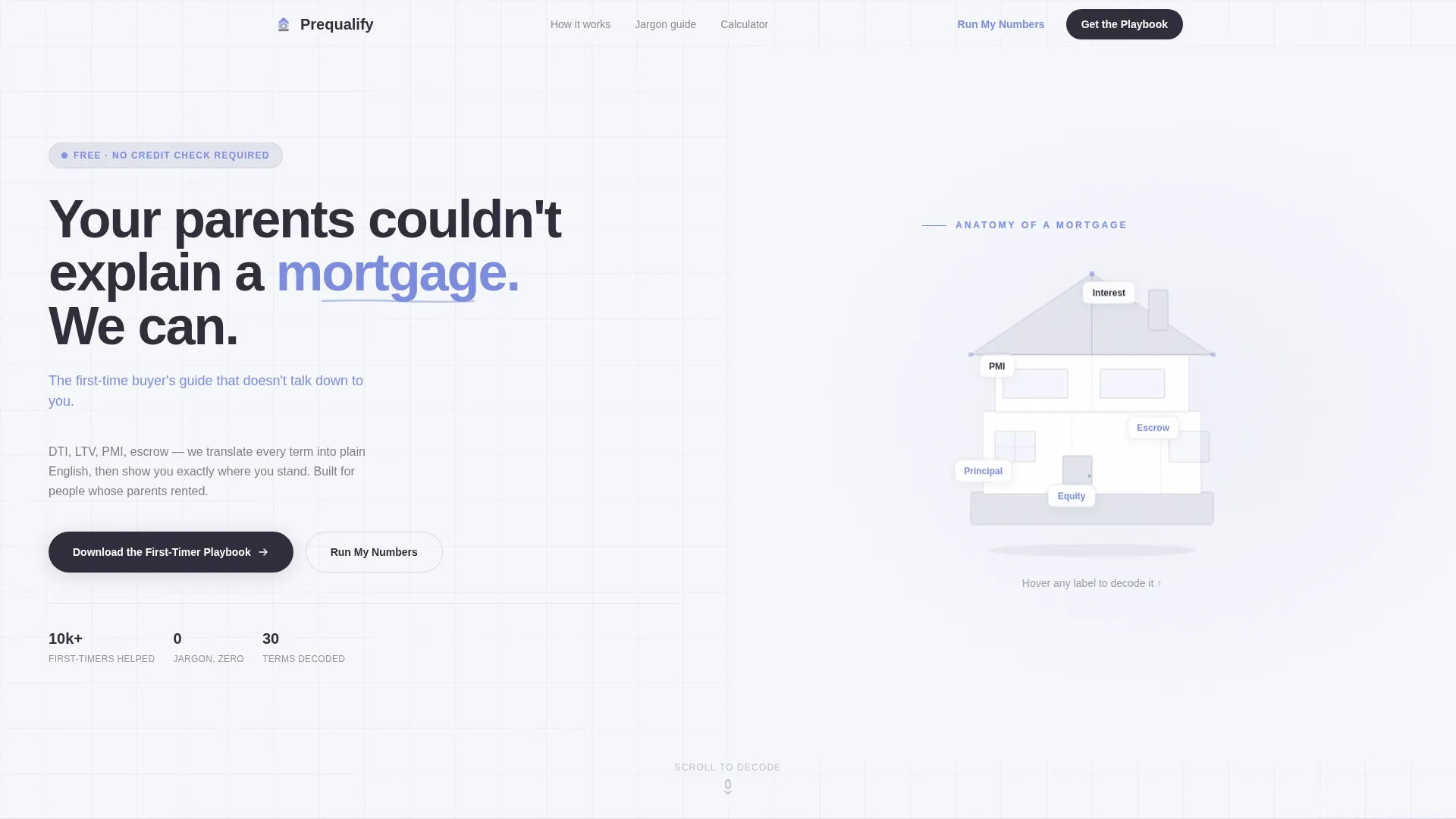
- A hero section with an oversized headline and an illustrated house cross-section that labels mortgage anatomy visually
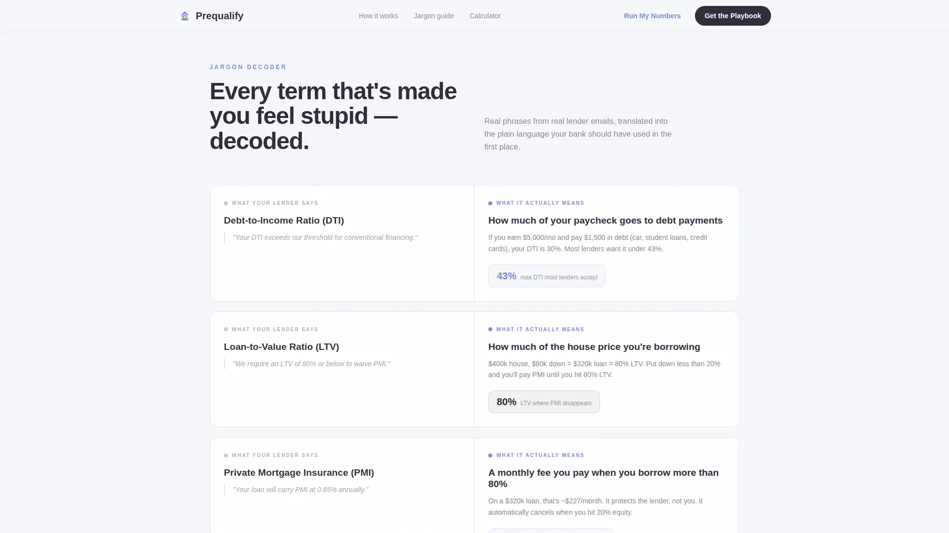
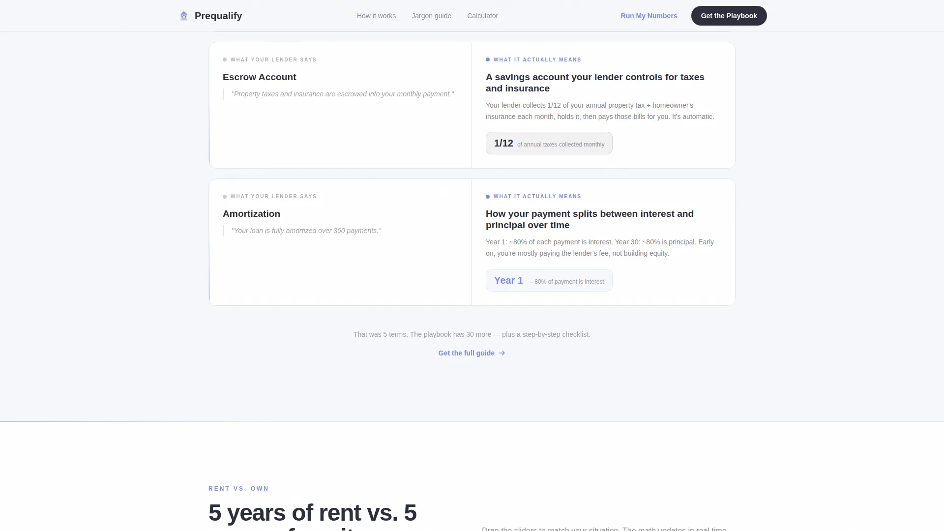
- A Jargon Decoder split comparing lender language with plain-English translations, supported by concrete stat callouts
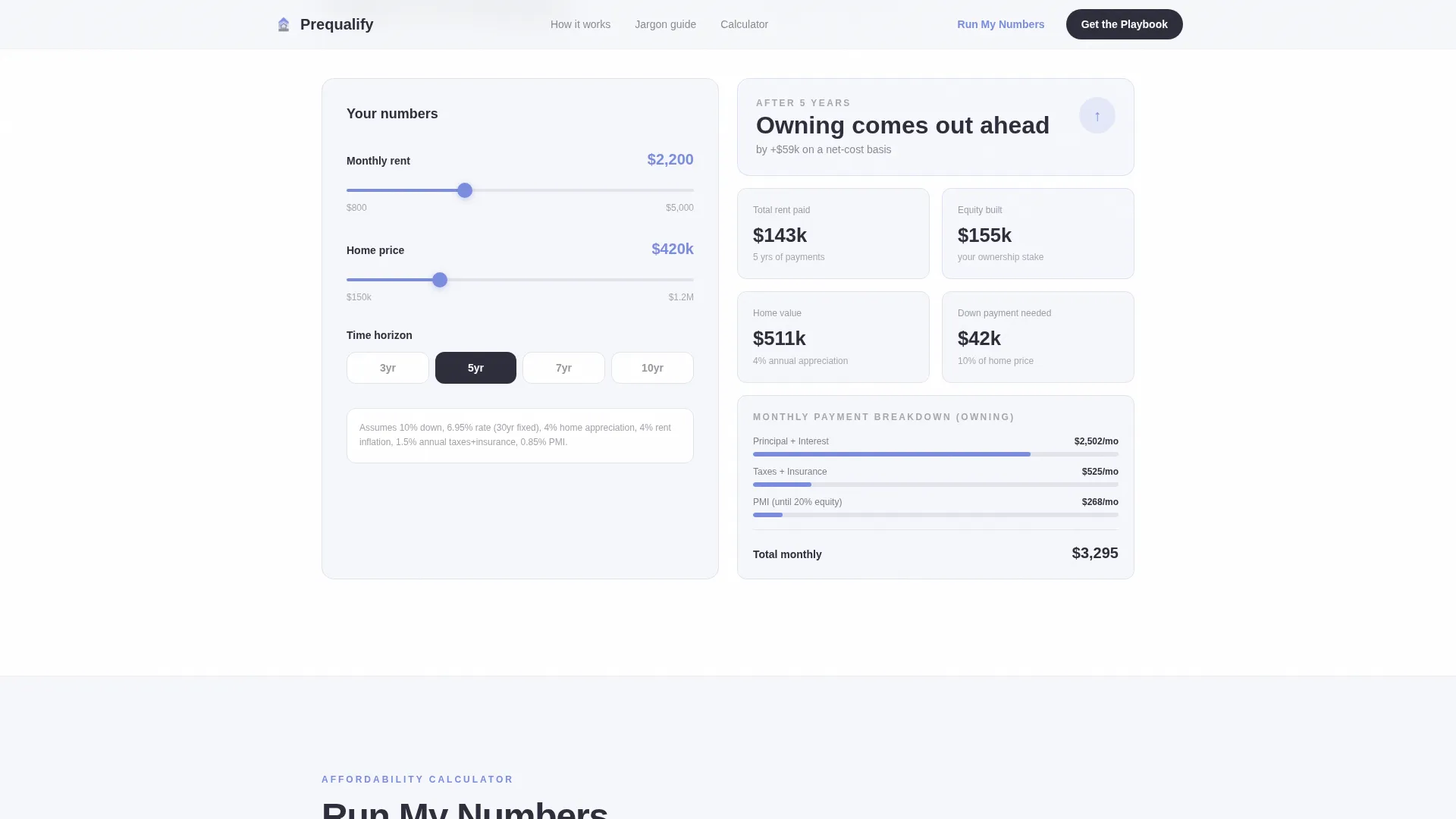
- An interactive five-year rent-versus-own calculator with dual sliders and real-time equity updates, a no-sign-up affordability tool, and a confidence-peak call to action that captures first name and email for the First-Timer Playbook download
Feature list
This template includes the following core components built directly from the source brief.
Split-Screen Hero with Mortgage Anatomy Illustration
The hero uses a 50/50 layout. The left side holds a 72-point-equivalent headline in graphite ink with a periwinkle subhead. The right side shows an abstracted house cross-section where each room is labeled with a mortgage term, making the anatomy of a loan spatial and immediately readable.
Jargon Decoder Comparison Panel
A side-by-side split presents real lender phrases on the left and plain-language translations on the right. Concrete stat callouts are embedded in the decoder section to add specificity without relying on testimonials.
Interactive Rent versus. Own Calculator
A dual-slider calculator lets visitors drag a rent input on the left and see five-year equity projections update on the right in real time. Client-side components handle the live calculation so the experience stays responsive and immediate.
No-Sign-Up Affordability Tool
The "Run My Numbers" section embeds an affordability calculator that requires no account creation. Visitors can explore their numbers freely, which lowers the barrier to engagement before any email is requested.
Confidence-Peak Email Capture call to action
The primary call to action appears after the calculator sequence, when visitor confidence is highest. It asks only for a first name and email in exchange for the First-Timer Playbook download, keeping friction minimal.
Scroll-Triggered Animation System
Sections reveal through scroll-triggered staggered fade-ins and beam borders. Interactive elements use real-time updates to reinforce the feeling that the page is responding to the visitor, not just presenting at them.
Page sections overview
| Section | Purpose |
|---|---|
| Hero Split | Introduce headline and mortgage anatomy illustration |
| Jargon Decoder | Translate lender terms into plain language |
| Rent versus. Own Calculator | Compare five-year renting and owning outcomes |
| Affordability Tool | Let visitors run personal numbers, no sign-up |
| Playbook call to action | Capture first name and email at confidence peak |
| Footer | Linear single-row navigation and legal links |
Design & branding system
The visual identity follows a Corporate Precision theme built on the Cloud Canvas color system. The palette is intentionally restrained, letting content carry the weight while color guides attention without competing for it.
- Cloud Canvas white (#F6F7FB) covers all backgrounds; Pale Fog (#E2E4EE) surfaces section dividers and card backgrounds
- Graphite Ink (#2D2D3A) handles all primary text; Muted Periwinkle (#7B8CDE) marks interactive elements and data highlights
- Plus Jakarta Sans drives headlines and Demand Sans (DM Sans) handles body copy and interface text throughout
Mobile & speed optimization
The template is built mobile-first because the target audience lives on their phones. The desktop layout expands into the full 50/50 split-screen treatment while mobile stacks sections vertically for clean readability.
- Server Components handle static sections to keep initial load lean; Client Components are scoped only to the interactive calculators
- Scroll-triggered reveals and staggered fade-ins are tuned to medium intensity so animation feels purposeful, not distracting
- Dual-slider inputs and hover-decode interactions are touch-friendly and sized for small-screen use
How this template helps you convert
The conversion architecture is deliberate. The page earns the email capture by delivering real value before asking for anything.
- The Jargon Decoder teaches three things the visitor did not know before arriving, establishing trust and demonstrating the platform's ability to explain complex concepts simply.
- The rent-versus-own calculator and the no-sign-up affordability tool let visitors engage deeply with their own numbers, which turns passive readers into active participants before the call to action ever appears.
- The "Download the First-Timer Playbook" call to action lands at the exact moment confidence peaks, after the visitor has already experienced the product promise firsthand, making the email exchange feel like a natural next step rather than a gate.
Other information about this template
This template is positioned at the intersection of fintech, consumer finance, and Gen Z-focused mortgage education. A few additional details are worth noting for teams evaluating fit.
- The localization is set to English (US) with USD currency formatting and MM/DD/YYYY date conventions
- The footer follows a Pattern 1 Linear Single-Row layout, keeping the page clean and uncluttered at the bottom
- Social proof is delivered through concrete stat callouts embedded directly in the decoder section rather than through standard testimonial blocks
- The no-stock-photography rule is built into the design direction; all visuals are illustrative and diagrammatic, which keeps the page feeling original and brand-consistent
- This template suits any first-time homebuyer platform, mortgage education product, or fintech brand targeting buyers who need clarity over credentials
Theme
Corporate Precision
Creative direction
Comparison Journey
Color system
Cloud Canvas
Style
Split Screen (50/50)
Direction
Content/Resource
Page Sections
Split-screen Hero with Mortgage Anatomy
Jargon Decoder Comparison Panel
Interactive Rent Versus. Own Calculator
No-sign-up Affordability Tool
Confidence-peak Email Capture Call to Action
Scroll-triggered Animation System
Related questions
Can I customize the mortgage terms used in the Jargon Decoder?
Does the rent-versus-own calculator need a backend connection?
Is the affordability tool separate from the main rent-versus-own calculator?
Can this template work for mortgage audiences beyond Gen Z?
What does the First-Timer Playbook call to action section include?



