Pharmaceutical Marketing & Agency Portfolio Website Template
Prescribe is a bold brutalist landing page template built for pharmaceutical SEO agencies. It features an animated molecule-diagram header, a masonry case study layout with three-layer expandable cards, and a lead-generation system with a sticky "Audit My Drug Pages" call to action. The design uses an AI iridescent color palette over a raw, structural grid.
by Rocket studio
Quick summary
Prescribe is a single-page landing page template engineered for pharmaceutical SEO agencies. It combines a bold brutalist grid with an AI iridescent color system, an animated molecule-diagram header, and a masonry case study narrative. The layout is built to earn trust from compliance-aware, VP-level buyers and convert them through a progressive three-step lead capture form.
Who this template is for
This template is designed for agencies that help drug manufacturers, specialty pharmacies, and biotech firms win visibility in heavily regulated search environments. It speaks directly to the professionals who sign off on digital marketing spend and compliance at the same time.
- VP-level marketing directors at mid-cap pharmaceutical companies managing branded drug page visibility
- Compliance officers who need every piece of public-facing copy to pass regulatory review
- Pharmaceutical SEO agencies that need to demonstrate technical credibility and proven results to high-stakes buyers
What problem this template solves
Pharmaceutical marketers face a unique challenge: paid advertising is restricted by the United States Food and Drug Administration (FDA), and organic search results for branded drug pages often get buried beneath third-party health content. A generic agency template cannot communicate the precision this niche demands.
- Branded drug pages lose ground to general health publishers, and the agency needs a page that proves it understands the YMYL (Your Money or Your Life) algorithm risk
- Compliance officers require evidence that the agency respects regulatory boundaries before they approve any engagement
- Standard portfolio layouts do not carry the technical authority or case study depth that pharmaceutical buyers need before they commit
What you get with this template
You get a complete, single-page landing page layout built around case study storytelling, regulatory credibility, and two distinct lead capture paths. Every section is designed to move a skeptical, senior buyer from first impression to form submission.
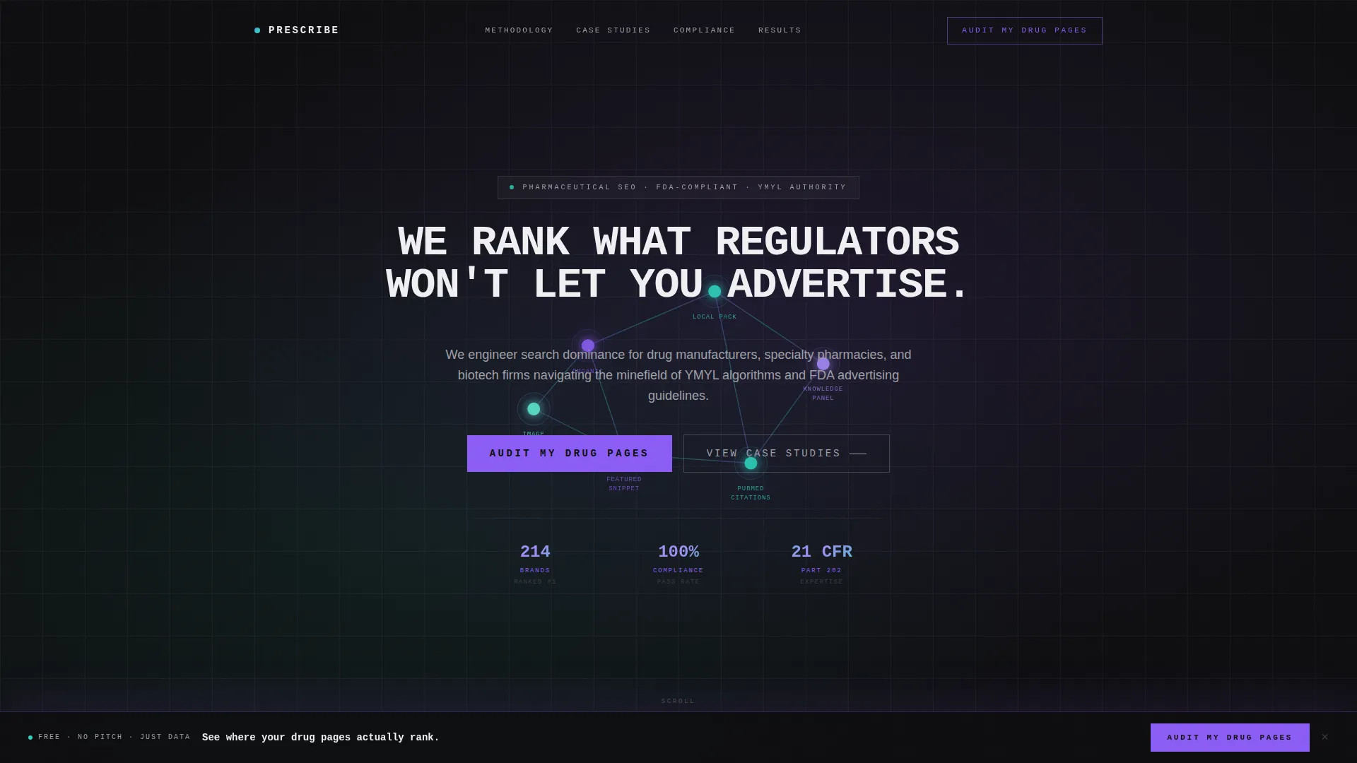
- An animated molecule-diagram hero section with a self-typing headline in heavy monospaced capitals
- A masonry card layout carrying expandable, three-layer client case study narratives
- A sticky bottom bar with the primary call to action and a secondary gated content offer for earlier-stage visitors
Feature list
The template delivers a focused set of purpose-built components. Each one maps directly to a buying signal that matters to pharmaceutical marketing decision-makers.
Animated Molecule Diagram Header
A stylized molecule diagram assembles itself atom by atom on page load. Each node represents a distinct search channel: organic search, local pack, knowledge panel, and PubMed citations. Connection lines draw themselves between nodes, pulsing with iridescent gradients, while the diagram rotates slowly in isometric space. The headline types itself in heavy monospaced capitals above the animation.
Three-Layer Masonry Case Study Cards
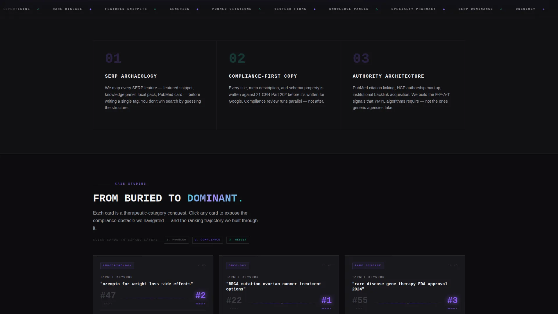
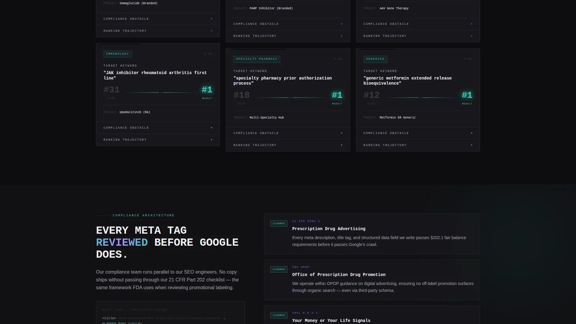
Each masonry card tells a client story in three expandable layers. The first layer shows a target keyword and its starting search position in brutalist typography. The second layer uses a redacted-document visual style, complete with struck-through phrases and regulatory citation numbers, to show the compliance obstacle. The third layer reveals ranking trajectory data as a line chart that draws itself on scroll. Cards are staggered at varied heights for visual rhythm.
Sticky Lead Generation Bar
A bottom sticky bar activates after the second case study card enters the viewport. It anchors the primary call to action, "Audit My Drug Pages," keeping the conversion path visible throughout the scroll without interrupting the case study narrative.
Three-Step Progressive Disclosure Form
The primary lead capture form uses three sequential steps. Step one collects the company URL. Step two presents a dropdown for therapeutic area, with options covering oncology, immunology, central nervous system (CNS) conditions, rare disease, and generics. Step three collects name and work email. The staged format reduces friction for high-intent buyers.
Gated Compliance Content Offer
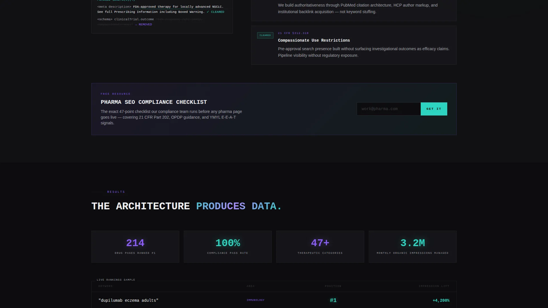
A secondary conversion path offers a downloadable Pharma SEO Compliance Checklist gated behind email capture only. This catches earlier-stage visitors who are not ready to book an audit but want proof the agency understands the regulatory landscape, specifically 21 CFR Part 202 standards for prescription drug advertising.
Bold Brutalist Iridescent Design System
The visual system pairs deep pharmaceutical black and clinical white as the structural grid anchors, with synthetic violet and iridescent teal as the active, living layer. Gradients appear on hover states, border glows, and data visualizations. Monospaced typography and exposed structural lines reinforce the engineered aesthetic throughout.
Page sections overview
| Section | Purpose |
|---|---|
| Animated Hero Header | Introduces agency positioning with a self-assembling molecule diagram and self-typing headline |
| Primary Value Statement | Communicates the agency's core promise to regulated-industry buyers above the fold |
| Masonry Case Study Feed | Delivers escalating client proof through expandable three-layer cards at varied heights |
| Compliance Obstacle Layer | Shows redacted-document styled cards with regulatory citation numbers per case study |
| Ranking Result Charts | Animates scroll-triggered line charts showing keyword trajectory outcomes per case |
| Sticky call to action Bar | Anchors the primary lead capture action after the second case study enters view |
| Three-Step Lead Form | Collects URL, therapeutic area, and contact details through progressive disclosure steps |
| Gated Checklist Offer | Captures early-stage leads with a downloadable compliance checklist behind email gate |
Design & branding system
The design language is bold brutalism filtered through an AI iridescent color system. It feels like laboratory infrastructure shot through with bioluminescent light, cold, precise, and unexpectedly alive. Every visual choice reinforces the idea that the agency operates at the intersection of scientific rigor and search engineering.
- Color palette: deep pharmaceutical black (#0D0D0F) and clinical white (#F0F0F3) hold the grid; synthetic violet (#8B5CF6) and iridescent teal (#2DD4BF) appear as gradients on hover states, border glows, and chart visualizations
- Typography: heavy monospaced capitals for headlines; exposed structural lines and raw grid spacing throughout the layout
- Visual motifs: molecule compound diagrams, redacted-document aesthetics, animated line charts, and iridescent gradient accents, no stock photography and no faces
Mobile & speed optimization
The masonry layout and scroll-triggered animations are structured to remain legible and functional at smaller viewport sizes. The staggered card heights that create rhythm on desktop adapt to a single-column flow on mobile without losing the narrative escalation the case study sequence depends on.
- Masonry cards reflow to a single-column layout on mobile, preserving the three-layer expand interaction
- Scroll-triggered line chart animations fire relative to viewport entry, so they work correctly on both desktop and mobile scroll behavior
- The sticky call-to-action bar remains anchored at the bottom of the viewport across device sizes, keeping the lead capture path accessible throughout the full page scroll
How this template helps you convert
The layout is engineered around two buyer types: the high-intent executive ready to request an audit, and the compliance-cautious researcher who needs more proof first. Both paths are served without either one compromising the other.
- The sticky "Audit My Drug Pages" bar activates at exactly the right scroll depth, after two case study cards have established credibility, so the call to action lands when trust is already building.
- The three-step progressive form reduces the perceived commitment of the first submission step, making it easier for busy VP-level buyers to start the process without feeling locked in.
- The gated compliance checklist creates a second conversion moment for visitors who are not yet ready for a direct audit request, capturing their email while delivering immediate, relevant value.
Other information about this template
This template is categorized under Portfolio and Agency, with a specific focus on pharmaceutical marketing and agency use cases. It is built as a single-page masonry layout, making it well-suited for agencies that want one focused, high-converting destination rather than a multi-page site structure.
- The template style is Masonry and Pinterest-inspired, with cards at staggered heights creating a scanning-friendly layout that rewards vertical browsing
- The creative direction is Case Study Narrative, meaning the primary content engine is escalating client proof rather than service feature lists
- The header concept is an Animated Illustration, specifically a molecule compound diagram with no reliance on stock imagery or human faces
- The lead generation direction means every section is sequenced to build toward a form submission, with two distinct capture paths built into the layout
Theme
Bold Brutalist
Creative direction
Case Study Narrative
Color system
AI Iridescent
Style
Masonry/Pinterest
Direction
Lead Generation
Page Sections
Animated Molecule Diagram Hero
Three-layer Expandable Case Study Cards
Sticky Lead Generation Call to Action Bar
Three-step Progressive Disclosure Form
Gated Compliance Checklist Offer
Bold Brutalist Iridescent Visual System
Related questions
Who is this landing page template designed for?
What makes the case study layout different from a standard agency portfolio?
Does the template include two separate lead capture paths?
Can I adjust the therapeutic area options in the lead form dropdown?
What does the iridescent color system look like in practice?



